Type Design Workshop / 2023
In our Type Design Workshop course, we continue to delve into the topic of extended Cyrillic. This year, we challenged the students to do the impossible: design a typeface that supports two languages in just two weeks. One of them was supposed to be based on the Cyrillic script, and the other on the Latin script.
The results, as always, were astonishing.
This year’s guest lecturer was Anatoliy Grashchenko.
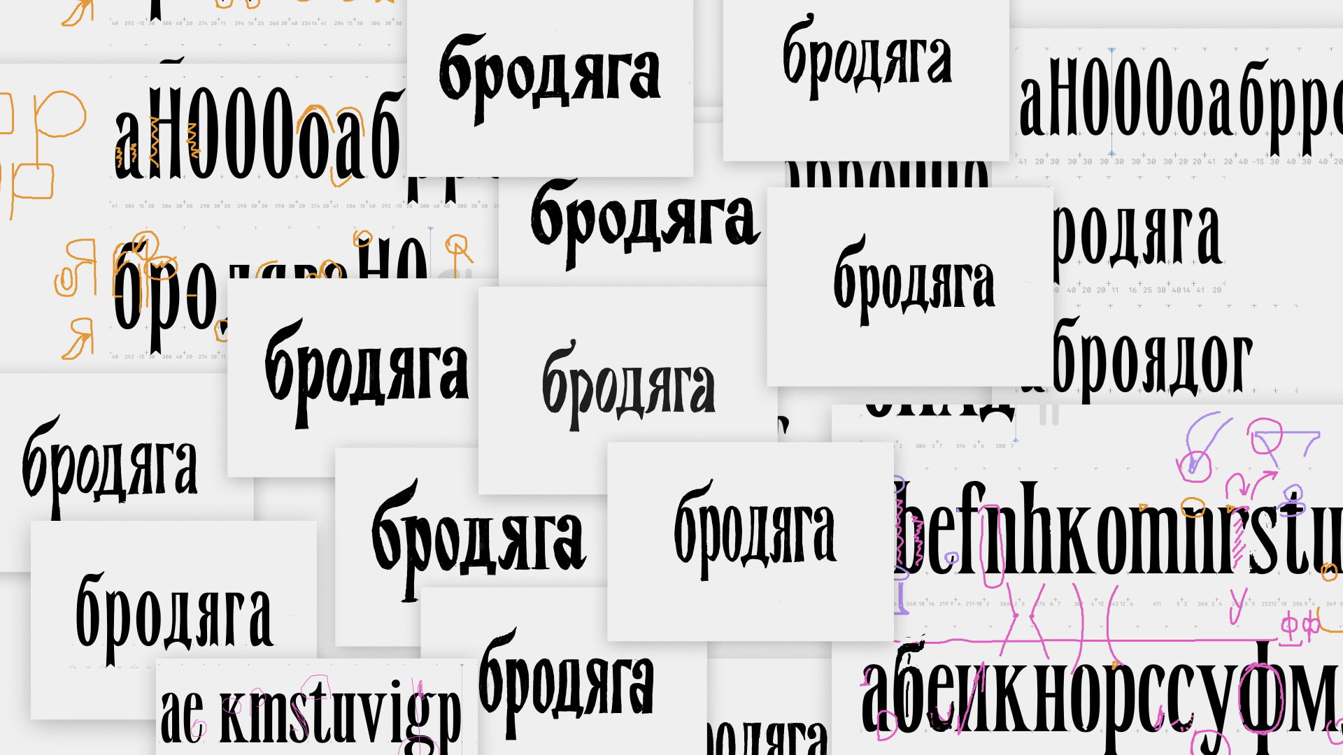
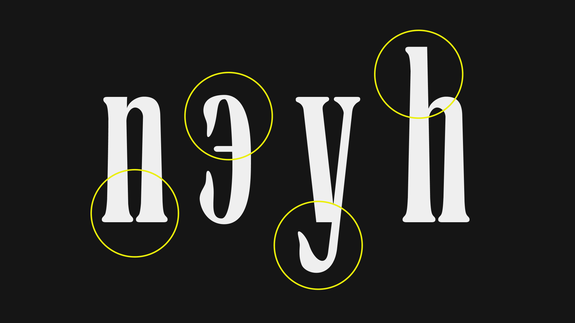
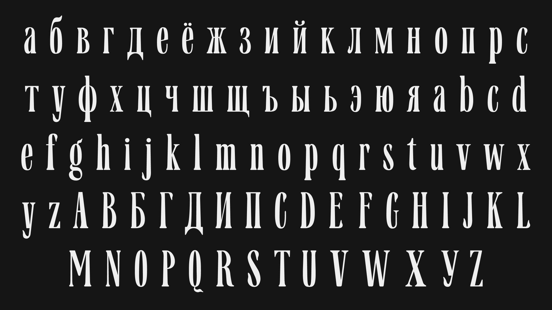
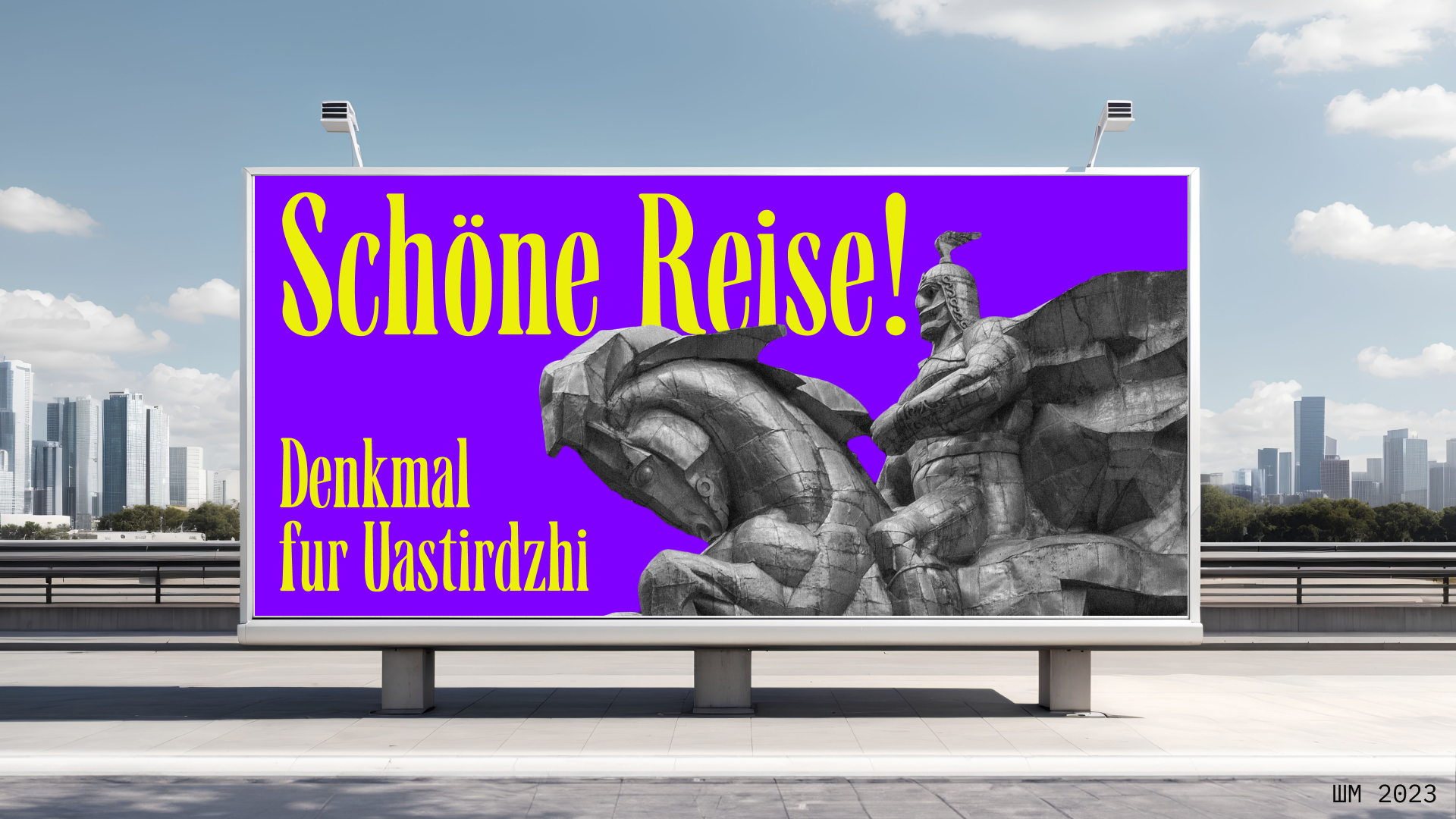
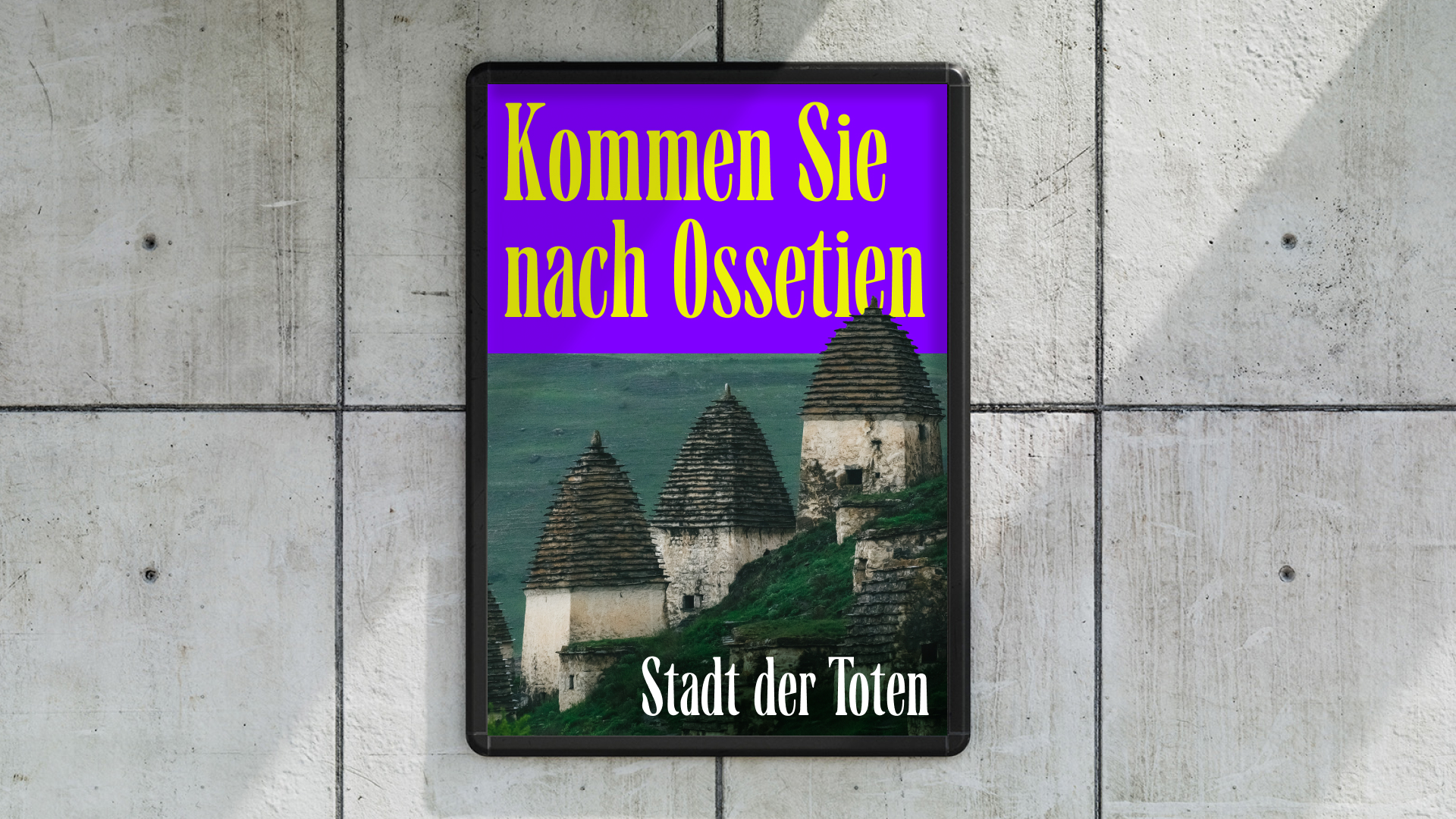
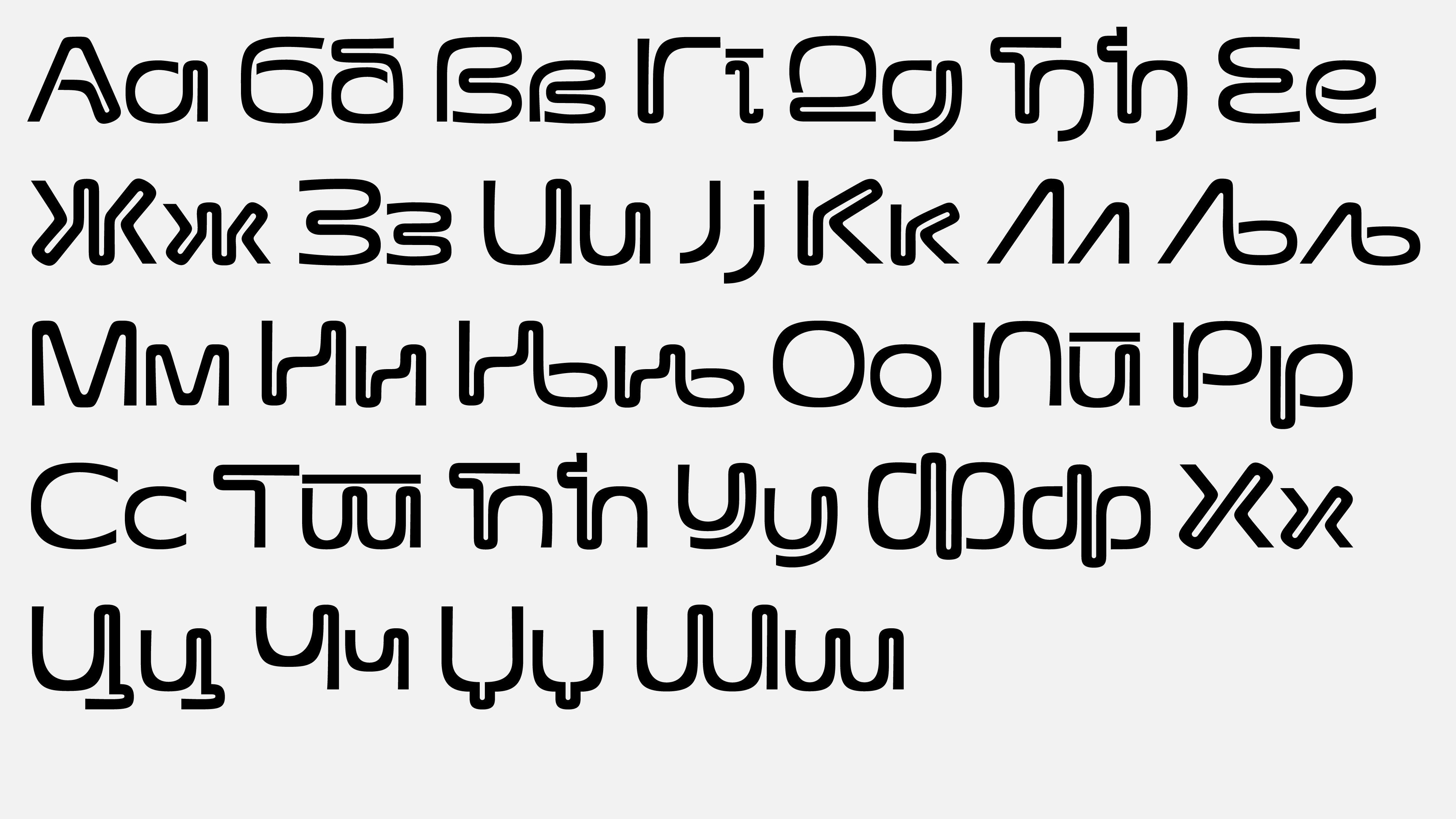
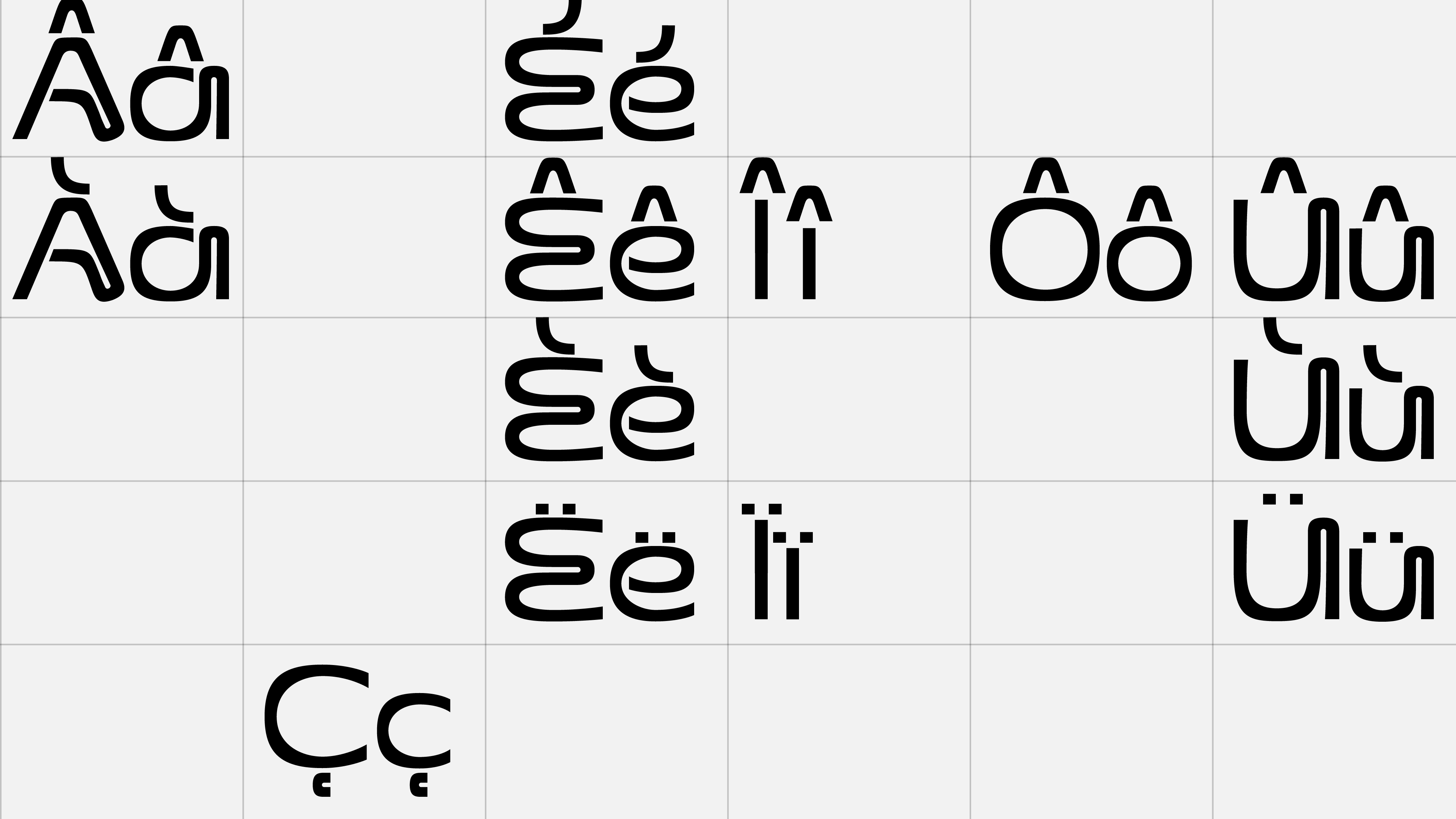
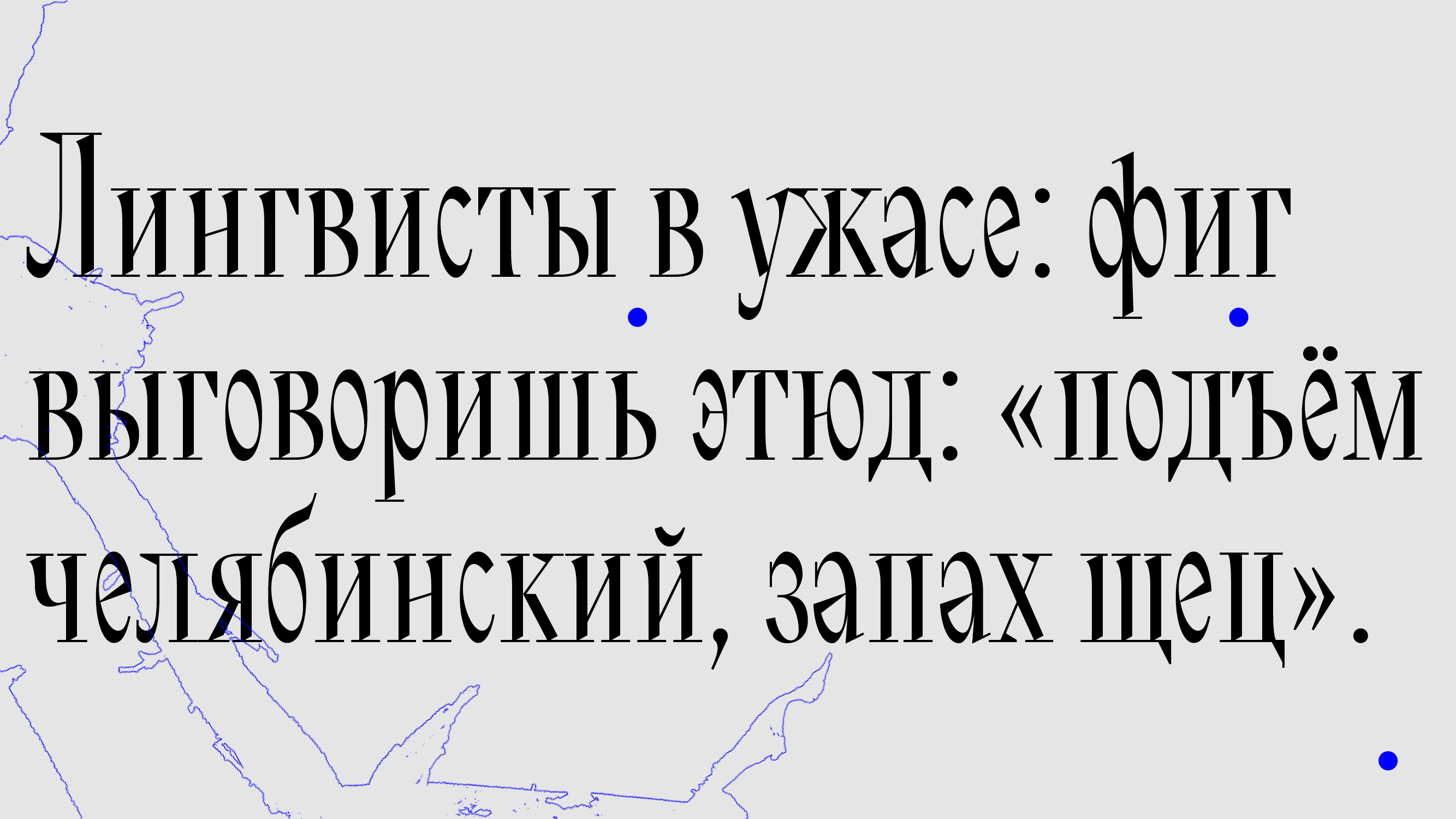
Sharkenih is a narrow display serif that contains characters typical of the German and Ossetian languages. The typeface was created relying on the similarity in density of graphics between Ossetian ornaments and blackletter. In the typeface serifs and ball ternicals, traditional esthetics and elements of the patterns are used. Another distinctive feature of the typeface is the expansion of the main strokes at the bottom, which is based on the construction of Ossetian ancestral towers.


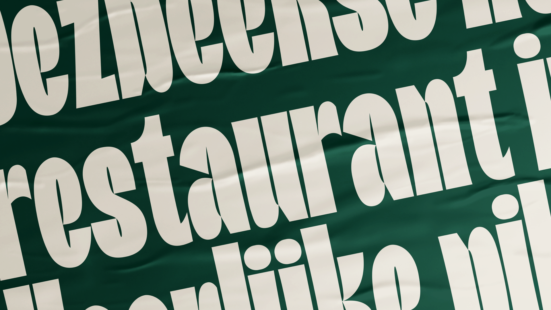
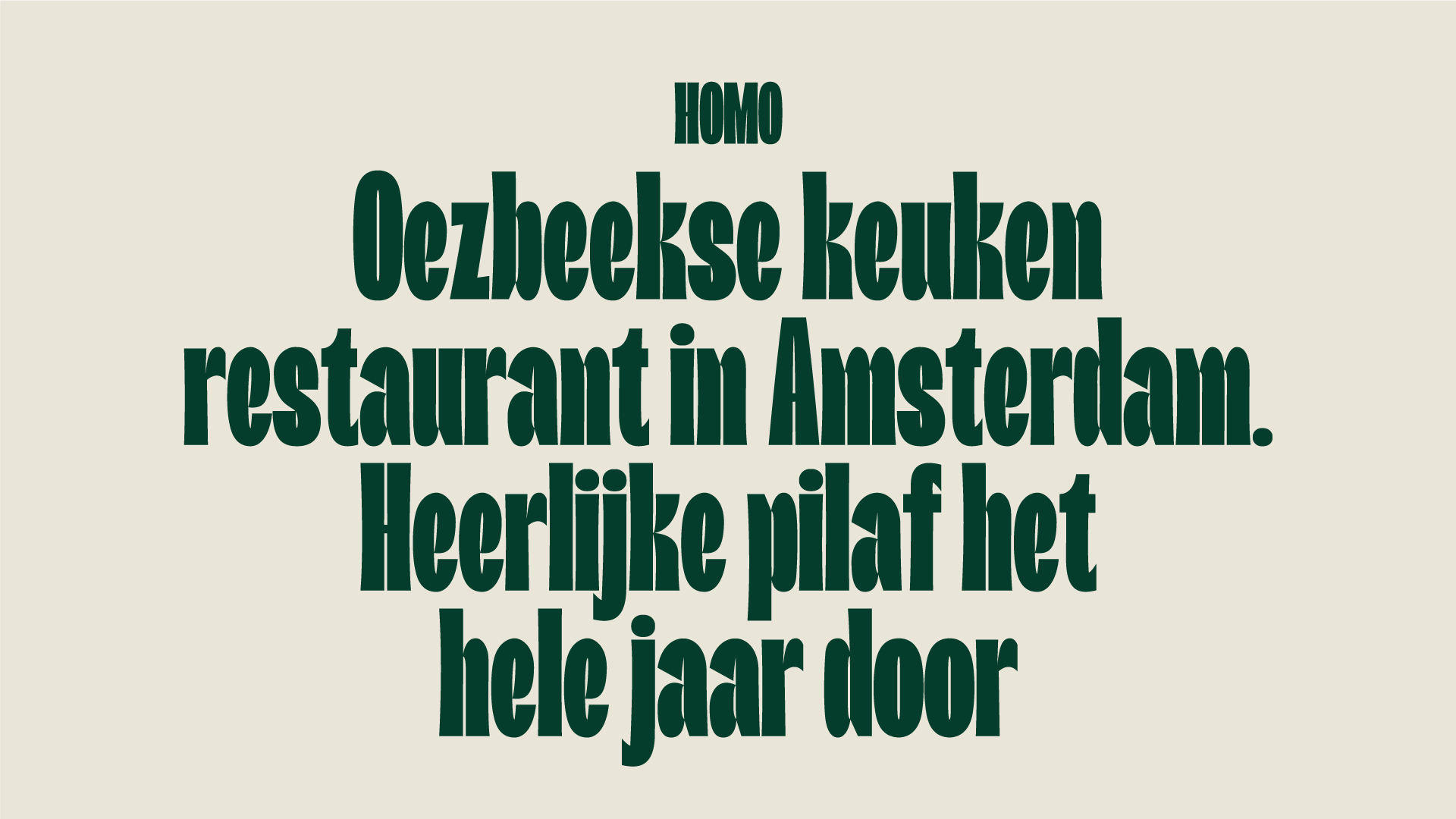
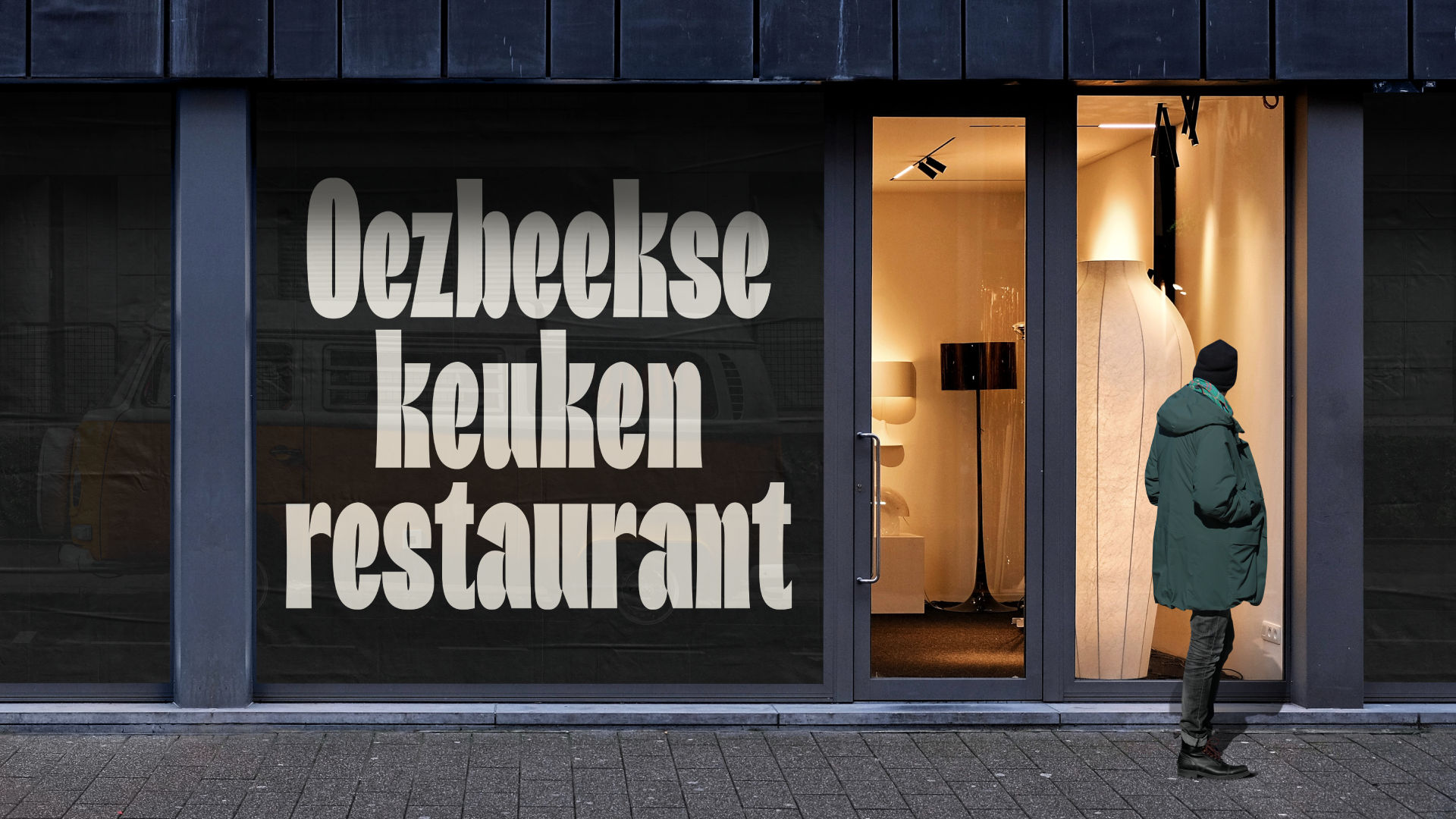
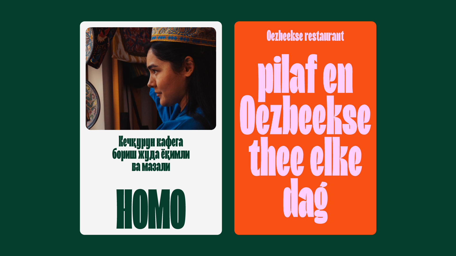
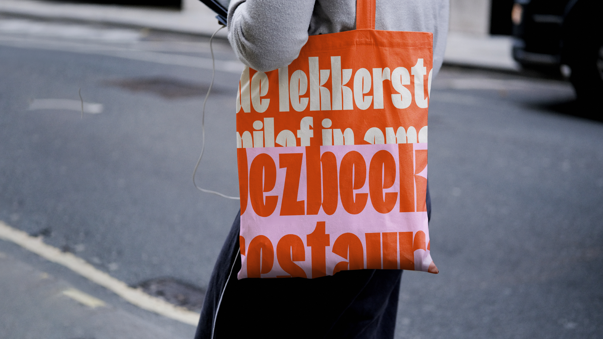
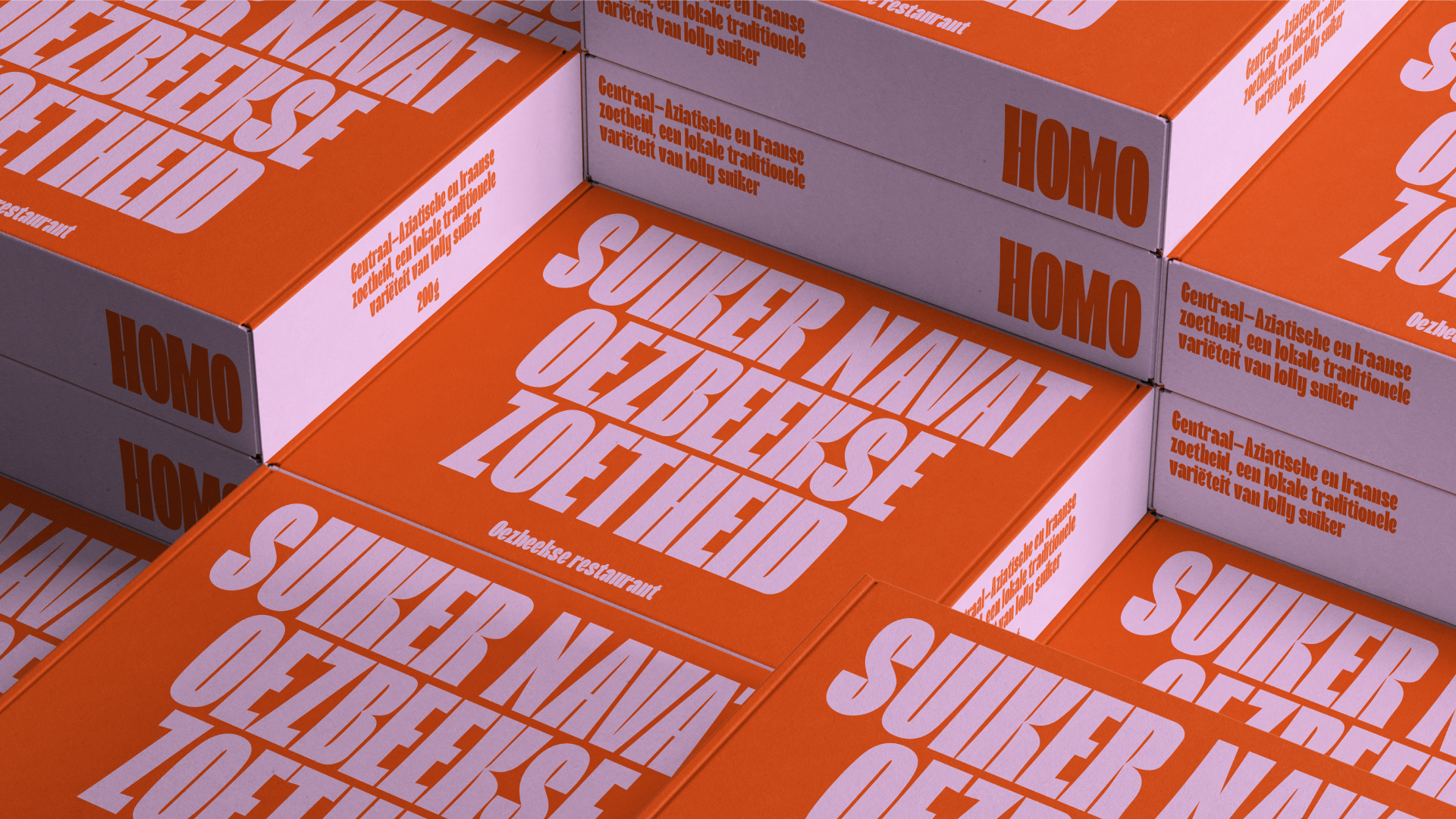
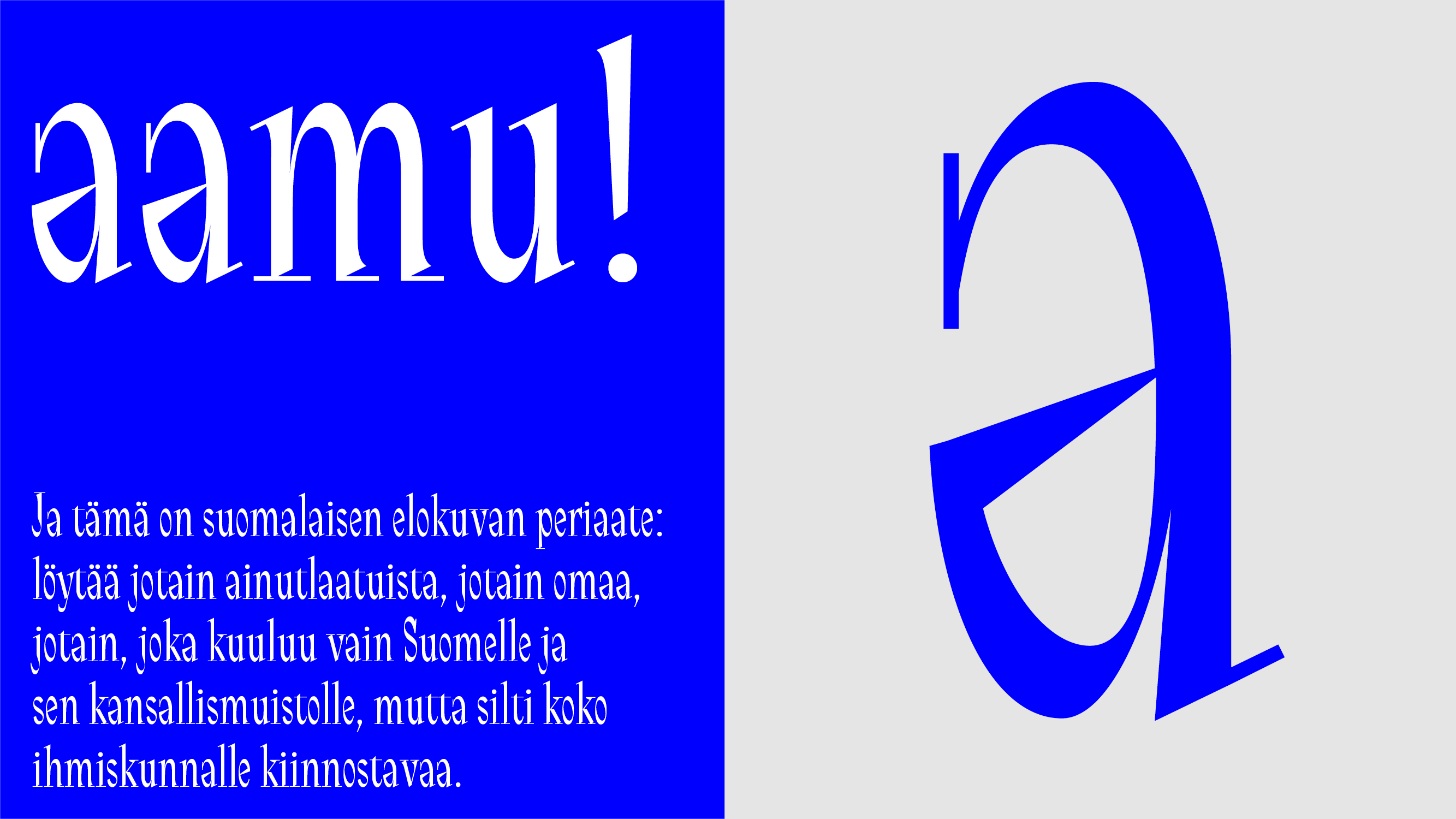
I was faced with the challenge of combining features of two languages—Dutch and Uzbek—in one typeface. These diverse visual cultures are embodied in Homo. At the foundation of this typeface lies the image of elongated Amsterdam architecture and the narrow traditional patterns of Uzbekistan. Homo creates a very dense set that resembles an intricate pattern. This is evident in the identity of an Uzbek cuisine restaurant in Amsterdam. The bright palette emphasizes the typeface’s playfulness, and the set of narrow letters is convenient for use in very long Dutch words, like “meervoudigepersoonlijkheidsstoornis”.

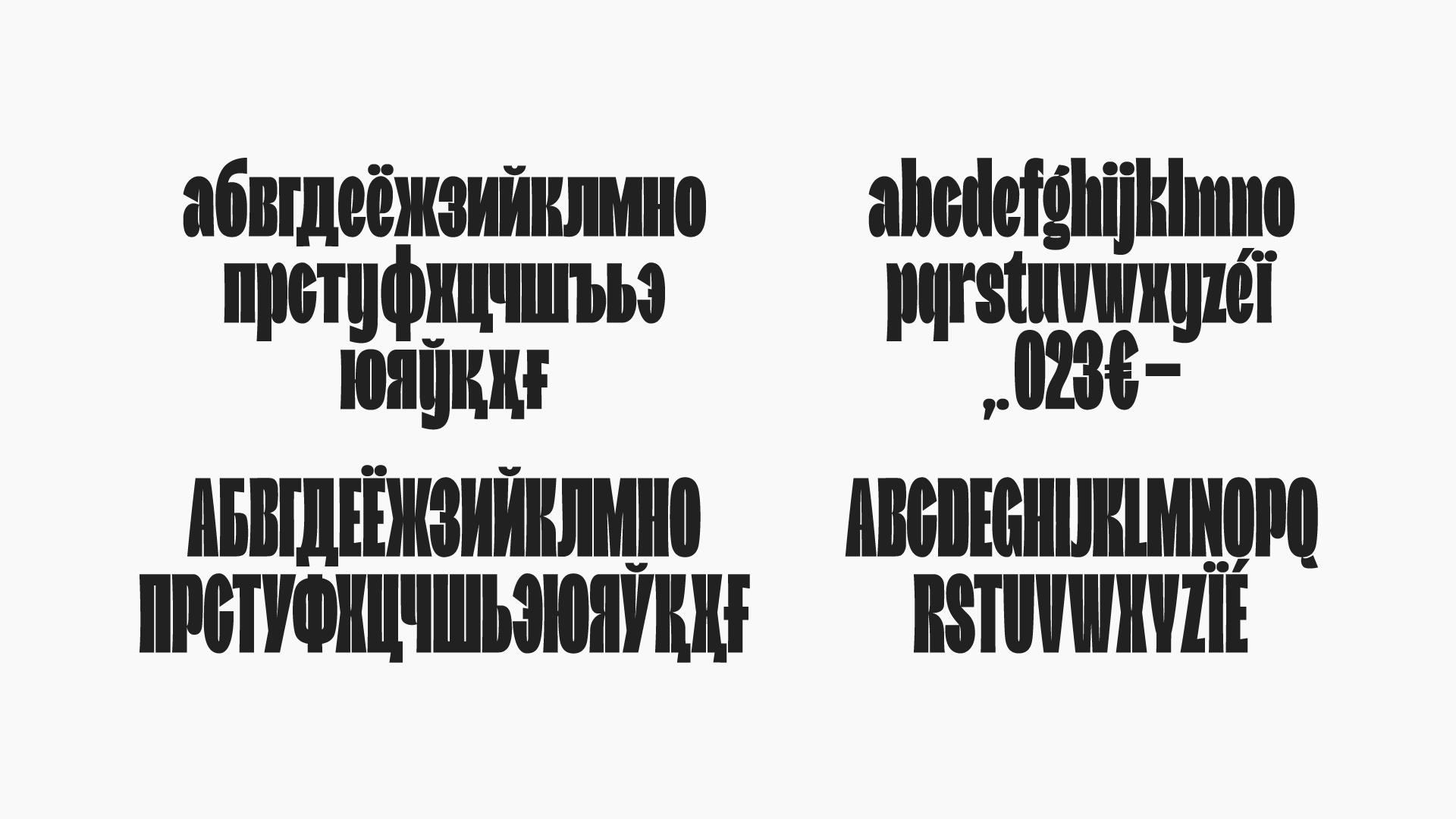


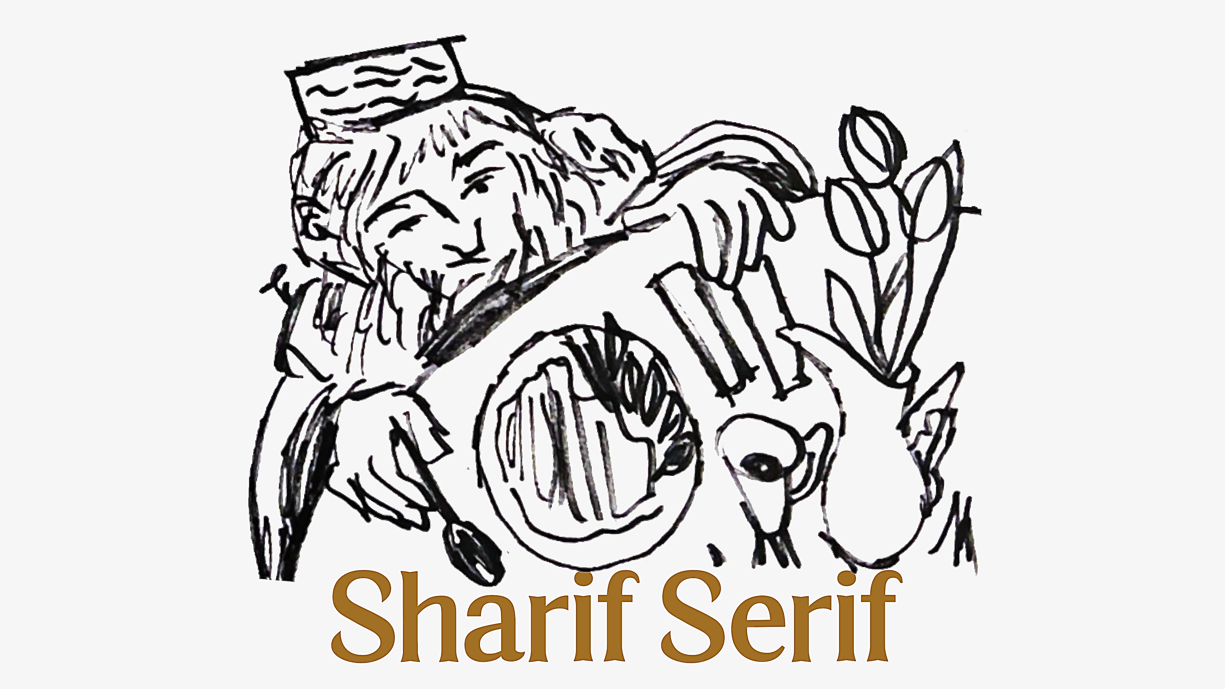
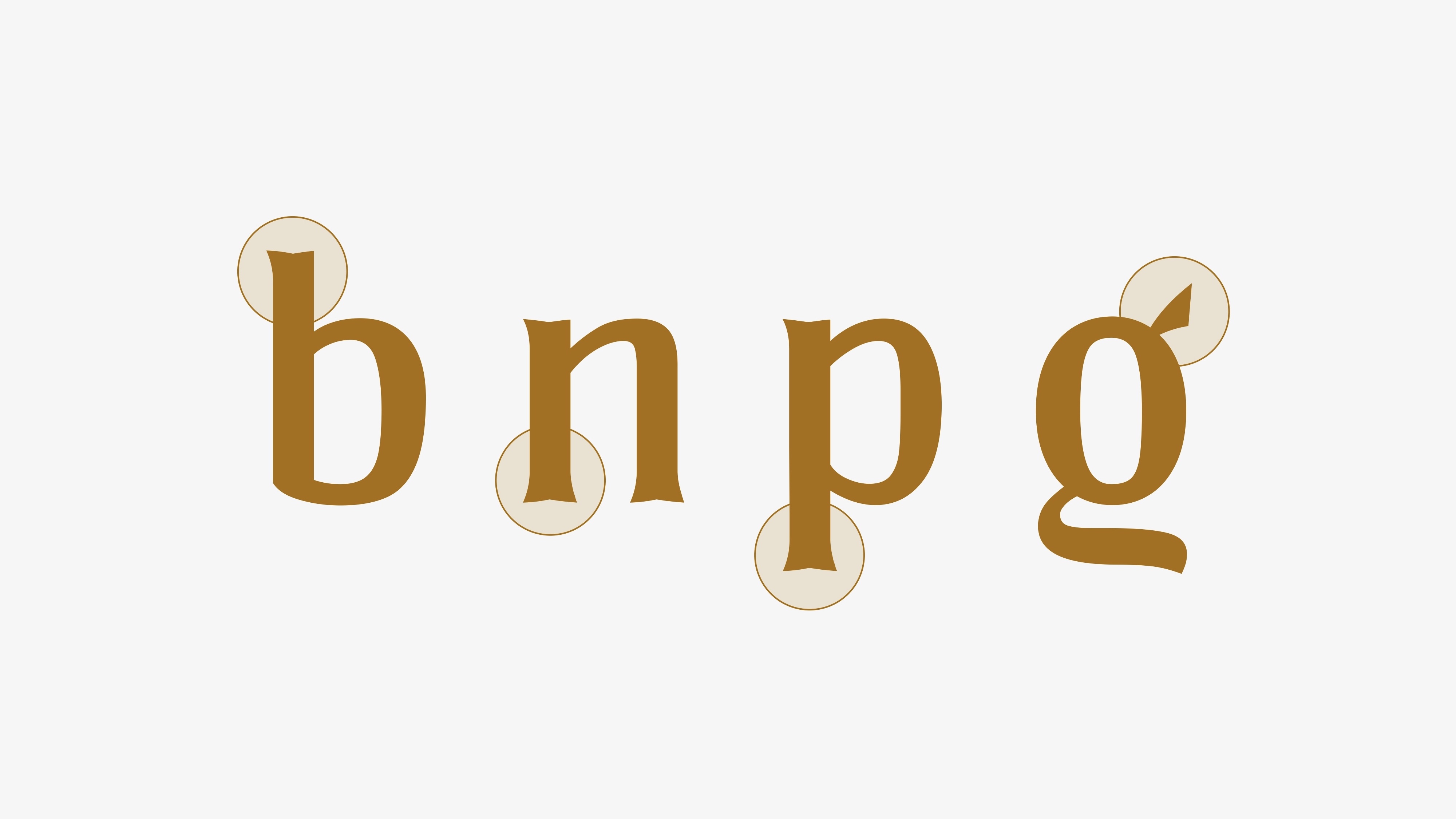
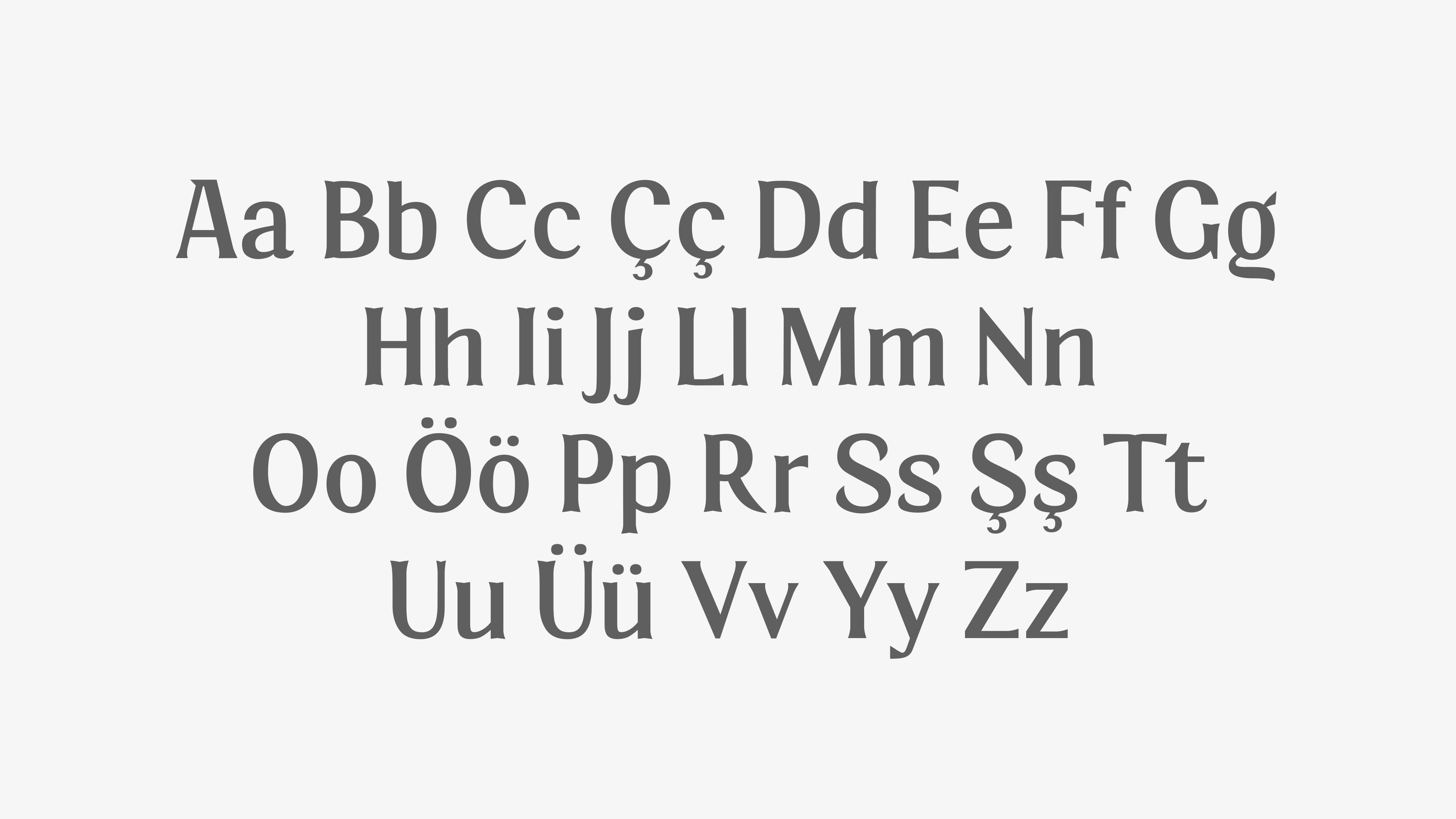
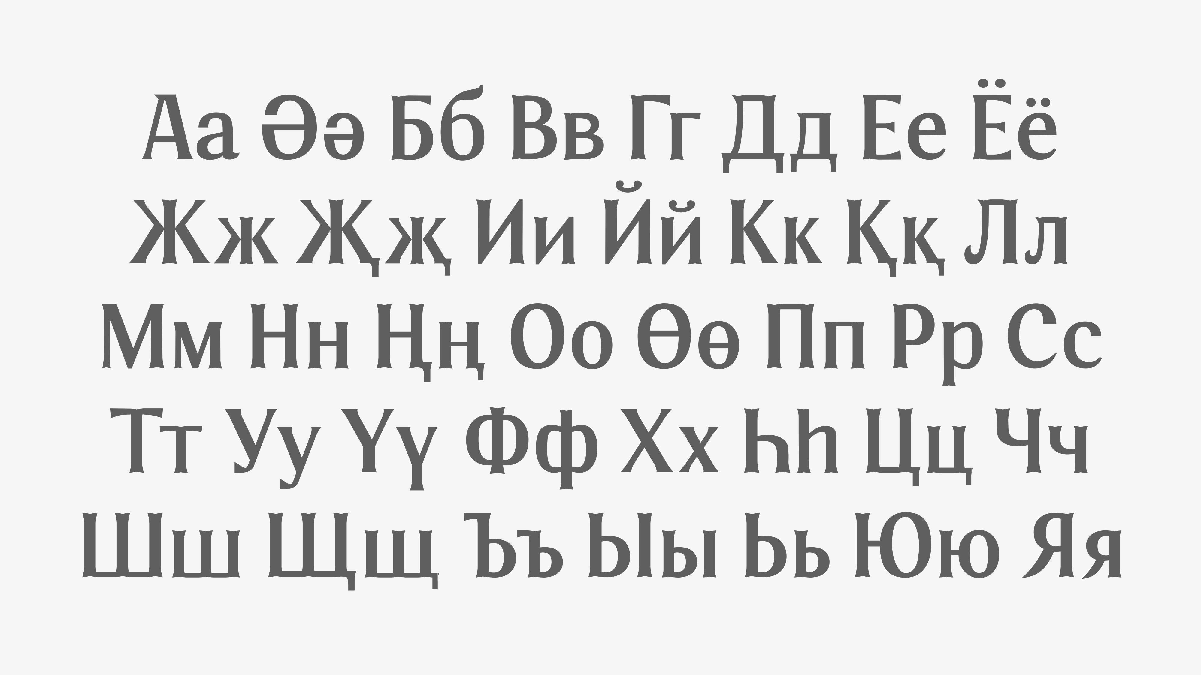
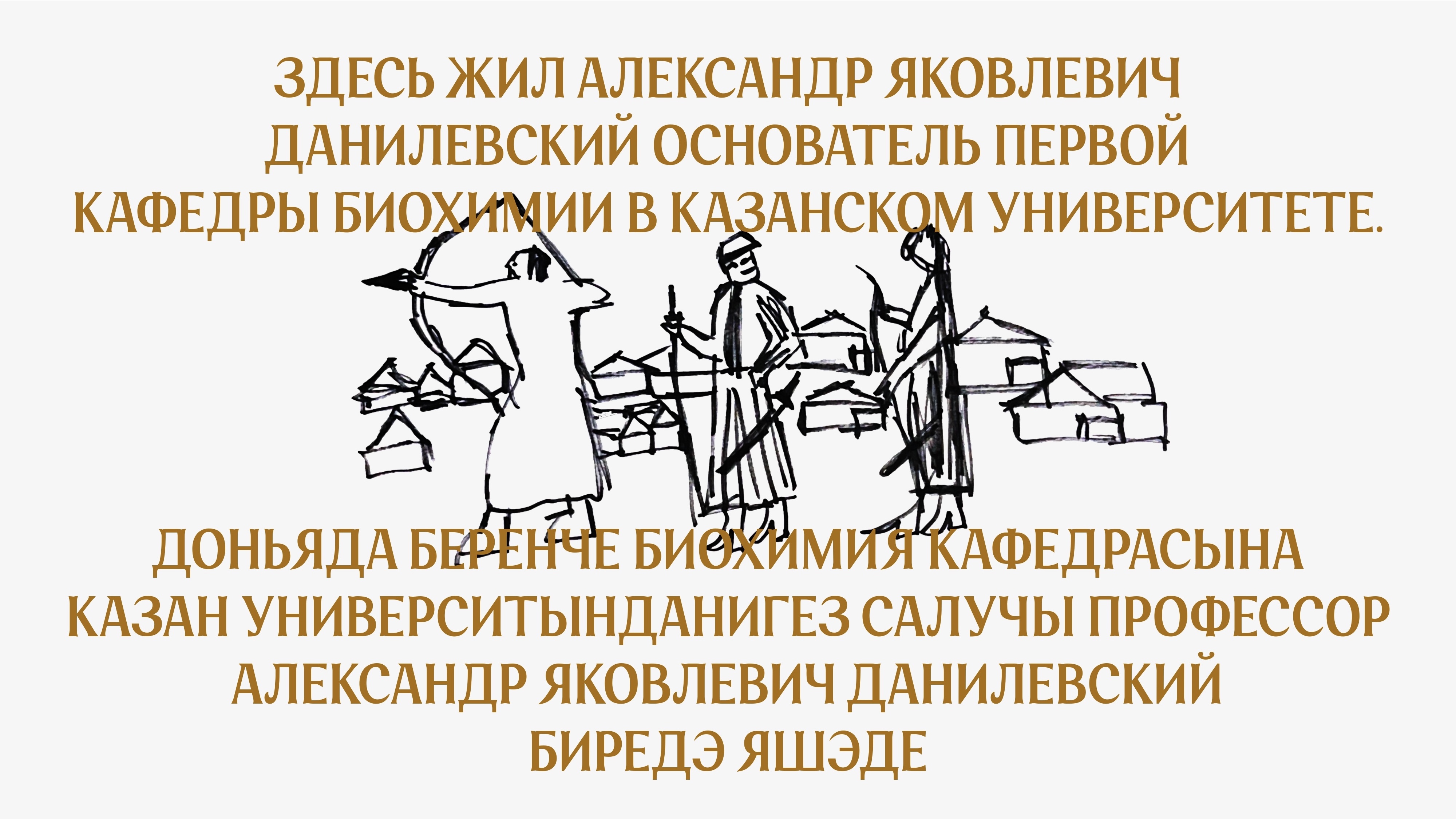
Sharif Serif is a typeface created by merging Tatar and Turkish. On one hand, it is a dynamic serif influenced by the movement of the pen, suitable for setting long texts. On the other hand, its character is defined by its lively, sharp and flowing terminals. The typeface is inspired by the aesthetics of Tatar and Turkish architecture and is applicable in Russian, English, Tatar, and Turkish languages.


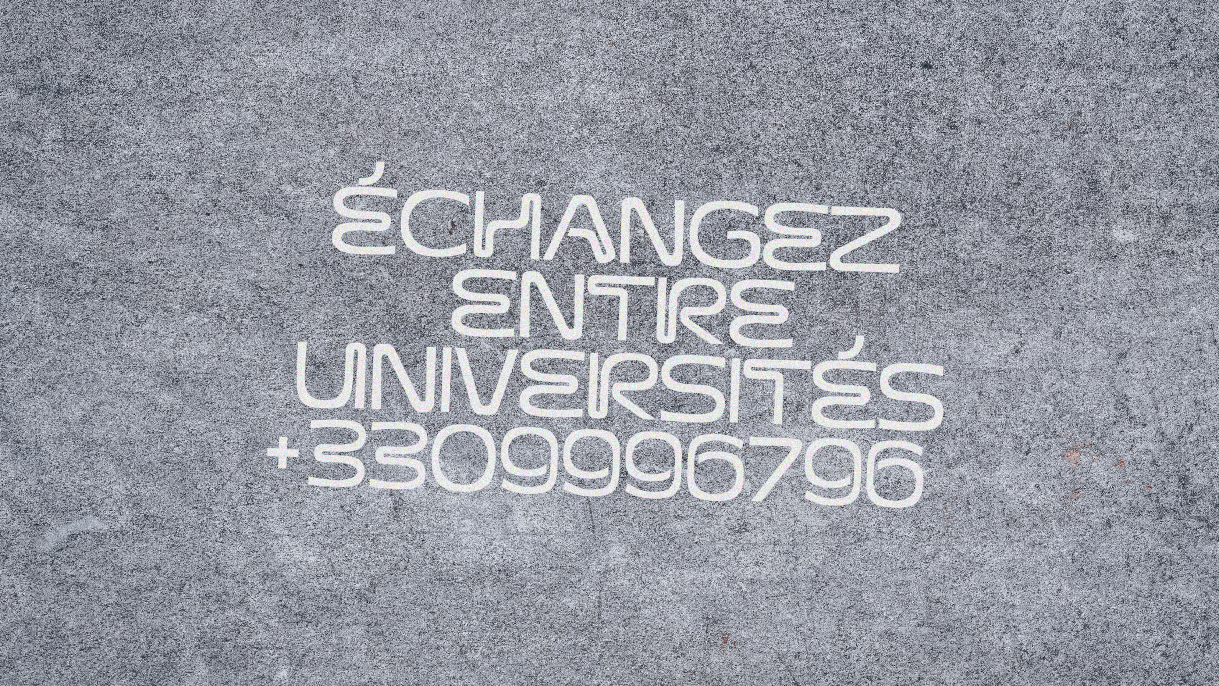
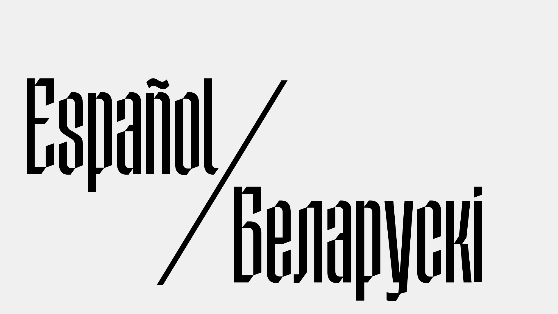
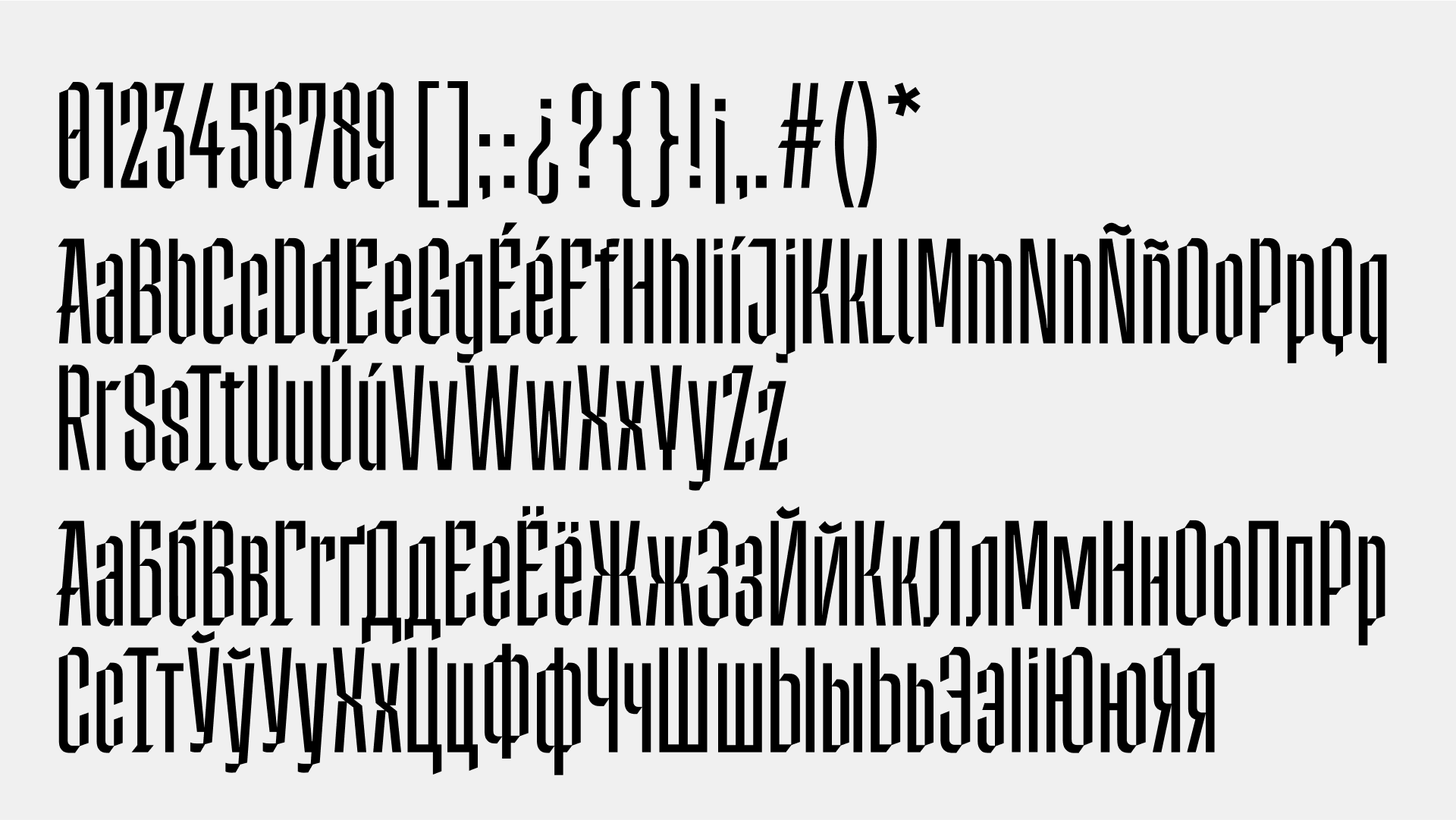
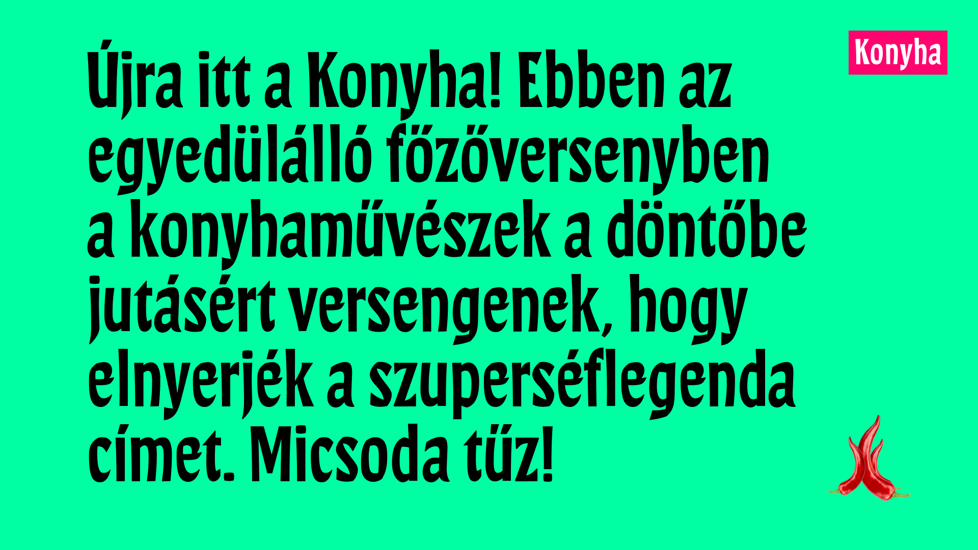
The “Svoboda” typeface was created to announce an exchange program between French and Serbian architectural universities. The forms of the letter were born from the intersection of two opposing architectural directions: classicism (prevailing in Paris) and modernist futurism, which is associated with the capital of Serbia. The “Svoboda” typeface playfully combines the geometricity and futurism of squared forms and ovals, turning them into the intricate ornament characteristic of classical architecture.


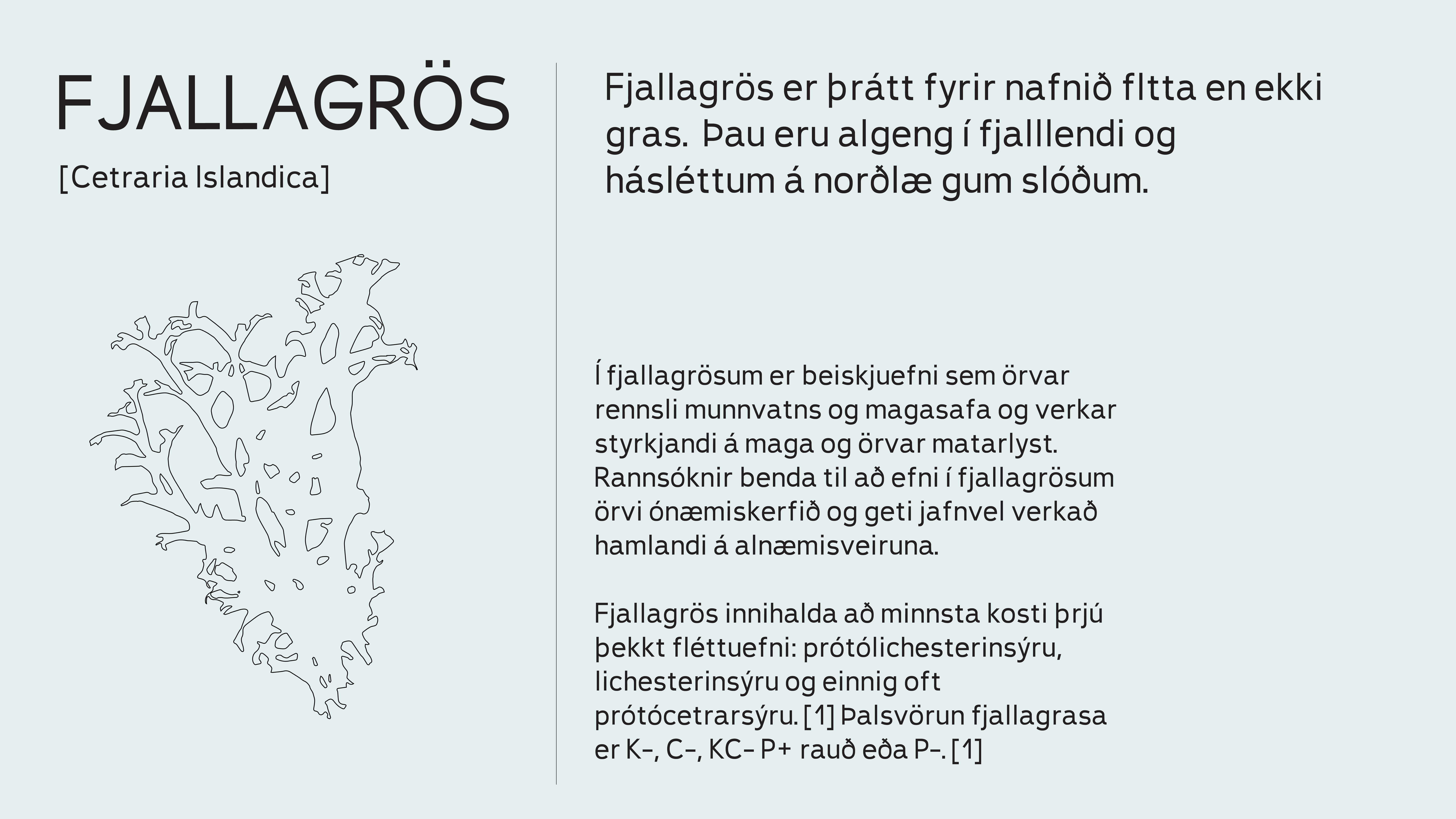
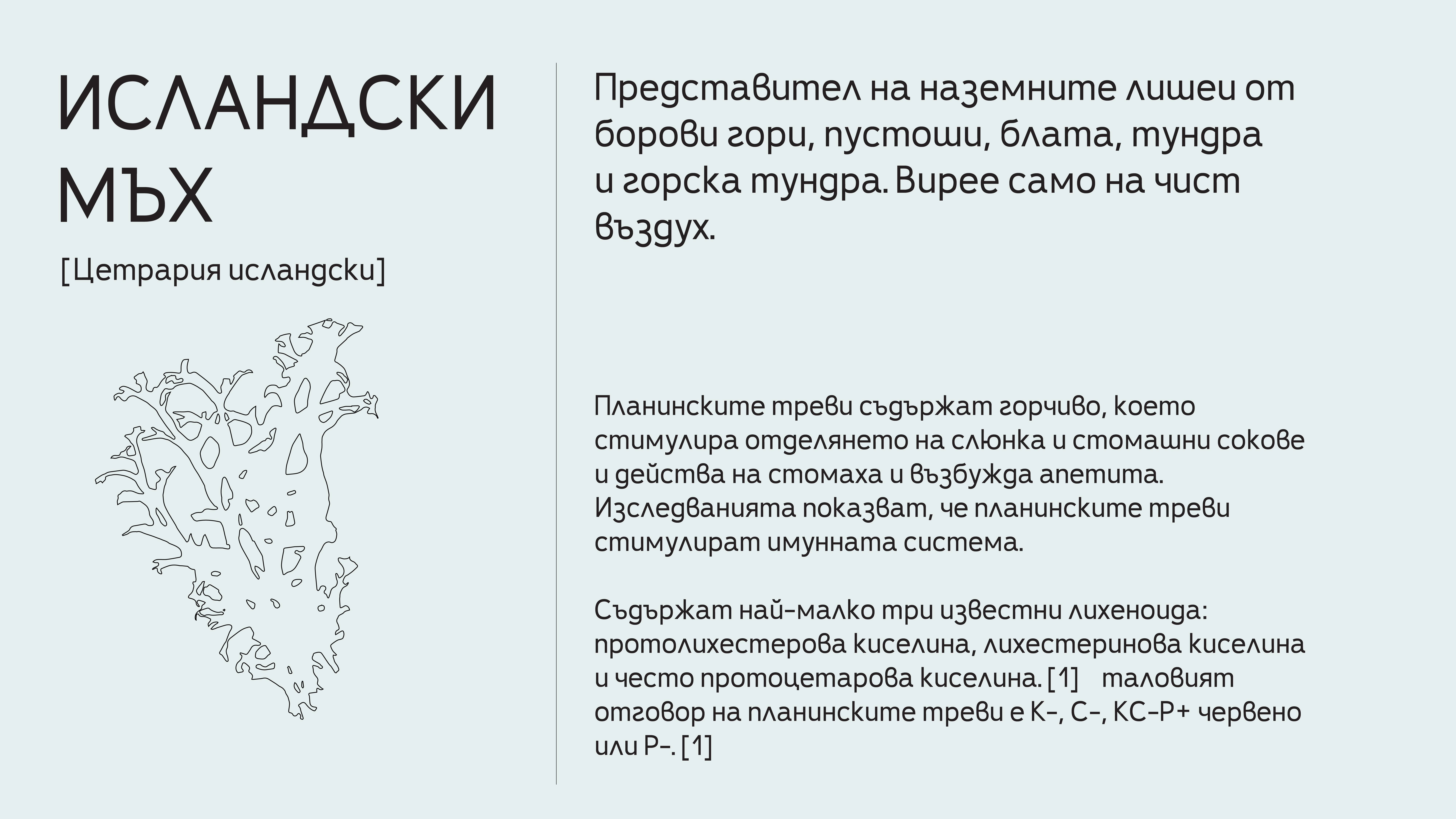
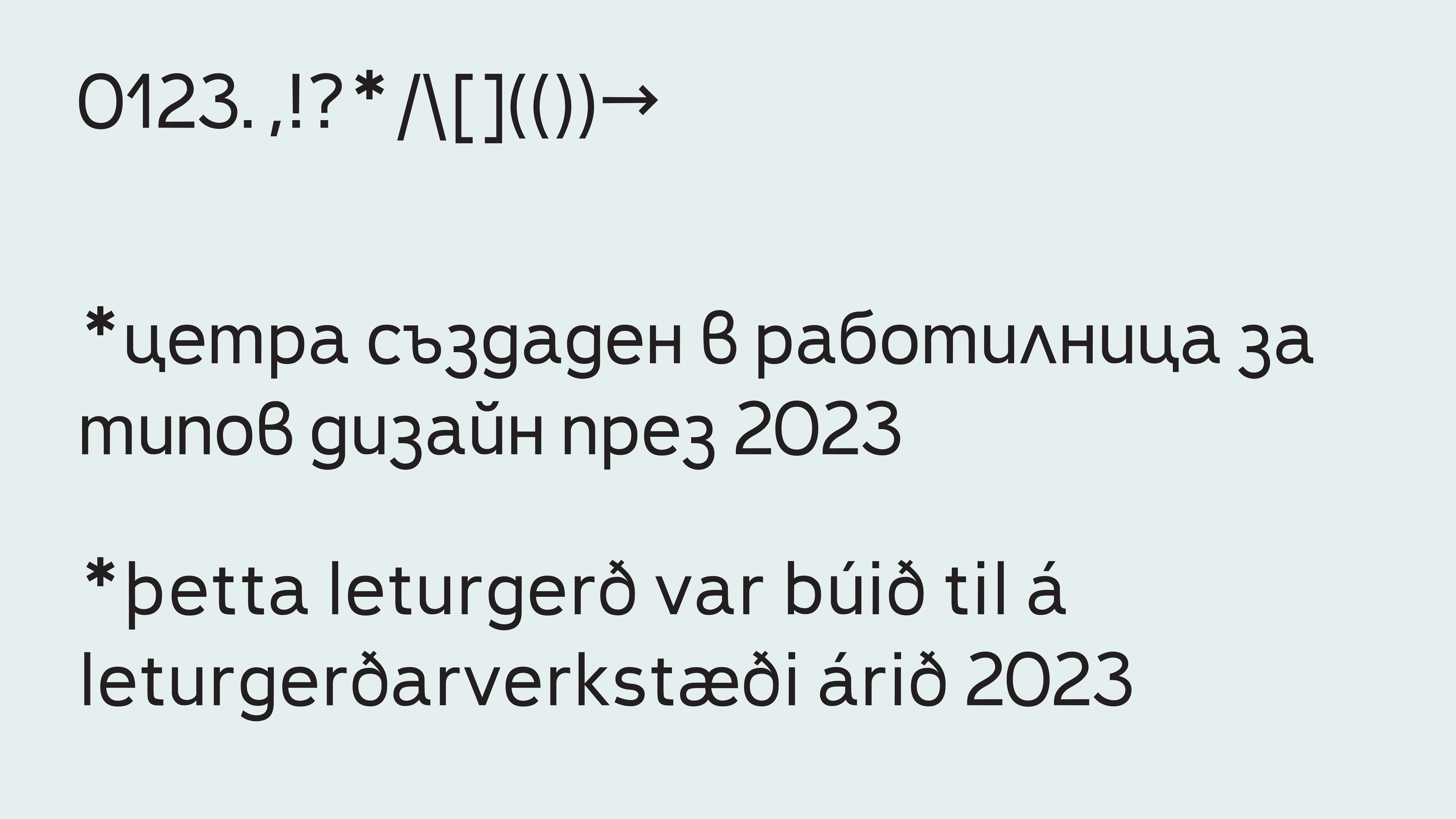
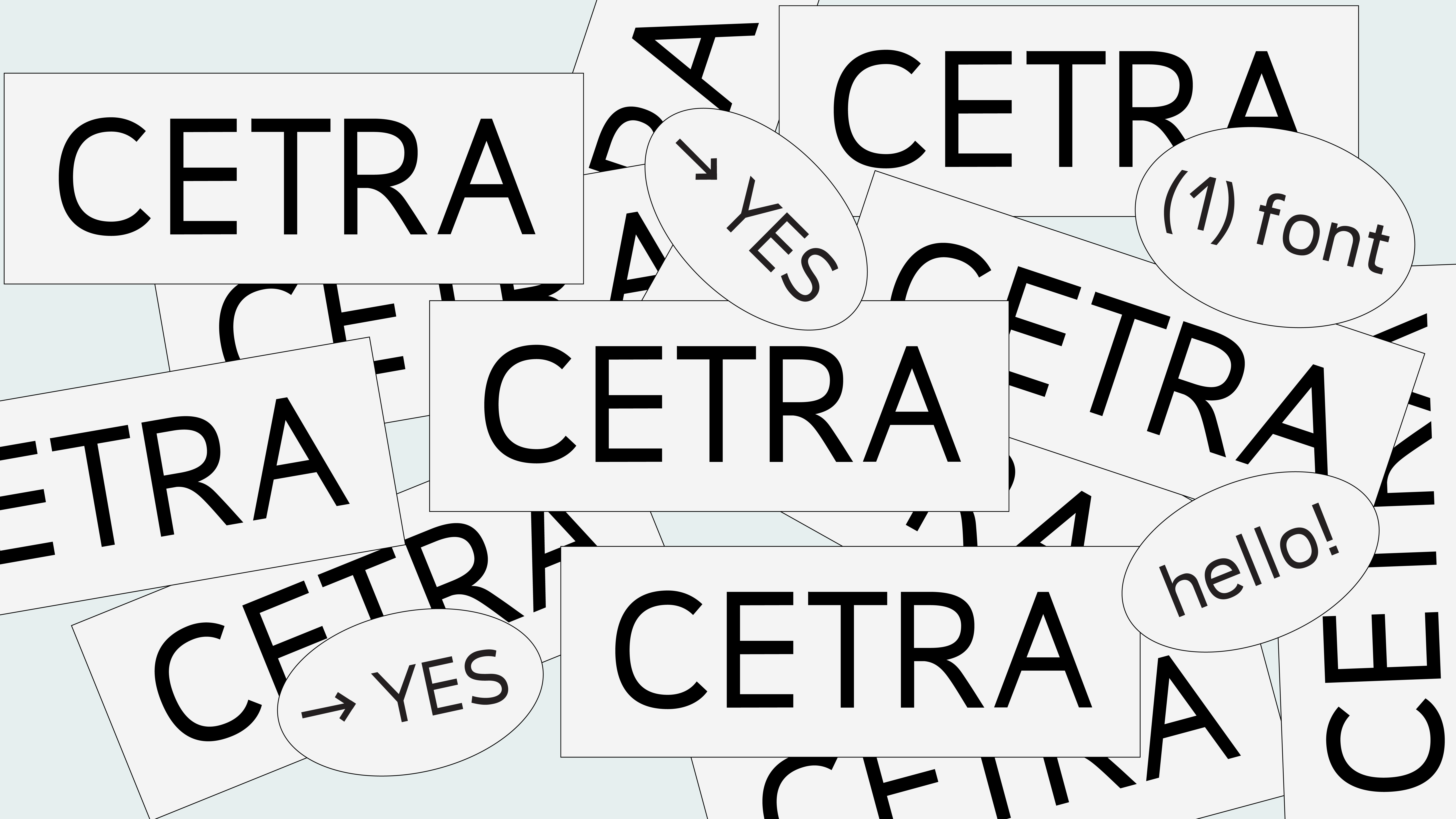
For this project, these two alphabets came together in a product that could be exported from Iceland to Bulgaria: “Icelandic Moss”. The name Tsetra is part of the Latin name of Icelandic moss—Cetraria—on which I had to work for the project. I wanted to create a functional minimalist sans serif that looks good in large blocks of text and, during the process, understand the nuances that are important for a “simple” good typeface.


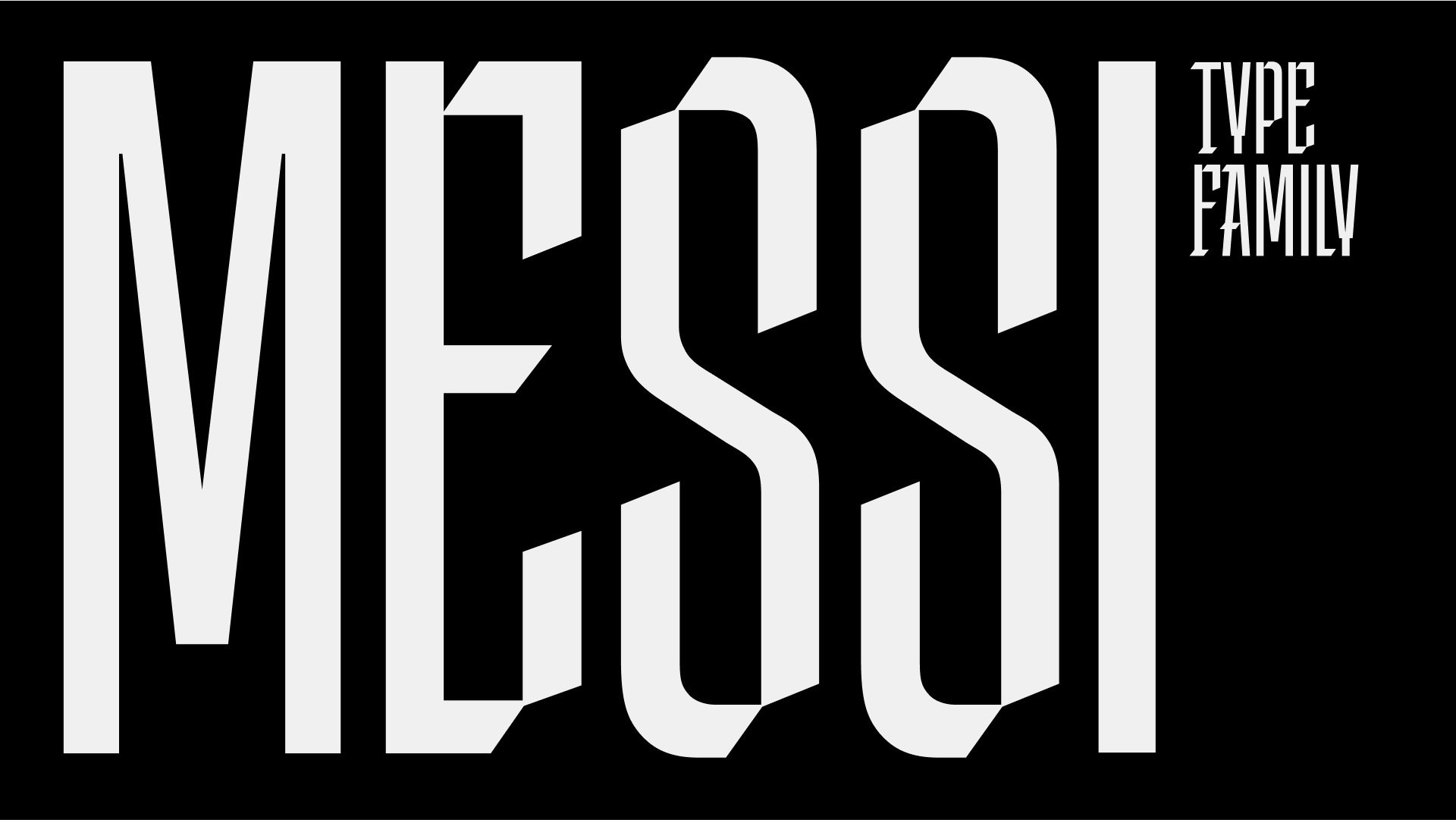
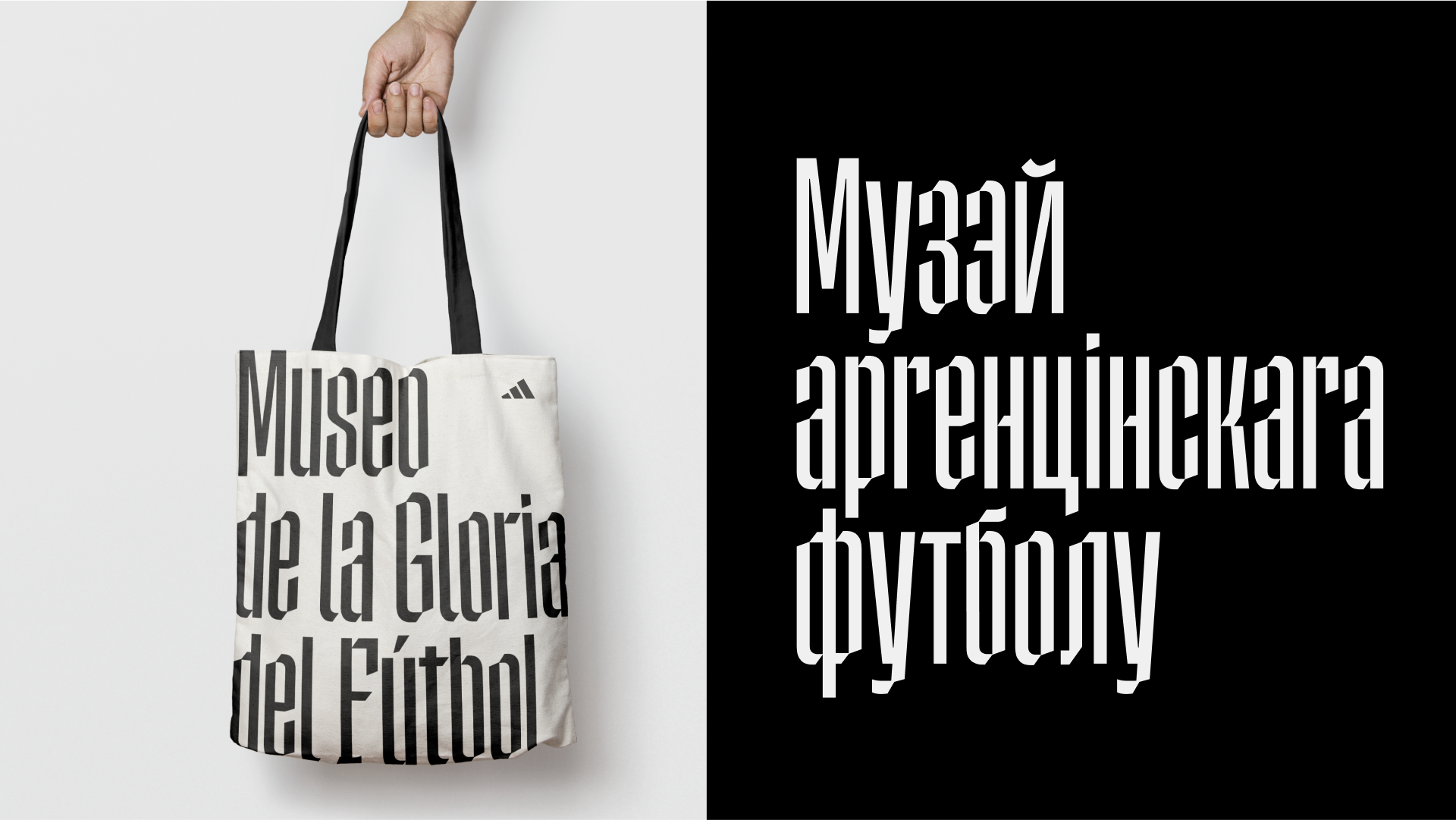
This is a typeface for the Museum of Argentine Football Glory. The typeface incorporates the idea of stripes, resonating with the Argentine flag and the uniform of its national football team. I named the typeface Messi, as he is a national hero of this country. Almost every other child walks around the city in a shirt with his name on the back. I have an idea to develop a range of styles using stripes of different widths. I hope Adidas sees this typeface and uses it for one of their projects.


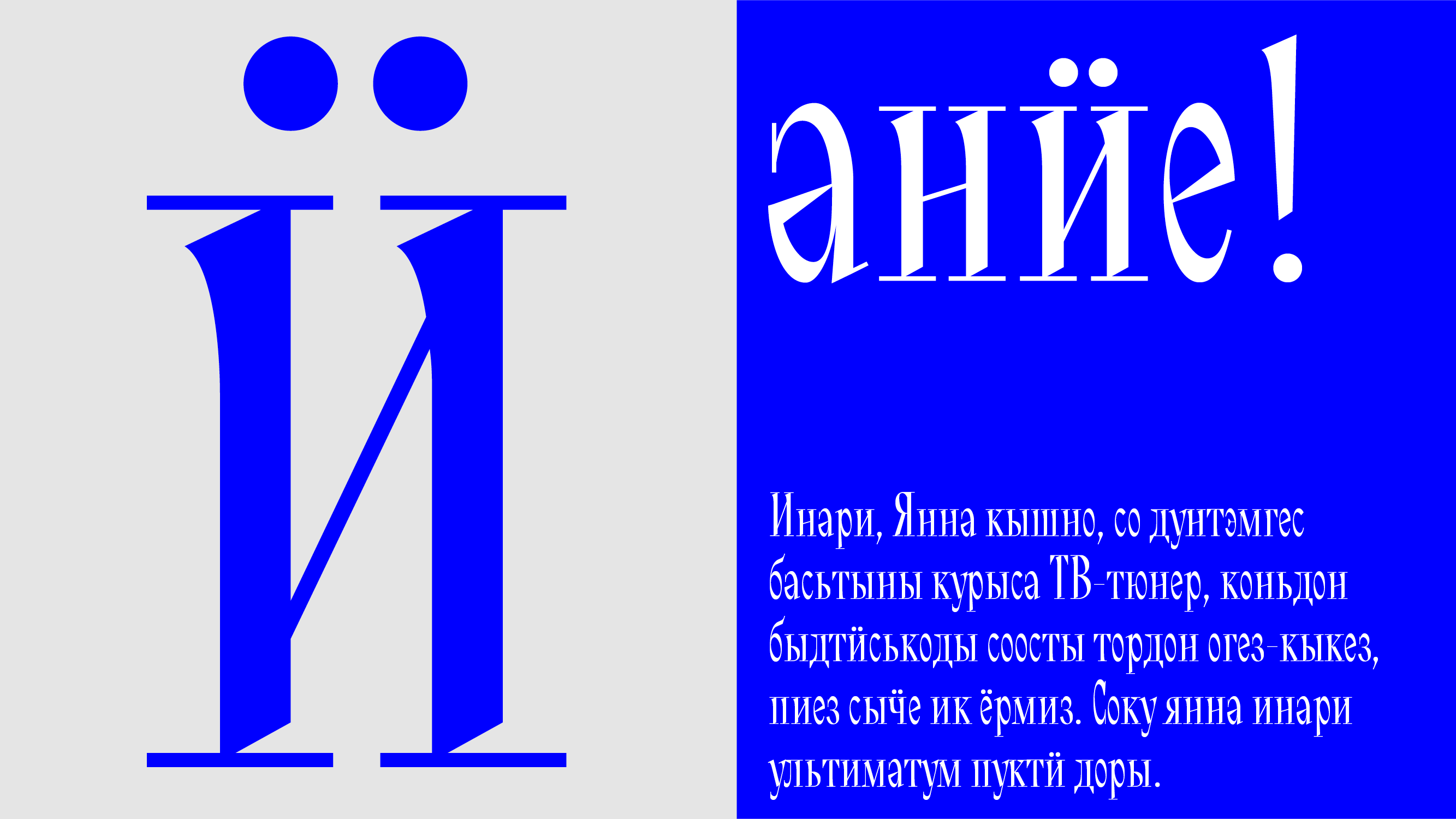
Chilk-valk is a display serif typeface inspired by the briskness of a frosty Finnish morning. The proportions of the letters—elongated and narrow—are taken from the pine forests surrounding Udmurtia. The typeface name translates from Udmurt as “shine” or “glow”, this glow in the typeface is achieved through “chipped” strokes, like early ice, coming from thin, ringing serifs. In addition to the basic Latin and Cyrillic, the typeface contains signs of Finnish, Udmurt, Komi-Zyryan, and Komi-Permyak languages.


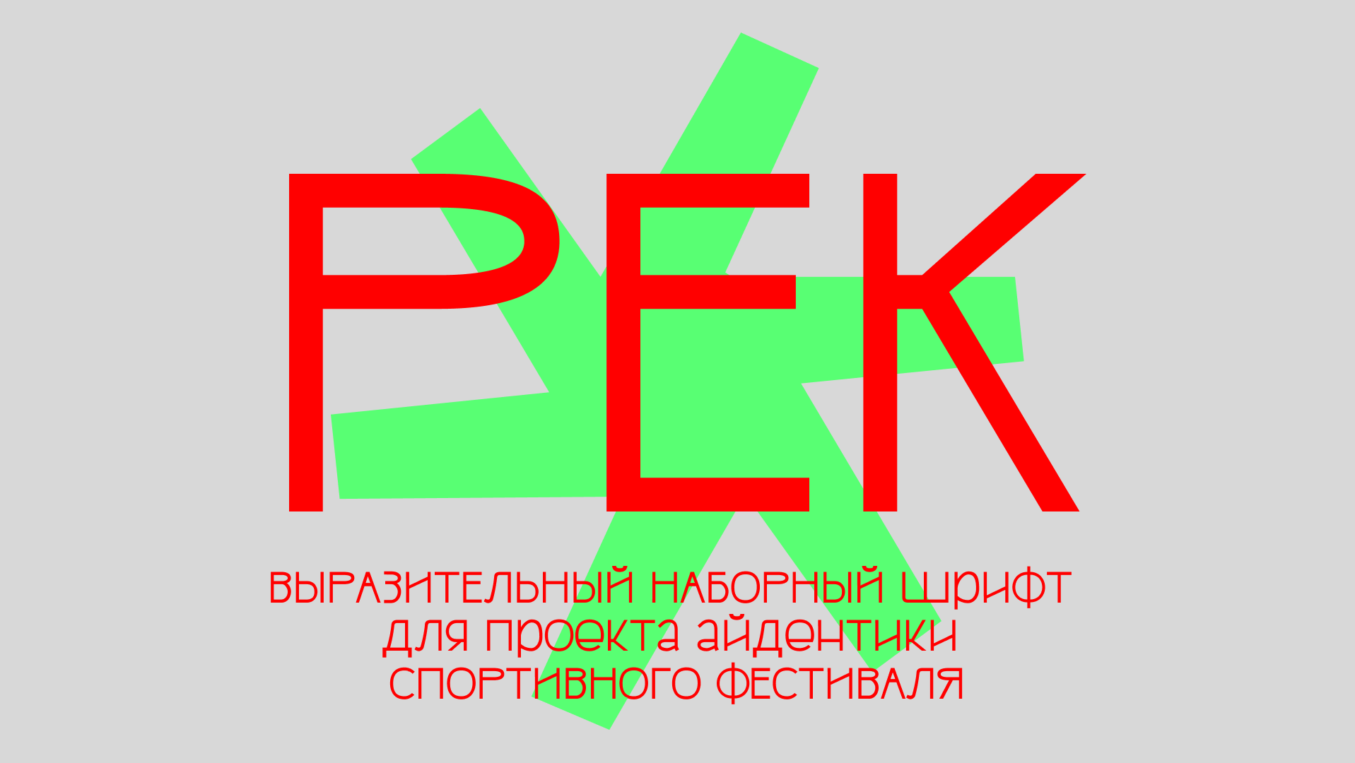
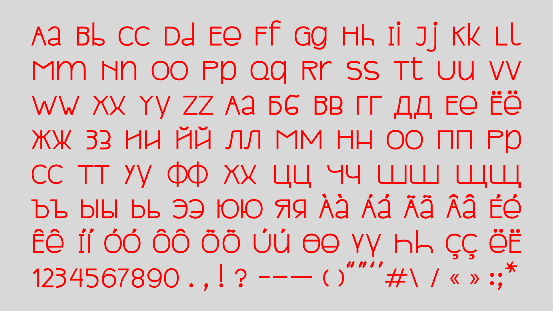
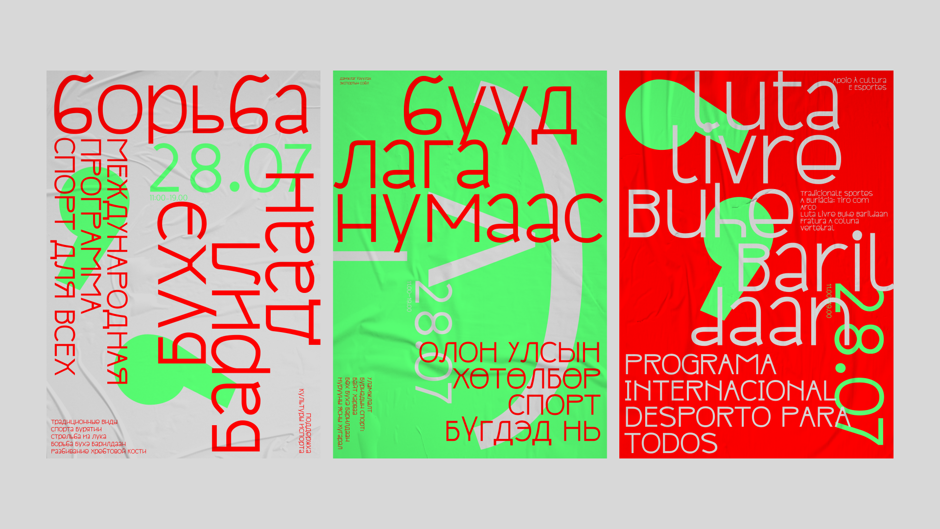
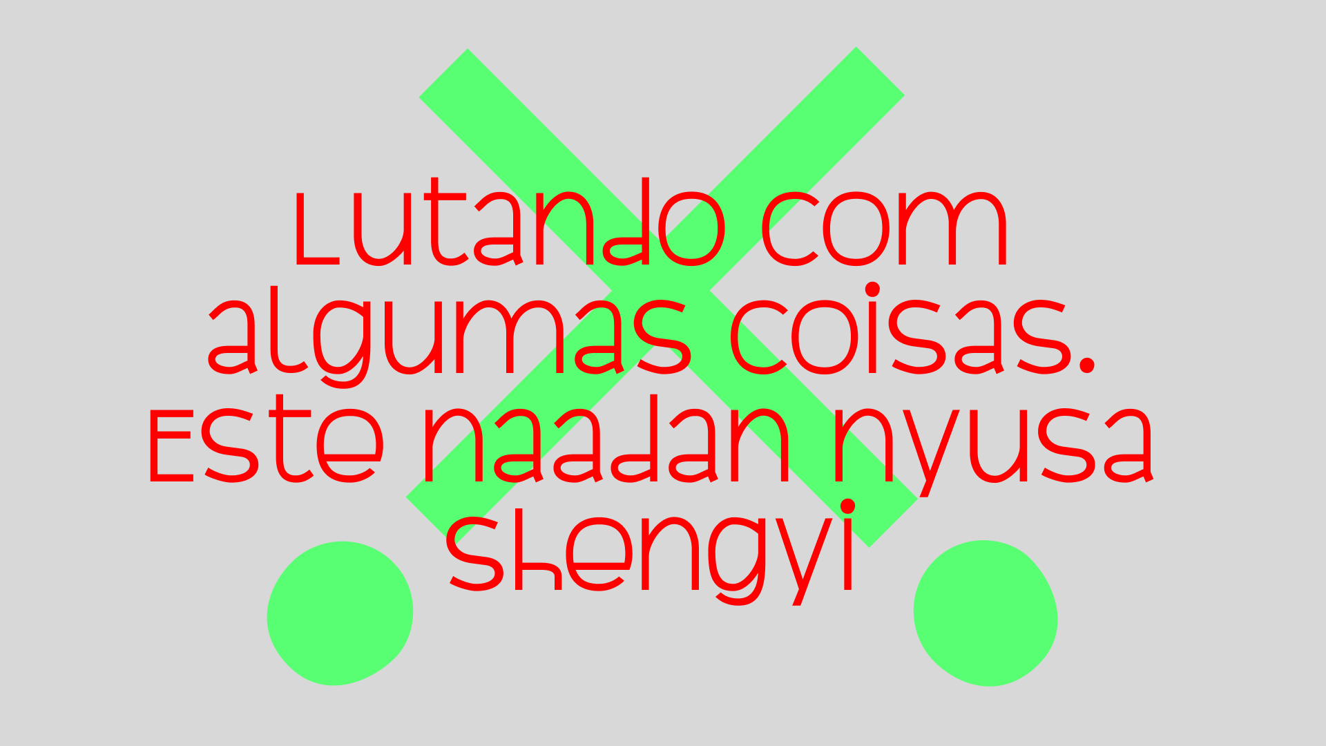
Pek is a typeface that is organic for Buryat and Portuguese contexts. For example, for a sports festival of national sports in Portugal, where Buryat sports were presented—wrestling, archery, and spine-breaking. Inspired by the intersection of the tile pattern Azulejo and historical geometric Buryat ornaments. Conceived as a unicase, the typeface still contains lowercase letters with small ascenders. The differences between lowercase and uppercase are defined by a geometric module—lowercase has a larger proportion at the top of the symbol, and uppercase at the bottom. A rule borrowed from the world of illustration—a character will be perceived as a “child” if it has a “big head”.


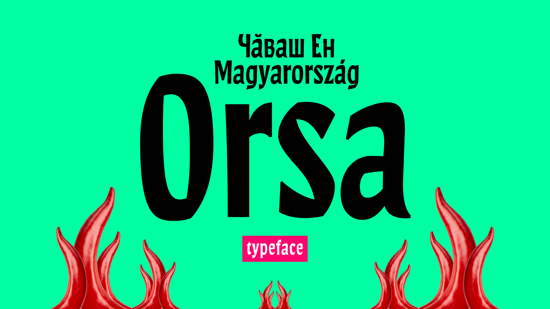
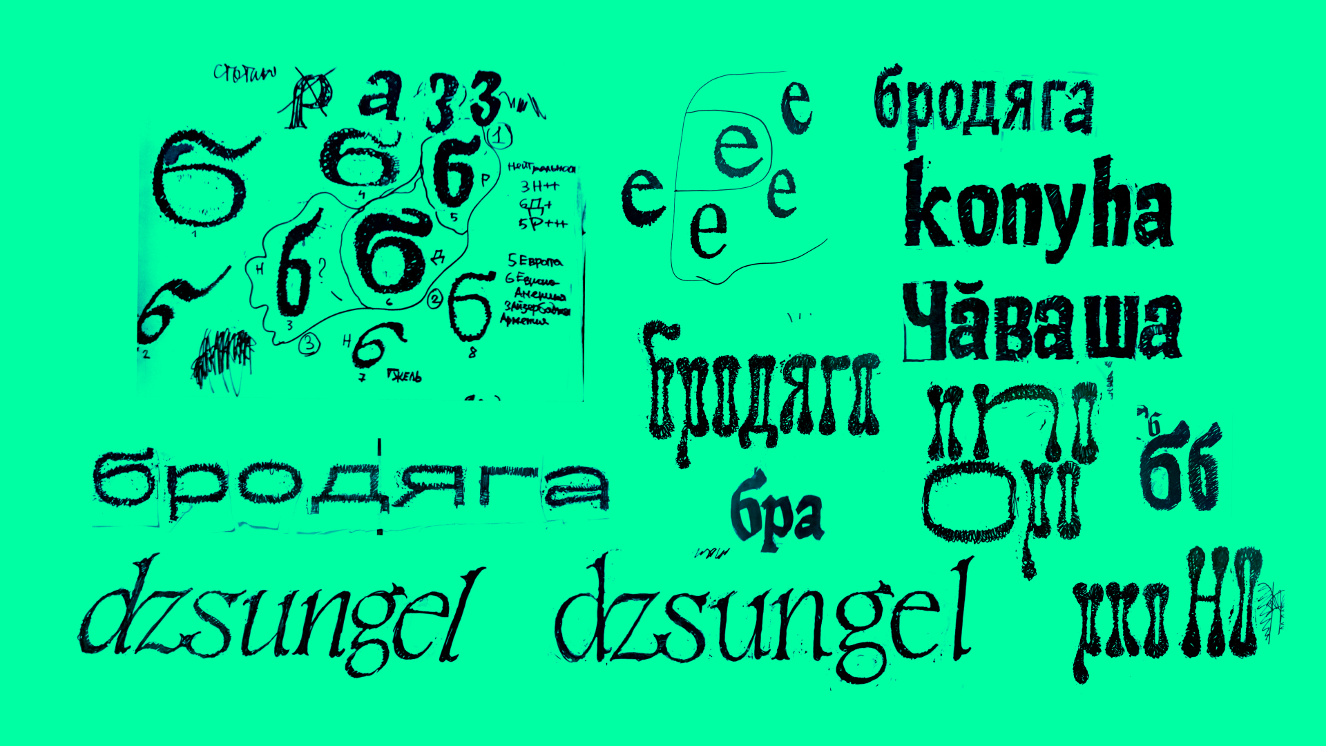
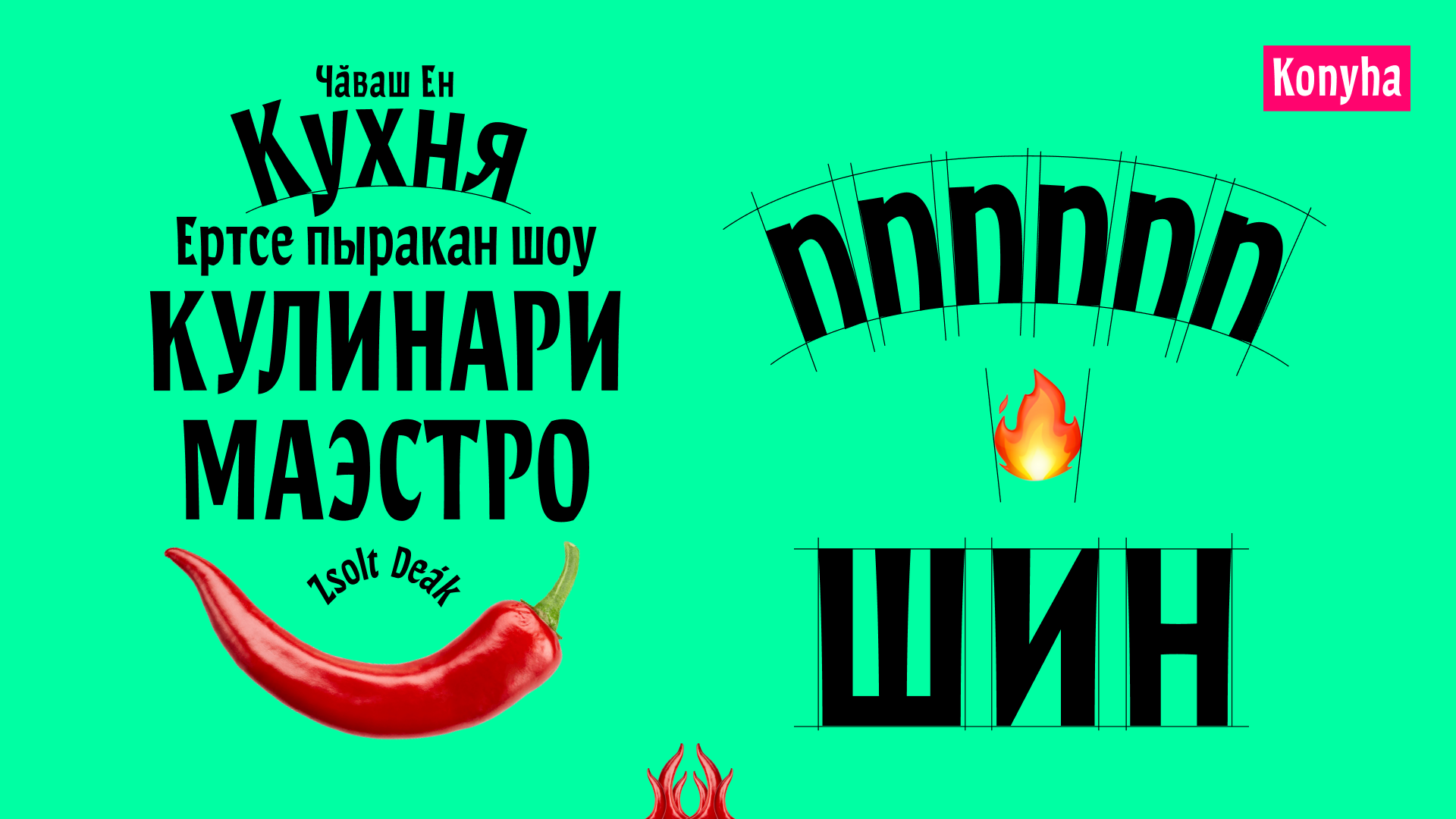
Orsa is a humanist sans serif with concave stems. The theme of the project was a Hungarian culinary show held in Chuvashia. I was inspired by Hungarian cuisine and Chuvash culture. The typeface has short ascenders and descenders and narrow proportions, allowing for dense typesetting at large point sizes. Orsa is also perfect for setting letters on a circle due to its upward-expanding shapes. The endings of the strokes follow the geometry of Chuvash ornaments, consistent with the logic of a broad pen.


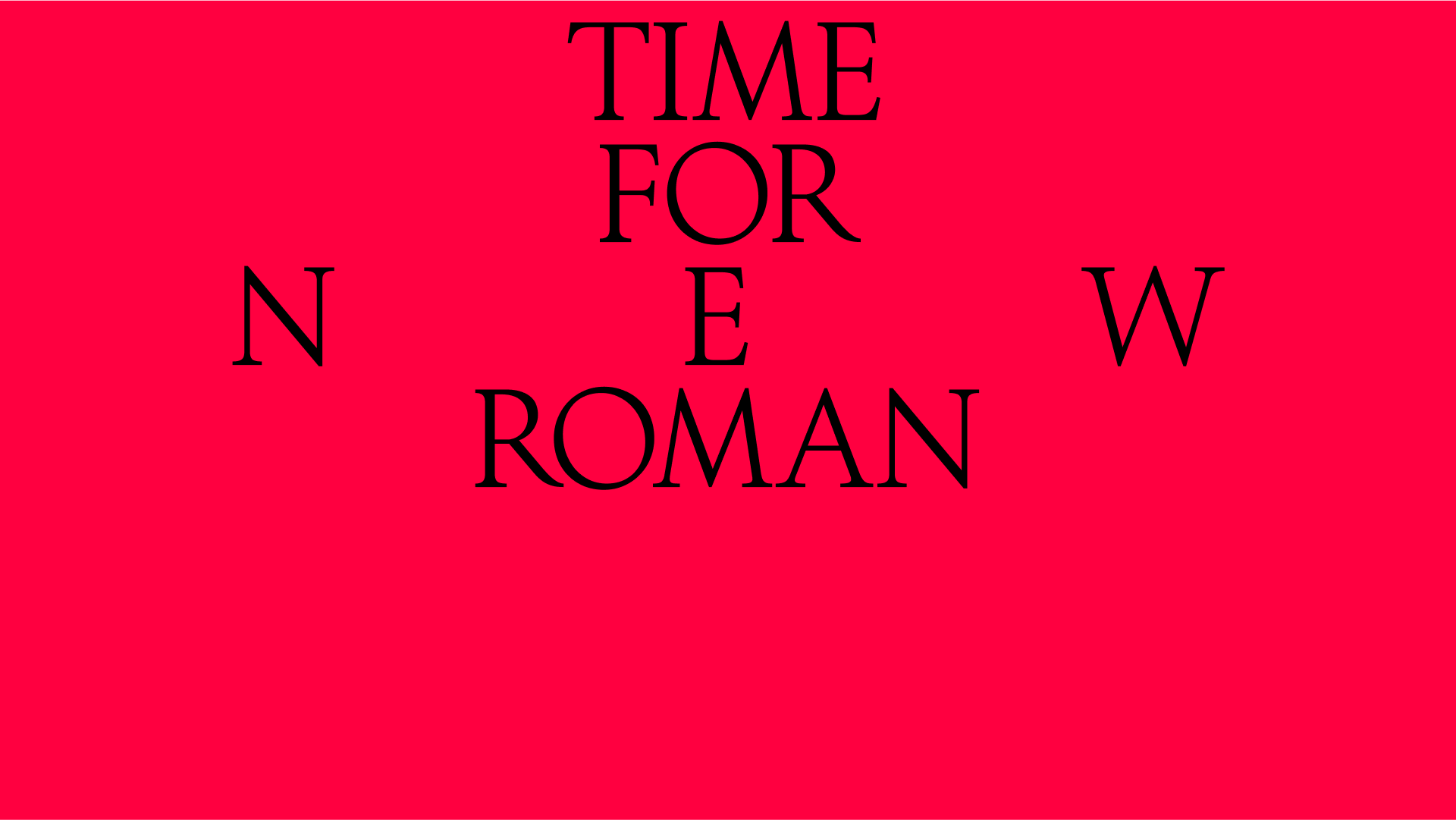
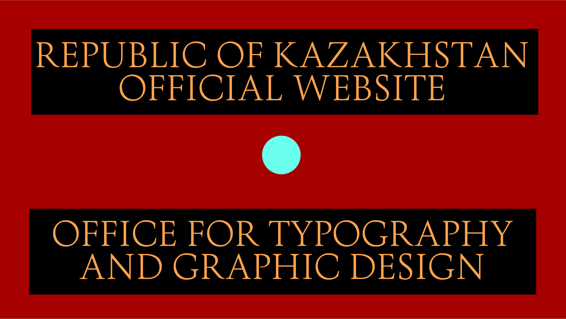
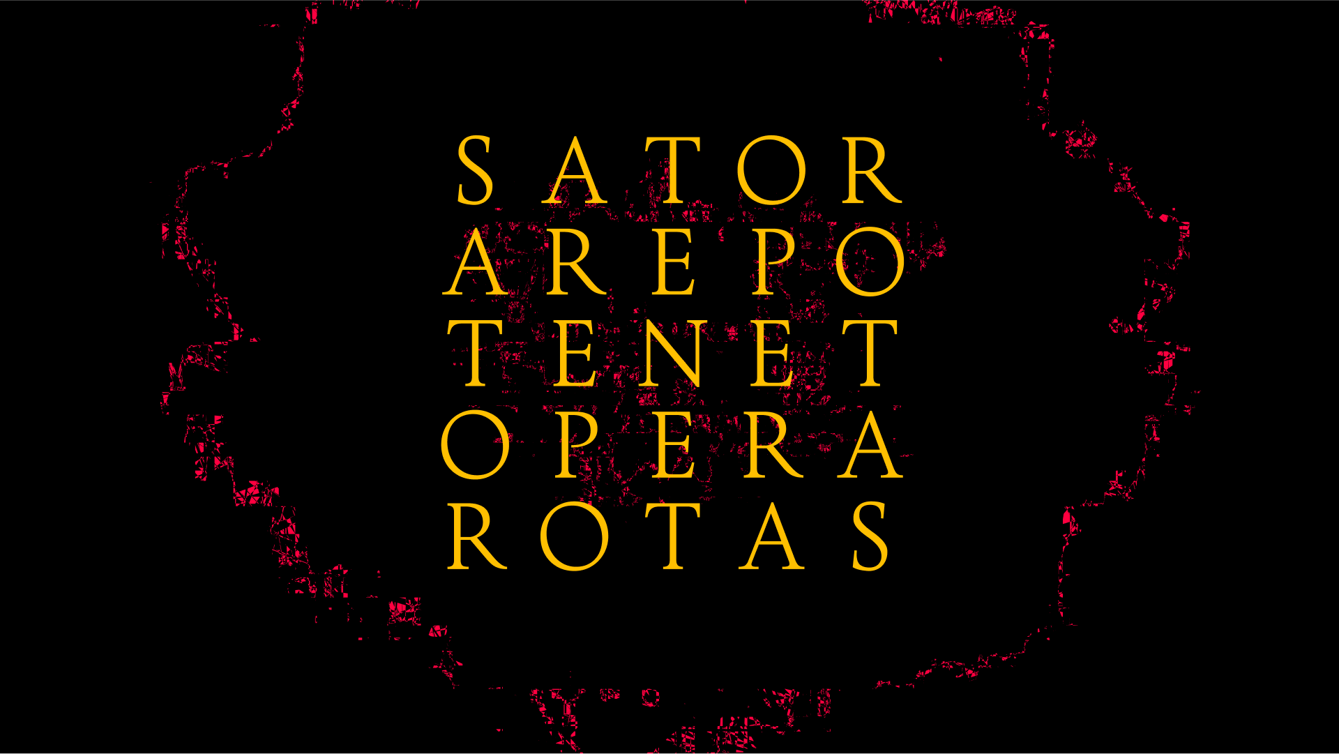
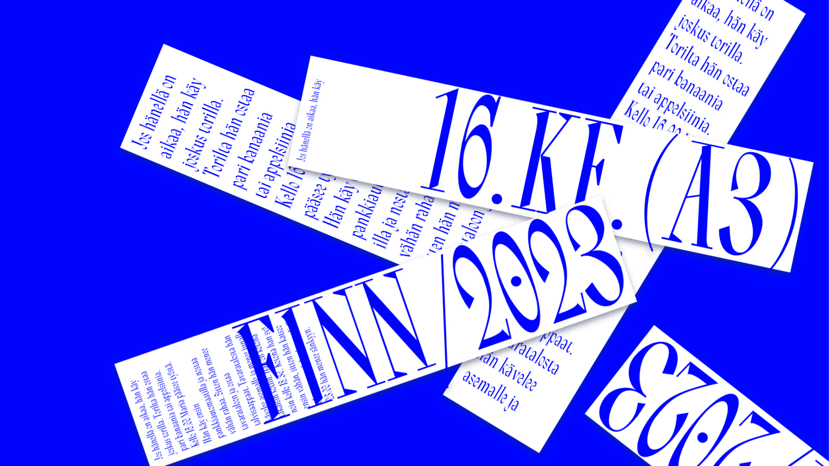
Time for New Roman is a typeface for the Kazakhstan embassy in Slovakia. The task was to create a typeface that commands respect yet conveys the feeling of a caring state. The idea was to take classic Roman Capitals but add geometric clarity as an analogy to efficiency. Most existing typefaces based on Roman Capitals mimic calligraphy, so the desire was to create a genuinely digital version. Thus, the strict yet modest Time for the New Roman was born.