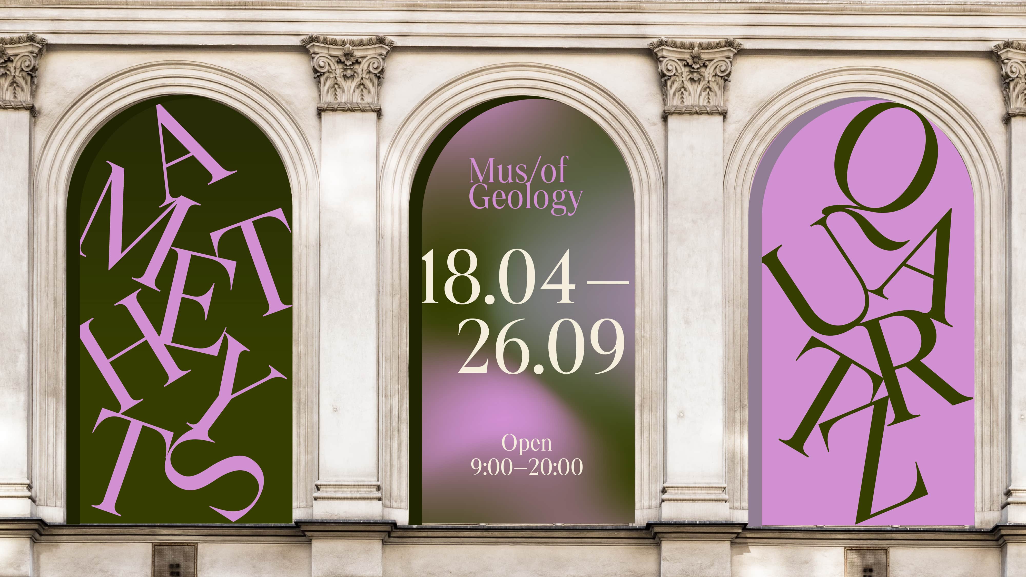
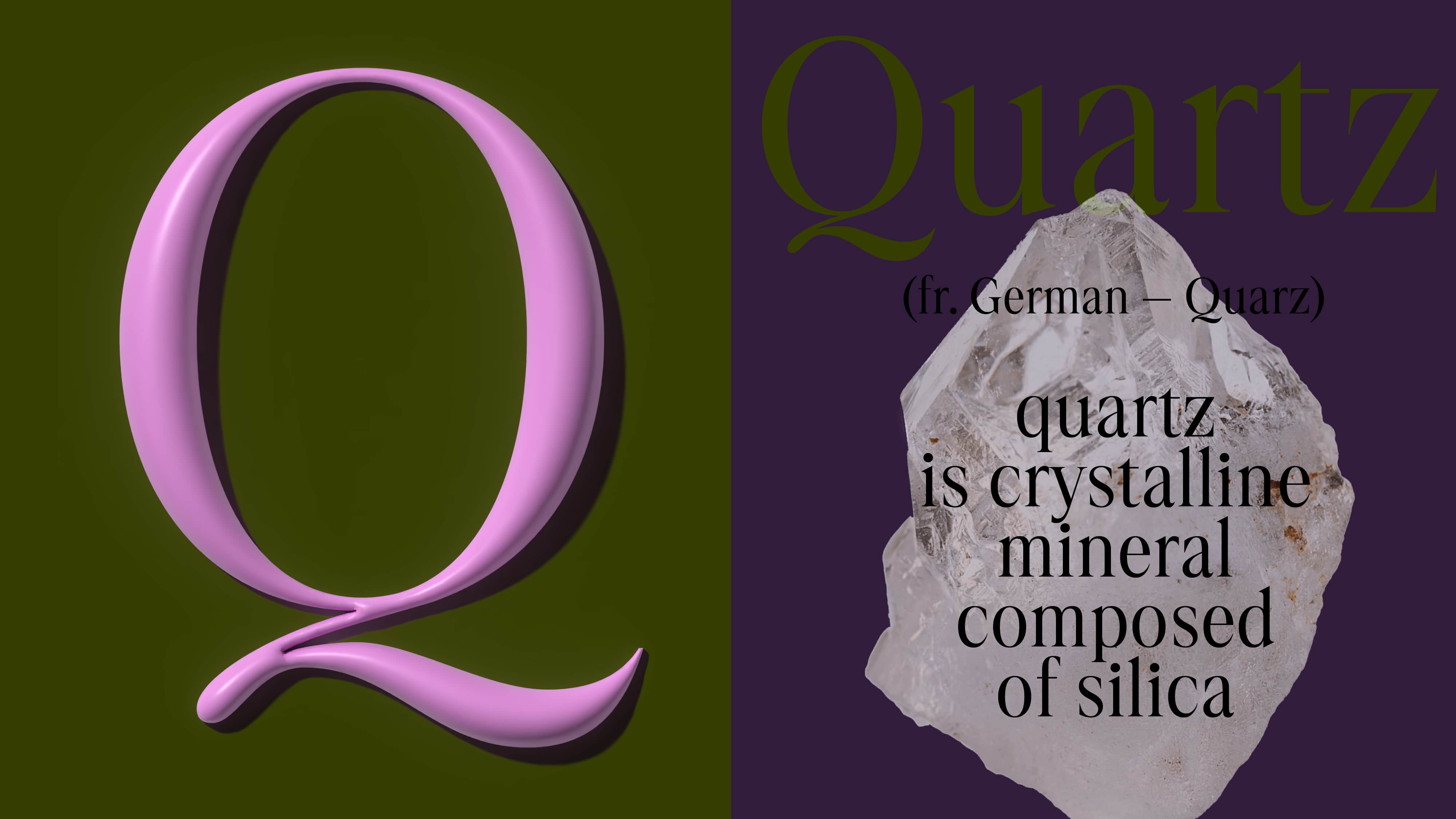
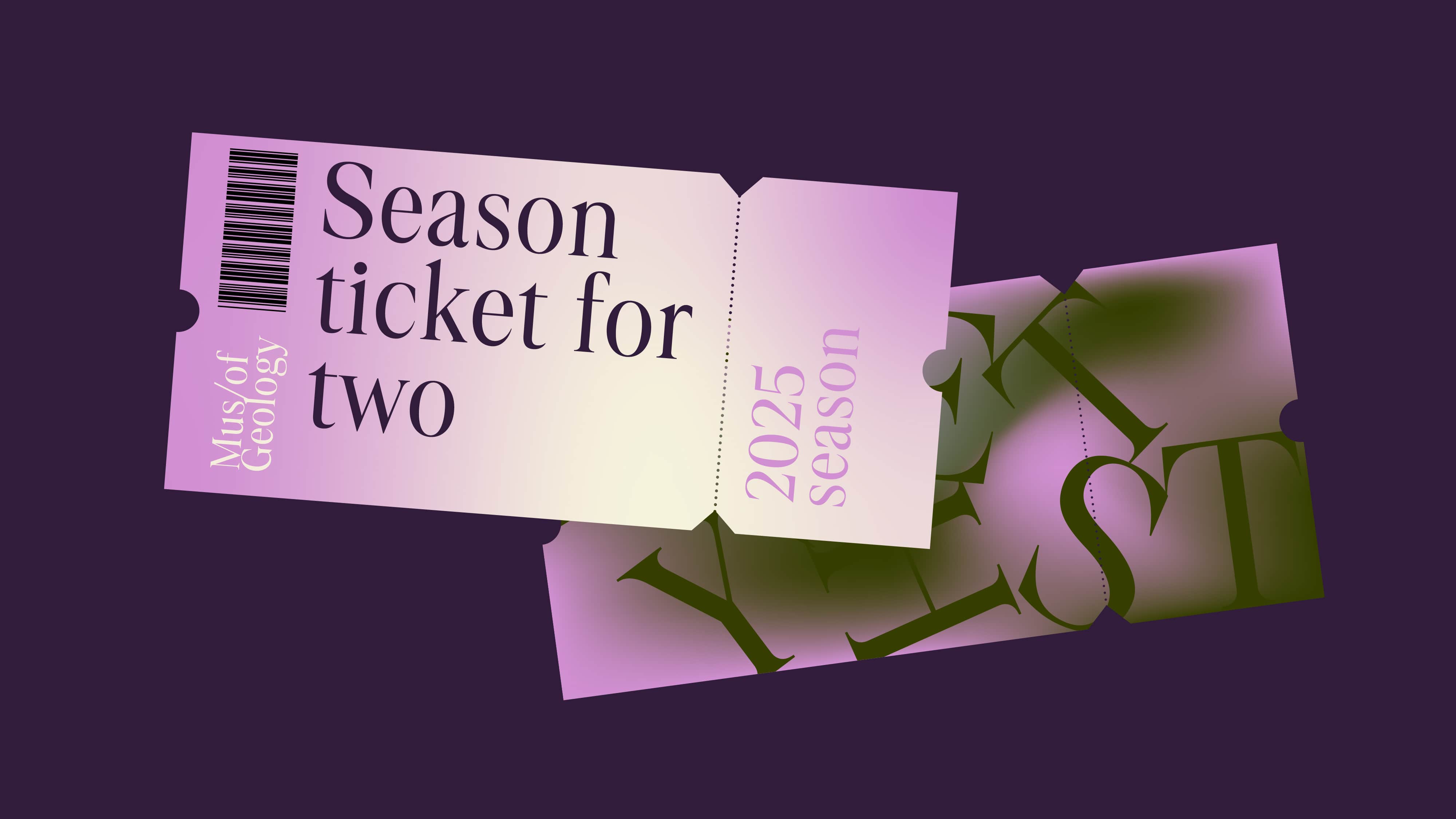
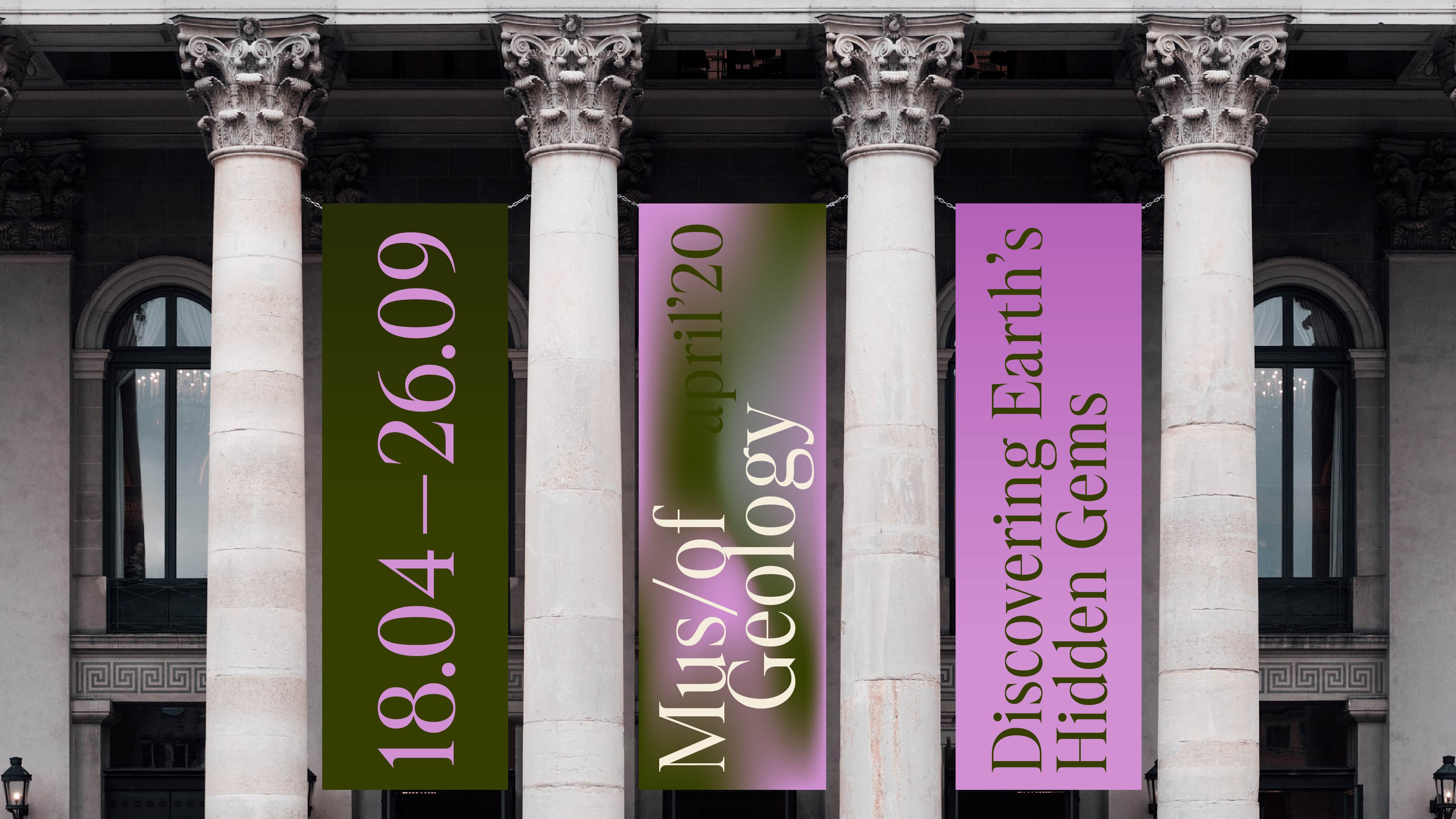
Type Design Workshop Pro / 24–25
We are thrilled to present the typefaces our students have designed over the past seven months. From wild display typeface explorations to tackling complex rendering challenges in maps—each project tells a unique story—reflecting individual interests and characters of each author.
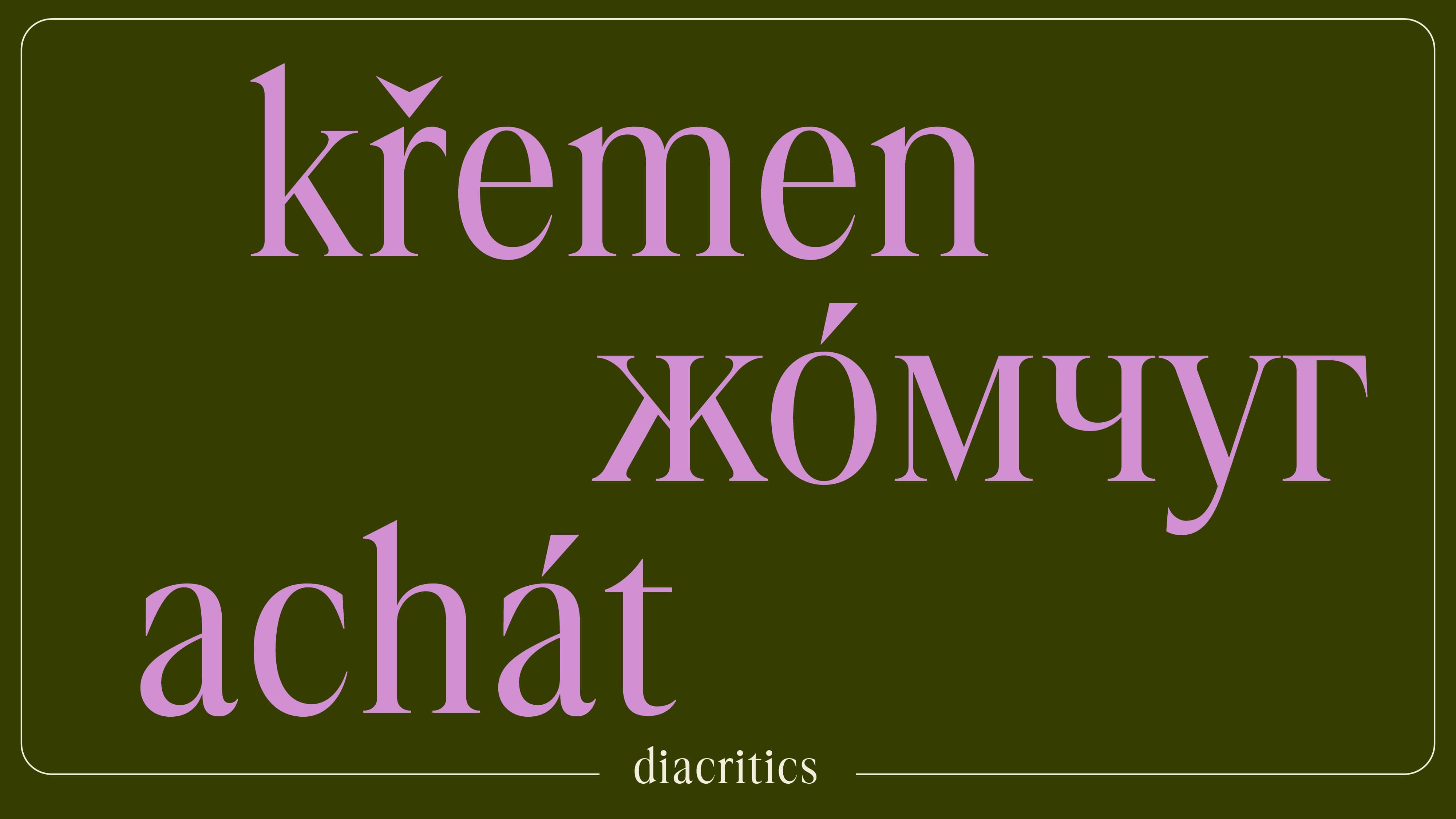
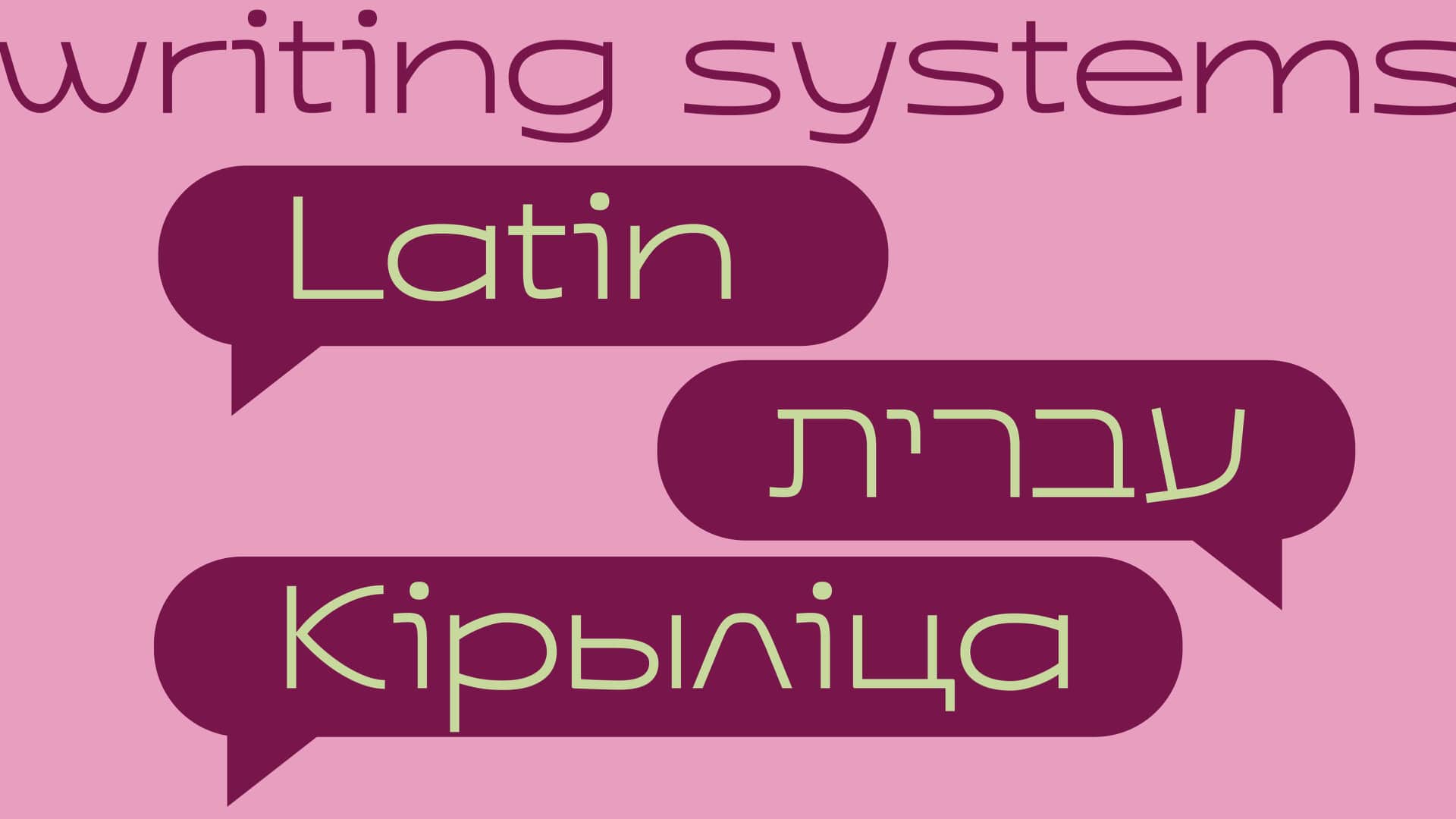
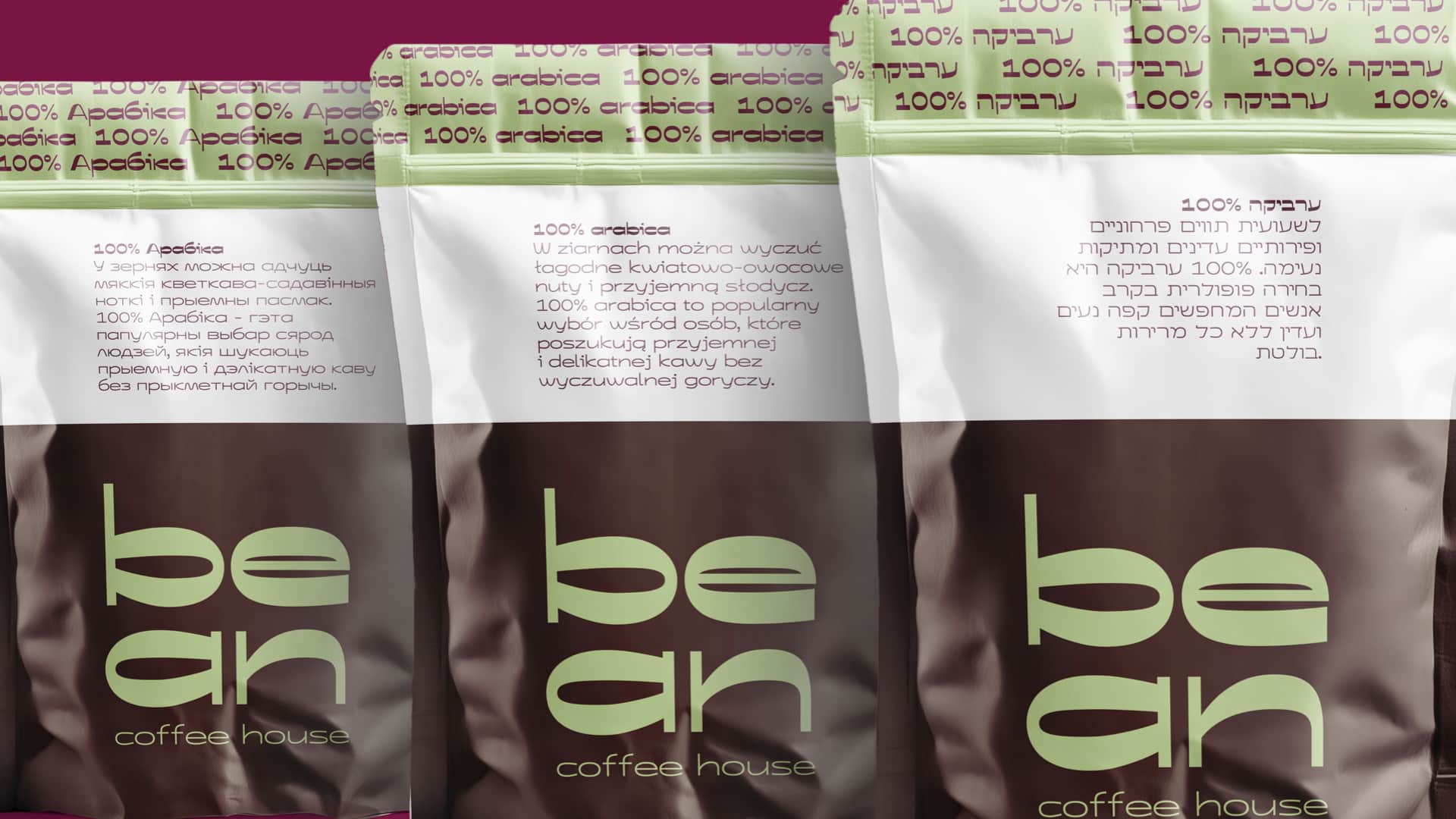
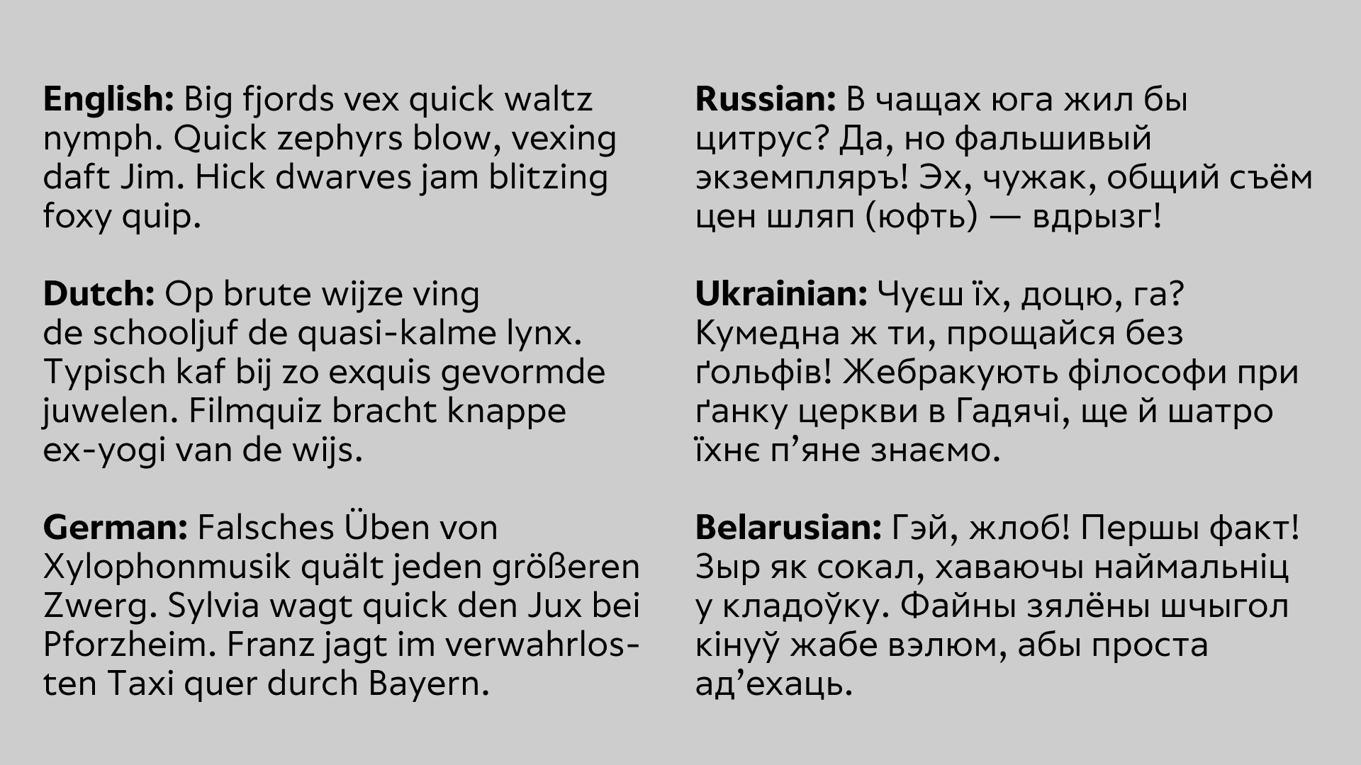
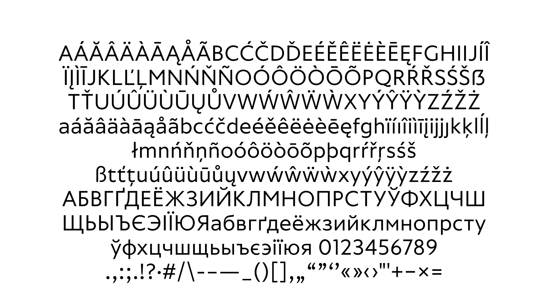
Our students approached their work with fluency in two scripts, Latin and Cyrillic, designing both simultaneously. Some even went further, beginning to explore additional scripts such as Hebrew and Armenian. What a journey it’s been!
Thanks to our guest lecturers for sharing their experience: Yuriy Yarmola and Adam Twardoch, Marte Verhaegen, Peter Nowell, Elena Novoselova, Liza Rasskazova, Krista Radoeva, Christopher Slye, Miguel Sousa, Lizy Gershenzon and Travis Kochel.
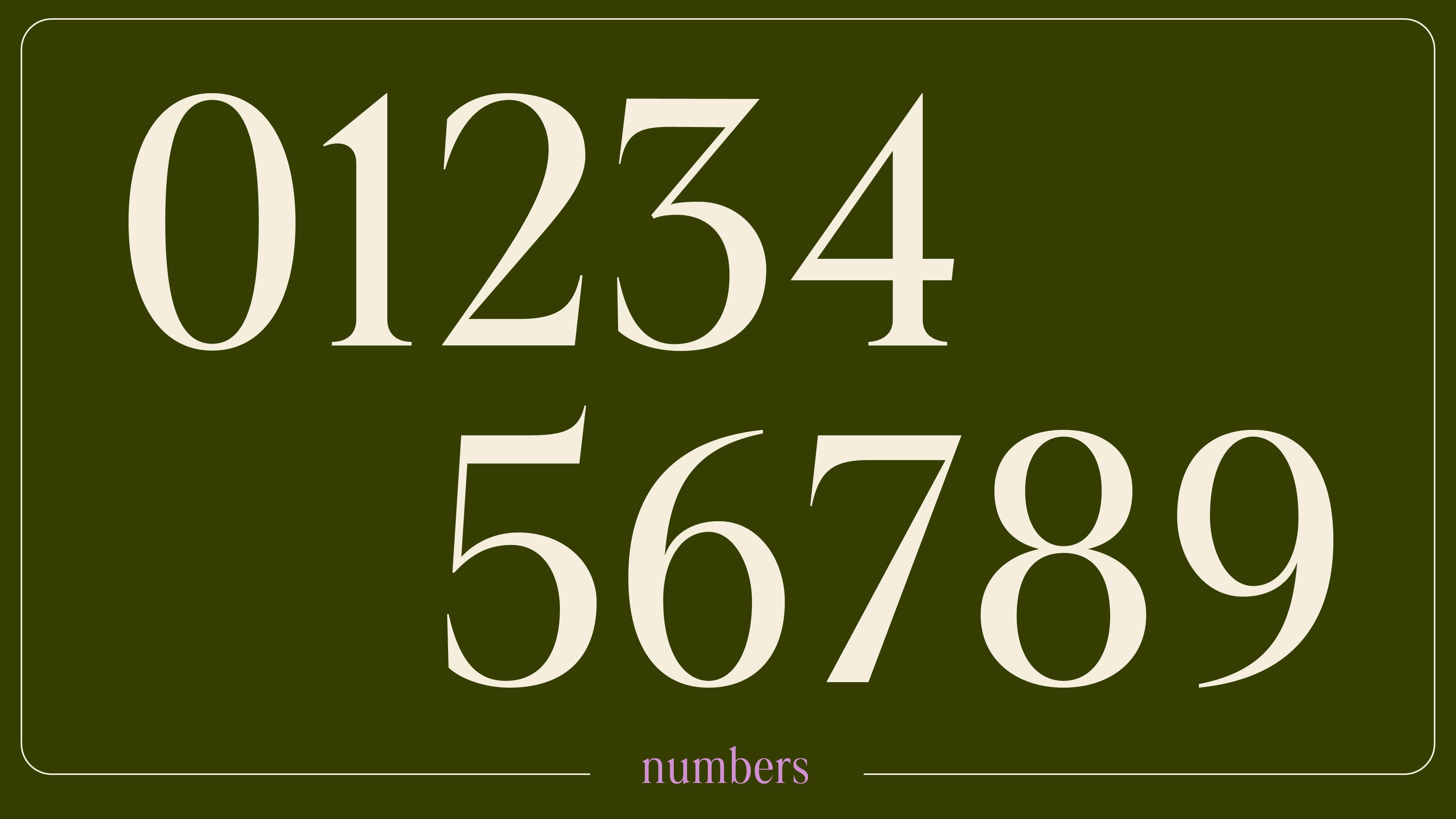
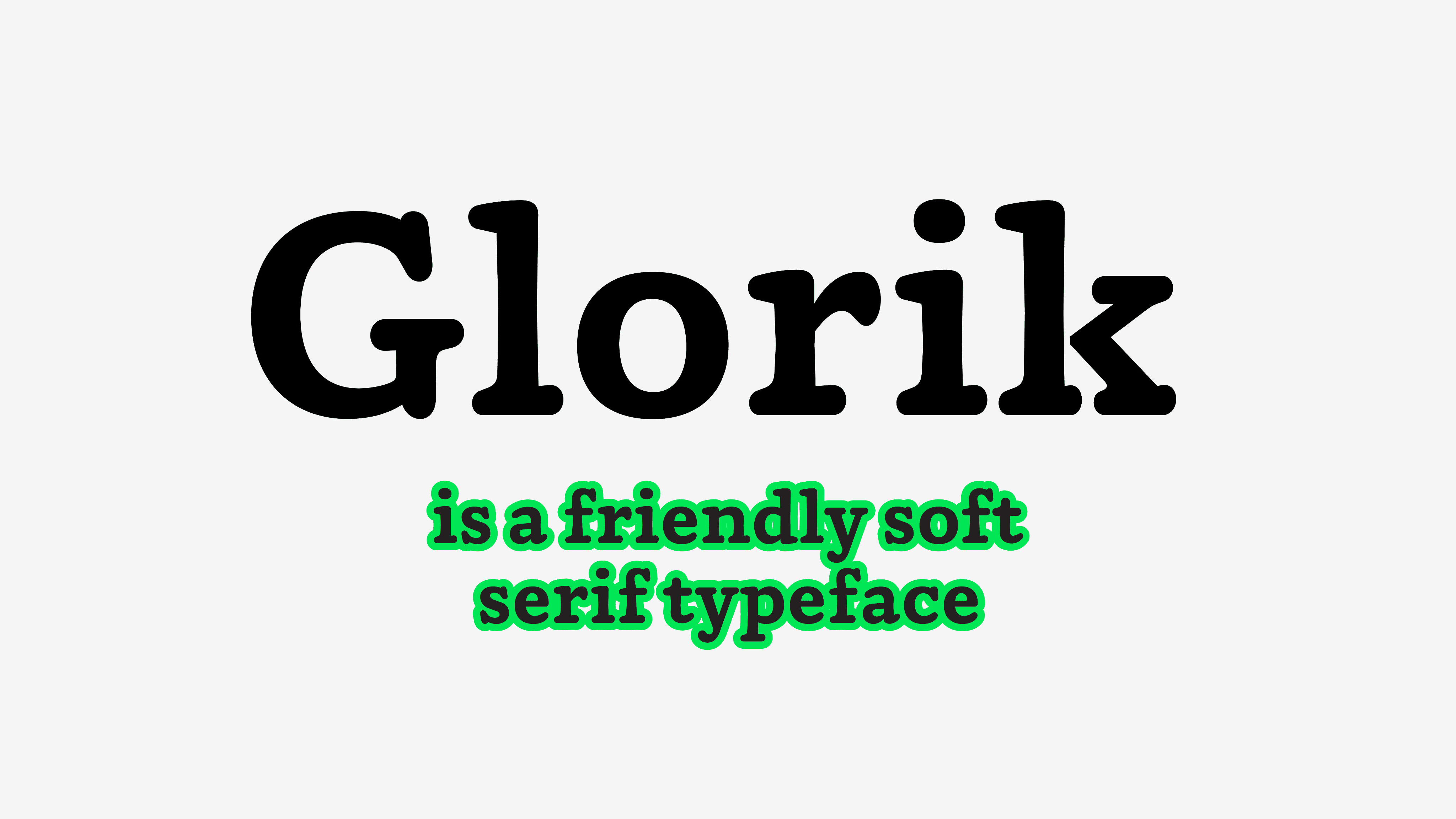
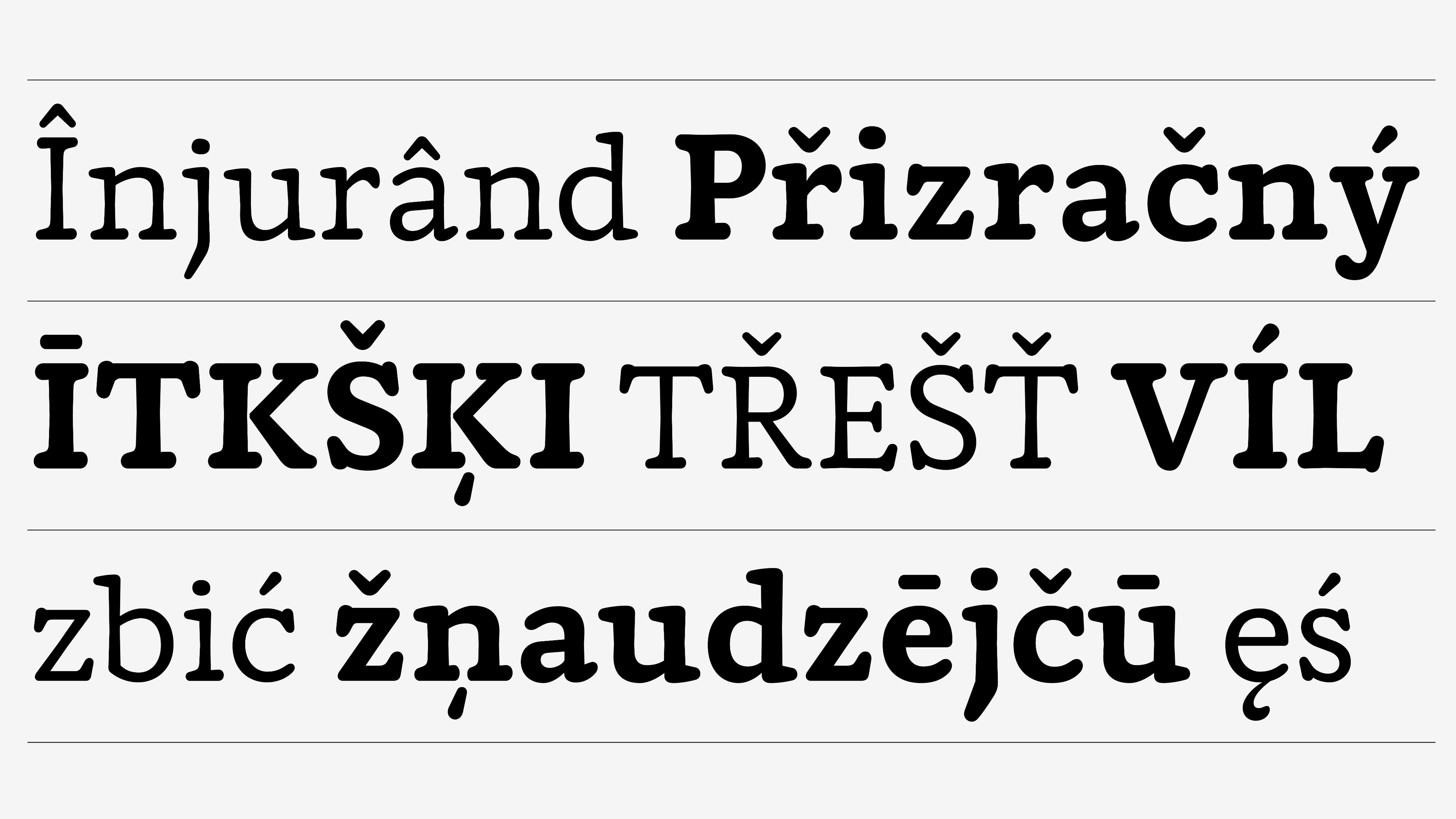
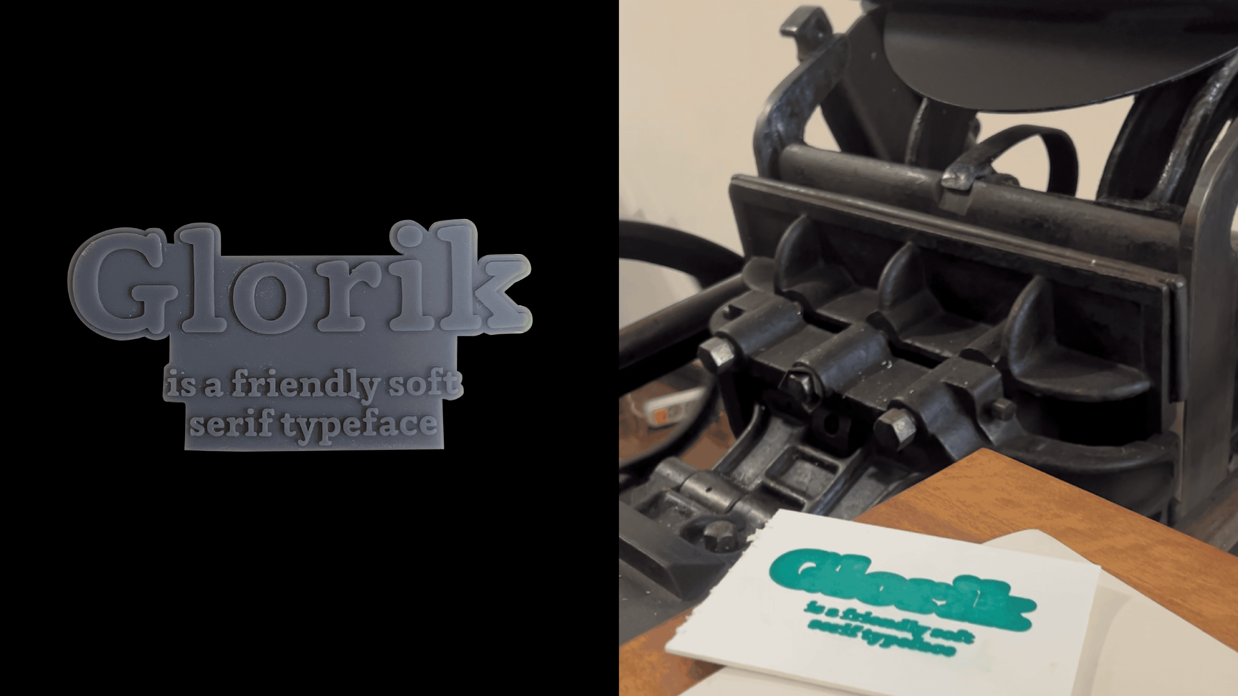
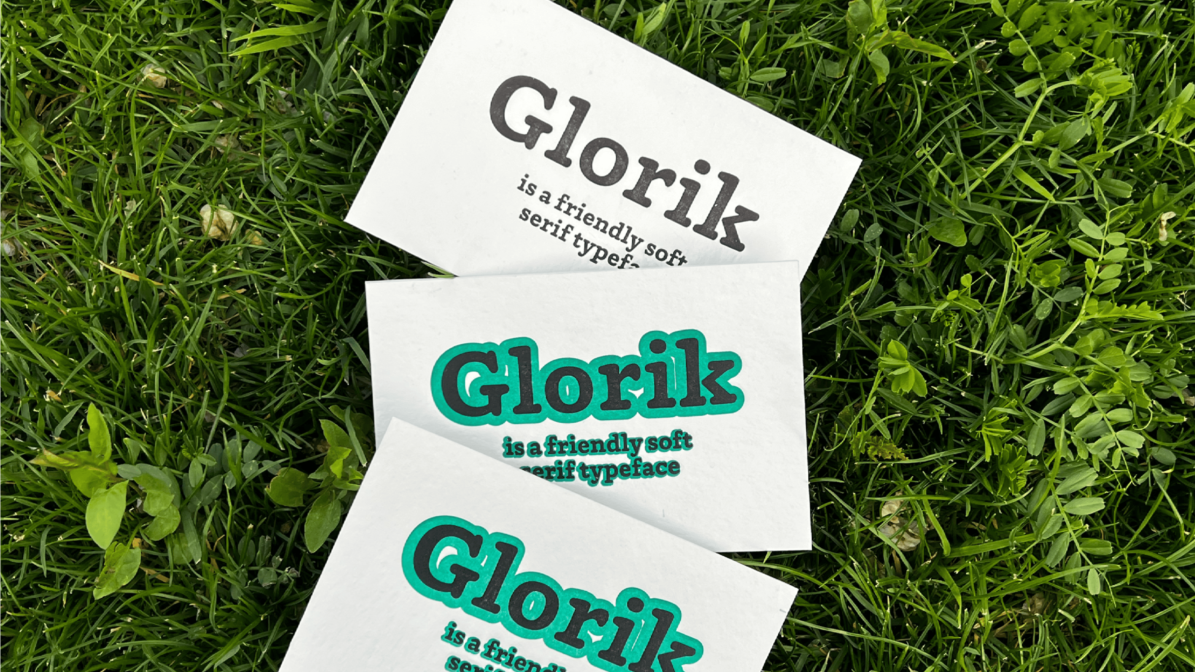
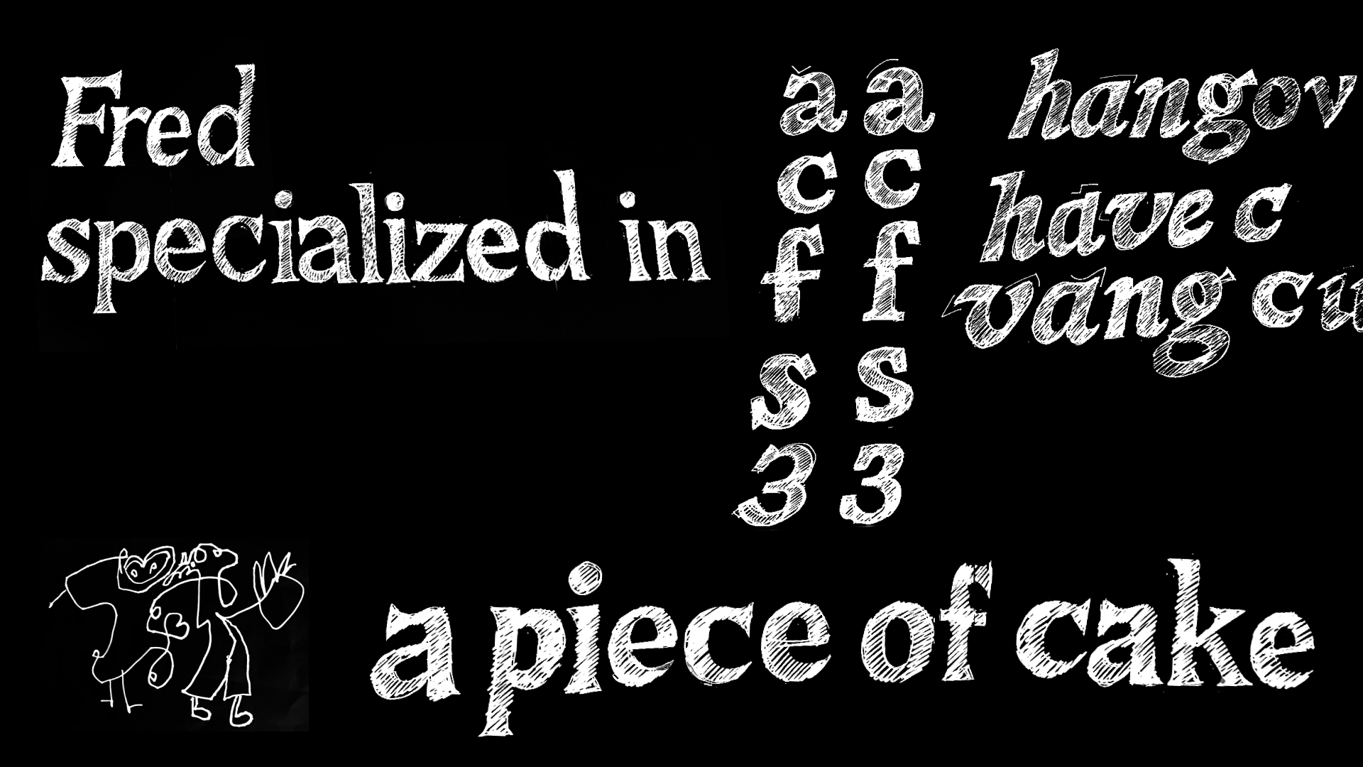
Glorik is a soft, rounded serif typeface. Its name translates from Armenian as “rounded” or “circular”, which perfectly reflects the font’s friendly and warm character. The visual concept was shaped at the intersection of transitional serif typefaces and slab-serifs— the goal was to combine their distinctive features into a harmonious text face.
The project includes three styles with support Cyrillic and extended Latin. Although originally designed for text, Glorik also performs well at larger sizes as a display typeface. Future plans include expanding language and character support, as well as developing a variable font version.
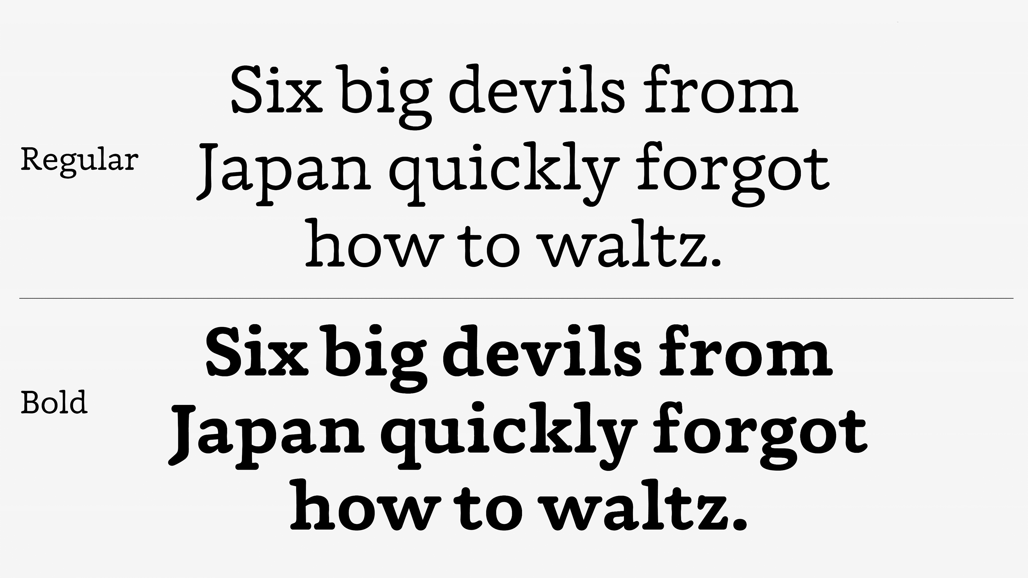
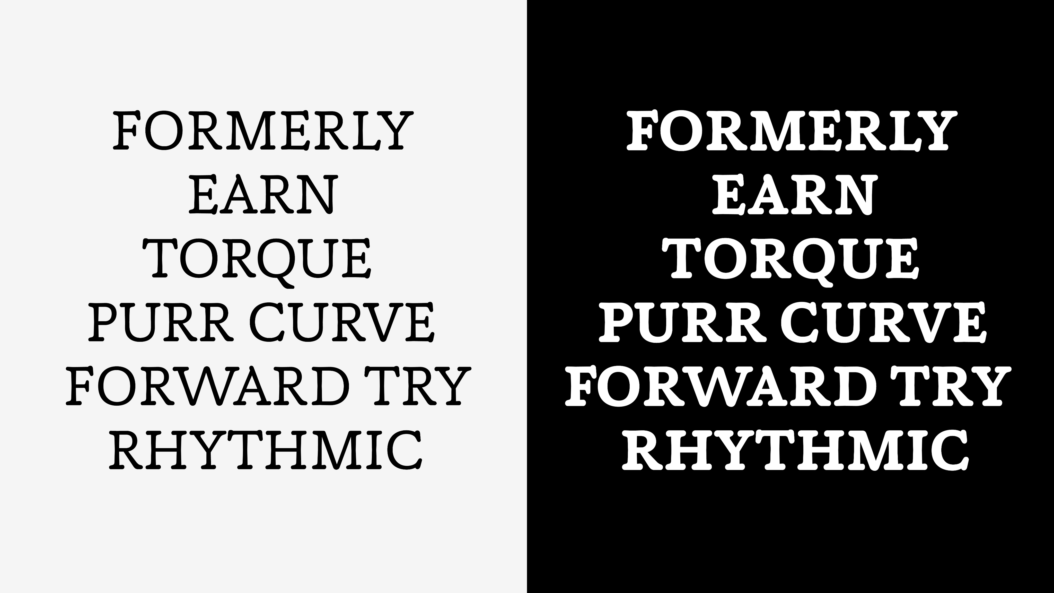

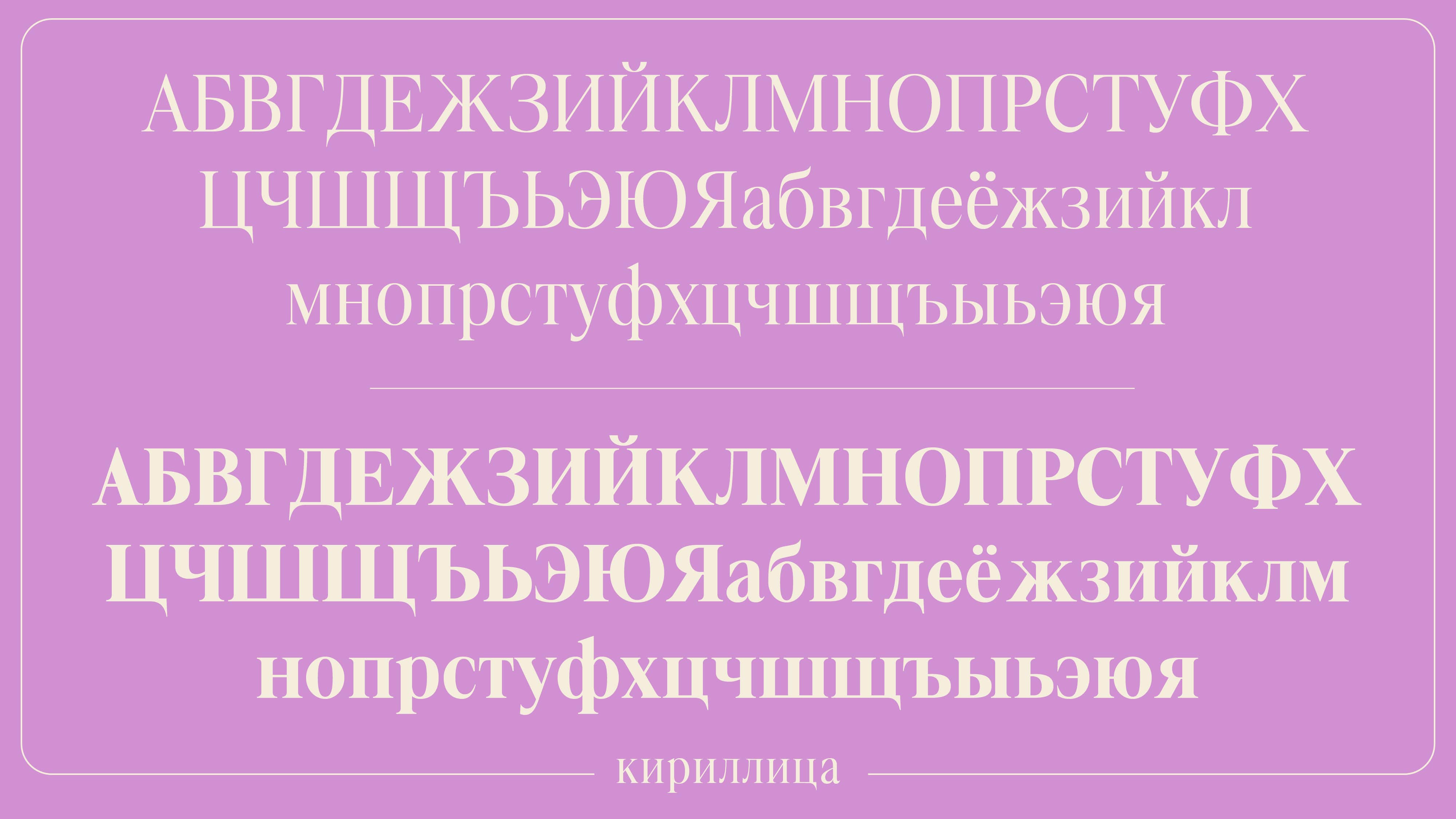
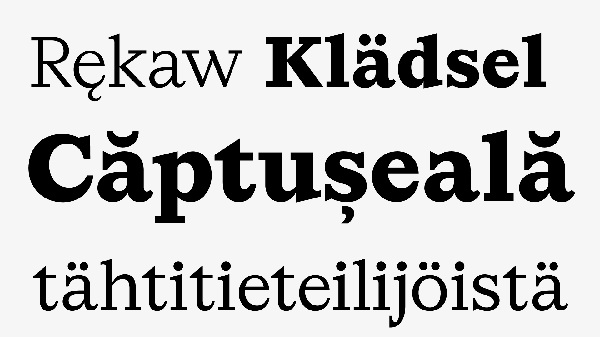
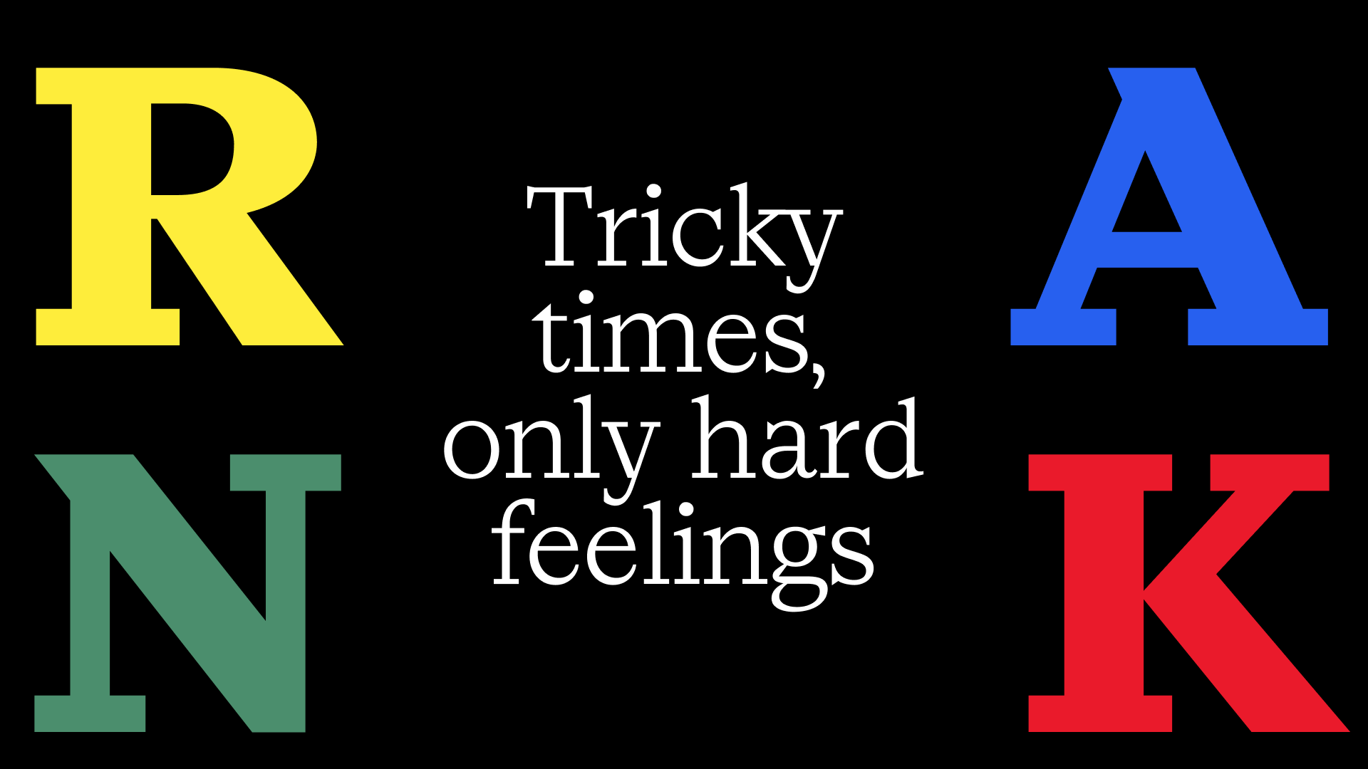
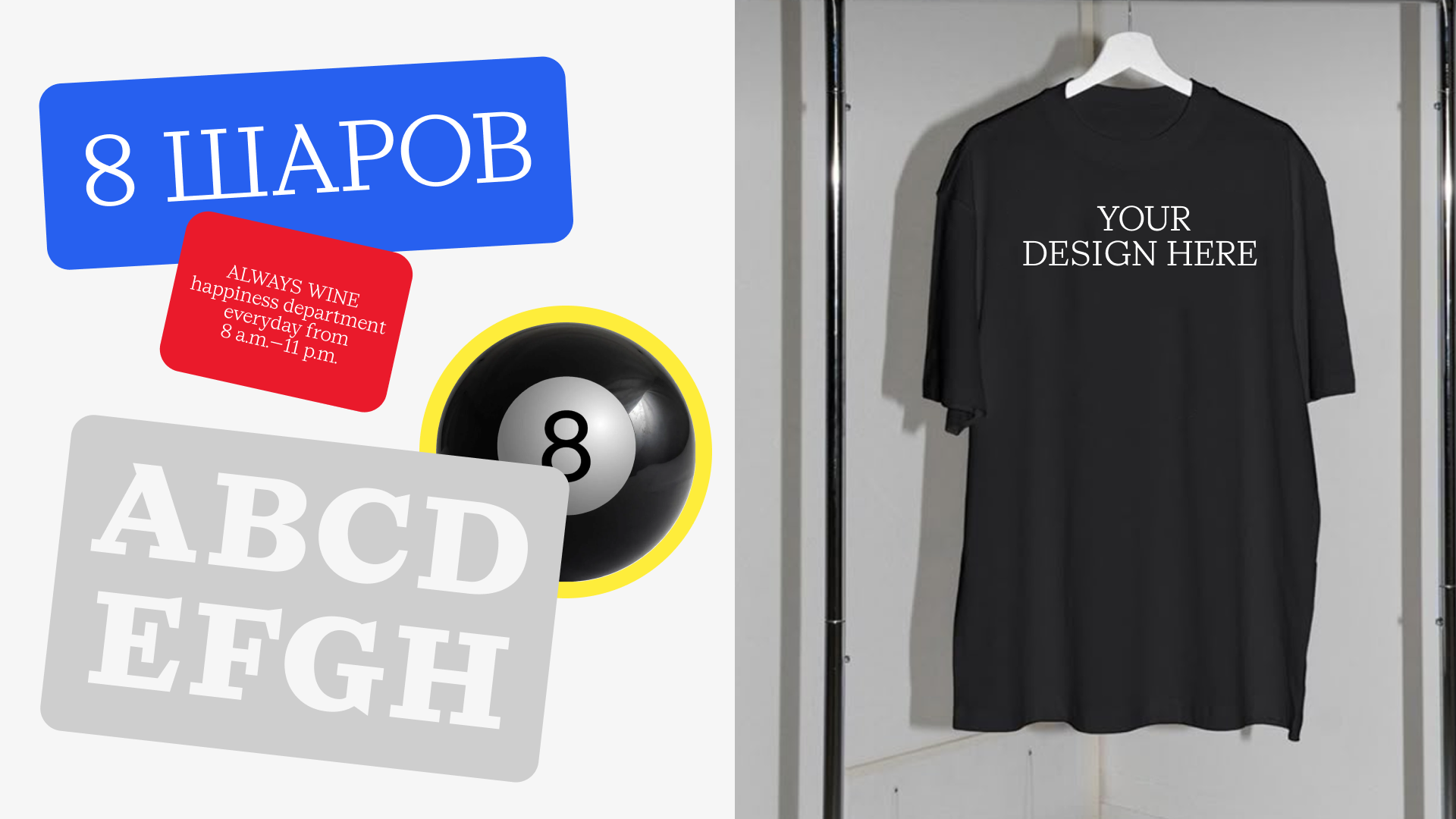
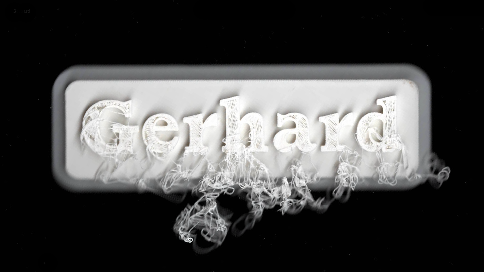
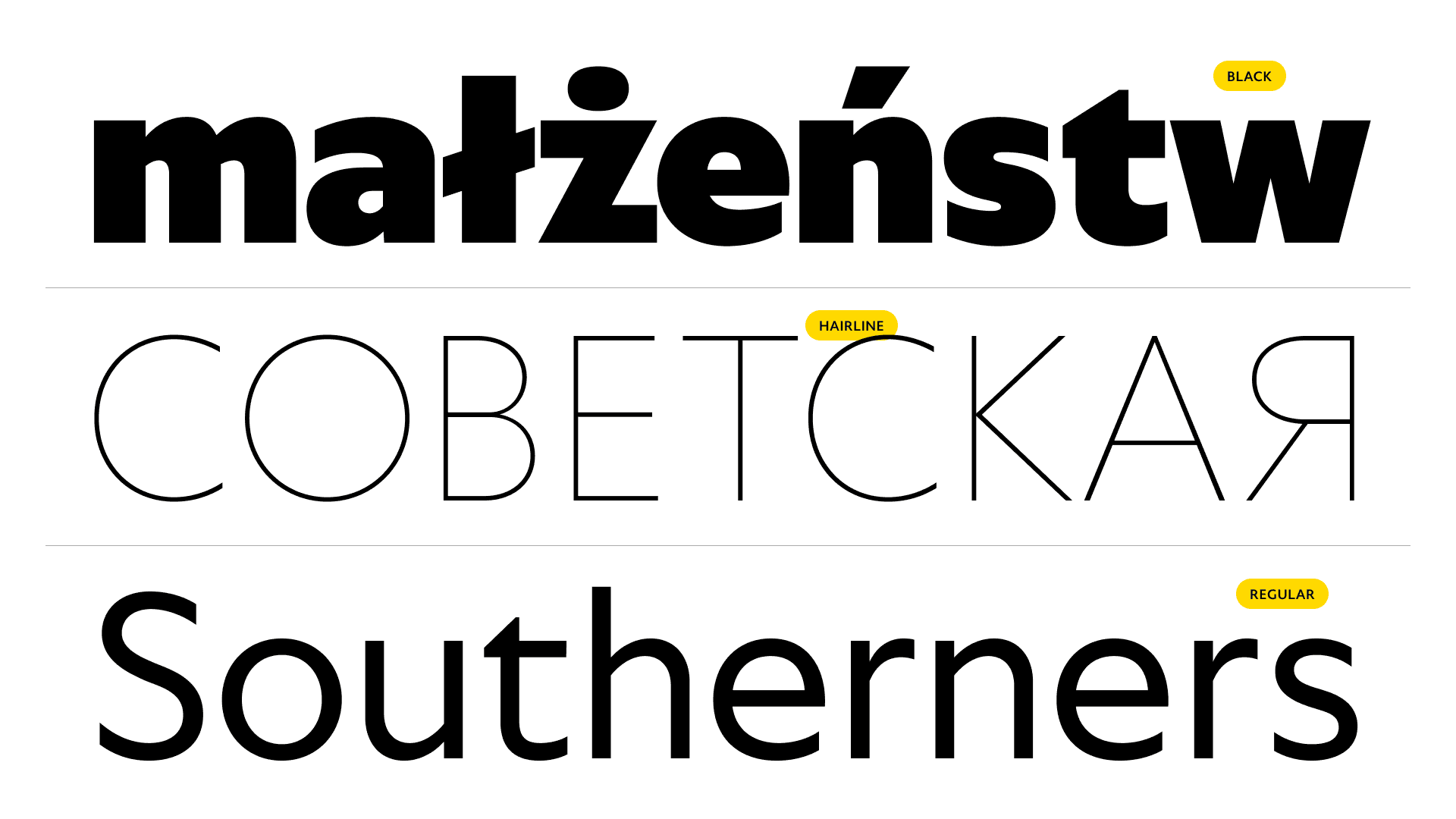
Gerhard is an eclectic serif typeface with slab serifs and sharp terminals. The name is a dithematic compound (ger- meaning “spear” and -hard meaning “strong”), which resonates with its design—sharp, compact, yet elegant.
Gerhard is a variable typeface that includes five weights: Light, Regular, Medium, Bold, and Black. It performs confidently both in body text and in large sizes, maintaining readability and expressiveness. In Gerhard, graphic precision combines with inner tension, creating a distinctive character that stands out in any context.

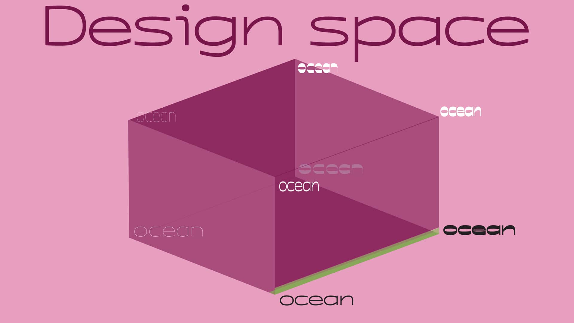
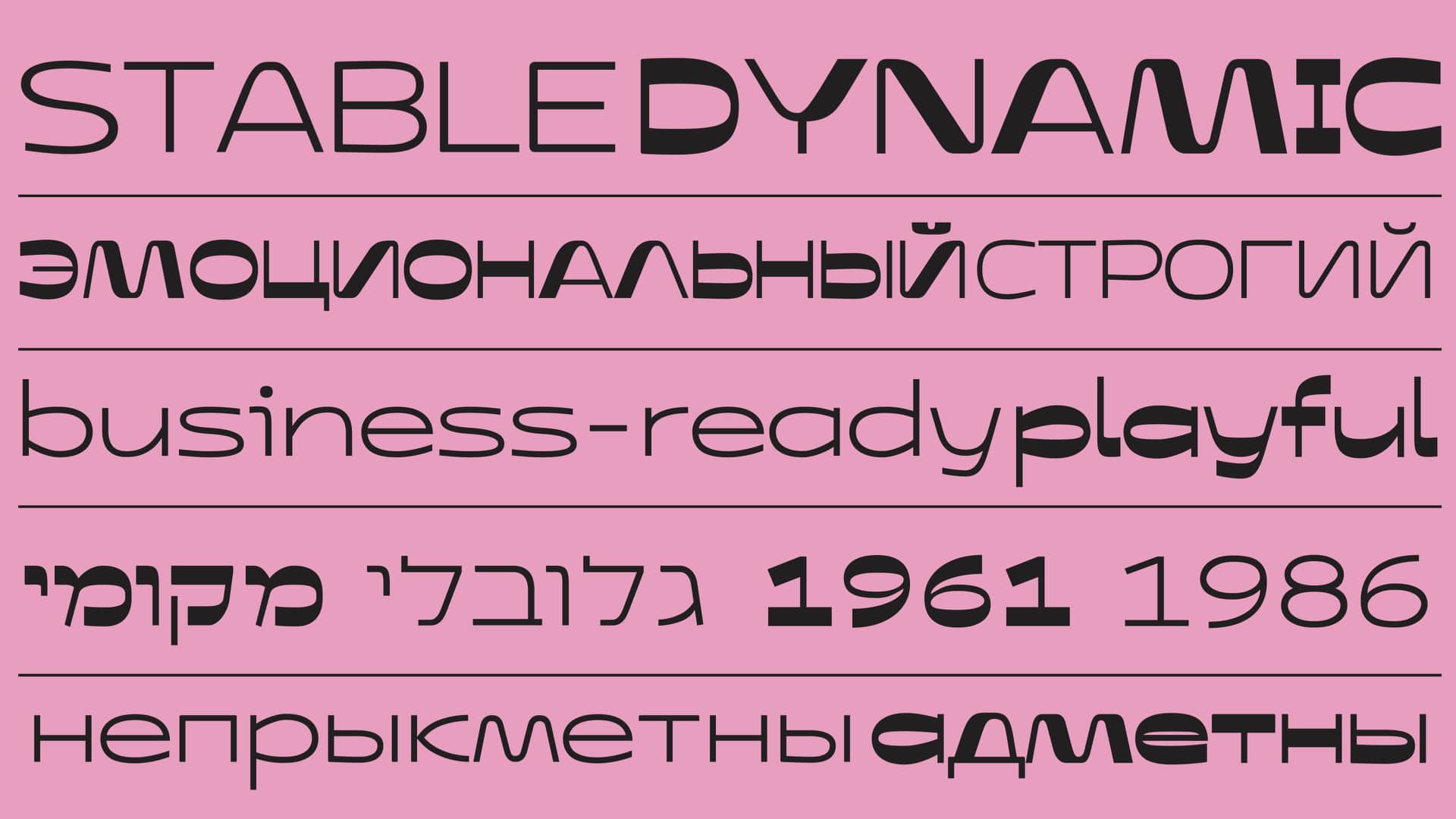
We live in a time of change. For brands, it’s becoming increasingly difficult to maintain consistency in communication. Sometimes, they have to meet seemingly opposite demands: to be global—yet stay local; to convey stability—yet be dynamic when needed; to sound friendly—while remaining business-oriented.
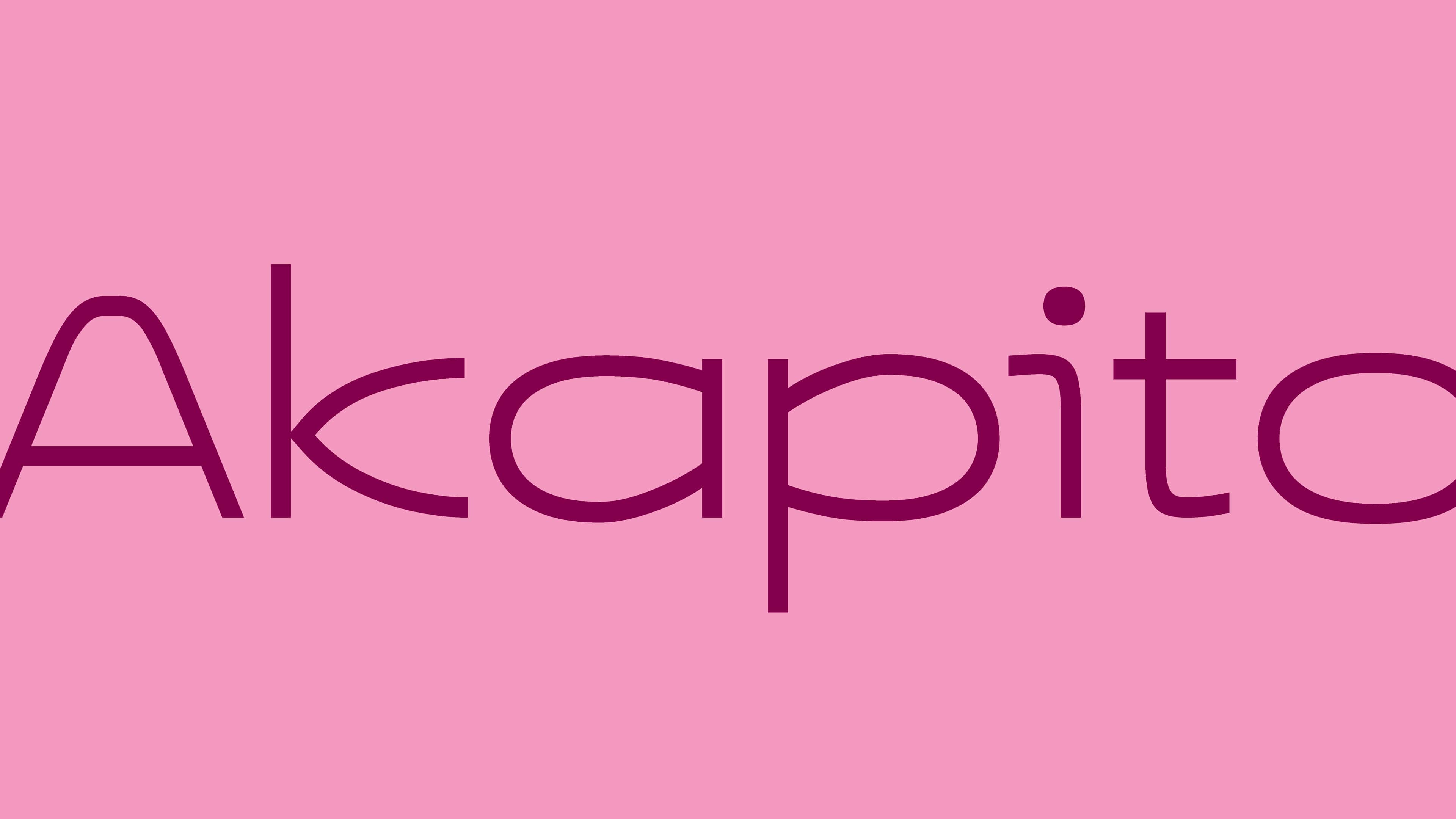
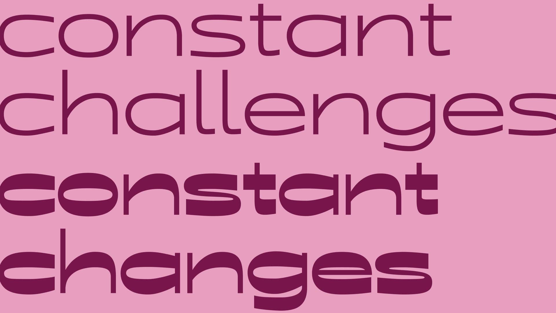
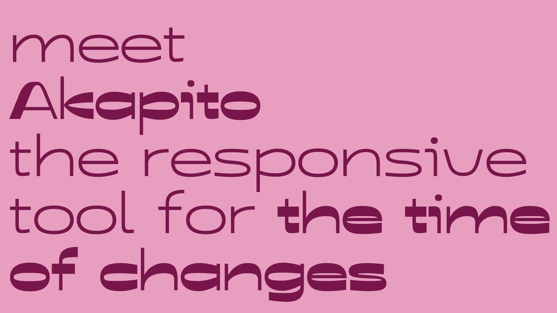
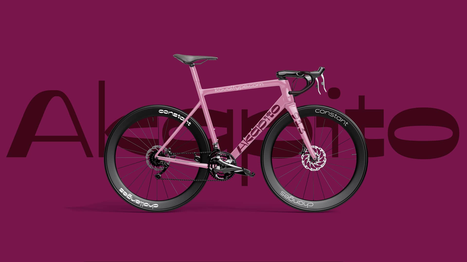
Can a single typeface family express such a wide emotional range? That was the idea behind Akapito.
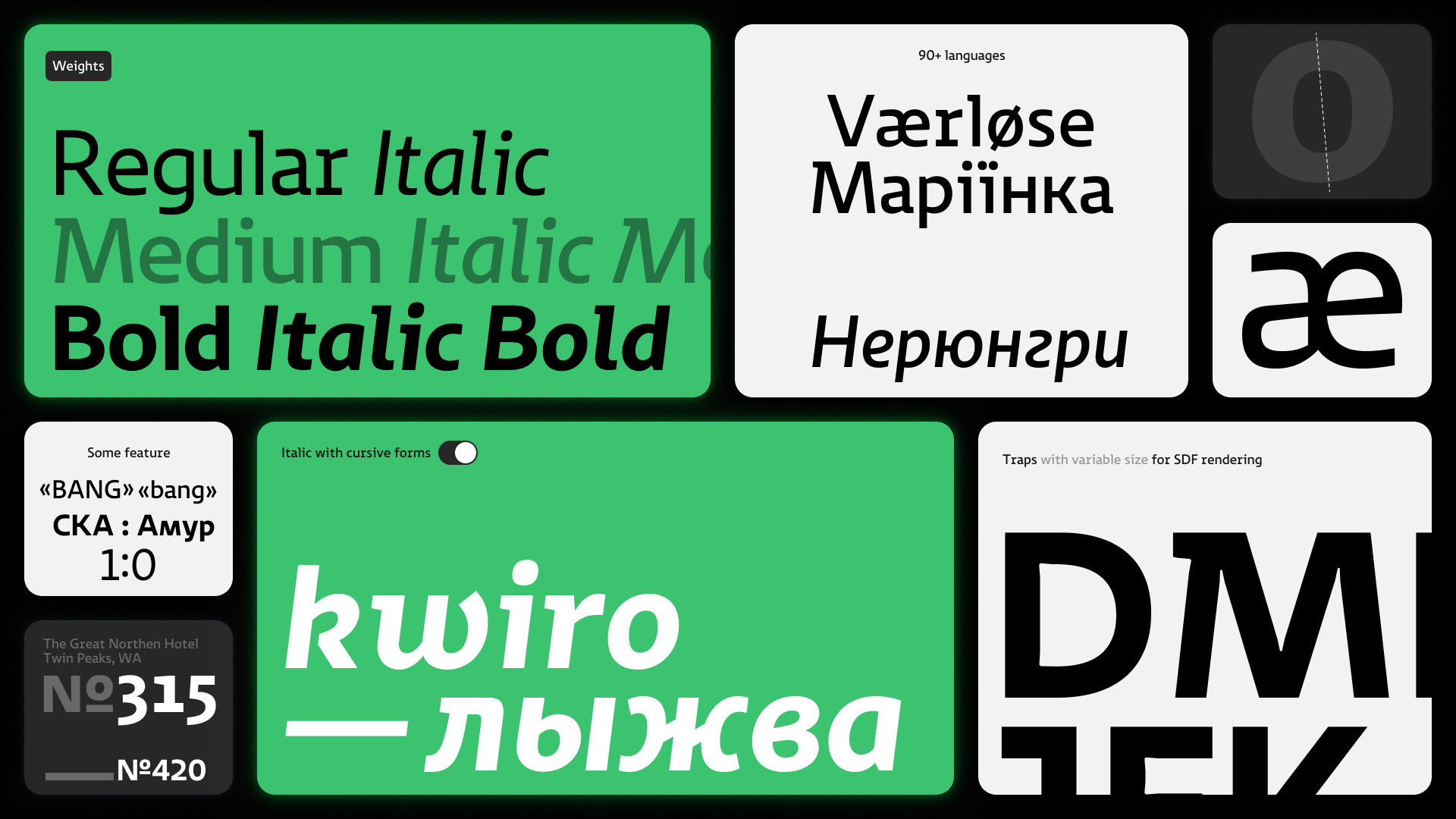
Akapito is a variable typeface that adjusts its parameters based on the intensity of emotion. Its reverse contrast helps bridge visual and semantic opposites. The typeface supports Latin, Cyrillic, and Hebrew scripts.
During the course, we only managed to scratch the surface of this design-space “cube.” And yet, even these initial results demonstrate how diverse the tasks are that Akapito can handle. It can be reserved or expressive, almost invisible or the life of the party.
A trial license is available on the website.
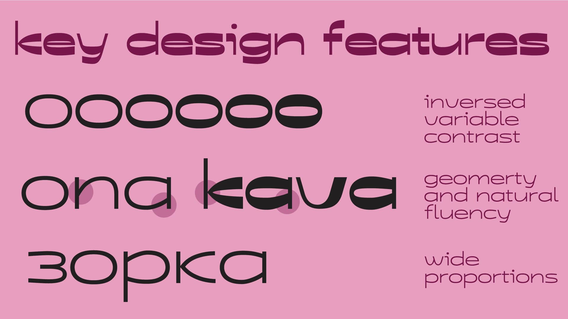
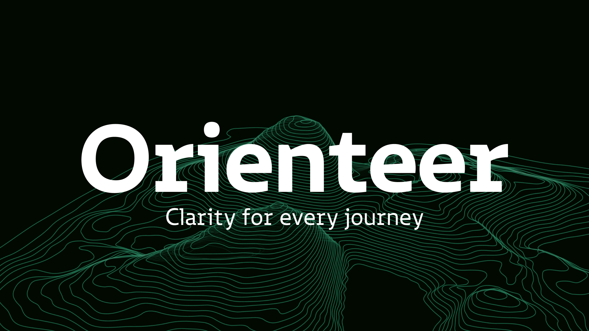
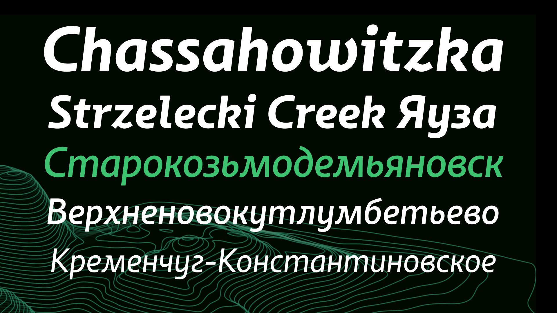
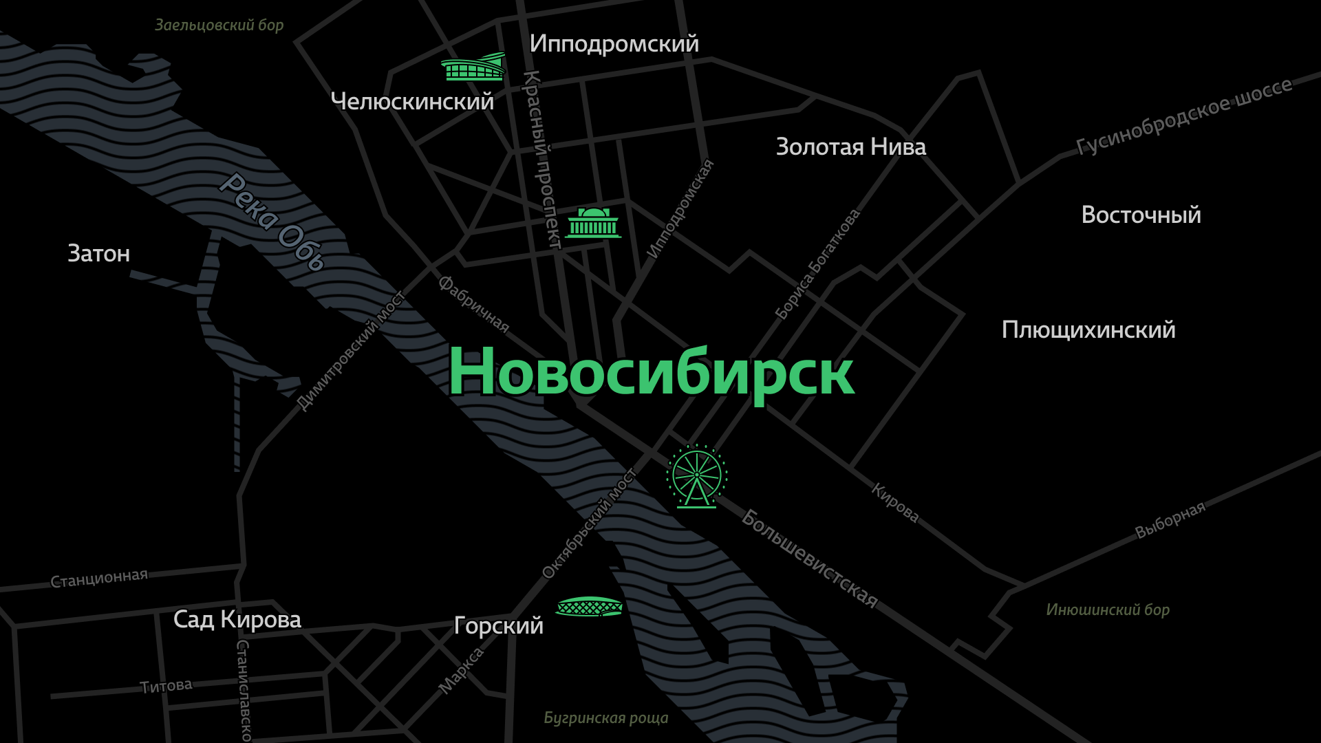
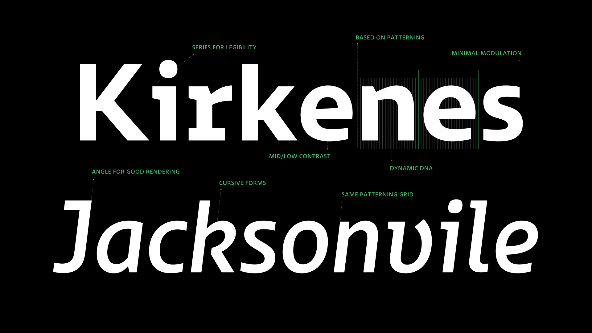
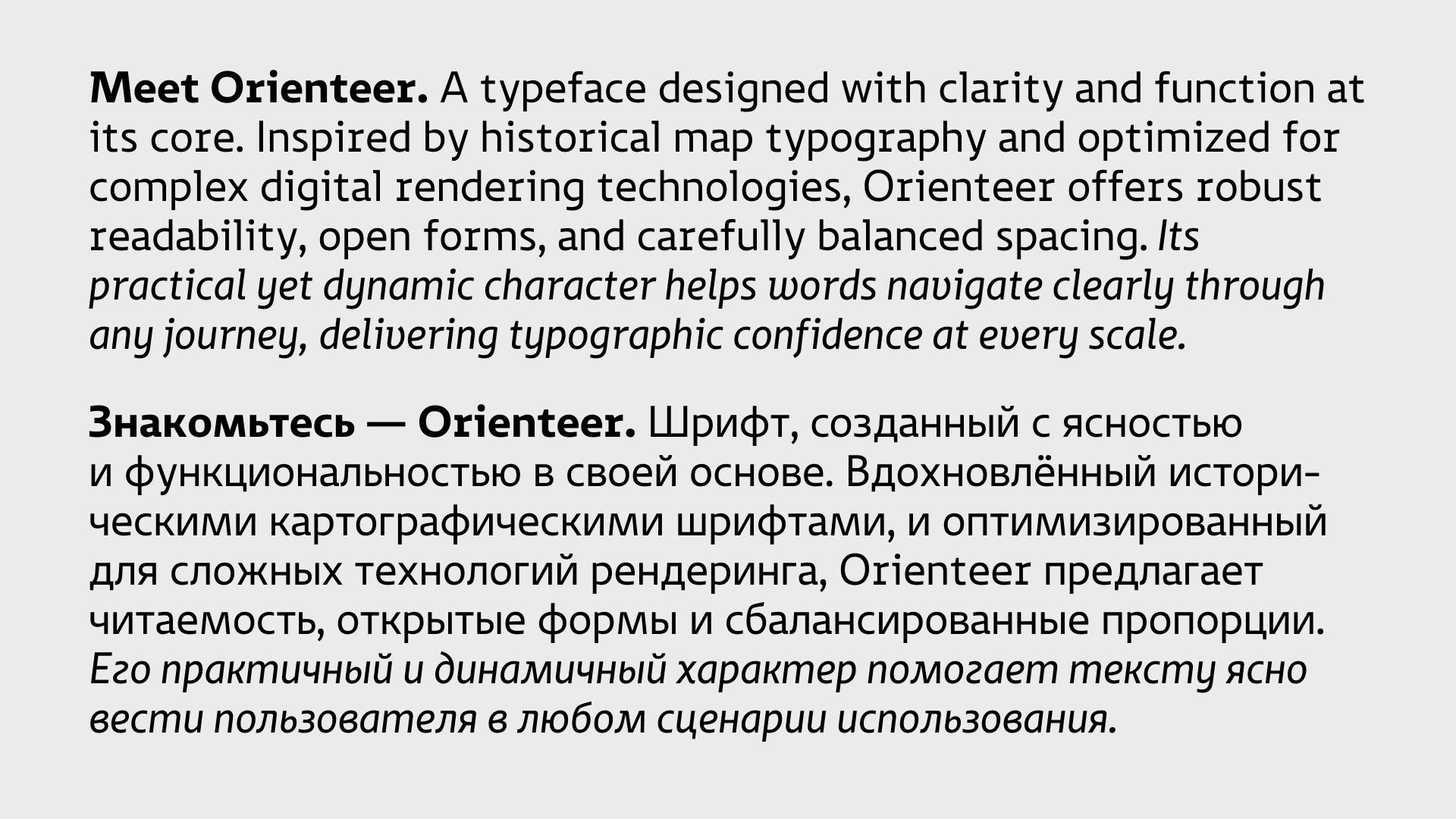
Orienteer is a typeface that pretends to be purely utilitarian. It begins as a strict sans serif, designed for digital maps: with open apertures, stable forms, and sober tracking. It reads well at any scale and resists the quirks of SDF rendering. But beneath this surface-level functionality lies a quiet rebellion—a desire to be expressive, not just useful. That’s where the italic comes in: not service-oriented, but alive. The forms start to lean, the lines begin to flow, and the utilitarian shell begins to crack. Orienteer was made for navigation, but it turned out to work just as well in text, interfaces, and even branding—wherever clarity needs a voice.
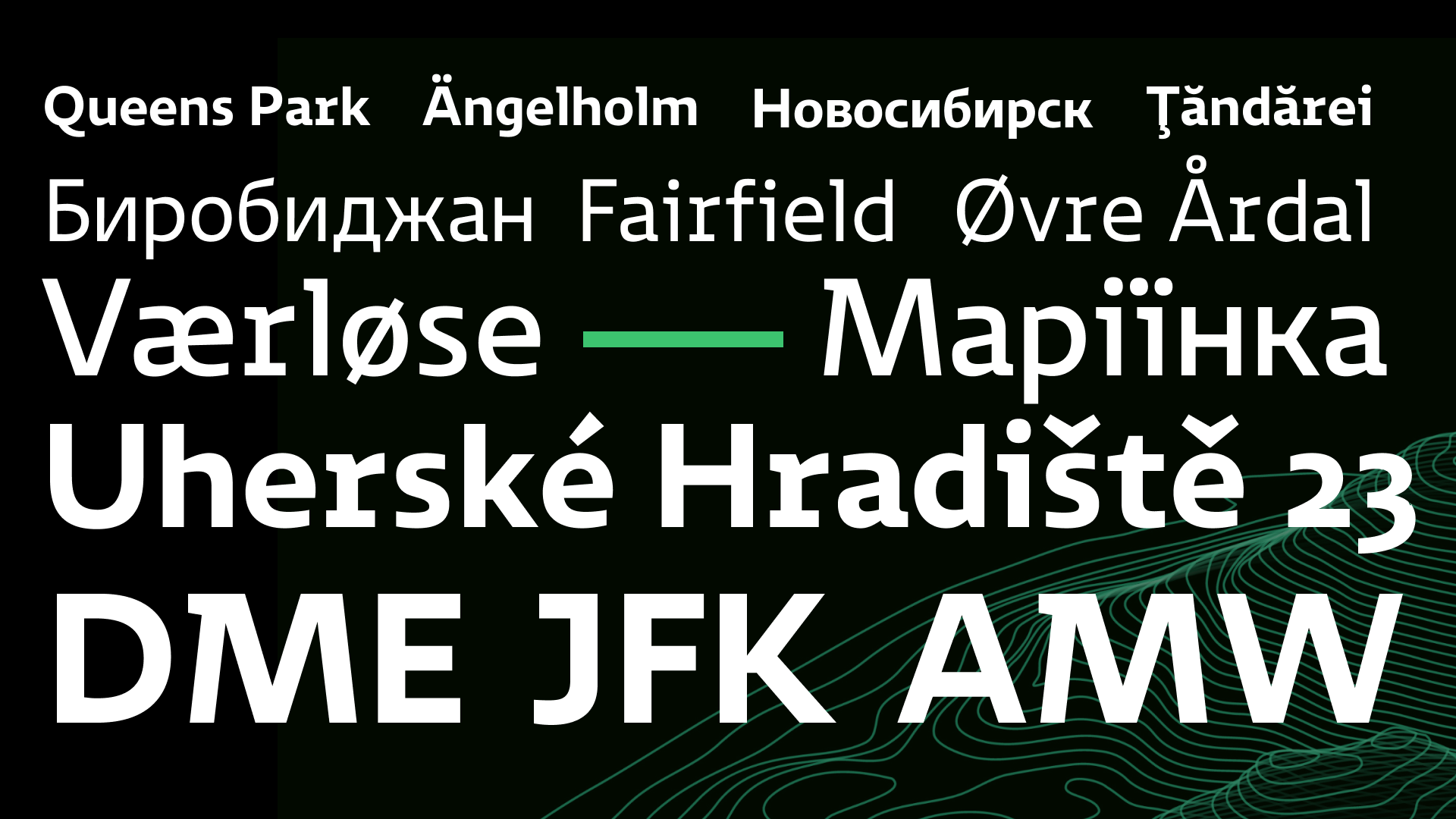
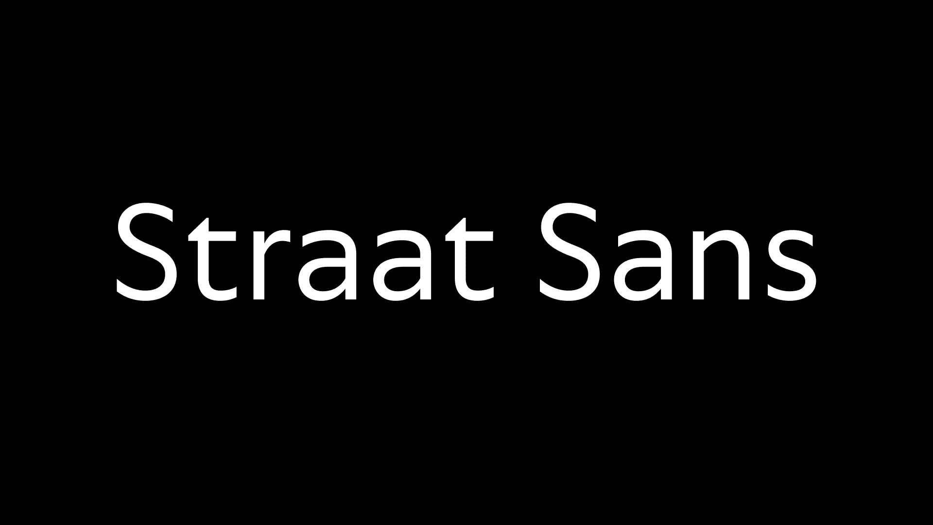
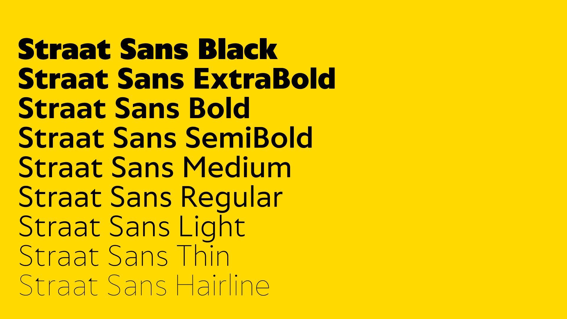
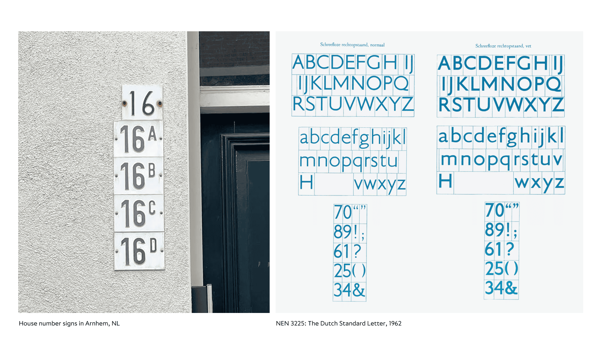
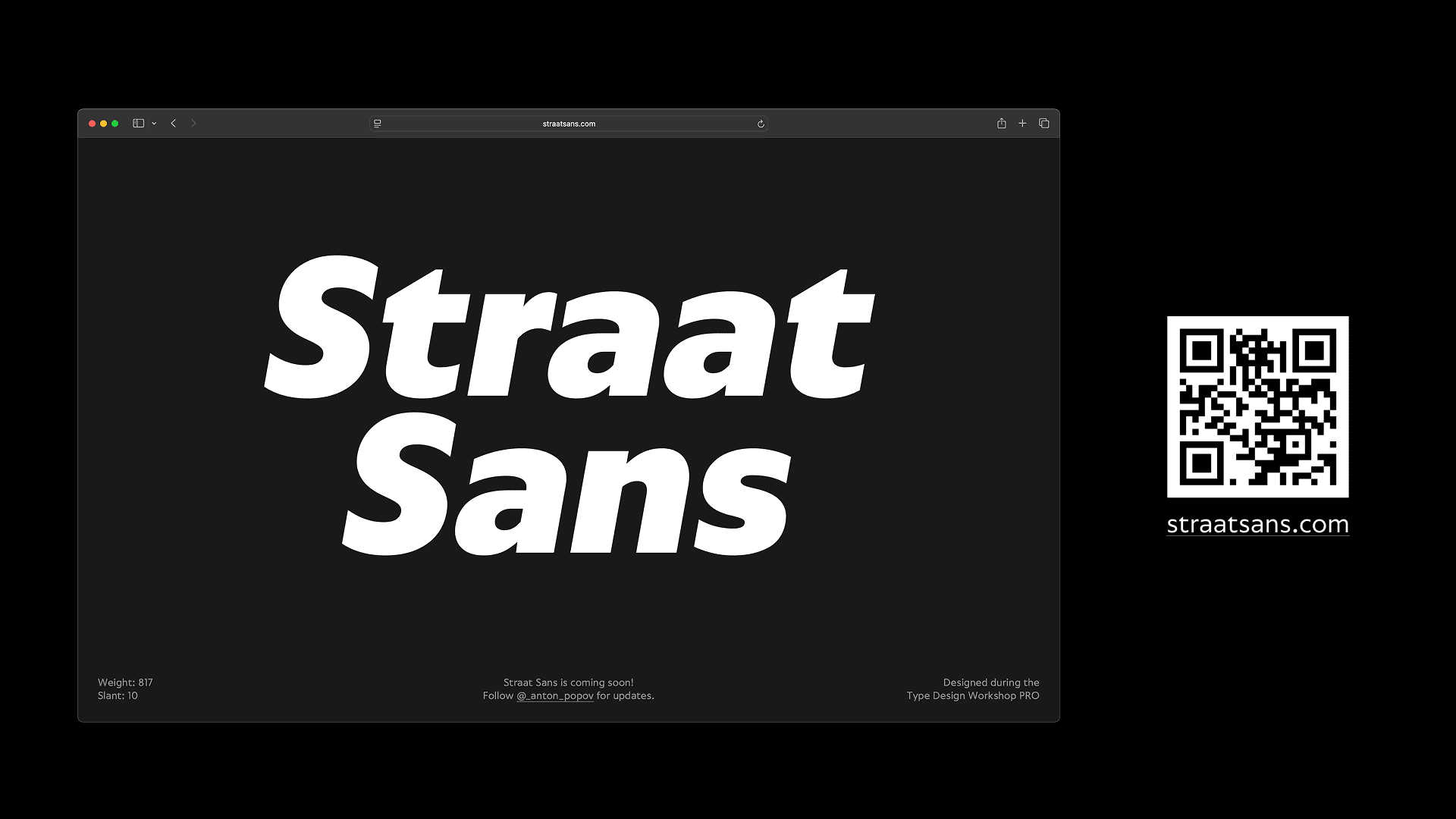
Straat Sans is a humanist sans-serif, shaped by close observation of the typographic landscape in the Netherlands and inspired by the classical work of Johnston and Frutiger. Its Regular weight is based on the Dutch typographic standard NEN 3225.
The typeface was designed as a variable system with clear logic and a broad range of weights. From the beginning, I imagined it typesetting a large catalogue or encyclopedia—neutral, composed, designed to serve the text.
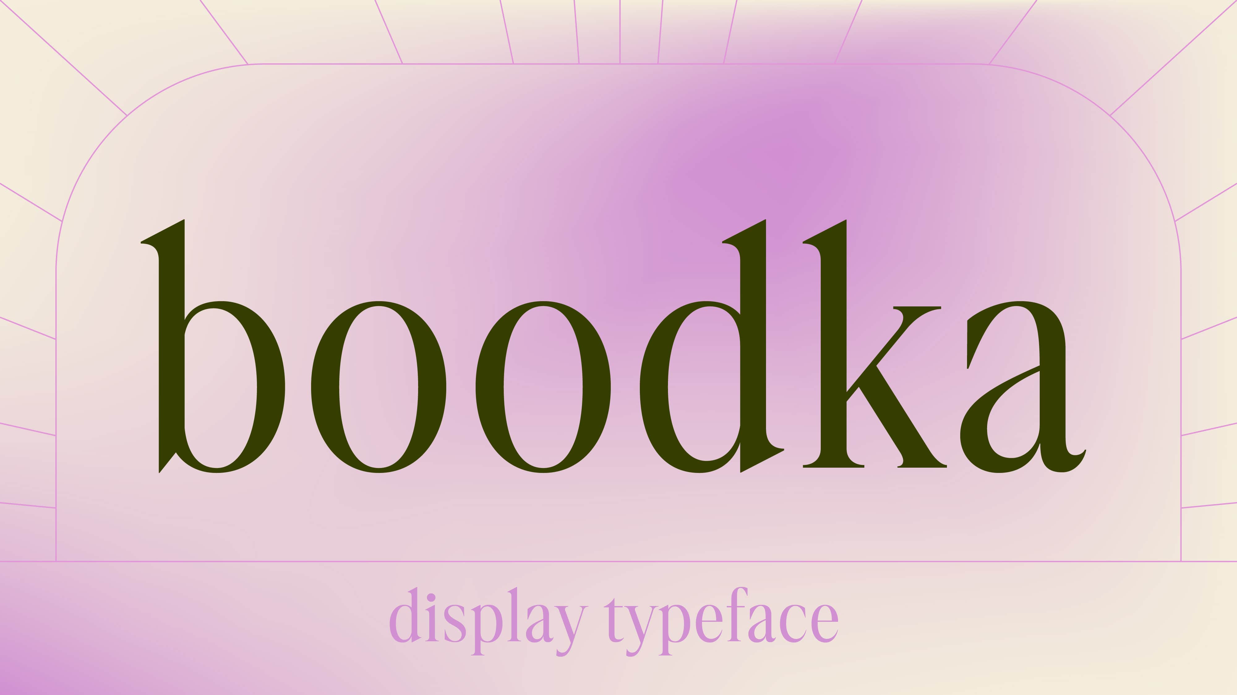
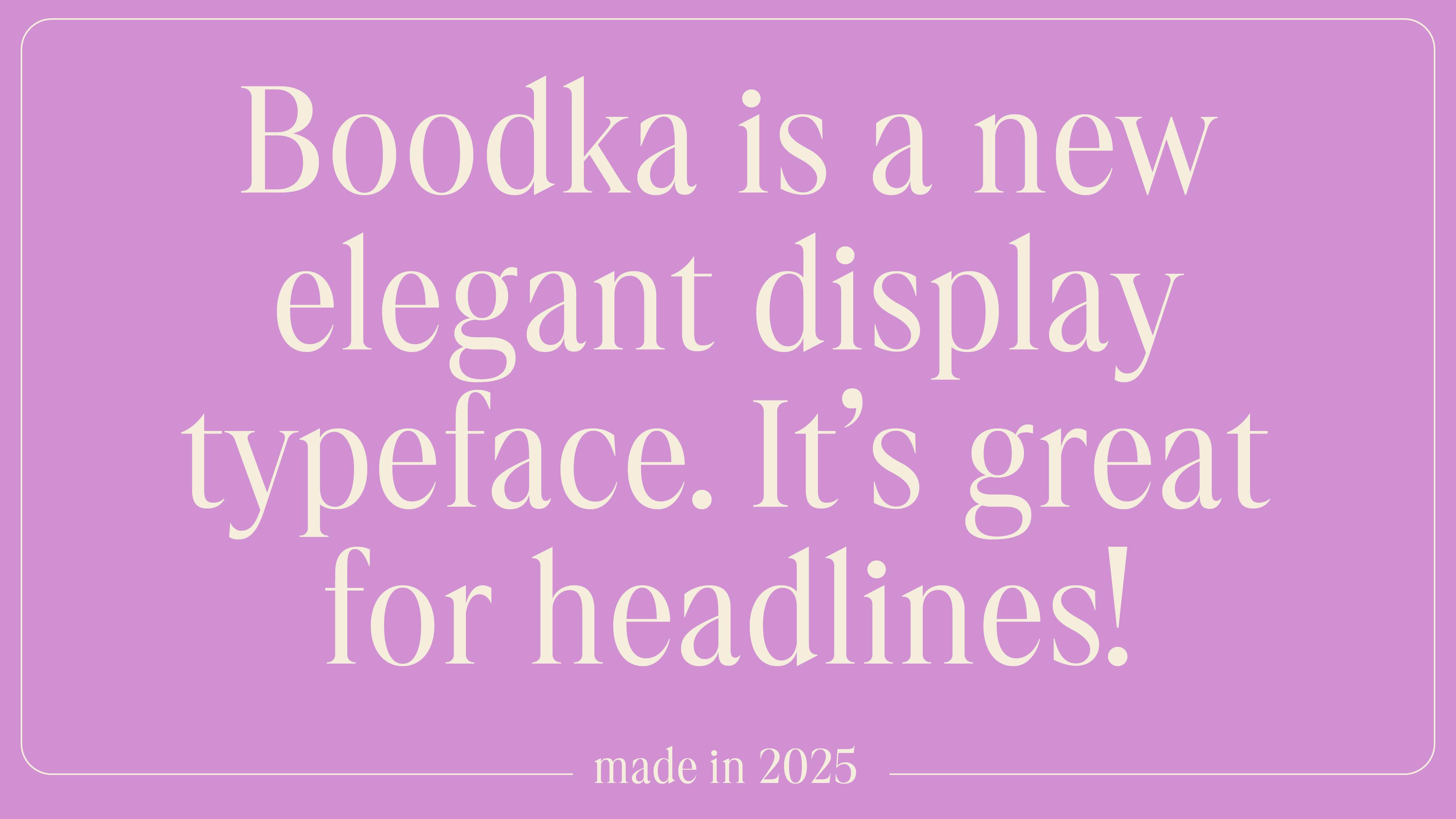
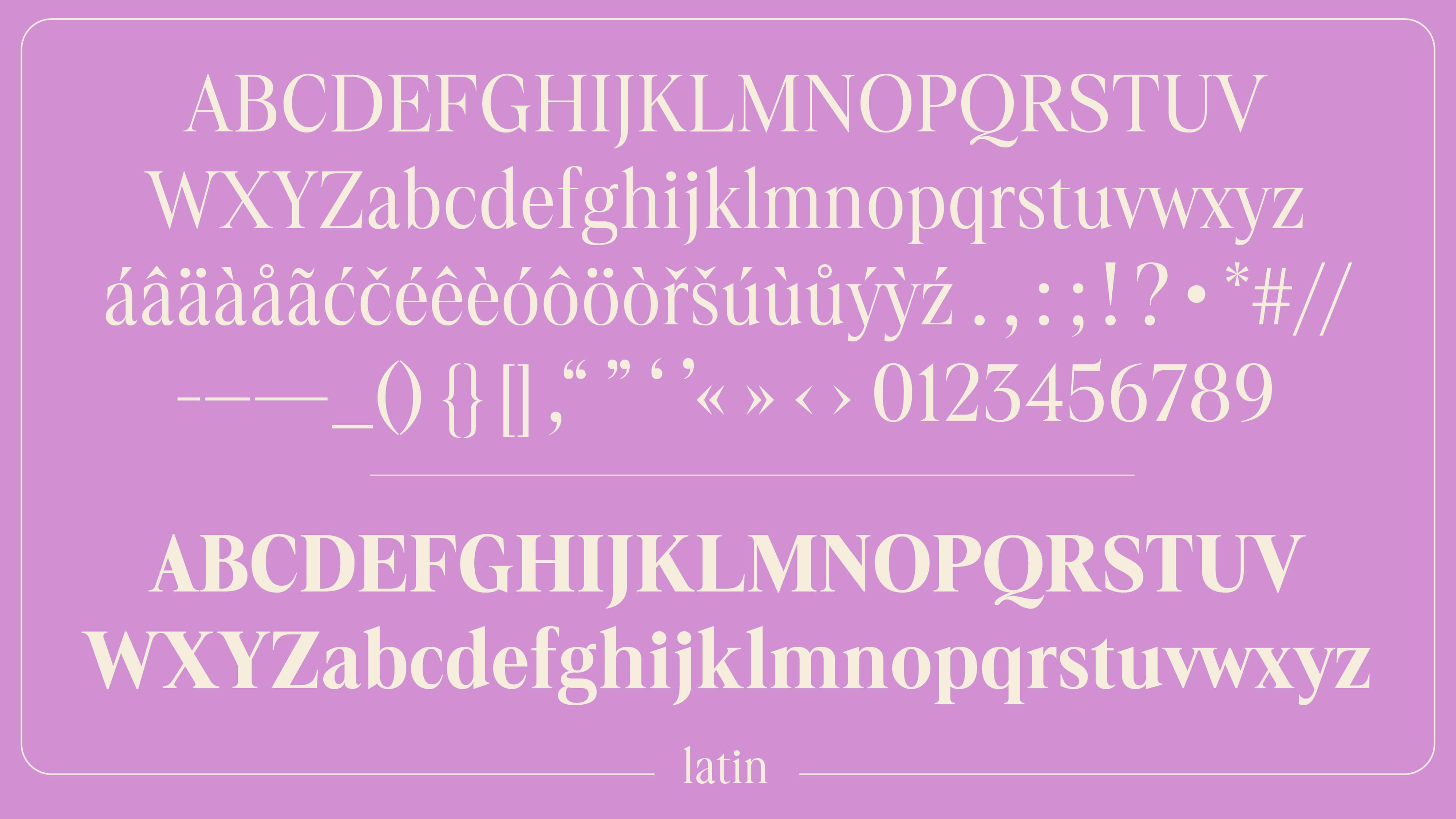
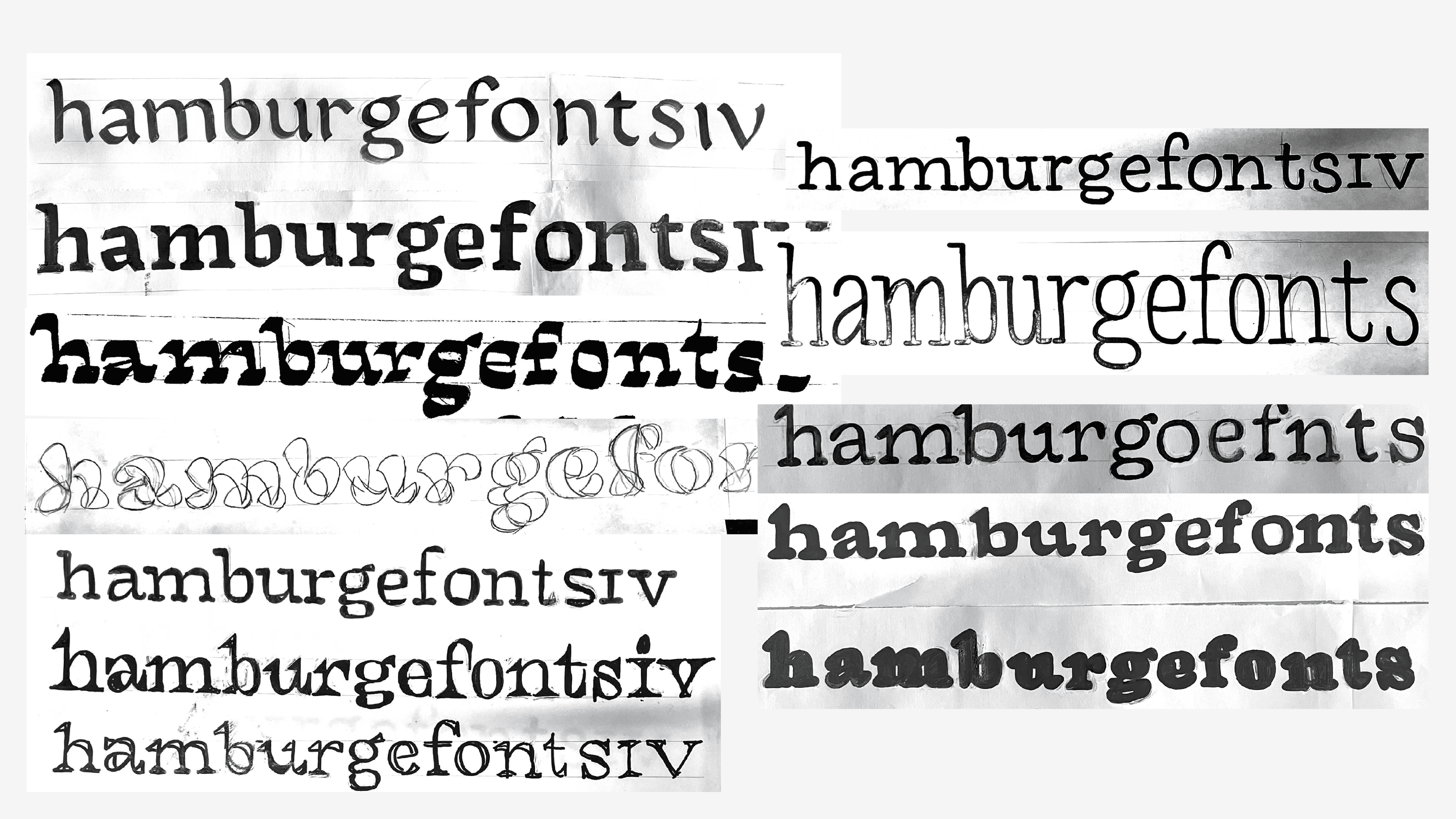
Boodka is a display typeface inspired by John Baskerville’s transitional serif designs and Fenic by Aldo Novarese. The initial concept was developed during a summer 2 week course of Type Design Workshop, and later refined during TDW Pro.
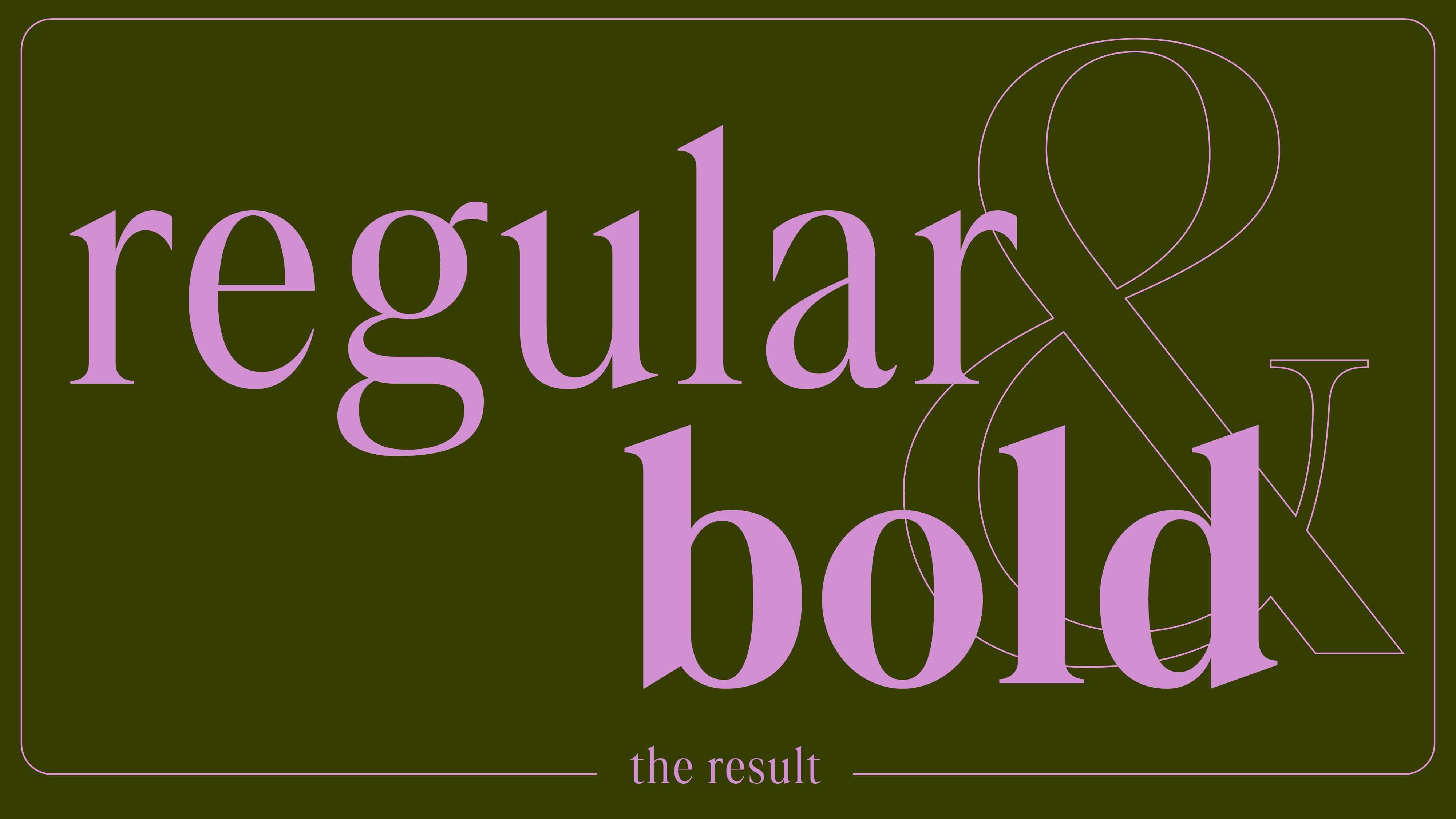
Over the course of seven months, I enhanced the Regular weight and added a Bold version. With its narrow proportions and high contrast, Boodka is well-suited for headlines and short large-format texts. It would also be a great tool for branding.