Type Design Workshop / 2024
The theme of the 2024 Summer Typeface Workshop is “Journey”. We asked our instructors to share photos of interesting signs from around the world and compile a list of potentially interesting applications.
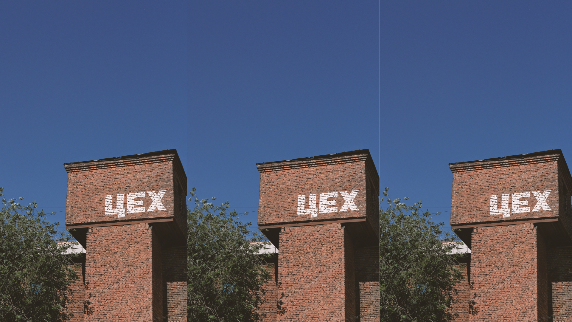
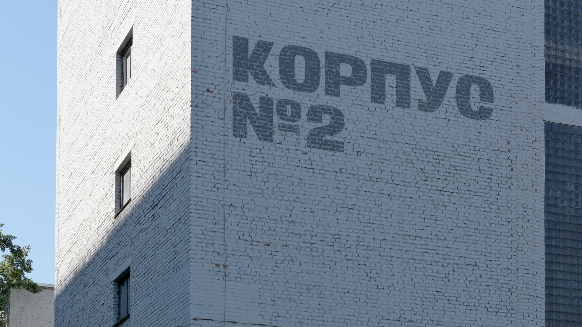
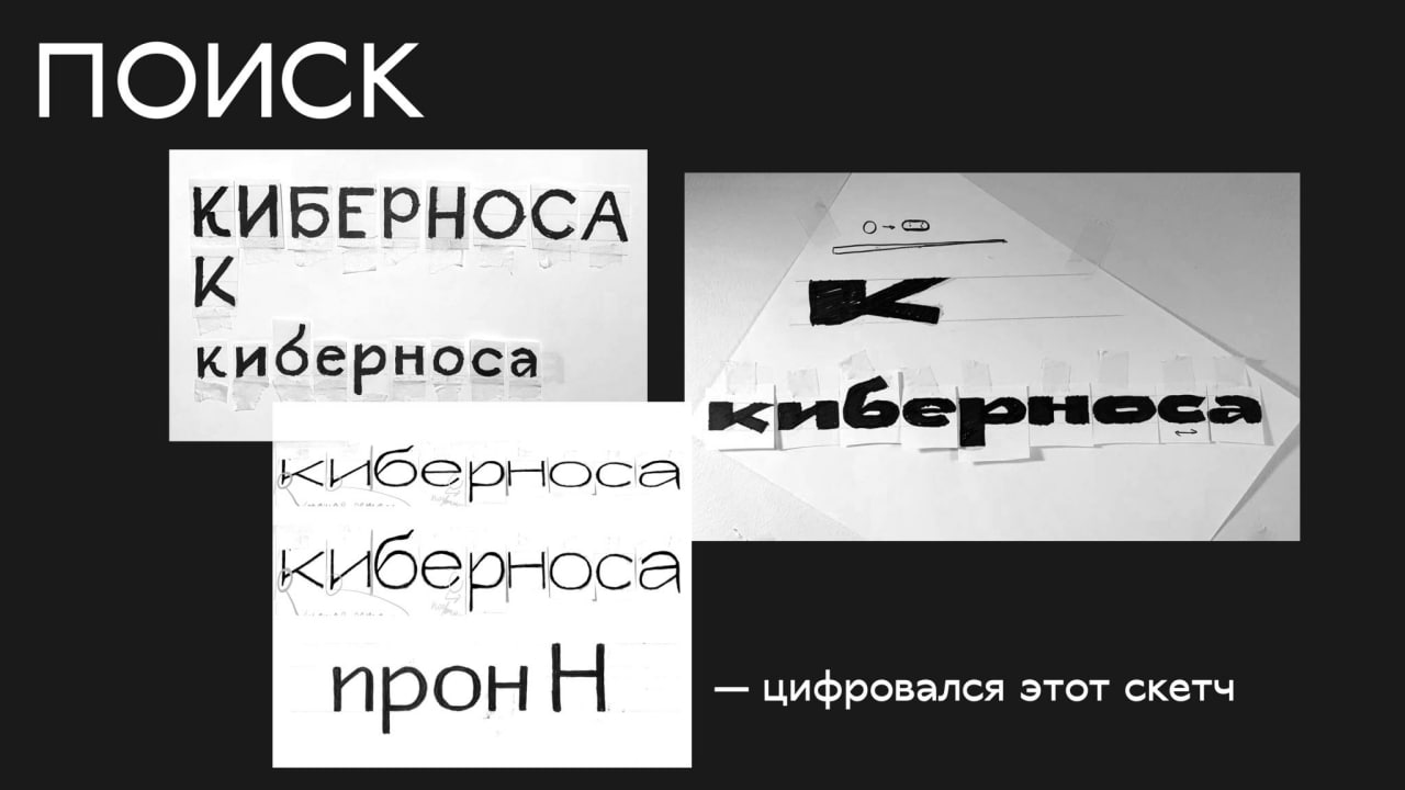
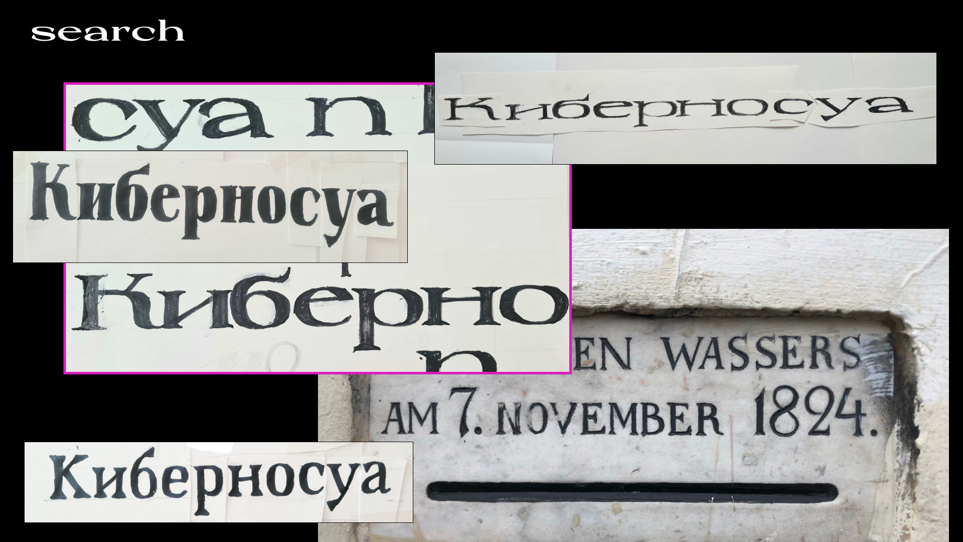
One photo and one location were randomly assigned to each student, setting the direction for their typeface projects.
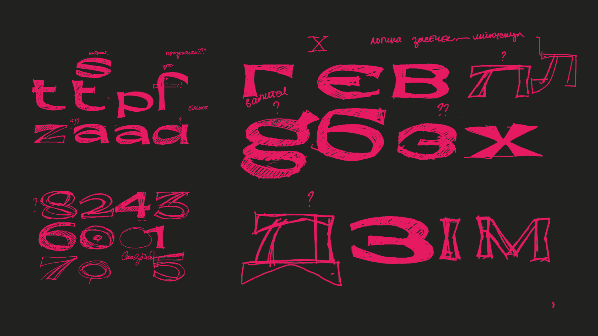
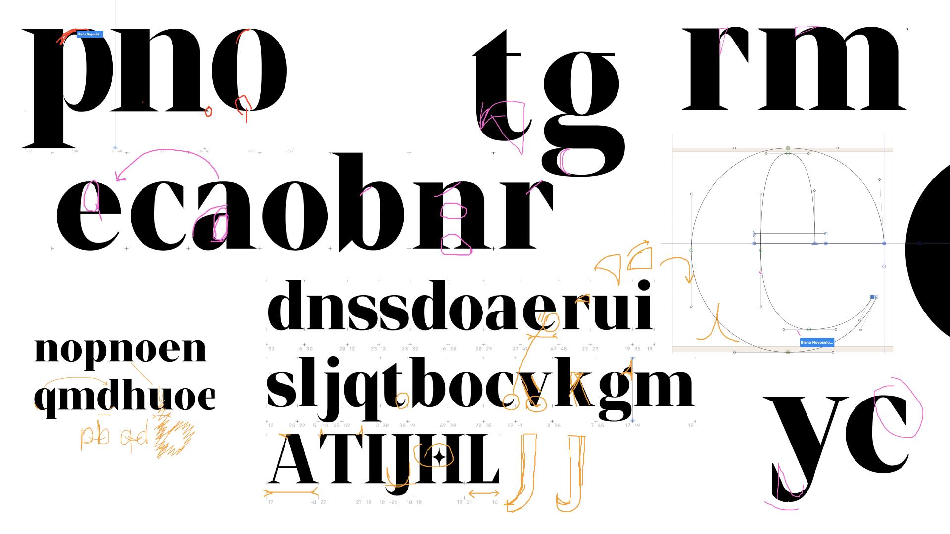
The students' task was to figure out how to connect these references and applications, select the most characteristic features in the inscription, and begin searching for the proportions and image of their first typeface. Each solved this puzzle in their own way.
As always, we are amazed by our students who manage to do everything in two weeks—get acquainted with the tools, hand-draw letters, and create a typeface in a font editor within just five days.
Guest Lecturer: Olga Kovalenko discussed lettering and her approach to working with it.
I’ve heard many times that the Workshop by Contrasts is capable of boosting skills and opening up new opportunities. Only after going through it you truly realize its significance. Two incredibly intense weeks opened my third eye and, most importantly, removed any fear of working with letters (and even any micro-graphics).
The last days of the seminar were so intense that at first glance, all my work seemed too rough and worthless. But now, looking back, I think: “Wow! I actually made a font! By myself! And in just two weeks!”
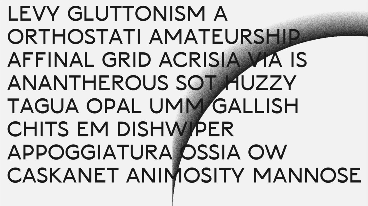
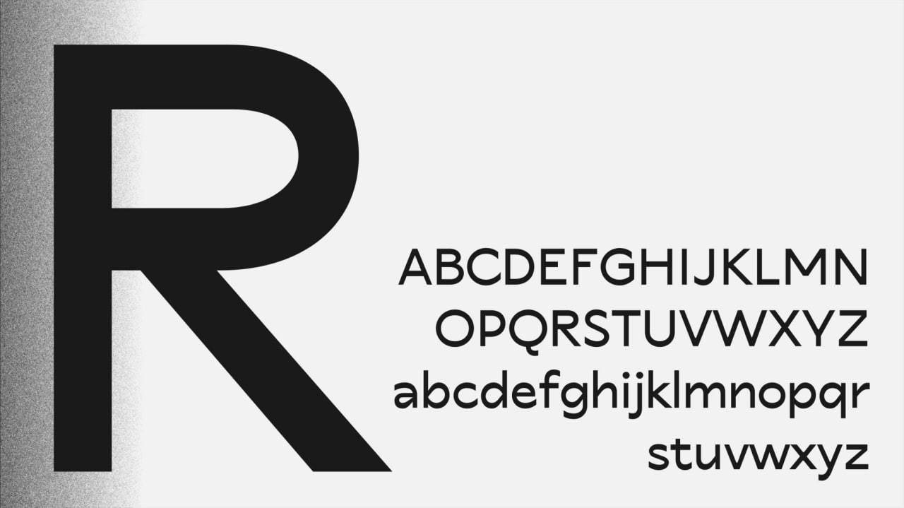
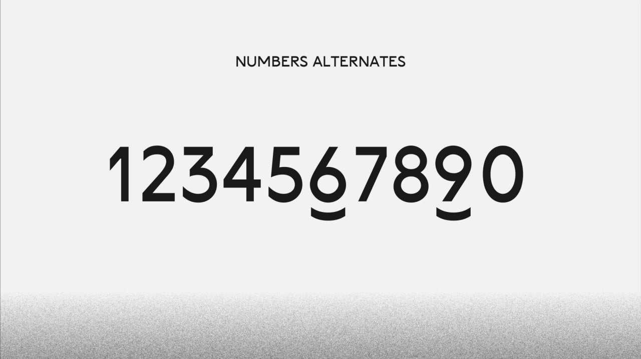
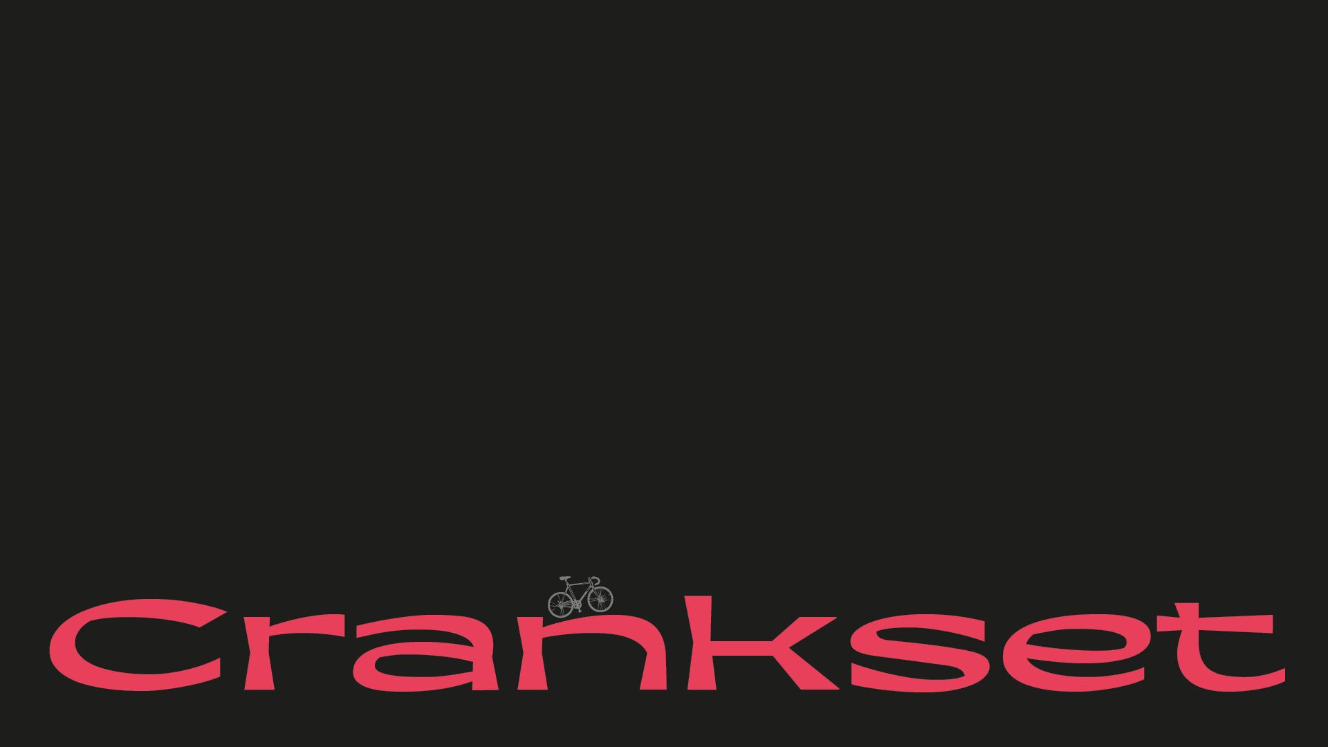
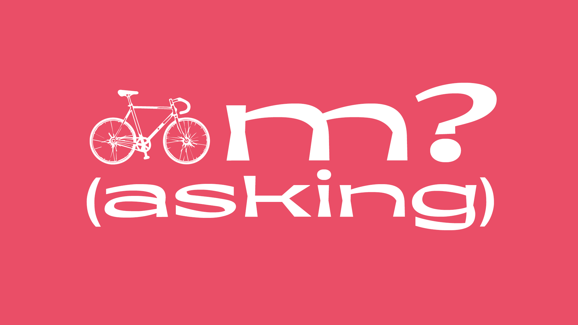
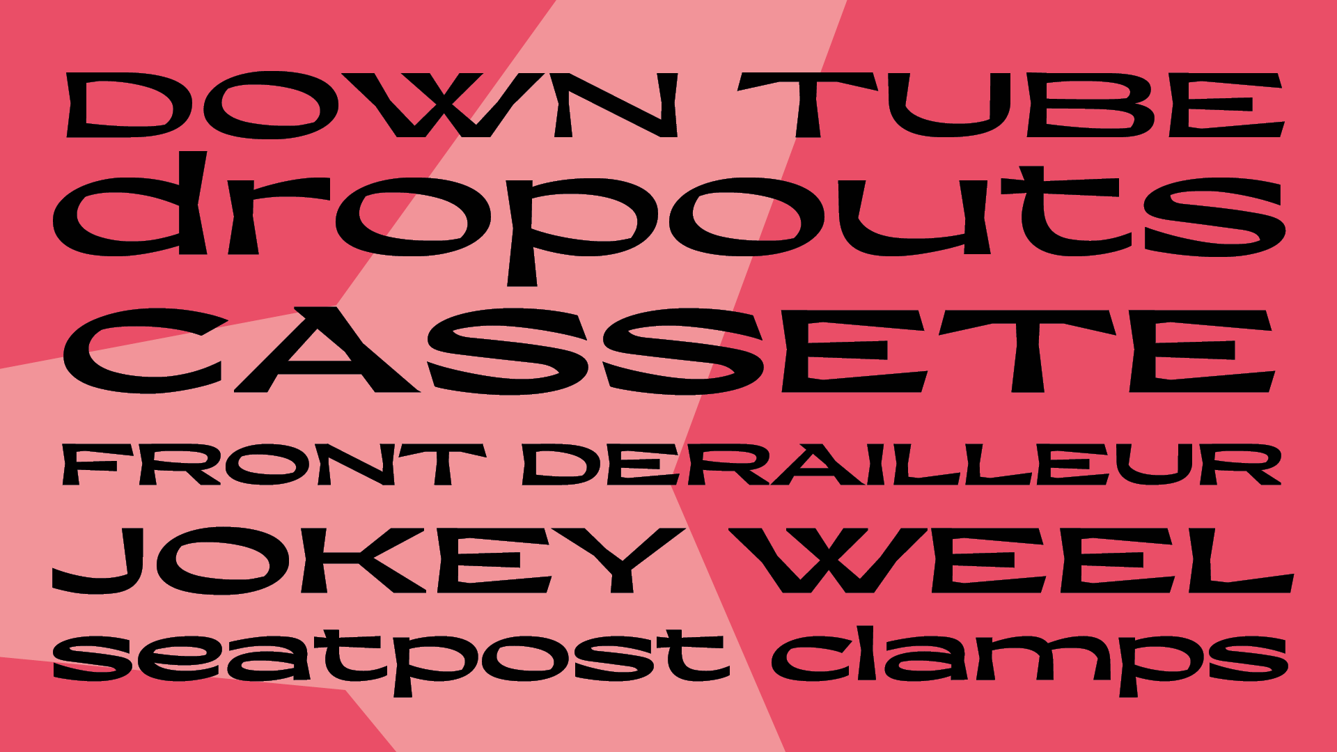
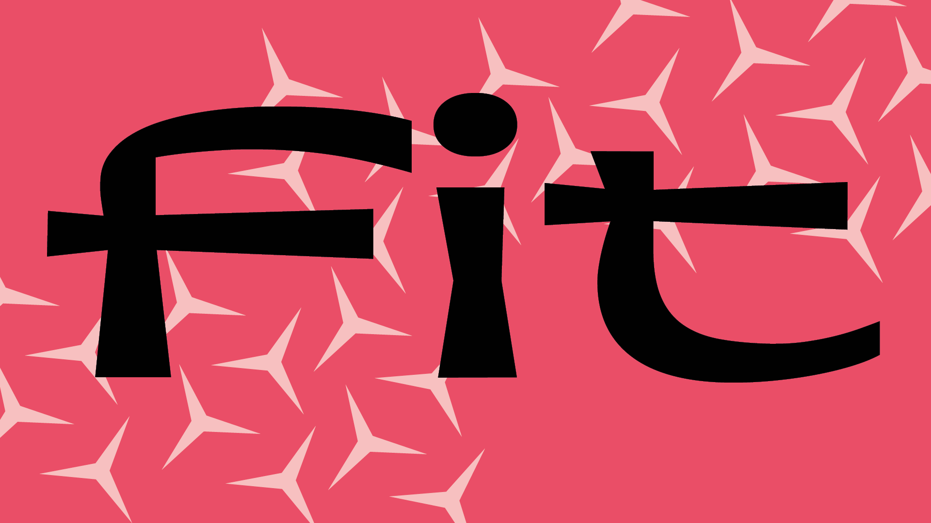
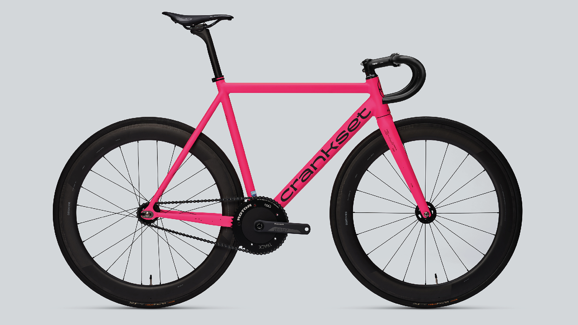
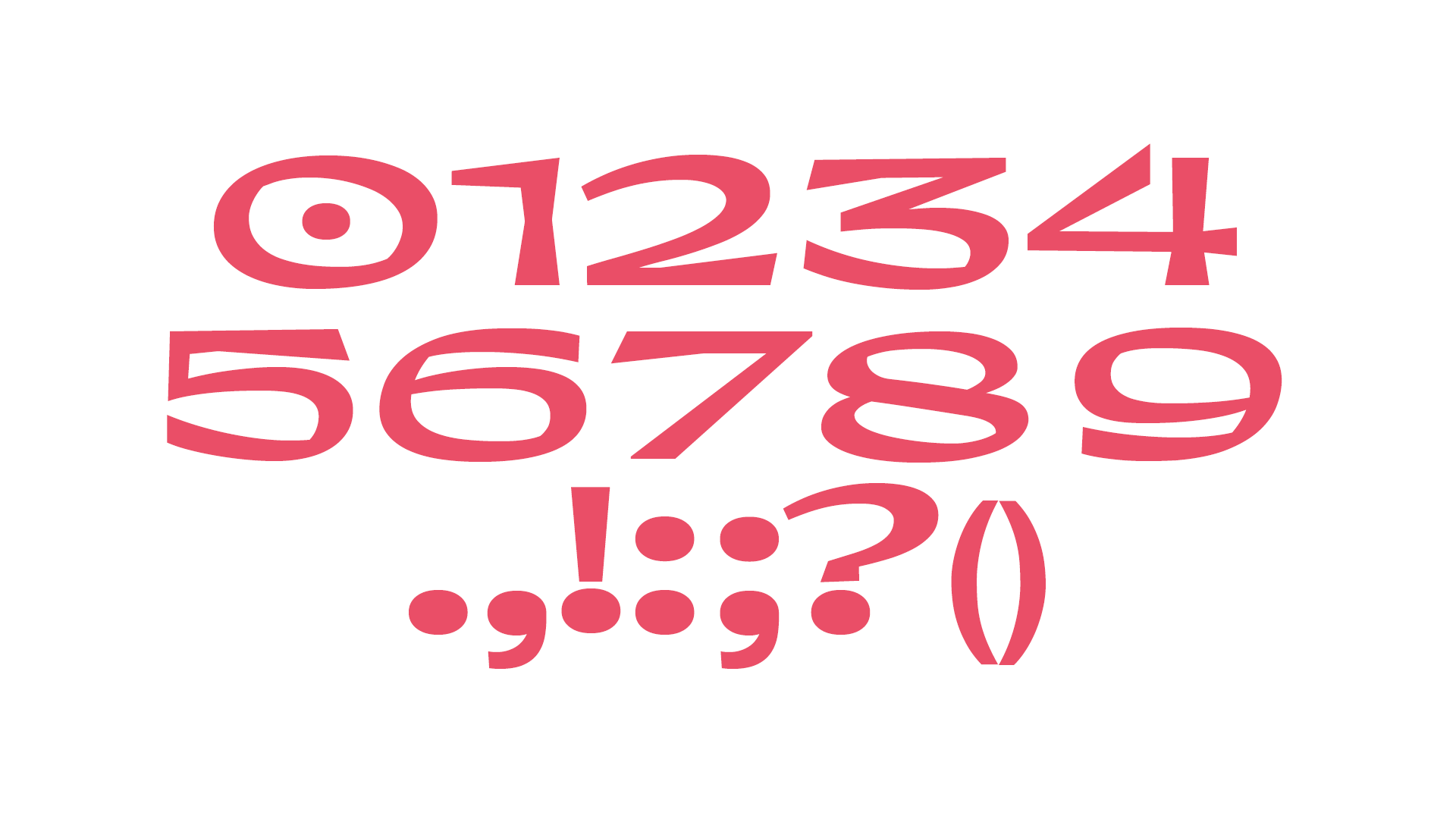
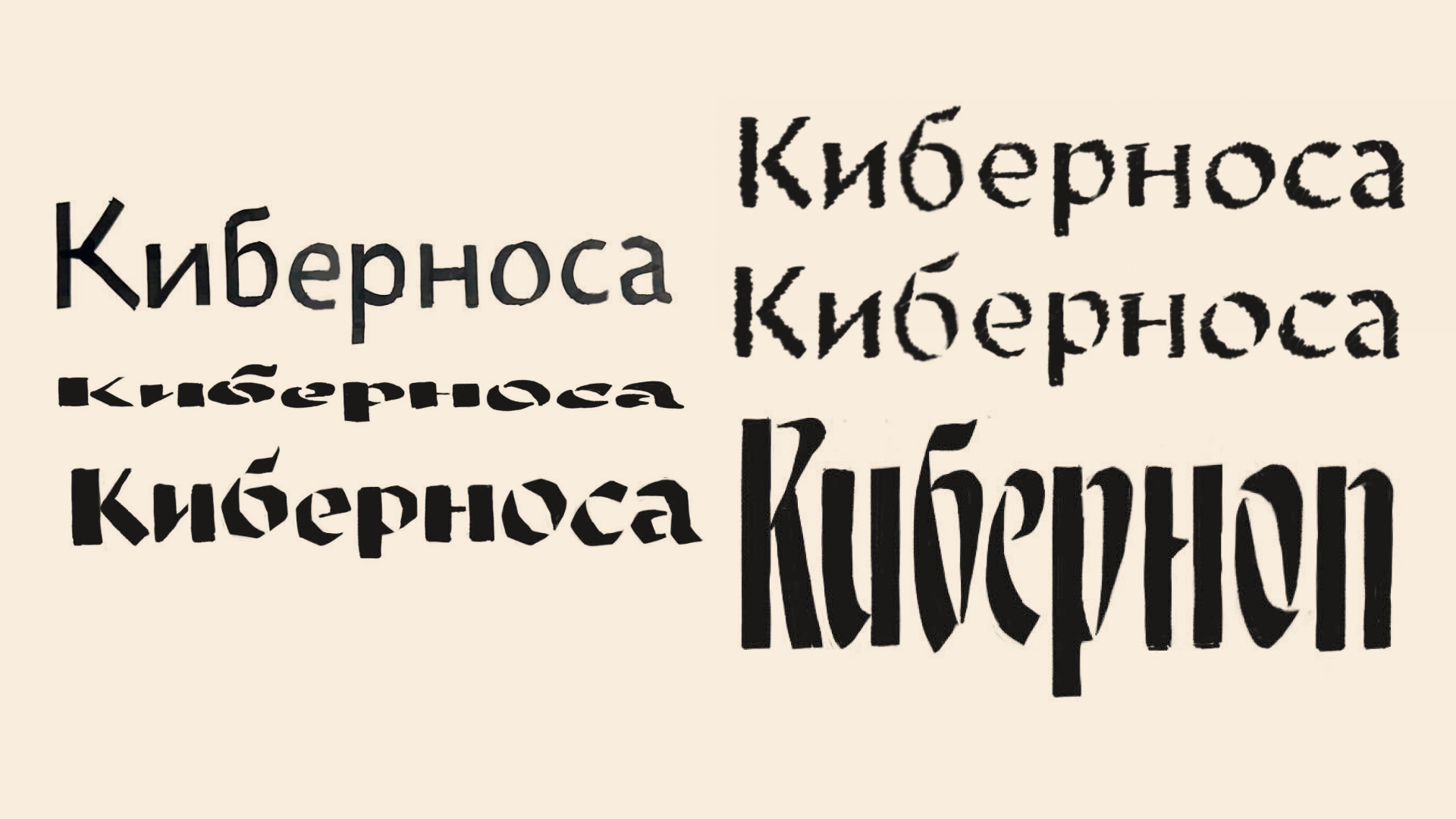
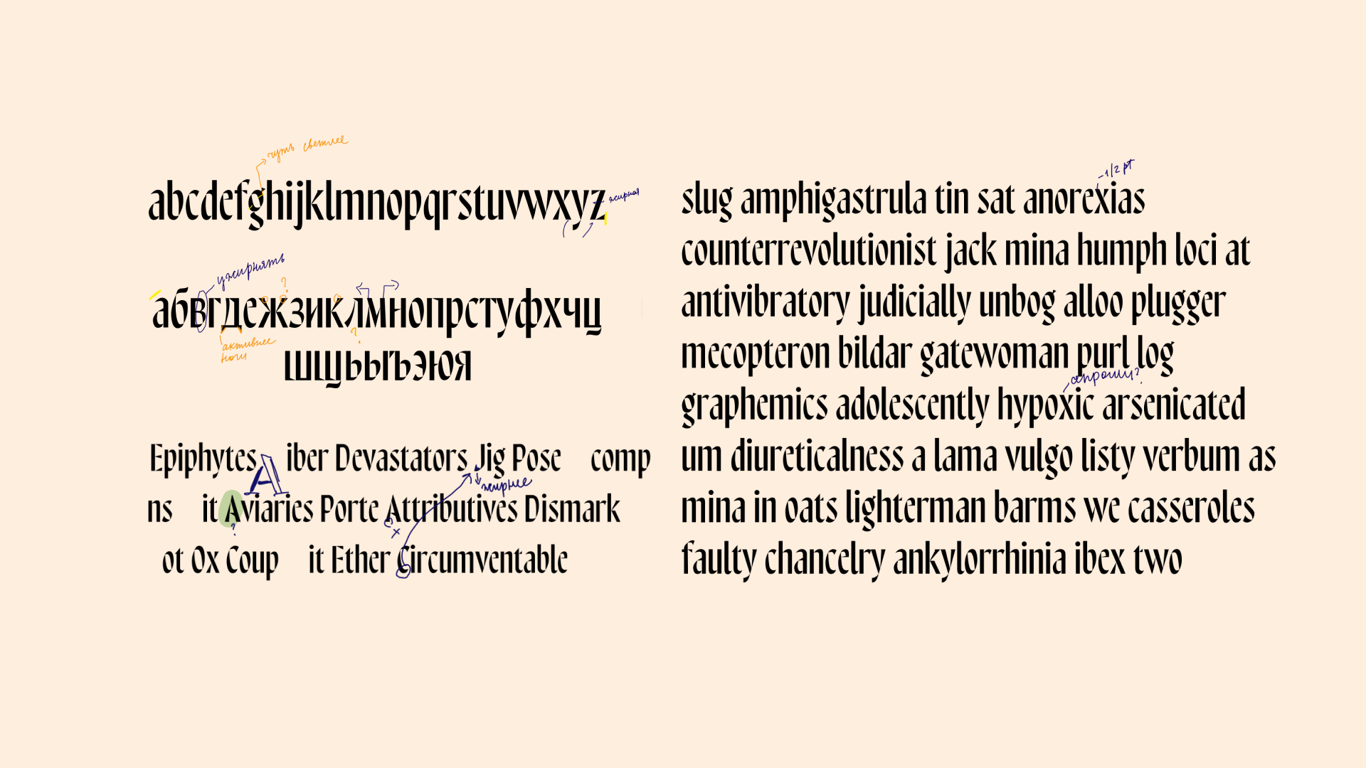
Crankset—inspired by bicycle aesthetics, this typeface combines the calligraphic foundation and plasticity of a serif typeface with the technicality of a grotesque. It features a dynamic character through slanted oval axes, breaks in form, stroke expansions, and wide proportions. The plasticity and contrast of the letters are based on the logic of a broad-nib tool, and the construction is based on Roman capitals and minuscule. Crankset looks equally good in lowercase and uppercase and has a full set of characters for Cyrillic and Latin alphabets. Future plans include expanding the character set and creating a variant with narrow and italic styles.
Emily Mikhaylenko
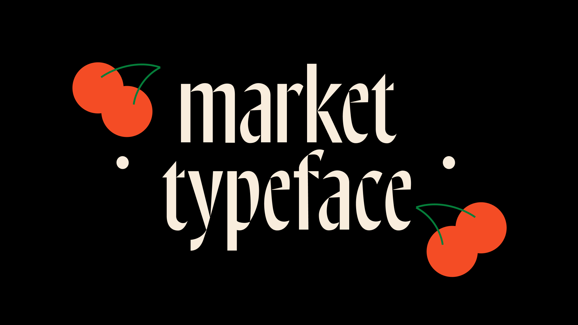
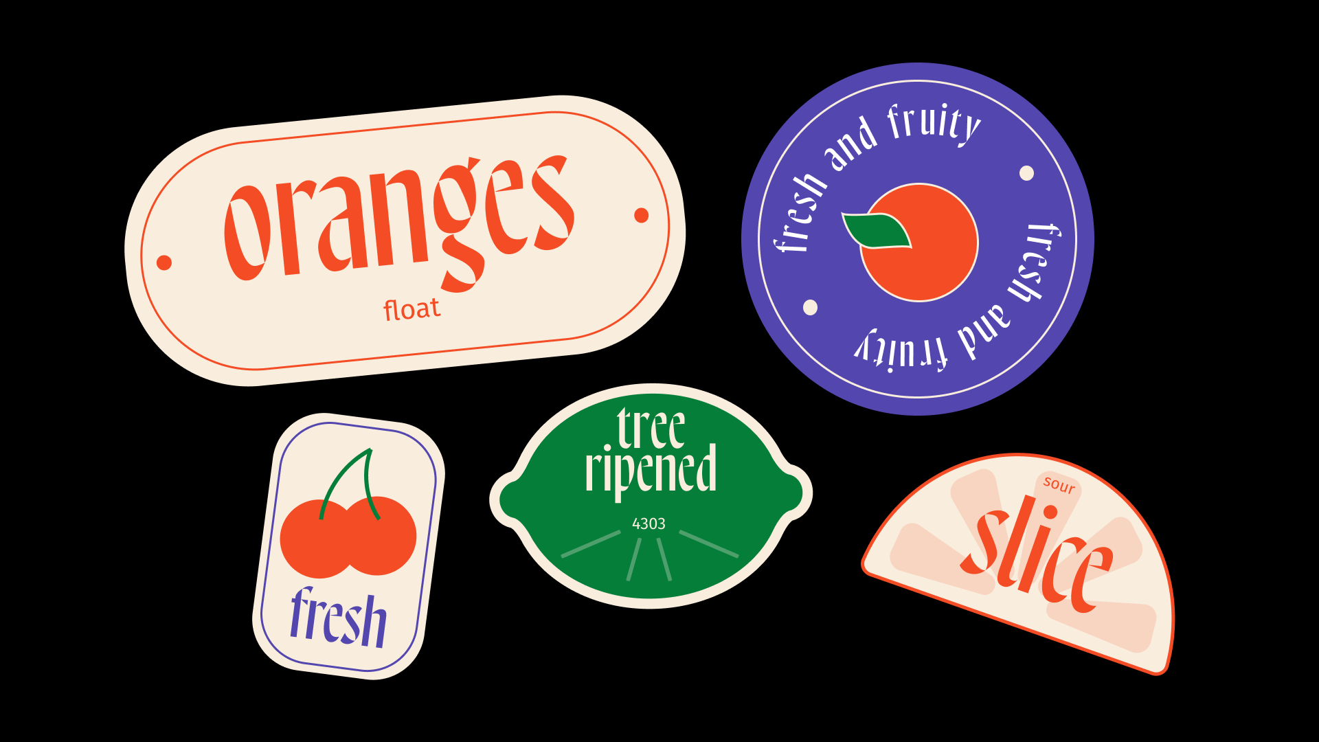
Application: market
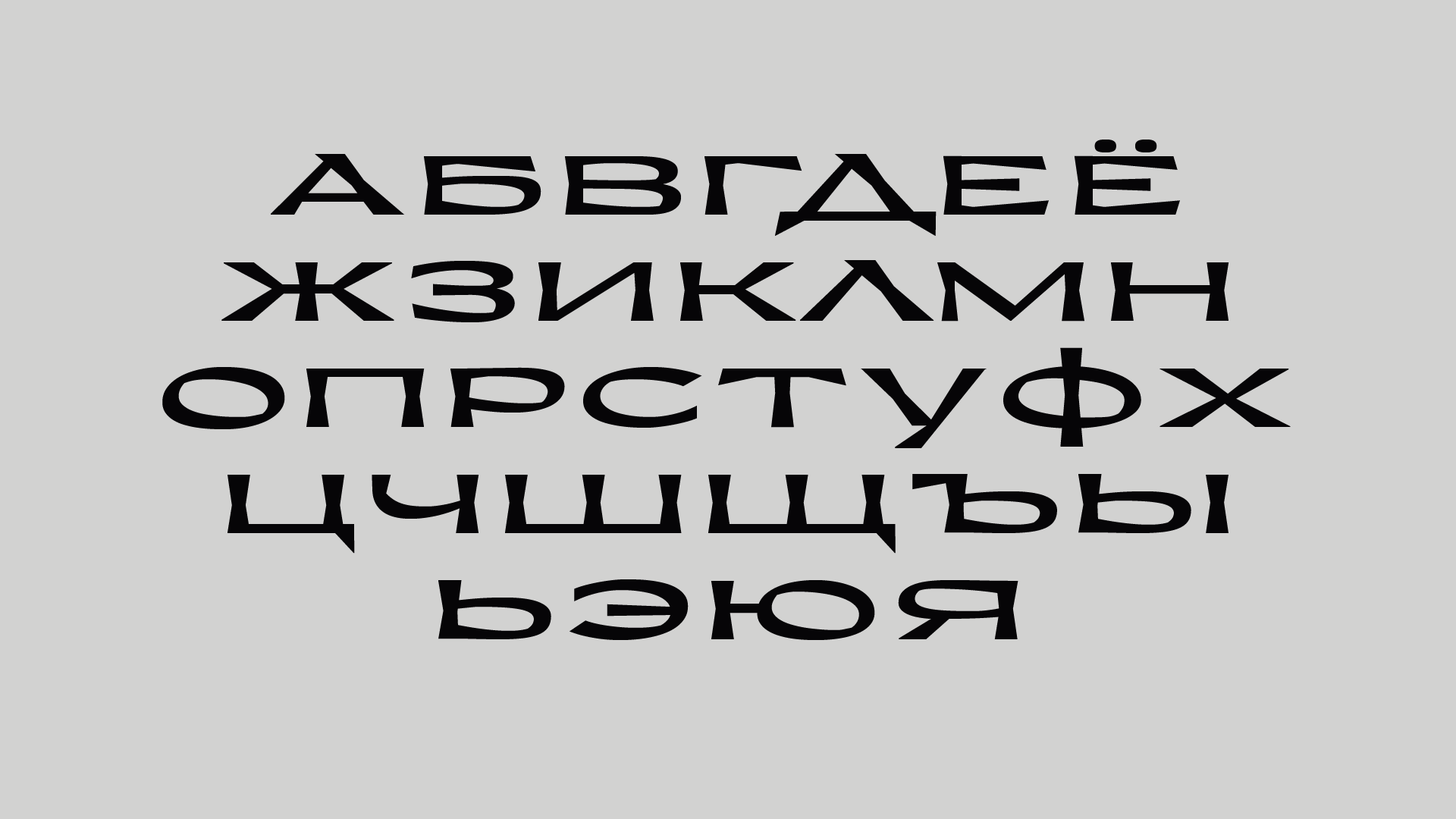
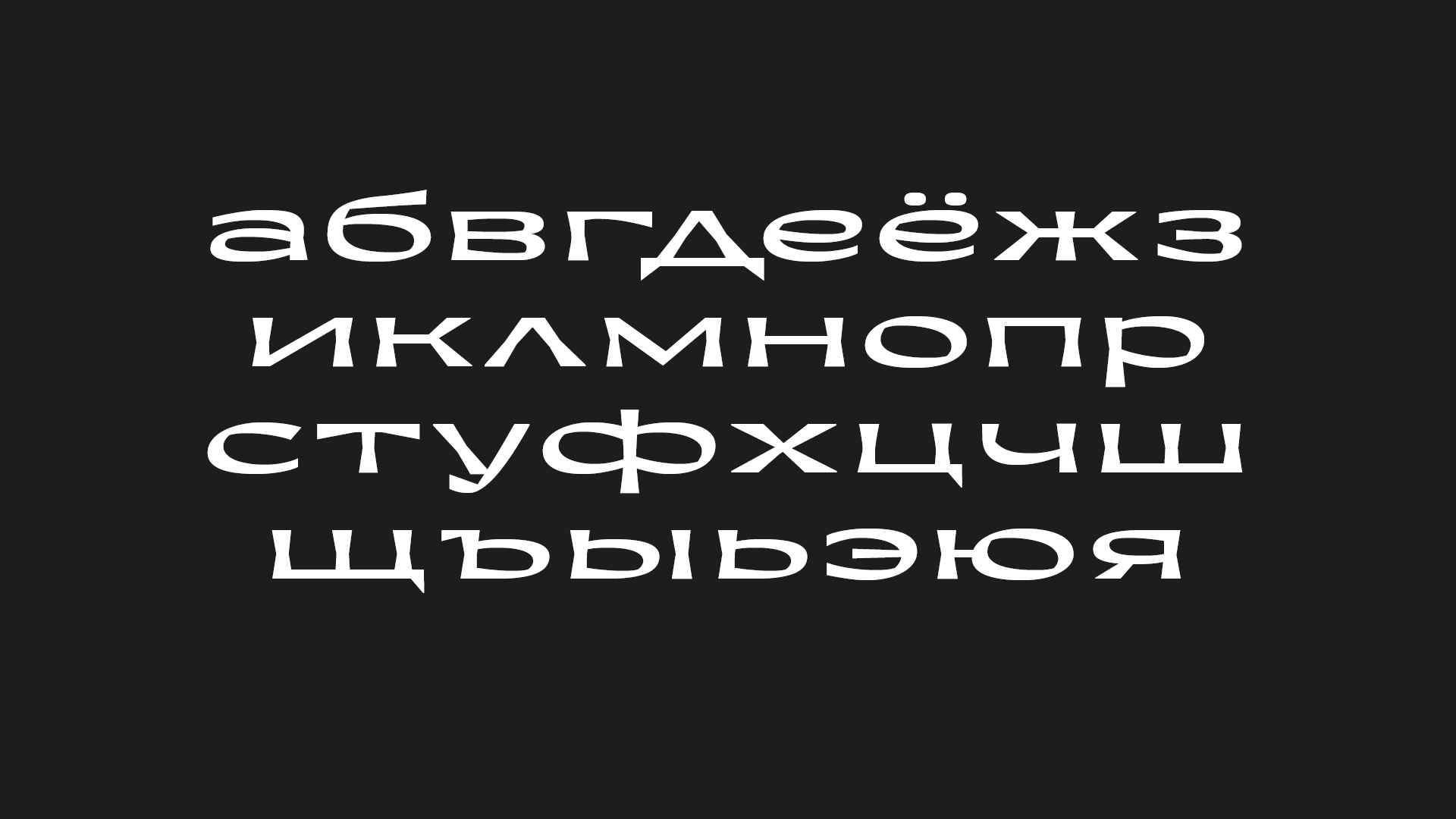
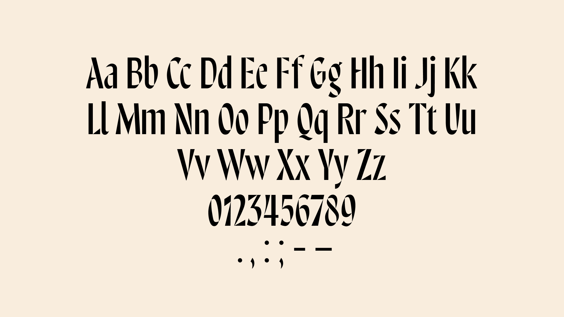
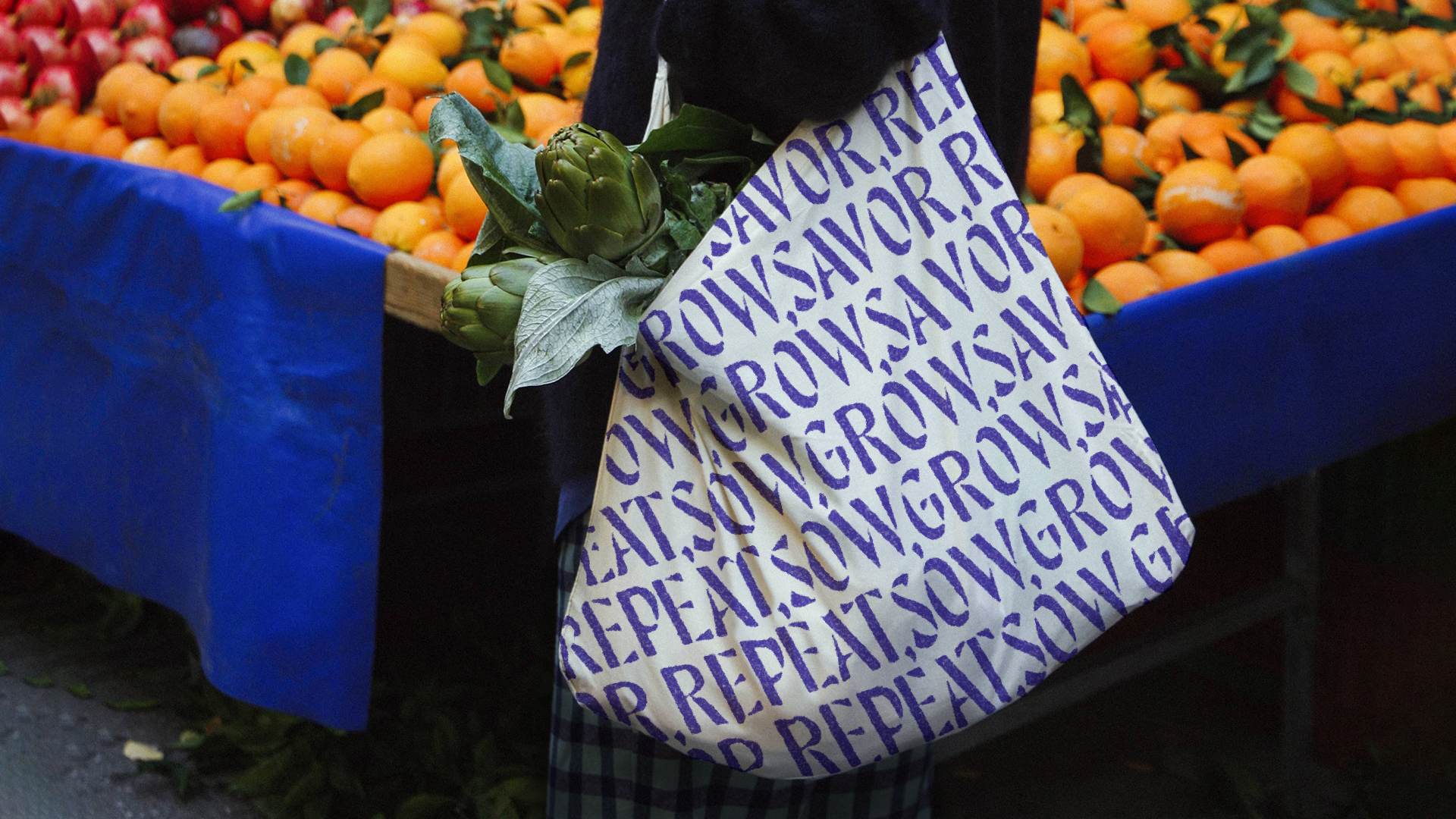
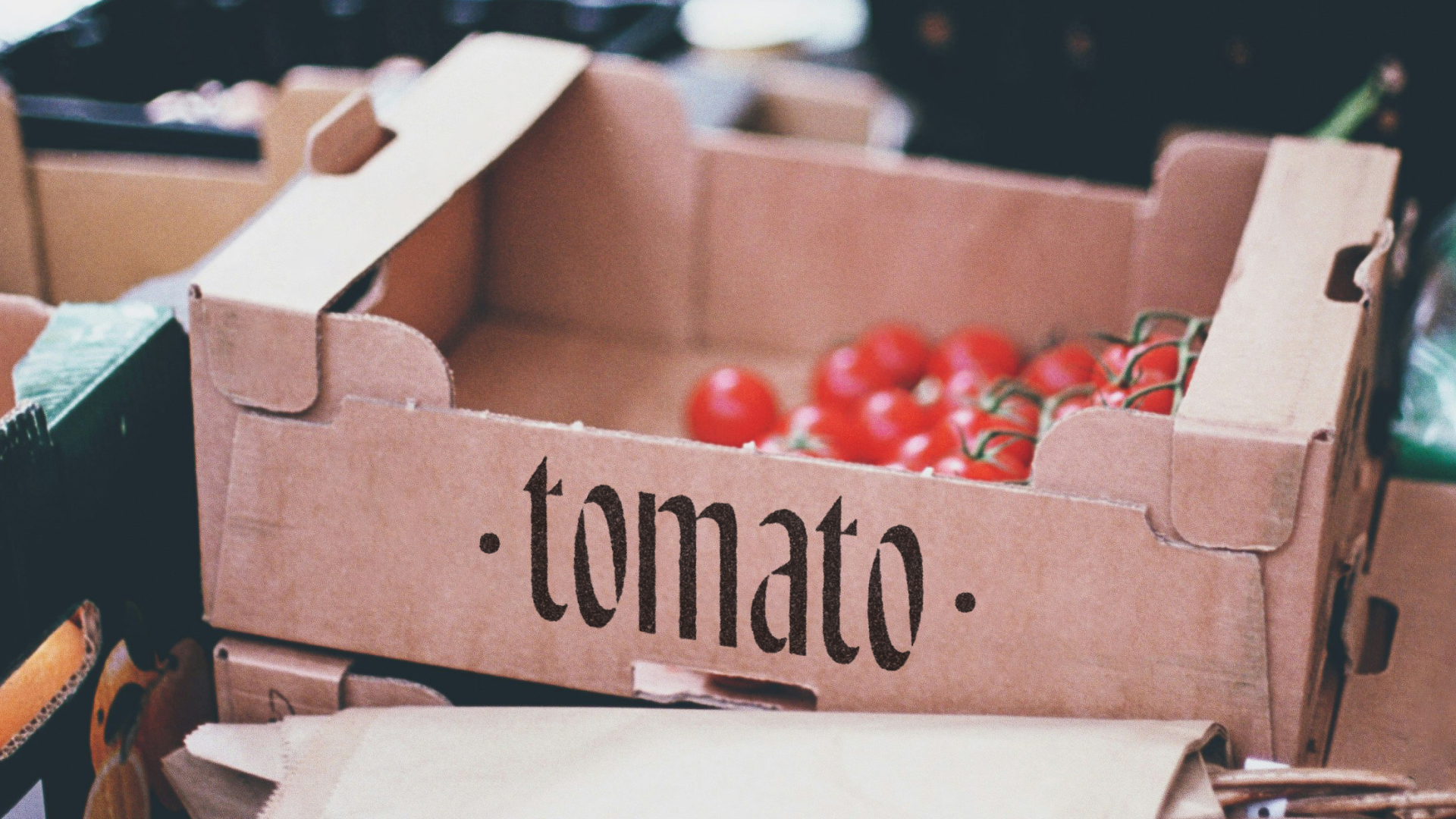
Market is a display typeface whose shape is based on the classical principles of broad nib writing. It replicates the logic of handwritten letters and is divided into component parts, necessary for writing each letter, turning the typeface into a stencil. The construction, inspired by the nib, creates a sense of craftsmanship. The stencil nature makes Market easily reproducible, making it ideal for signs and indicators.
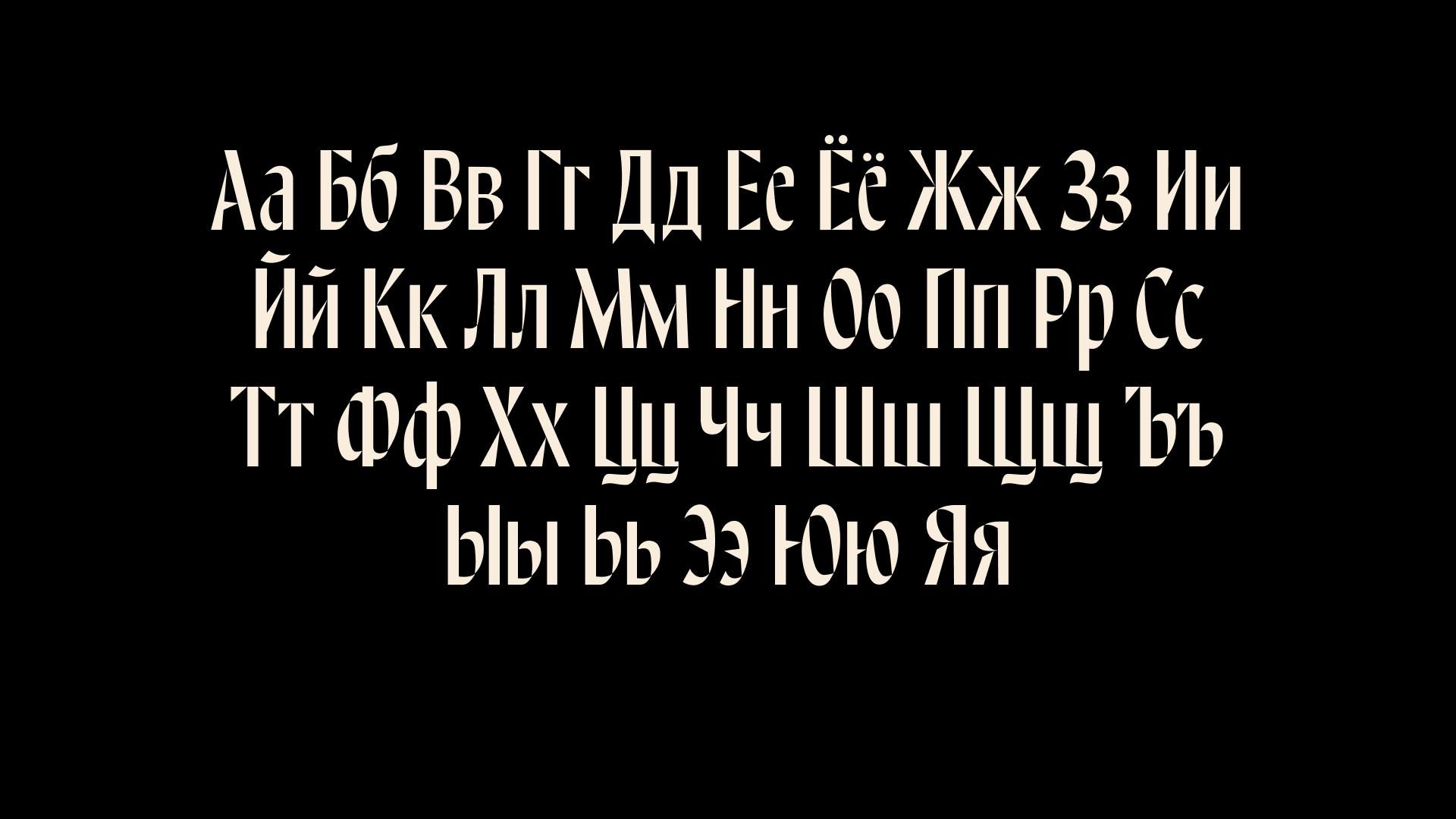
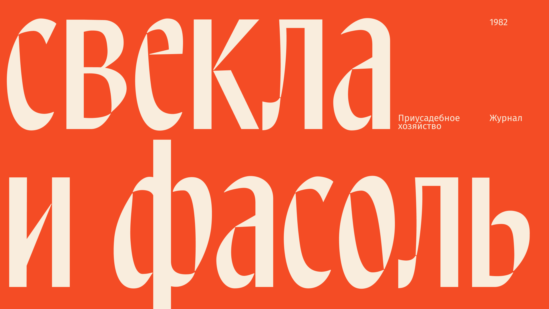
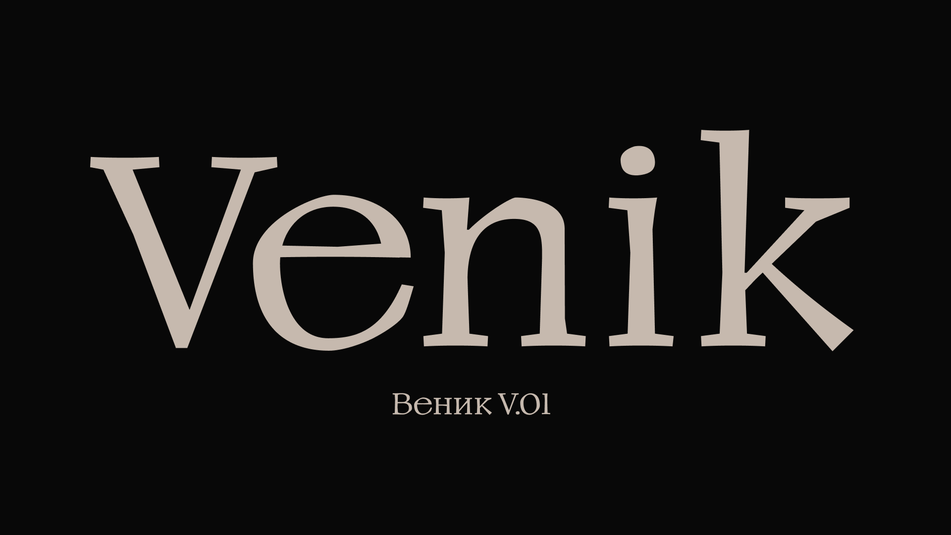
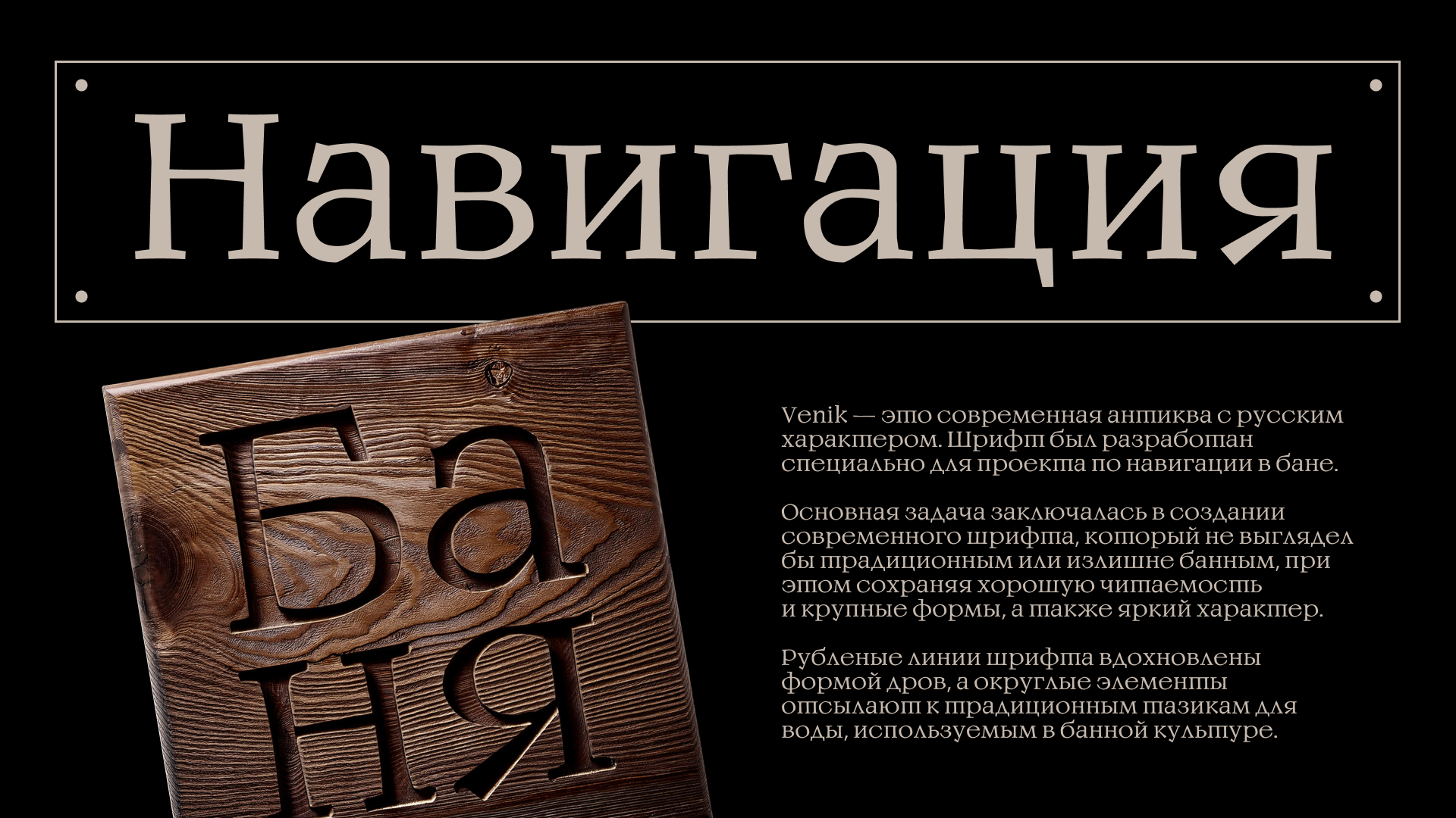
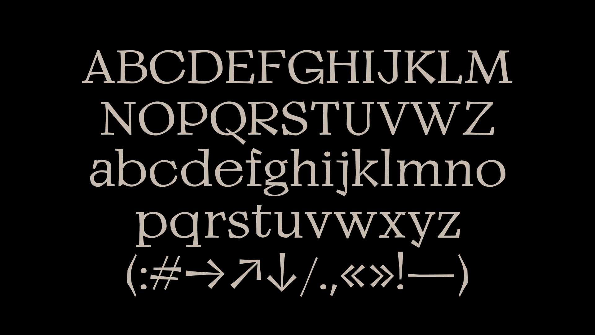
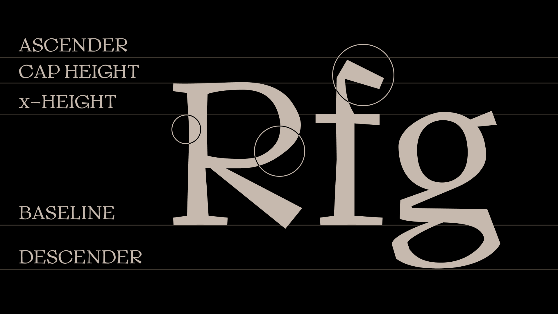
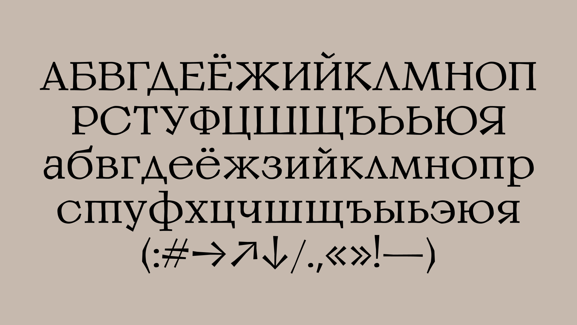
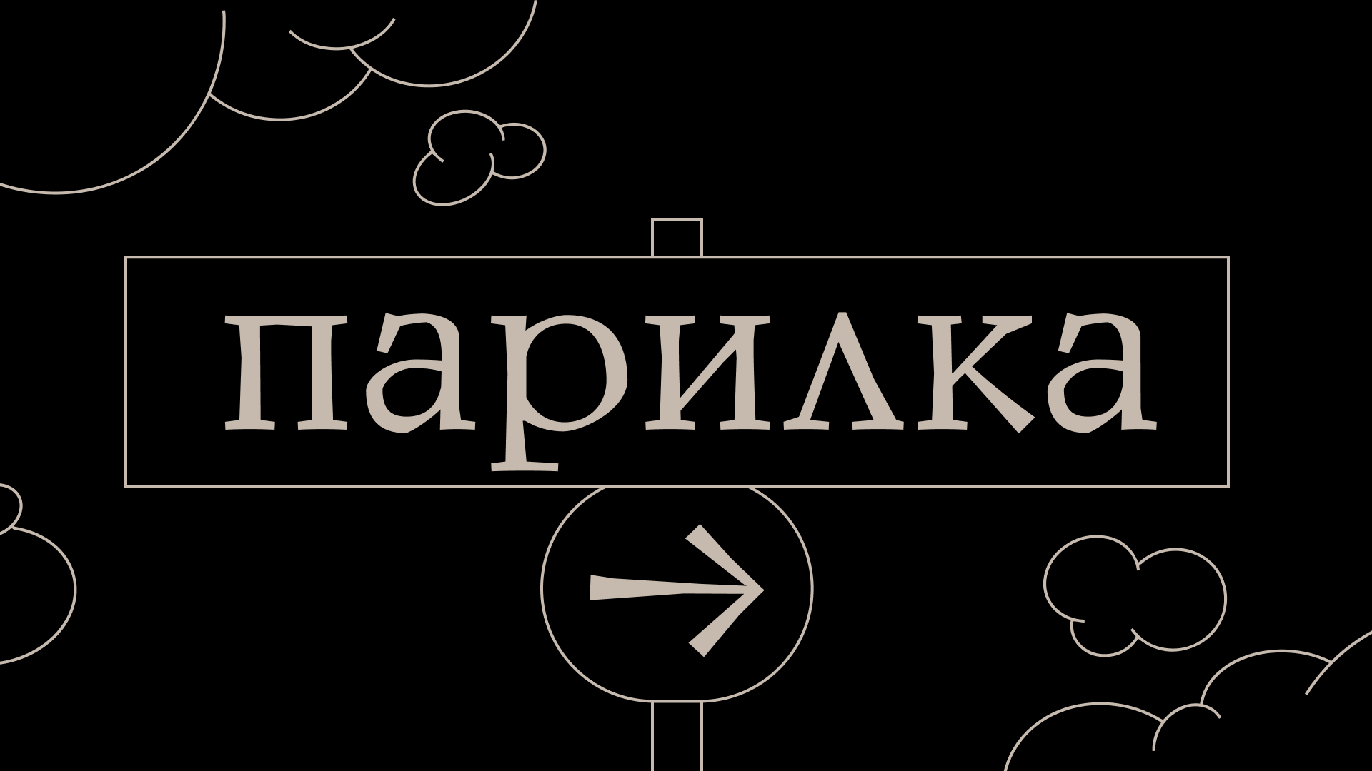
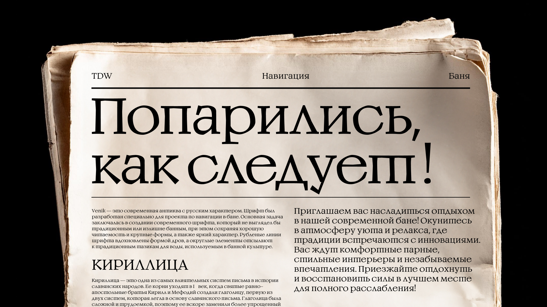
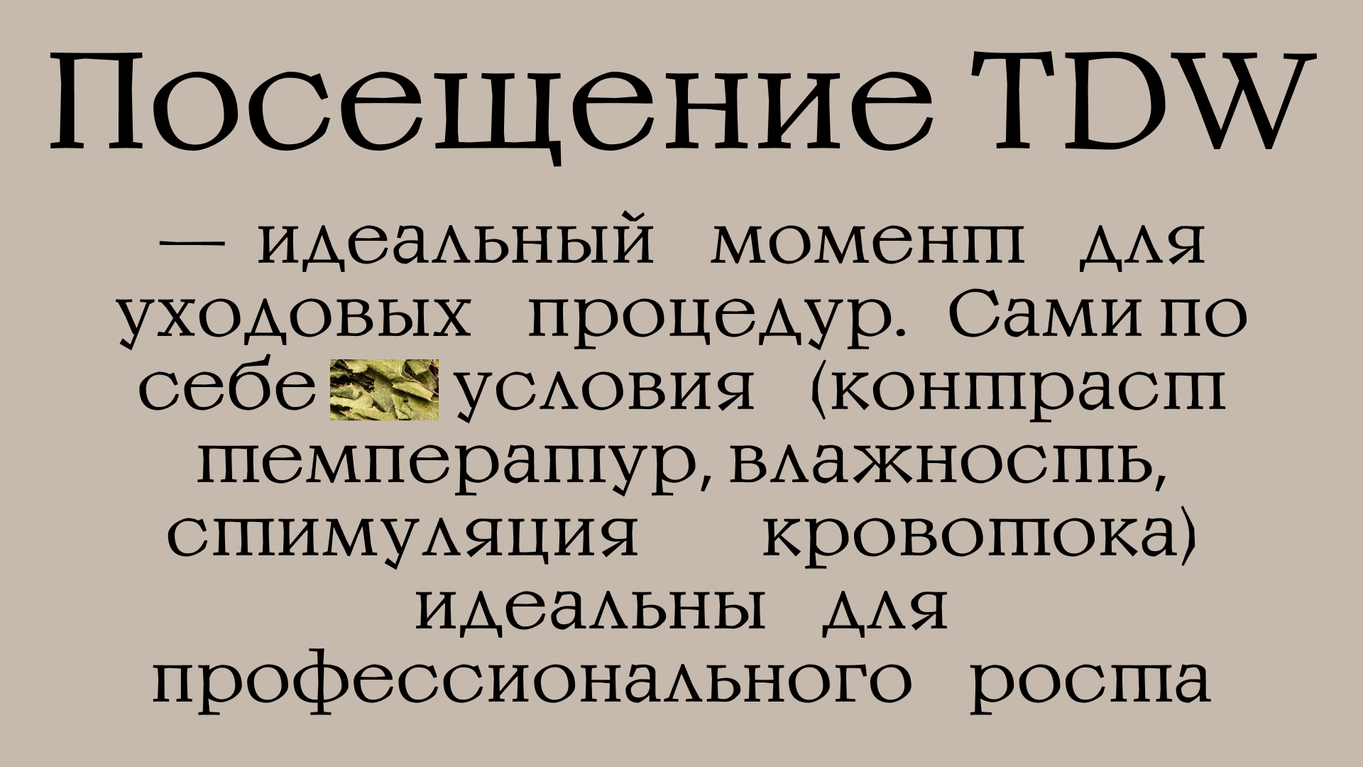
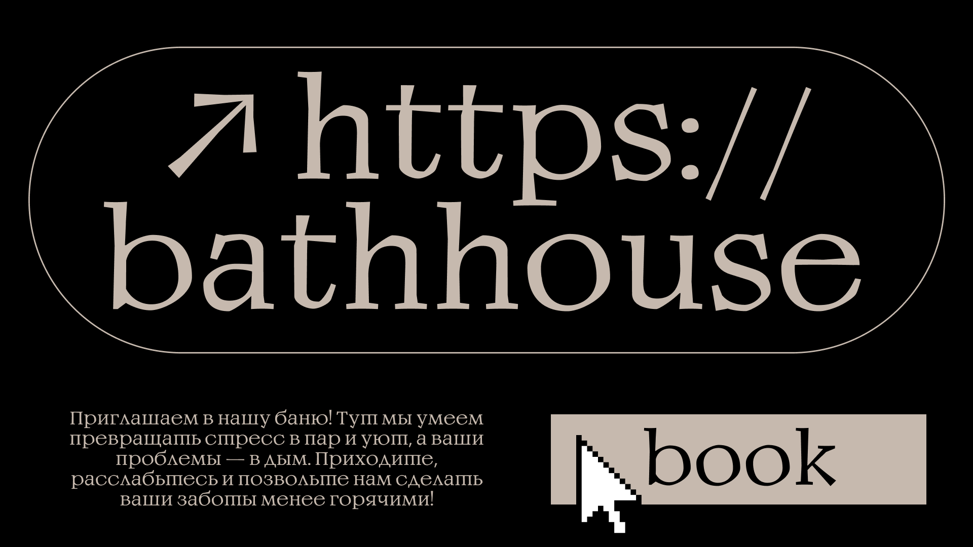
Venik is a modern serif typeface with a Russian character, developed specifically for a project on navigation in a bathhouse. The main task was to create a modern typeface that did not look traditional or overly bath-like while maintaining good readability and large forms, as well as a vivid character. The chiseled lines of the typeface were inspired by the shape of firewood, and the rounded elements refer to the traditional water basins used in bath culture.
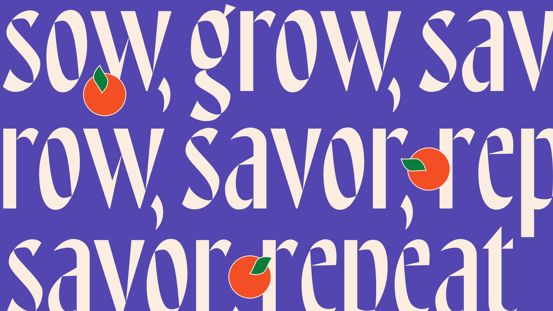
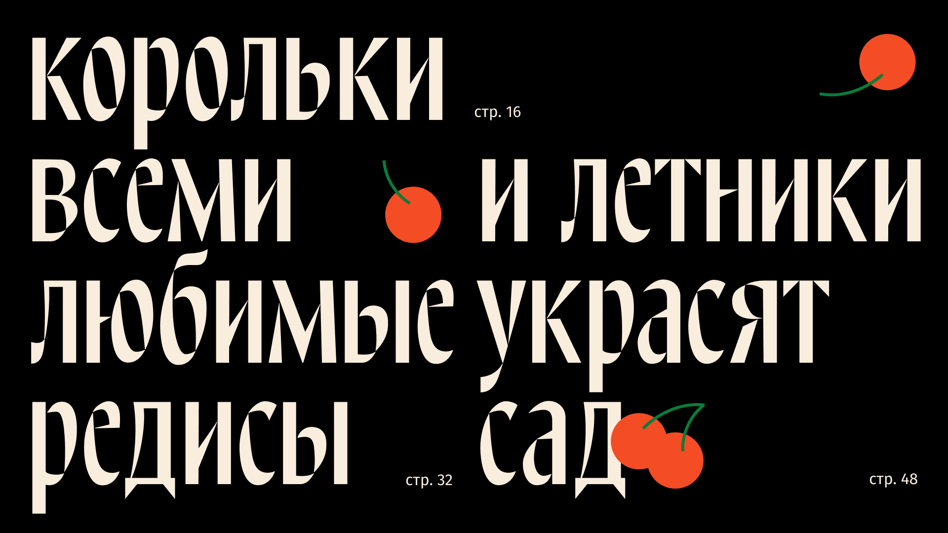
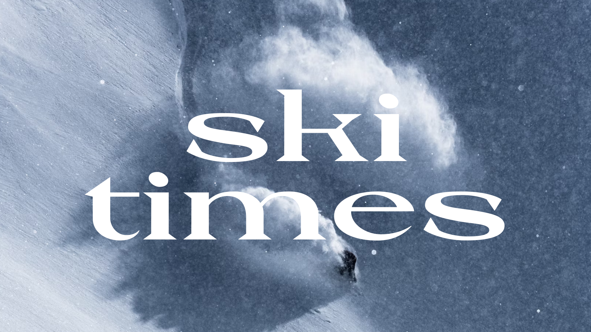
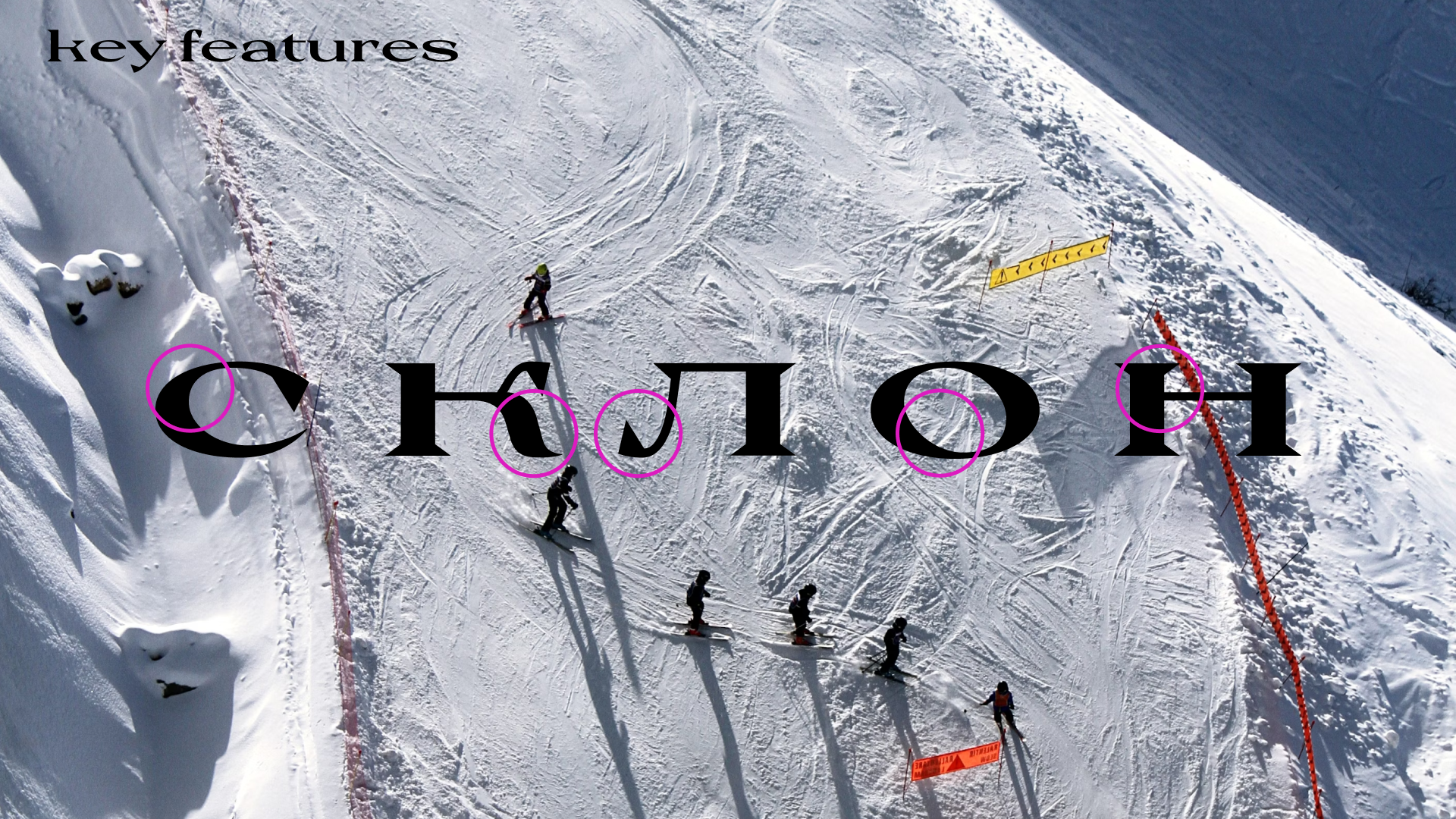
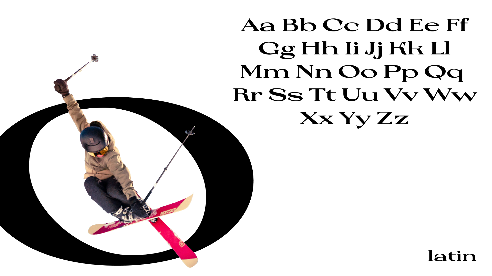
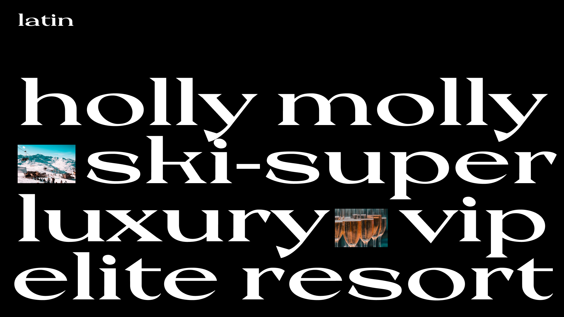
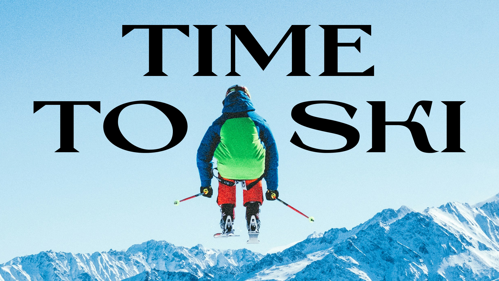
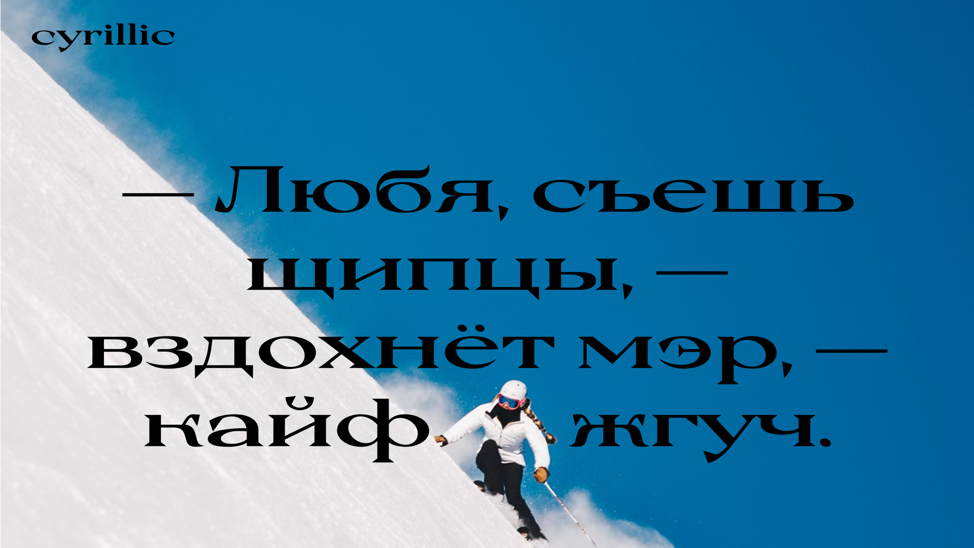
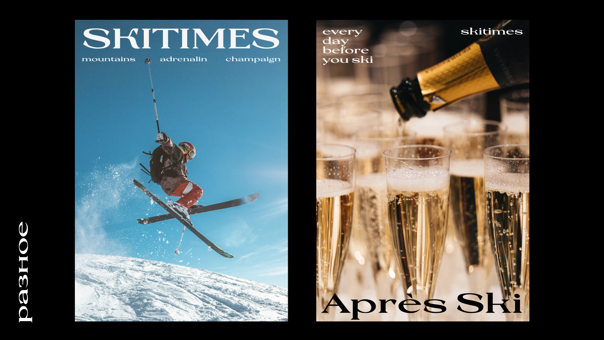
Skitimes is a ski resort typeface. Inspired by a reference serif typeface, it acquired a vivid character with sharp serifs, a wide sweep, and slanted ovals. Skitimes is sporty in spirit but has a distinct inclination towards luxury. If you have an elite ski resort and you’re not sure what to use for it, Skitimes is your choice.
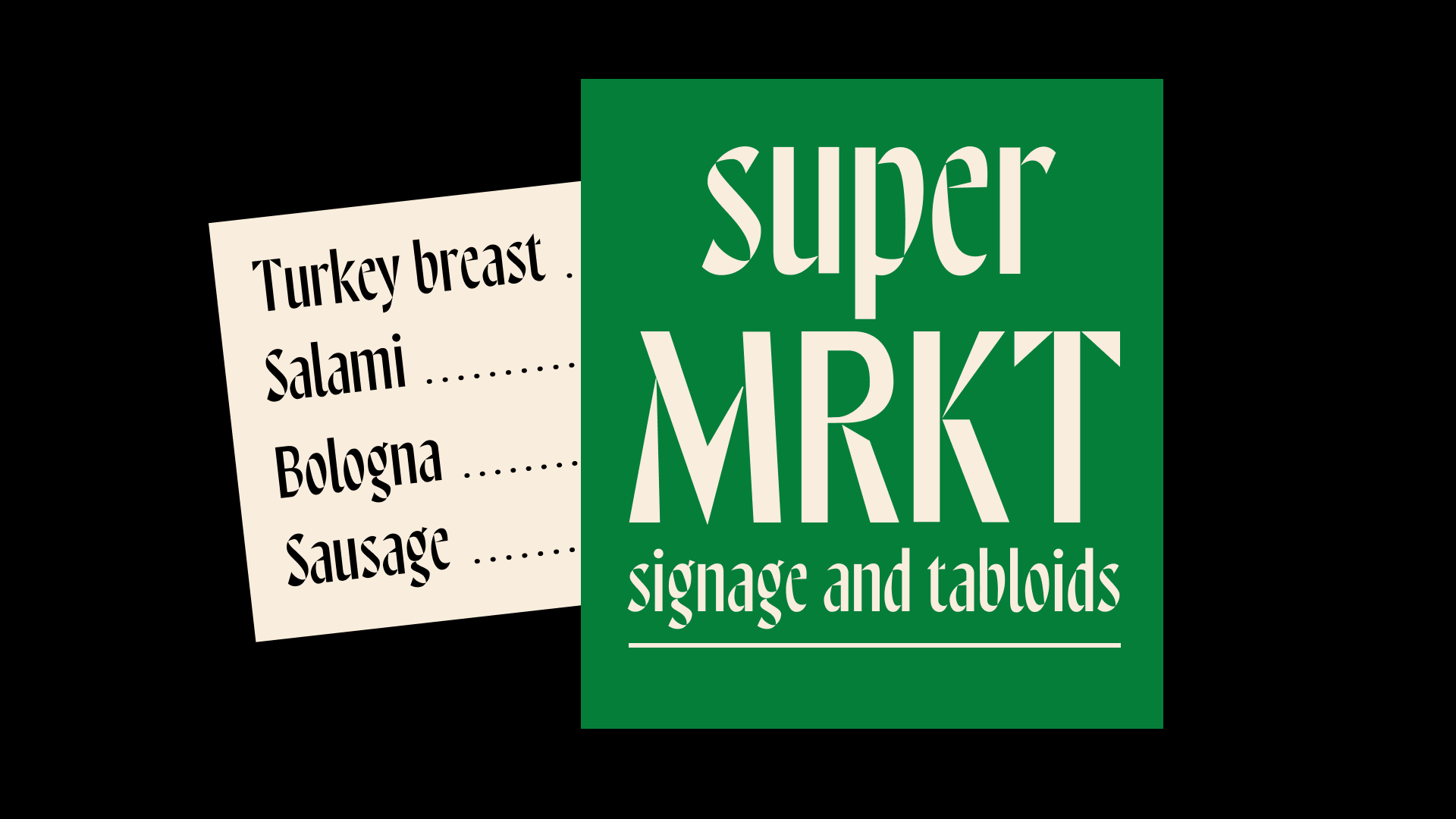
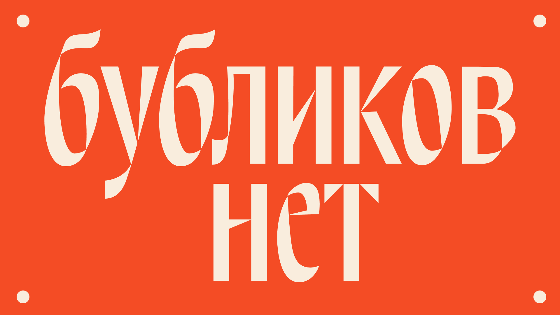
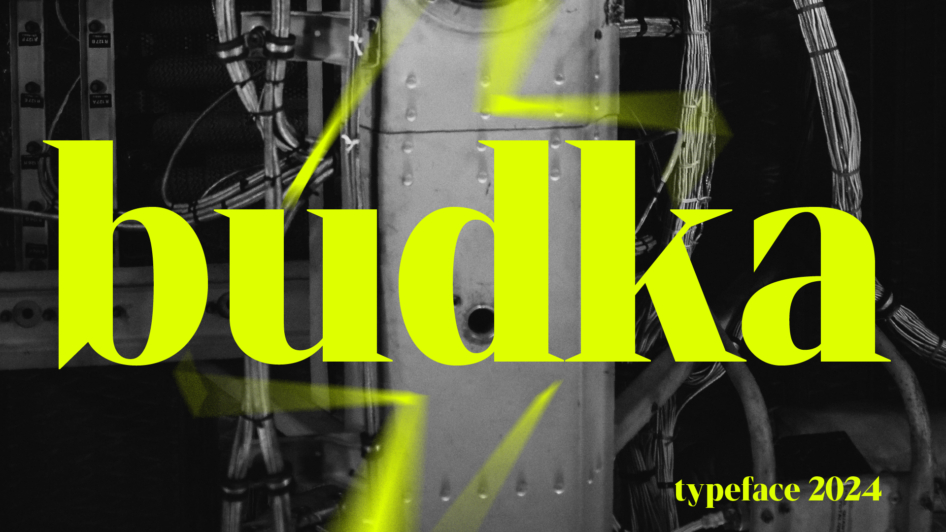
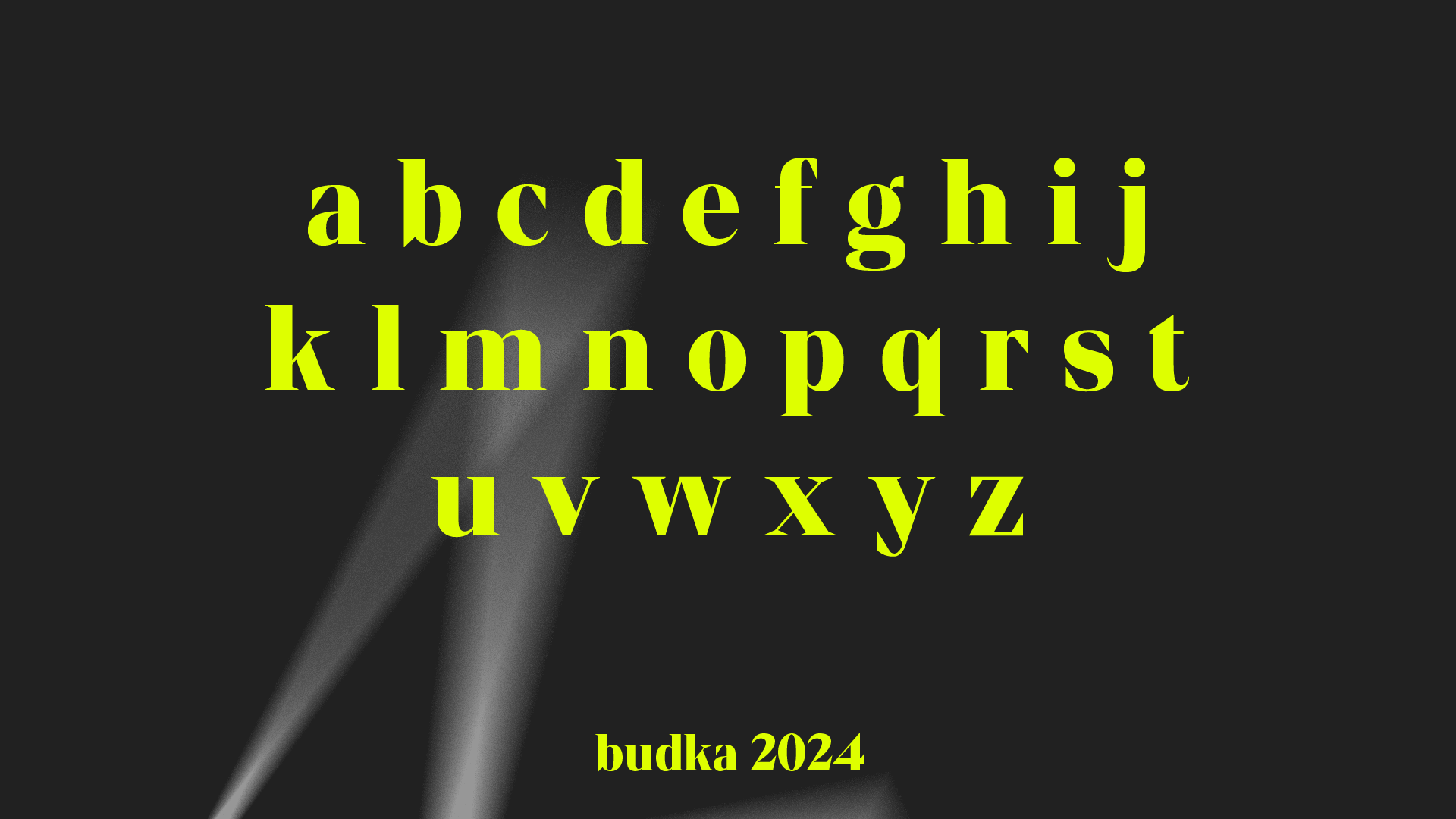
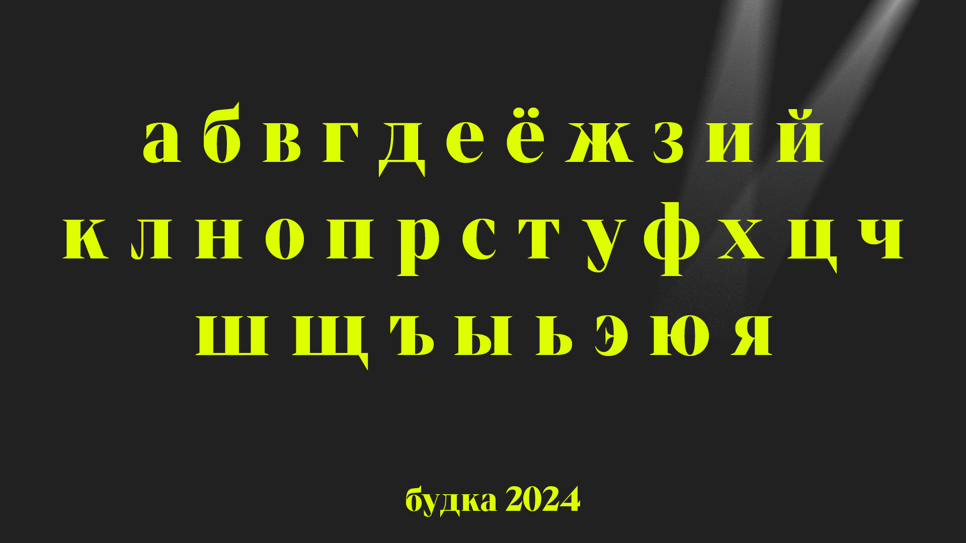
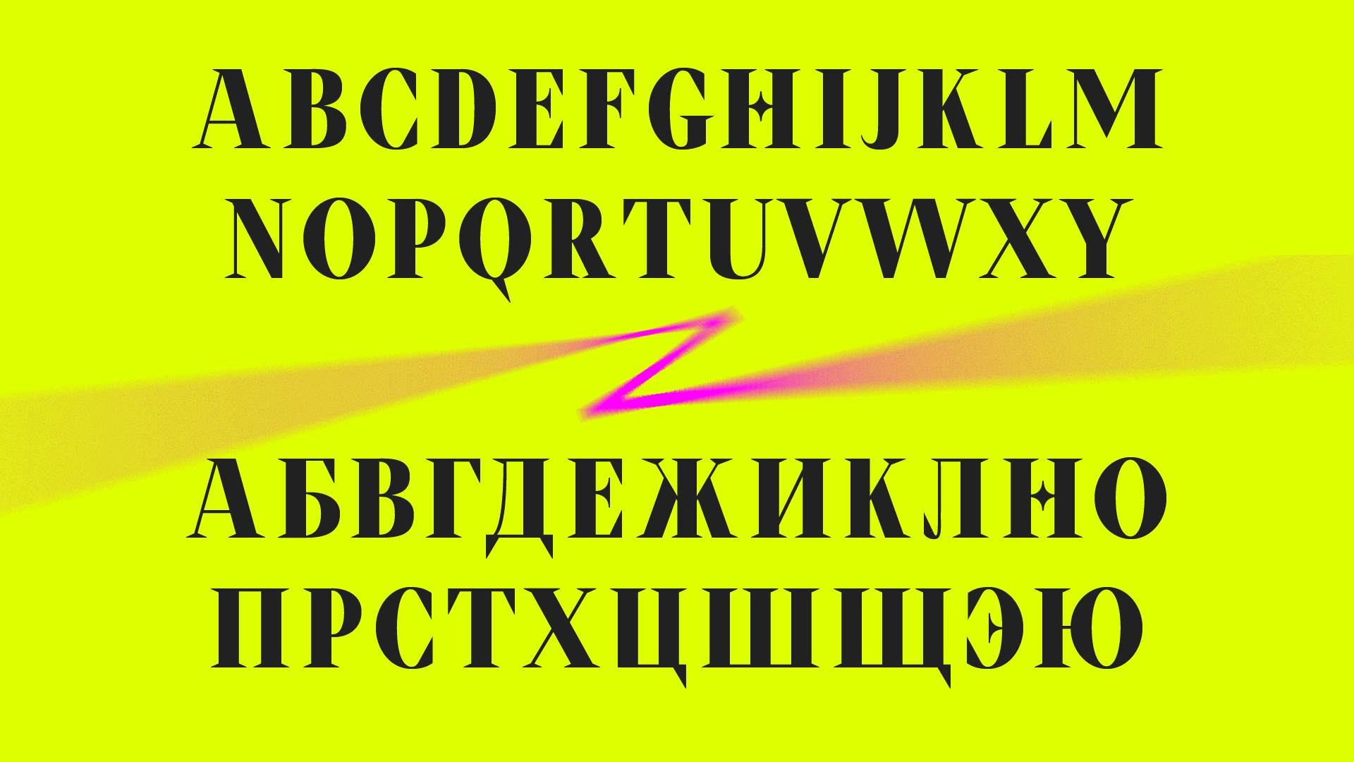
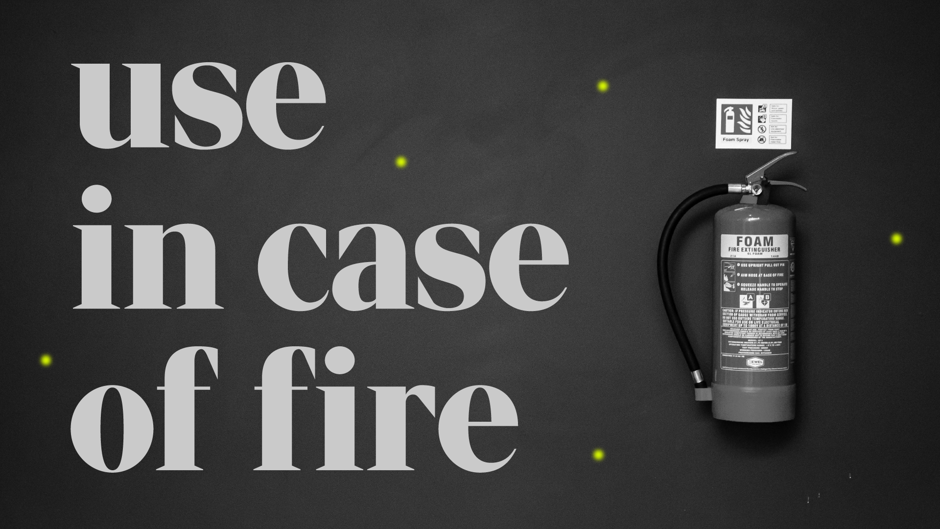
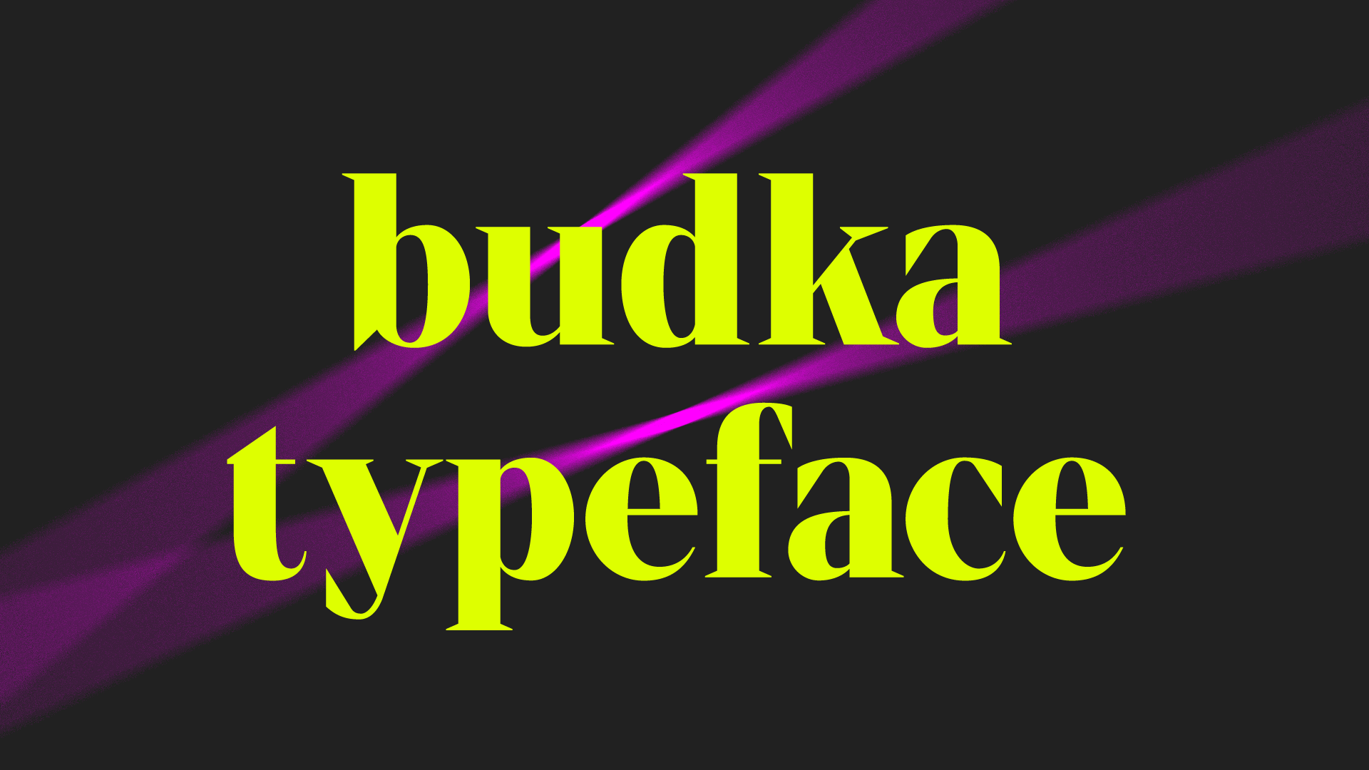
Budka is a display serif typeface created for decorating transformer booths. The typeface’s graphics aim to convey elements of sparks and lightning. Pointed elements in f, a, c, and other letters support this idea. The font maintains readability from various distances, which is important from a practical point of view. Therefore, Budka is well suited for use in urban environments while maintaining a modern look and character.

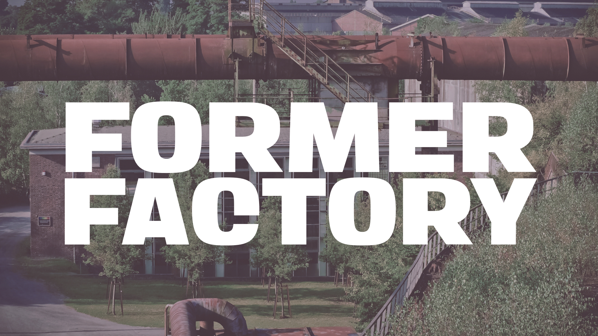
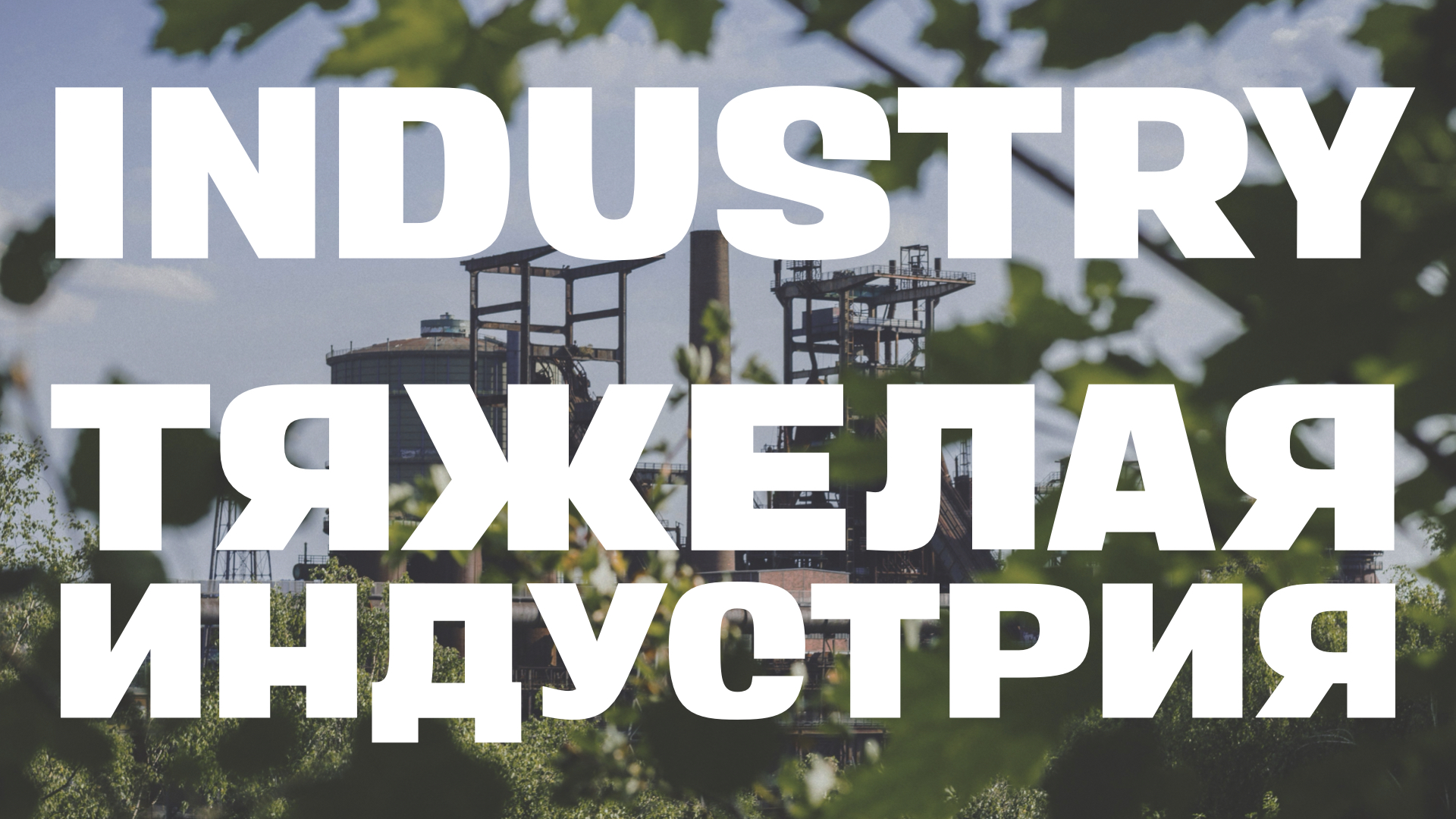
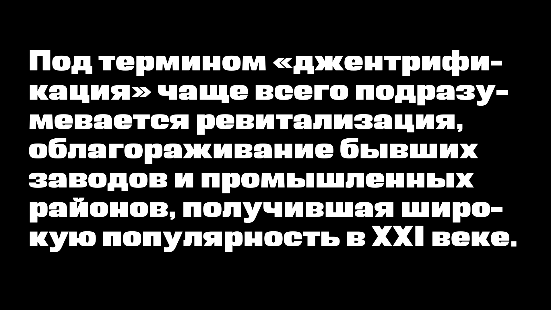
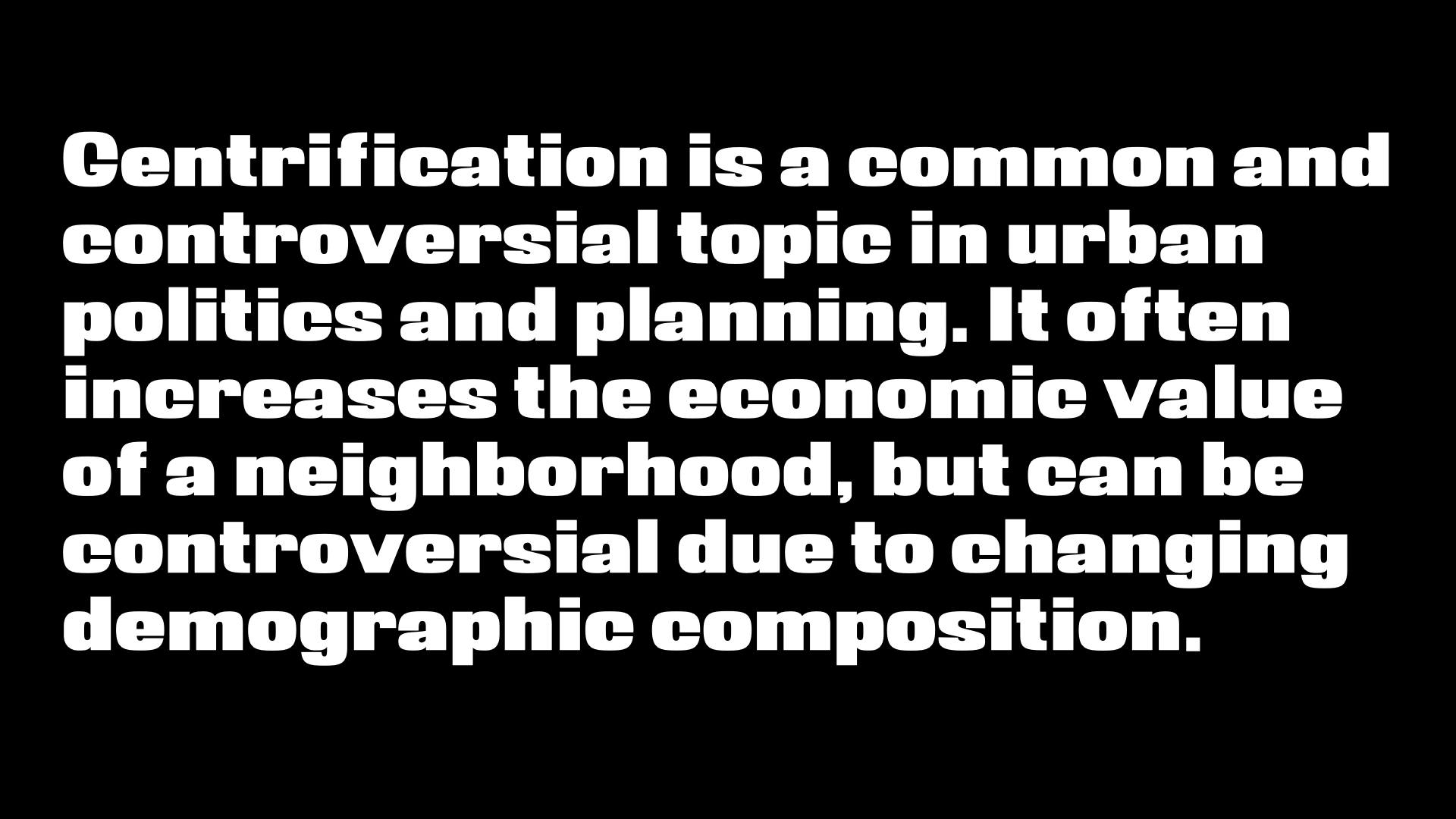
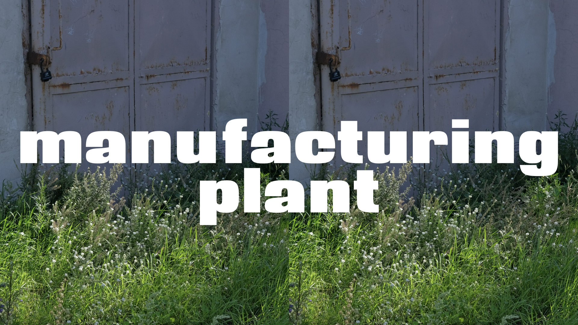
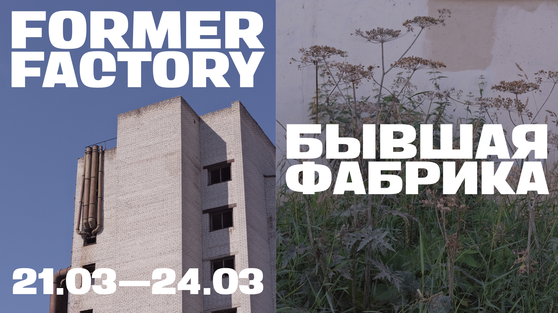
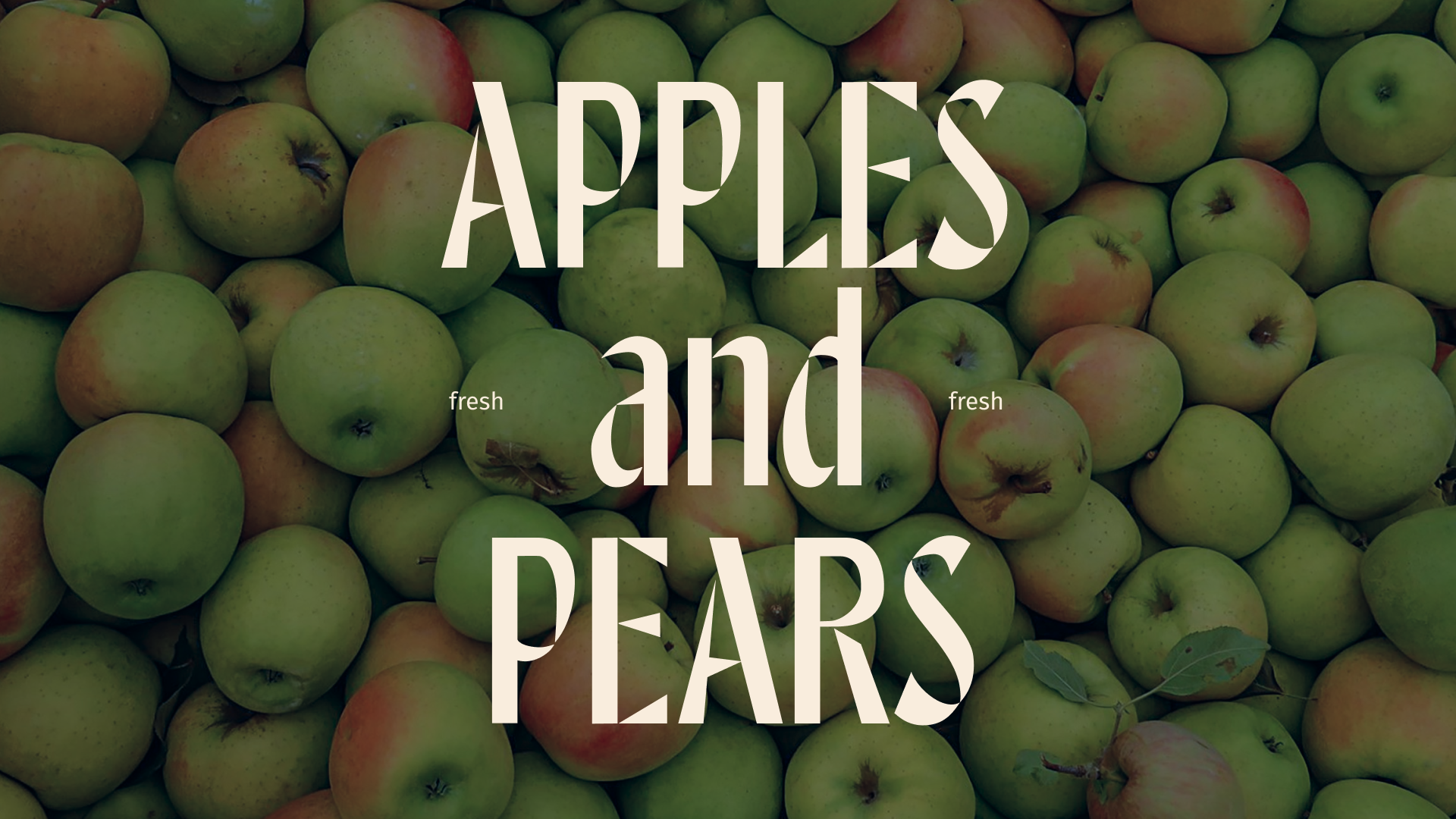
Former Factory is a low-contrast static grotesque designed for use in large headline sizes and for navigation in a cultural space at the site of a former factory, which inspired its name. From the reference typeface, it inherited basic parameters and a lowered x-height but acquired a broader and bolder style, giving it an industrial constructivist character.