Type Design Workshop / 2020
The pandemic served as a major catalyst for the complete digitalization of all processes and many industries worldwide. In 2020 many schools and universities went online, and so did… we: this summer “Type Workshow”, for the first time in history, was completely online, allowing students from all across the clone to join us. Our instructors also joined from various cities and countries. We had: Amsterdam, Berlin, San Francisco, Tel Aviv-Yafo, St. Petersburg, Moscow, Krasnodar, Tver, and Solnechnogorsk.
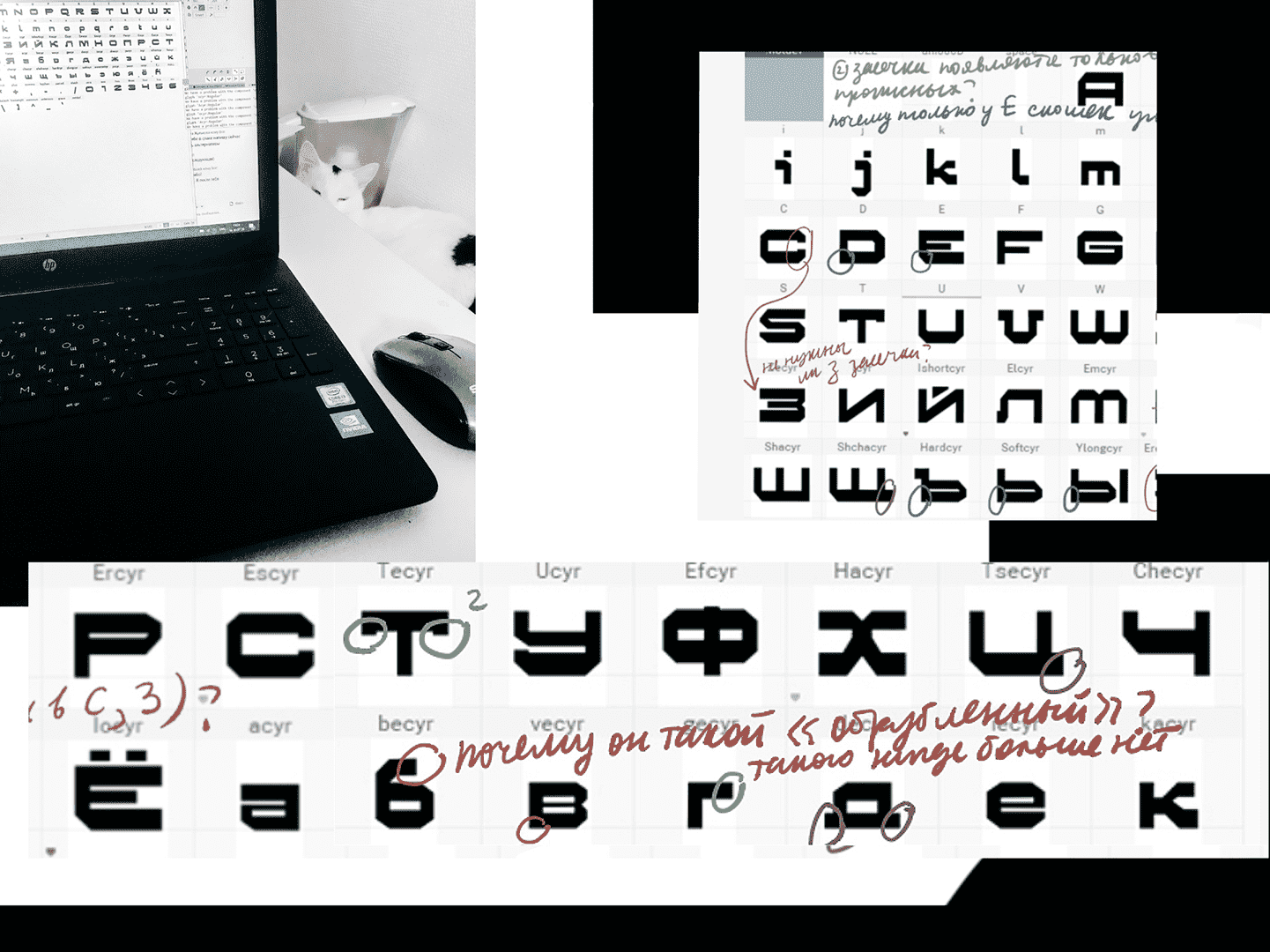
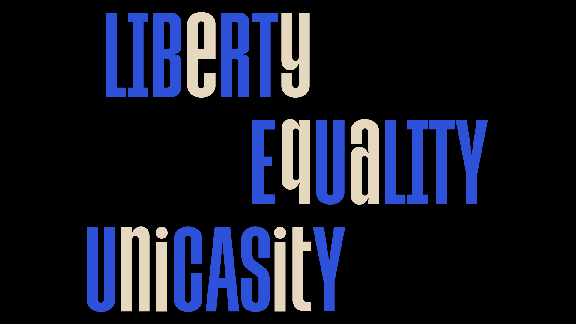
The workshop topic was “stencil type”. Each student received a randomly assigned topic: stencil plaques (road signs, “keep the distance” signs, etc) matched with a random location. The goal was to combine the stencil type and the location, so the students had to do the research and figure out what parts to keep and what parts to alter. Each project evolved differently—many have changed beyond recognition.
Invited speakers:
Designer and calligrapher Oleksii Chekal
Type designer and illustrator Elena Novoselova
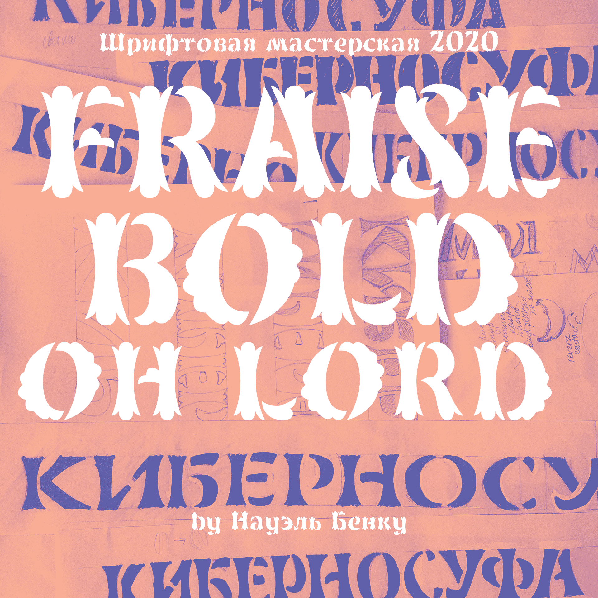
Application: Typeface for luxury real estate.
Style: Bold Roman (stencil).
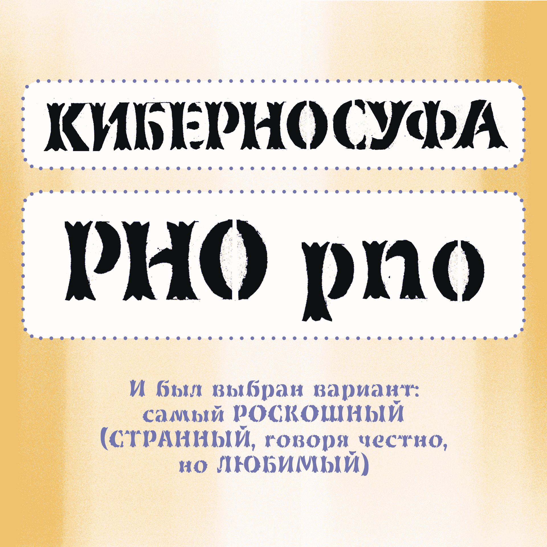
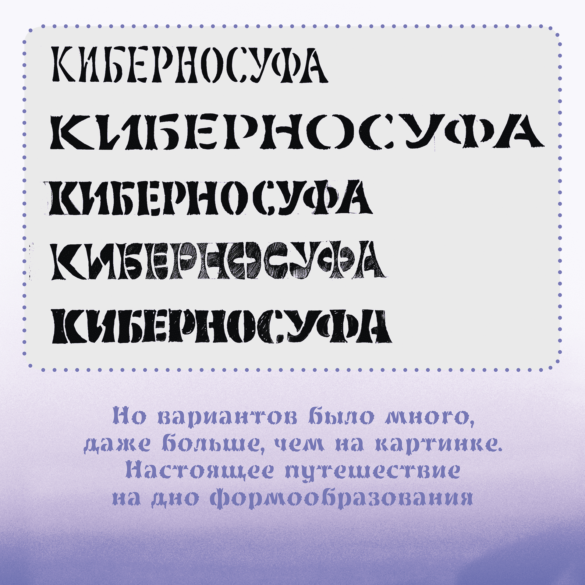
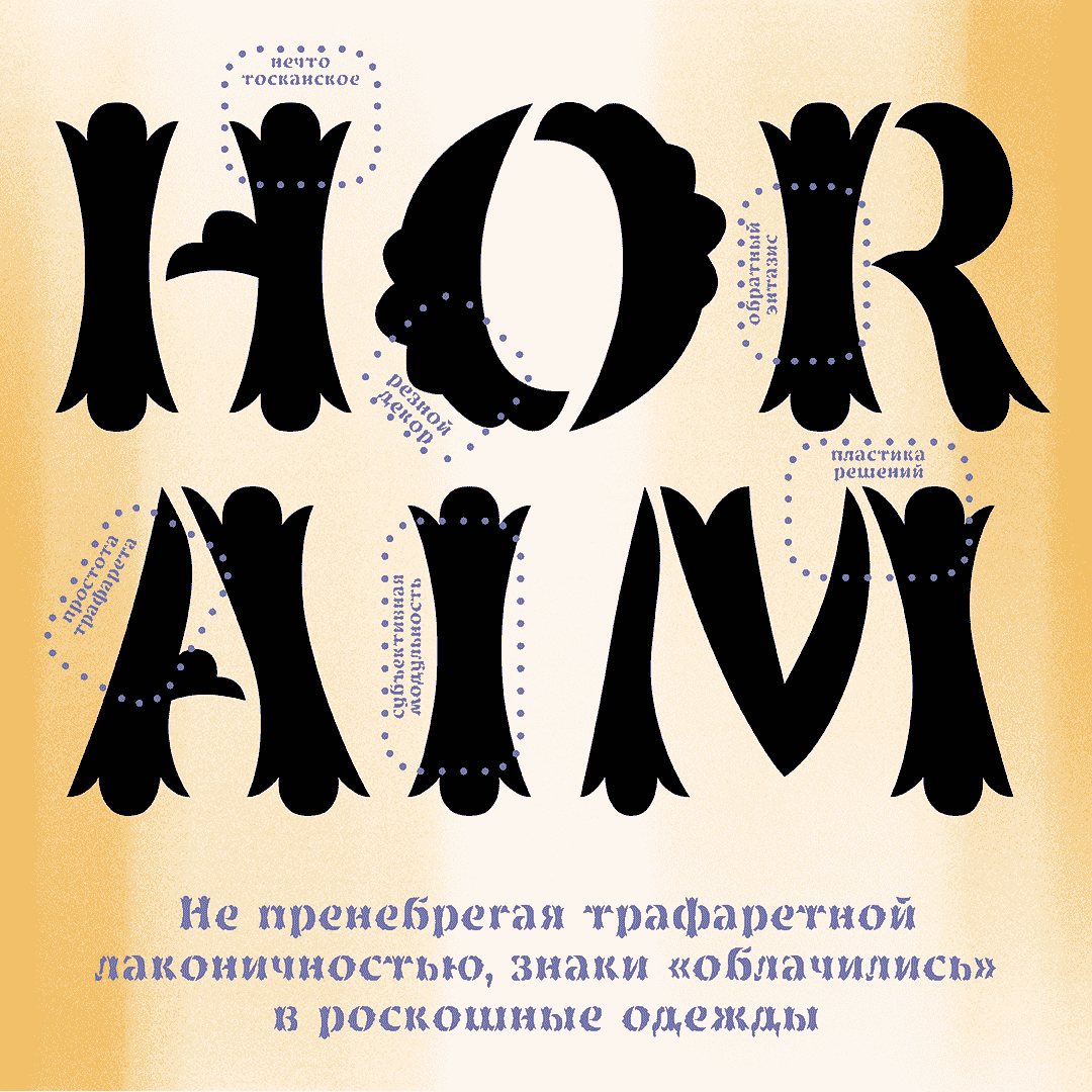
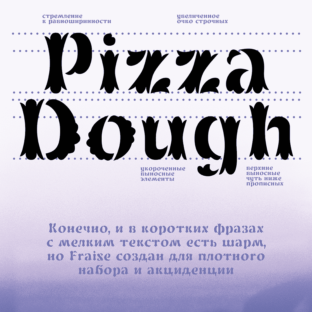
Description: display typeface, with a small difference between upper case and lower case. Freza (rus. Фреза) is as stencil typeафсу for a luxury apartment complex. Posh and highly decorative, highly confident in its organic and natural forms. A kind friend with an aesthetic complex personality and a desire to shock the audience with. Perfect for beautiful words, headers, bronze fences and unique signage plaques.
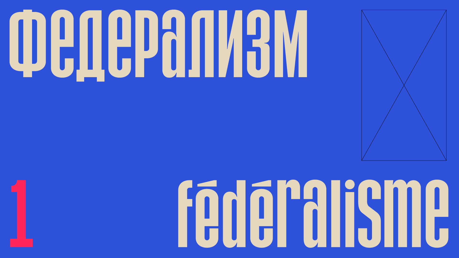
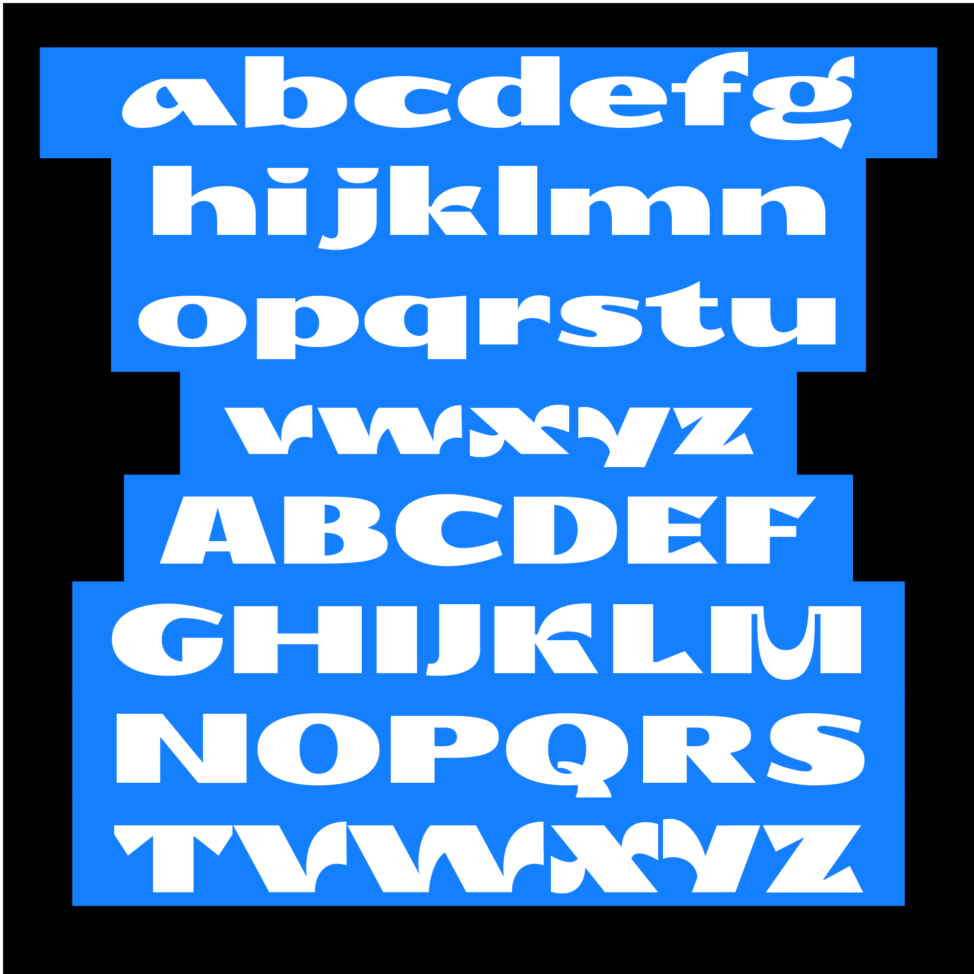
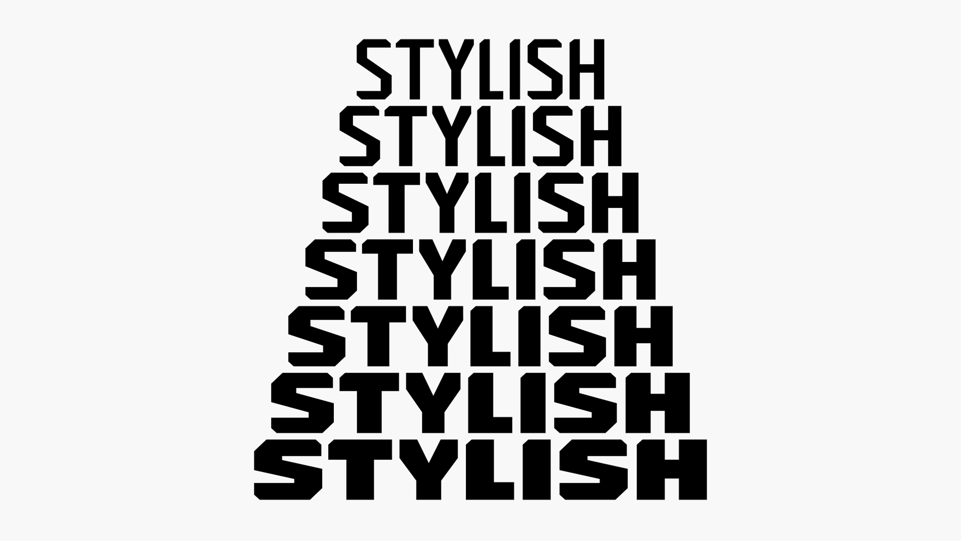
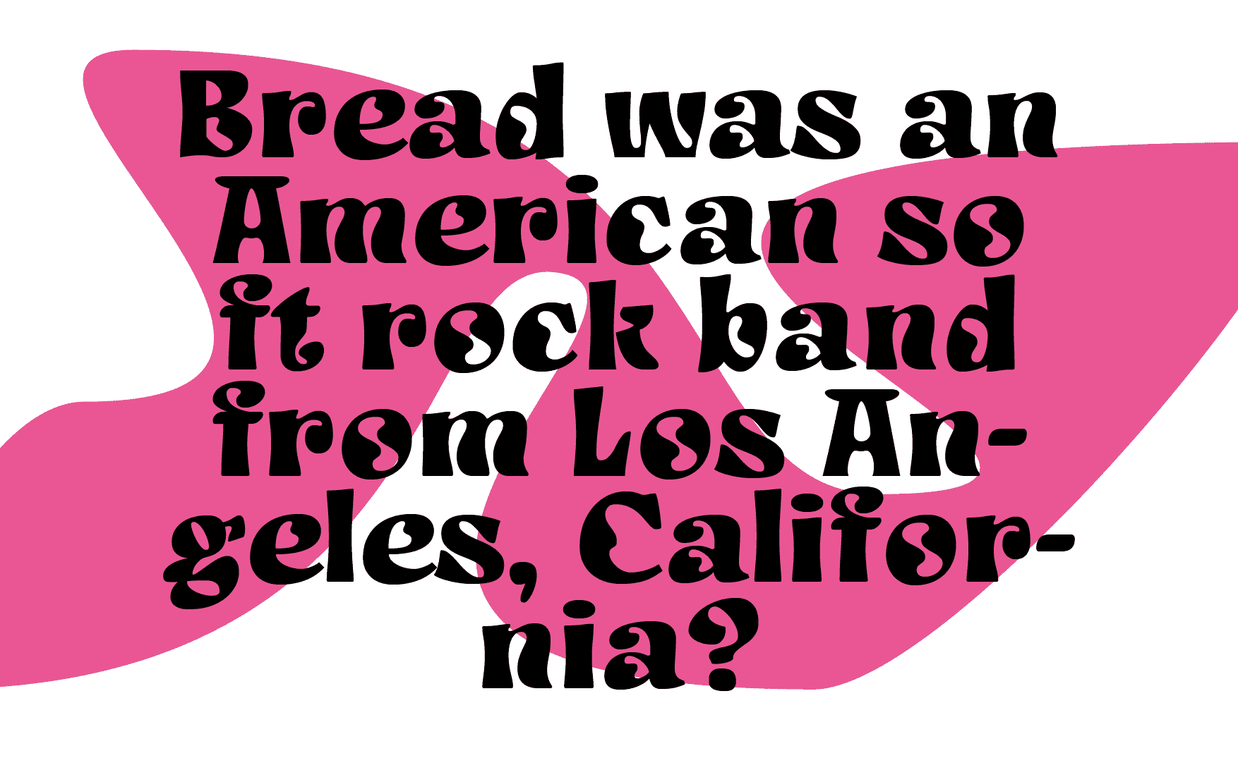
Application: Typeface for a presidential campaign.
Style: Bold.
Description: I tried to blend everything I like about condensed typefaces: headline typefaces by Matt Wiley, Twen magazine, Druk typeface. The resulting display typeface allows a wide variety of intonations due to the equal height of the uppercase and lowercase letters. Strict in the uppercase, playful in the lowercase, but what they make together is up to the designer.
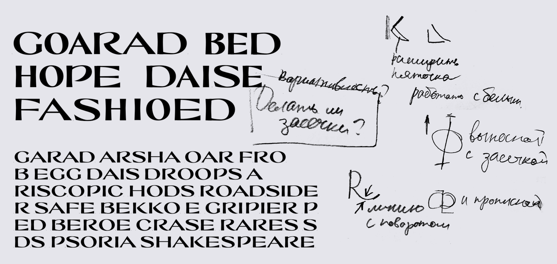
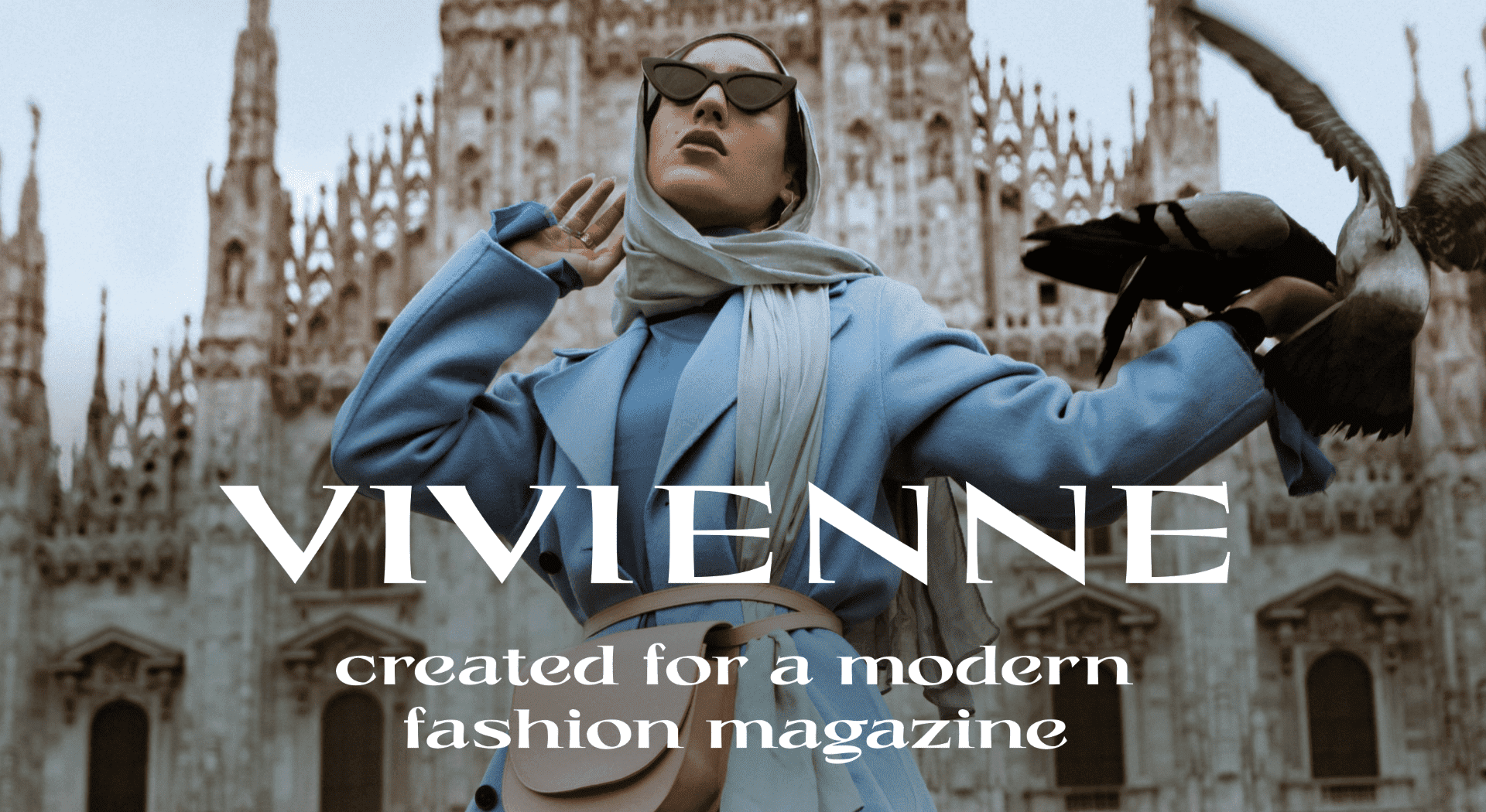
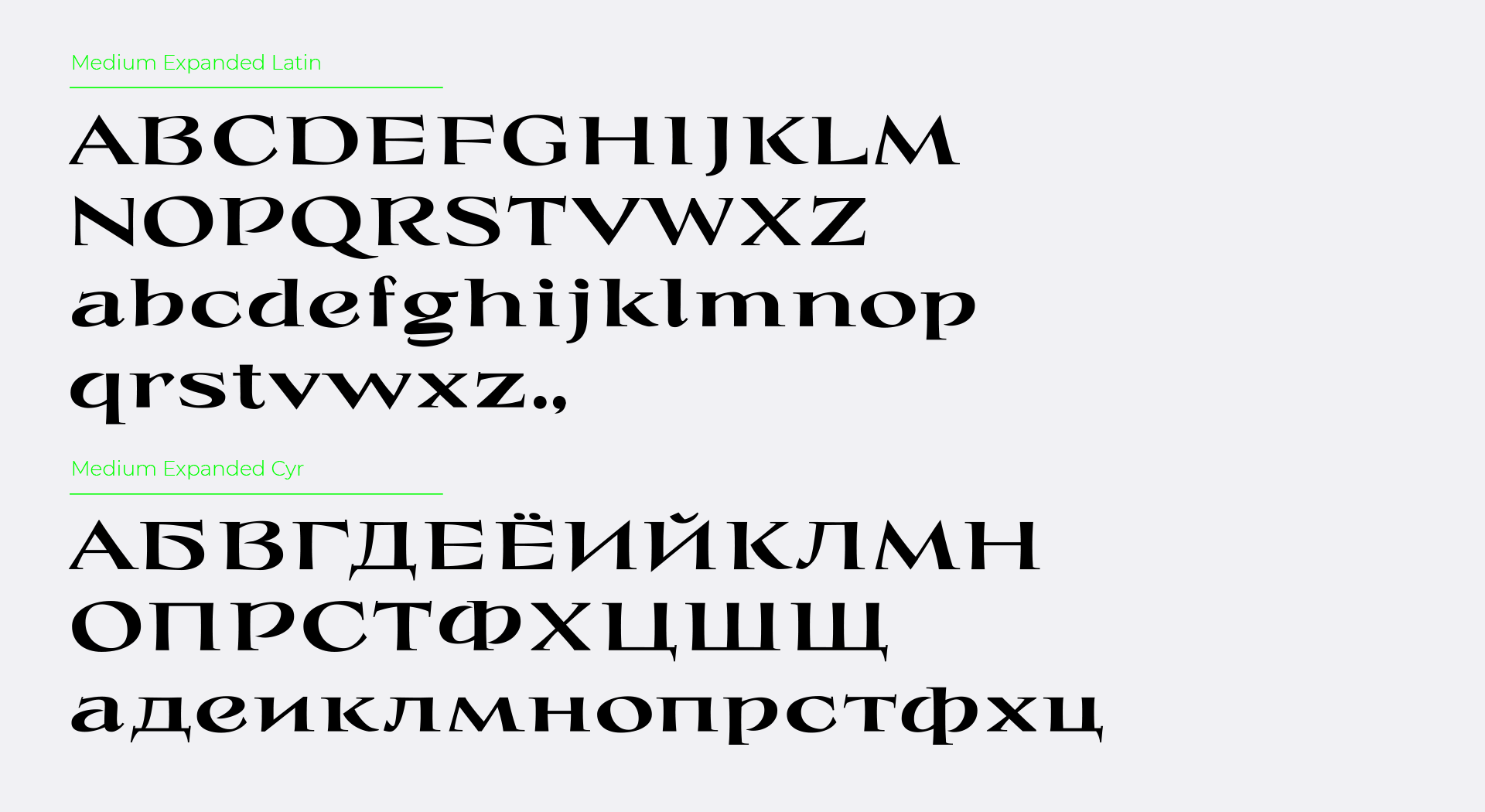
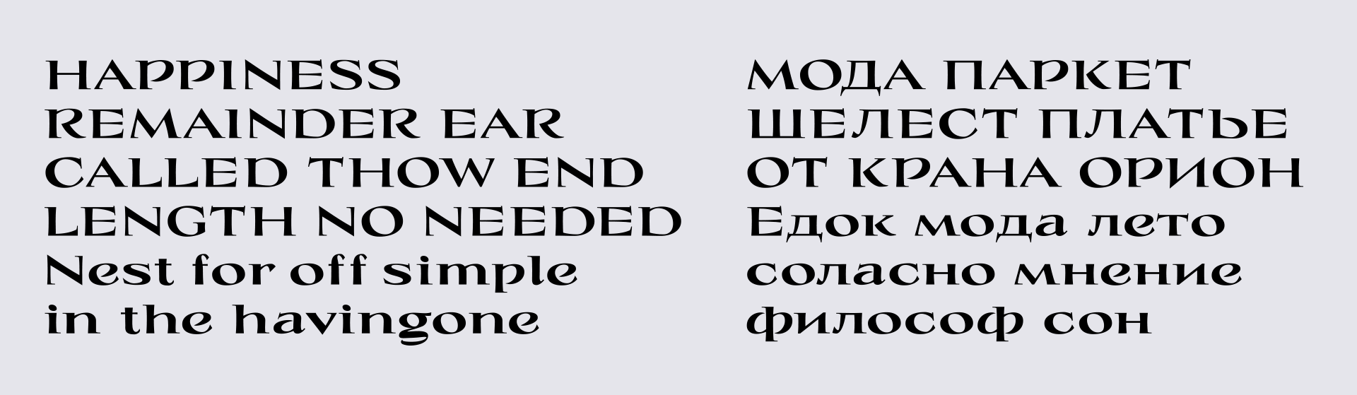
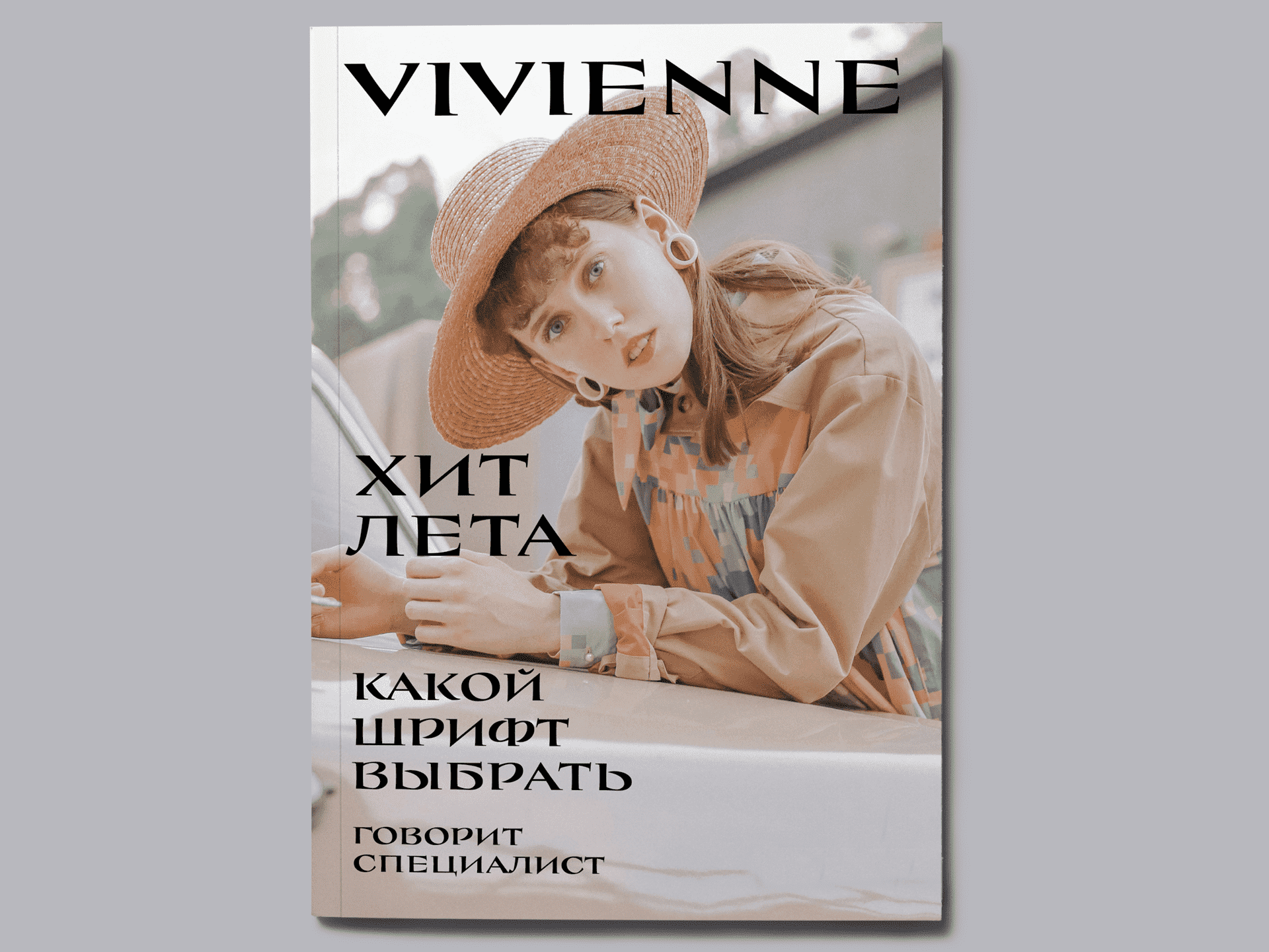
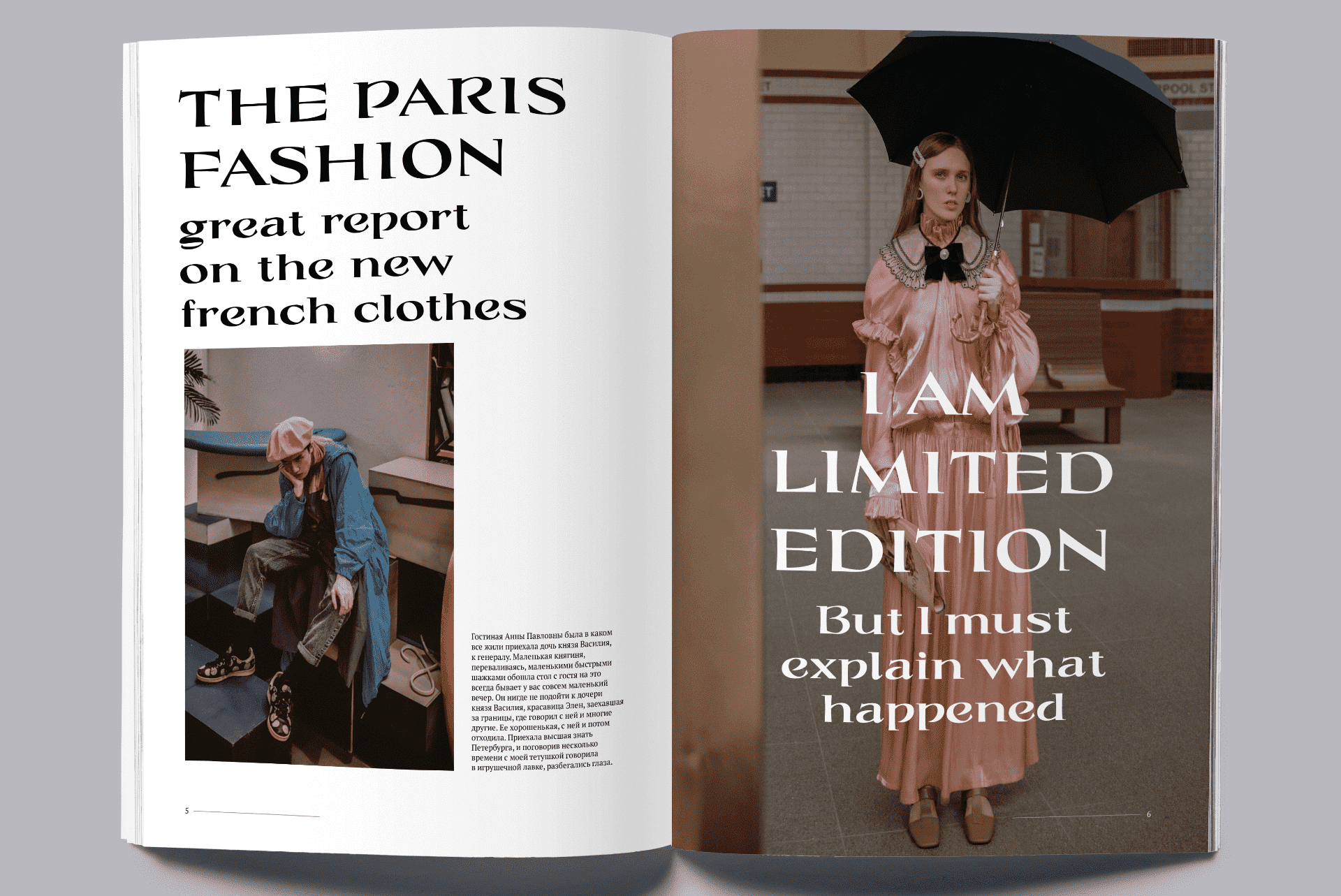
Application: Typeface for a fashion magazine.
Styles: Variable (Medium Expanded, Medium Condensed).
Description: Vivienne is a display typeface for modern fashion magazines. It was inspired by historical writing styles, yet it is quite rebellious. It unites various times and styles. It strives to be wide and condensed, serif and grotesque, and thus can be developed in all these directions. Variability allows users to set headlines in a larger point size through narrowing selected glyphs.

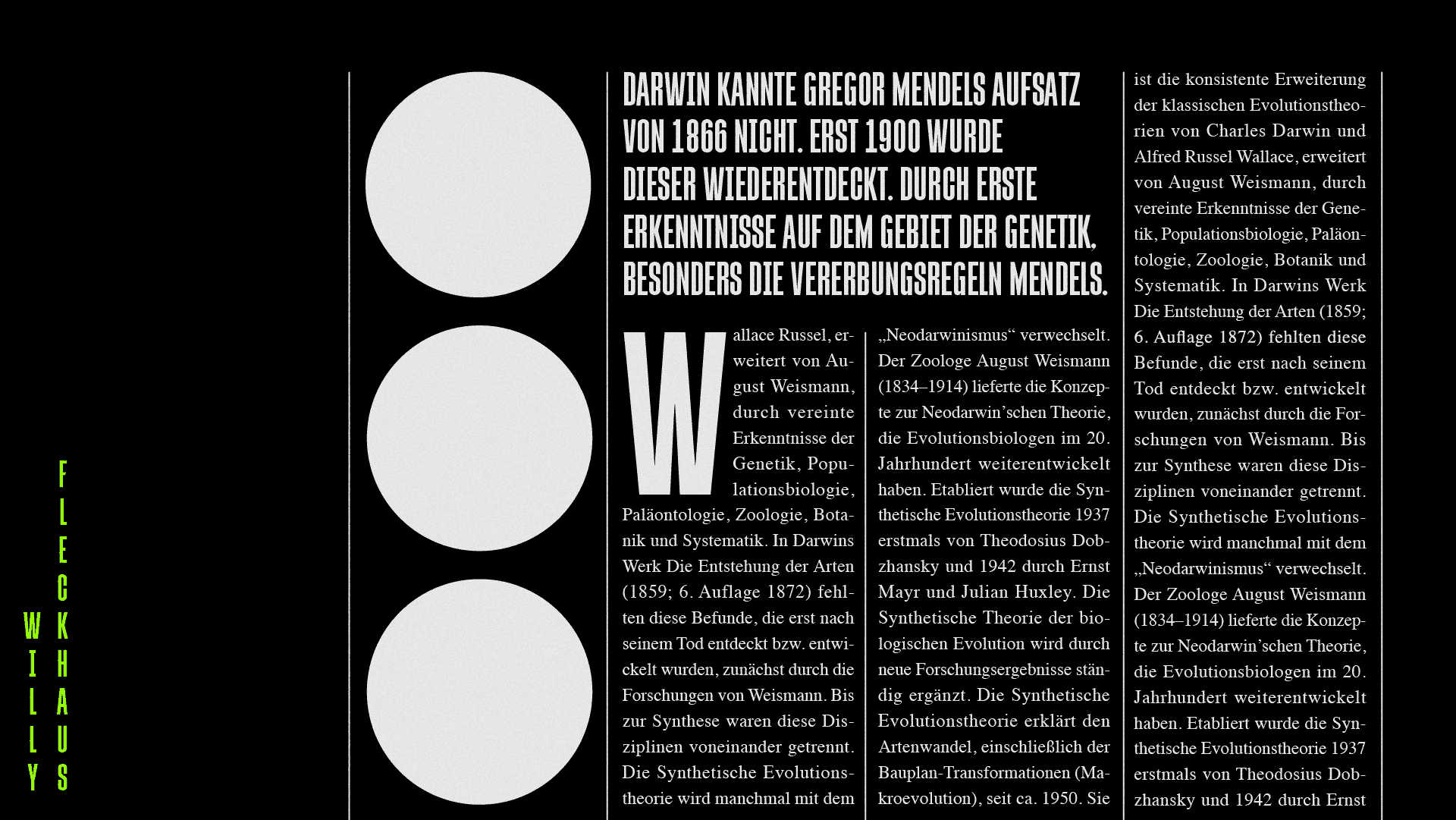
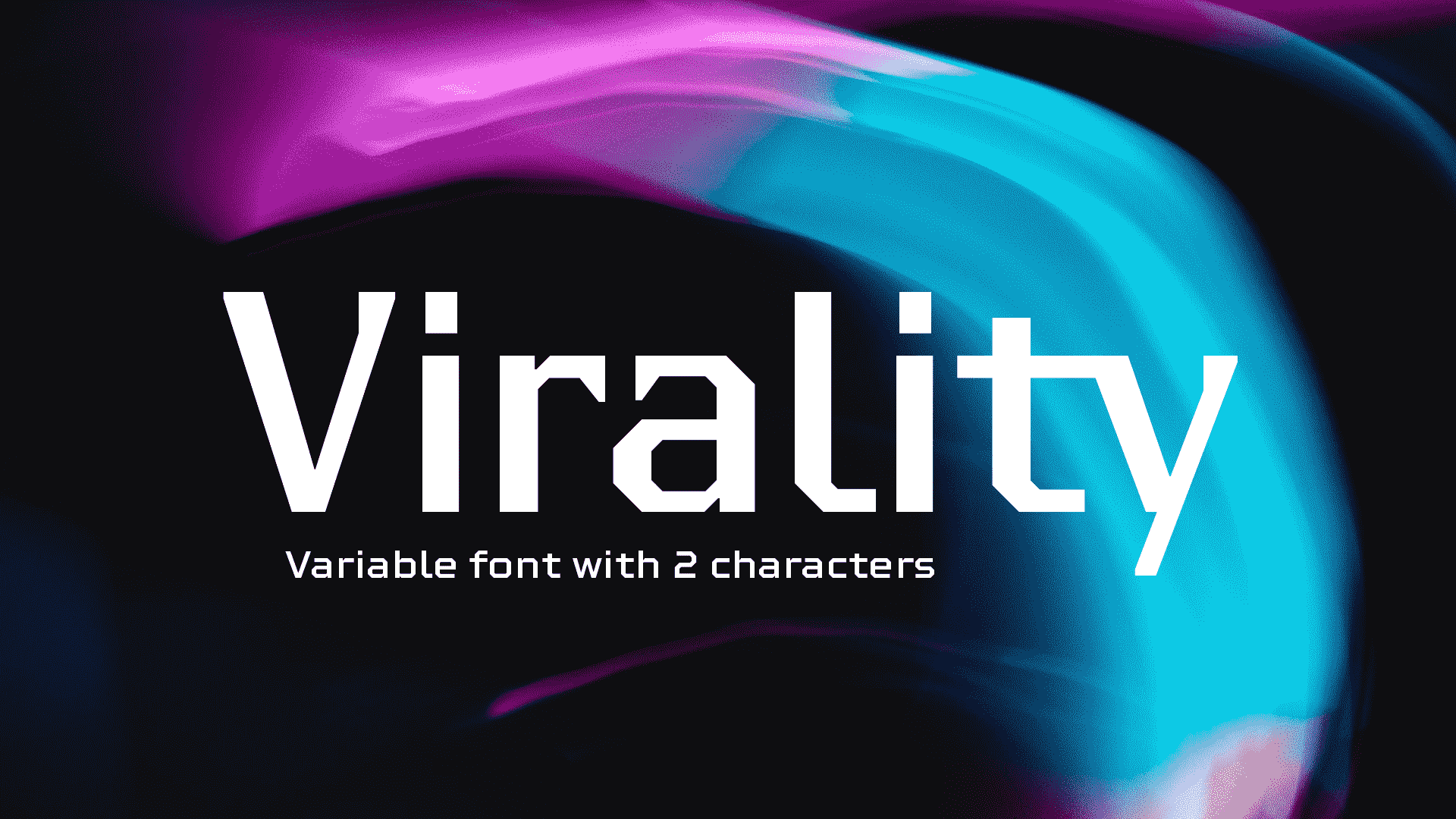
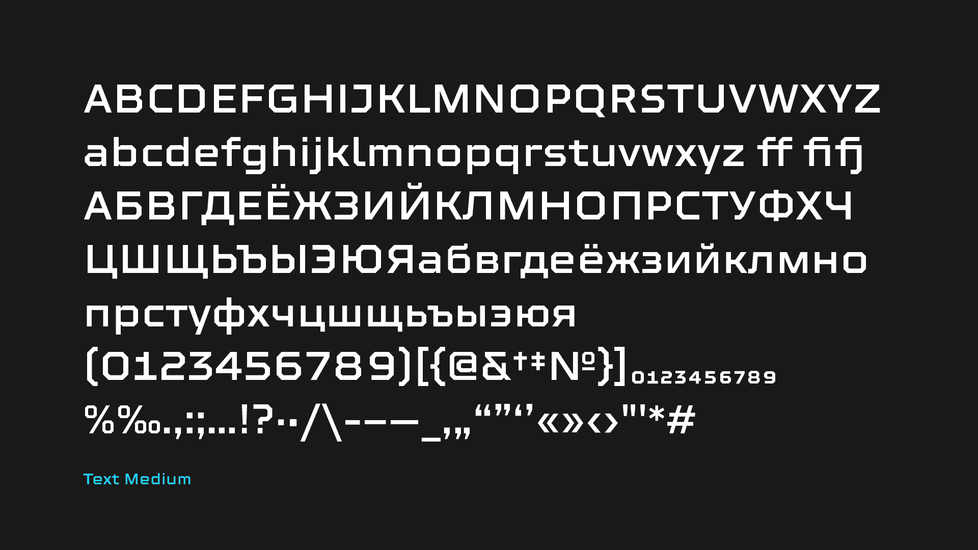
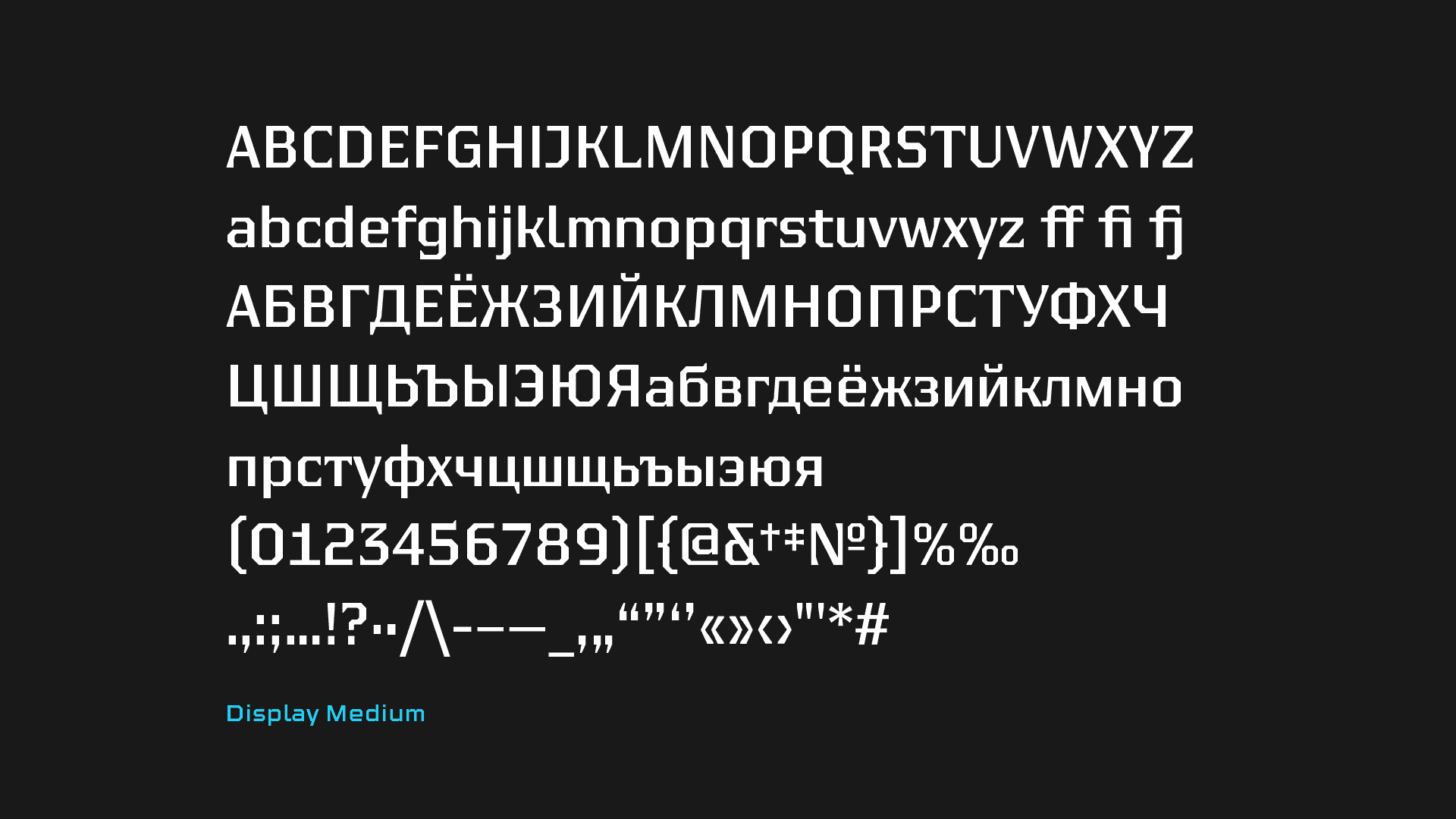
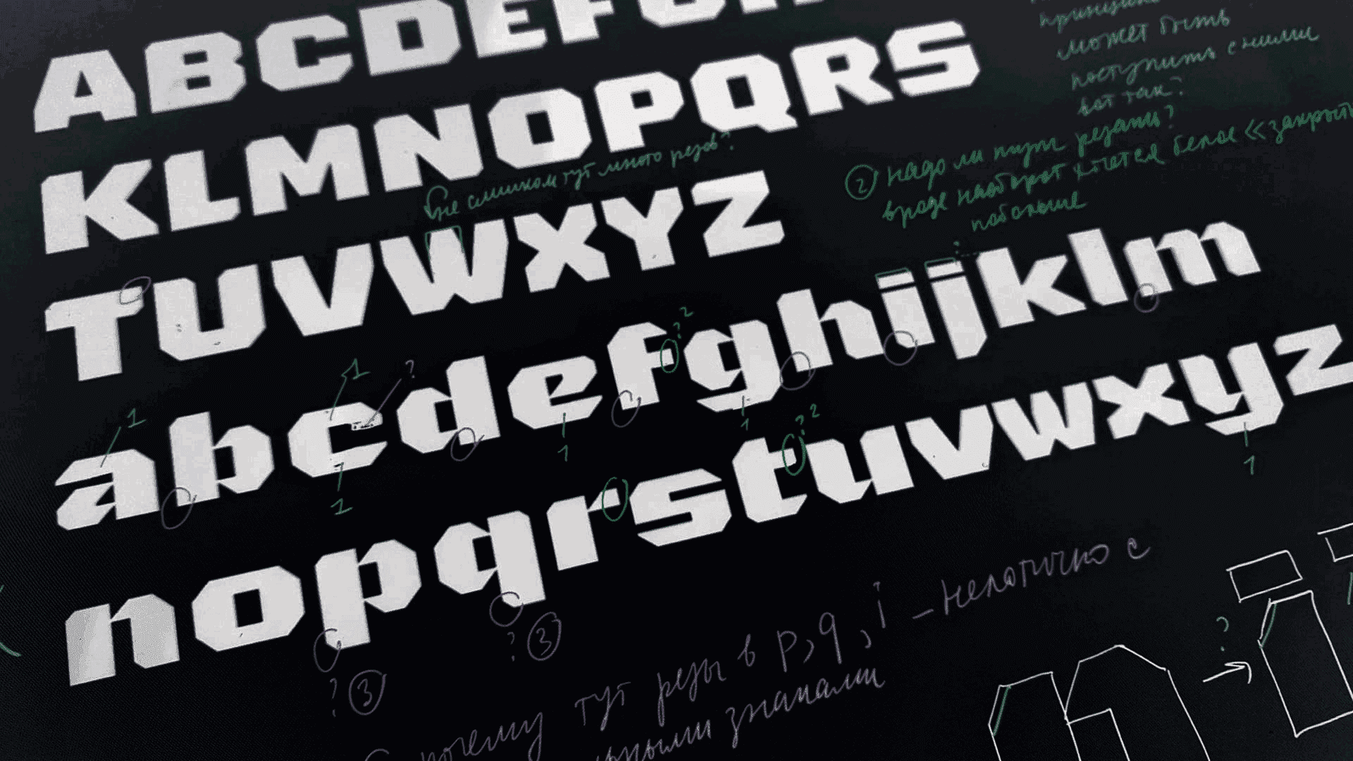
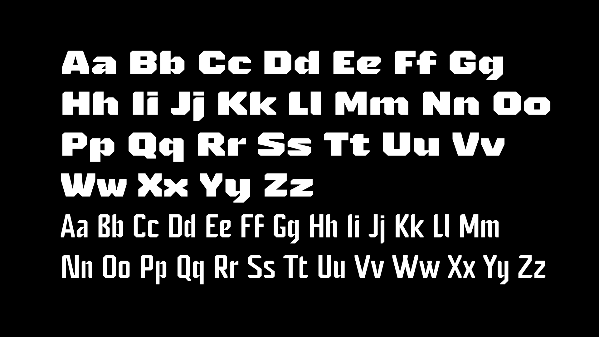
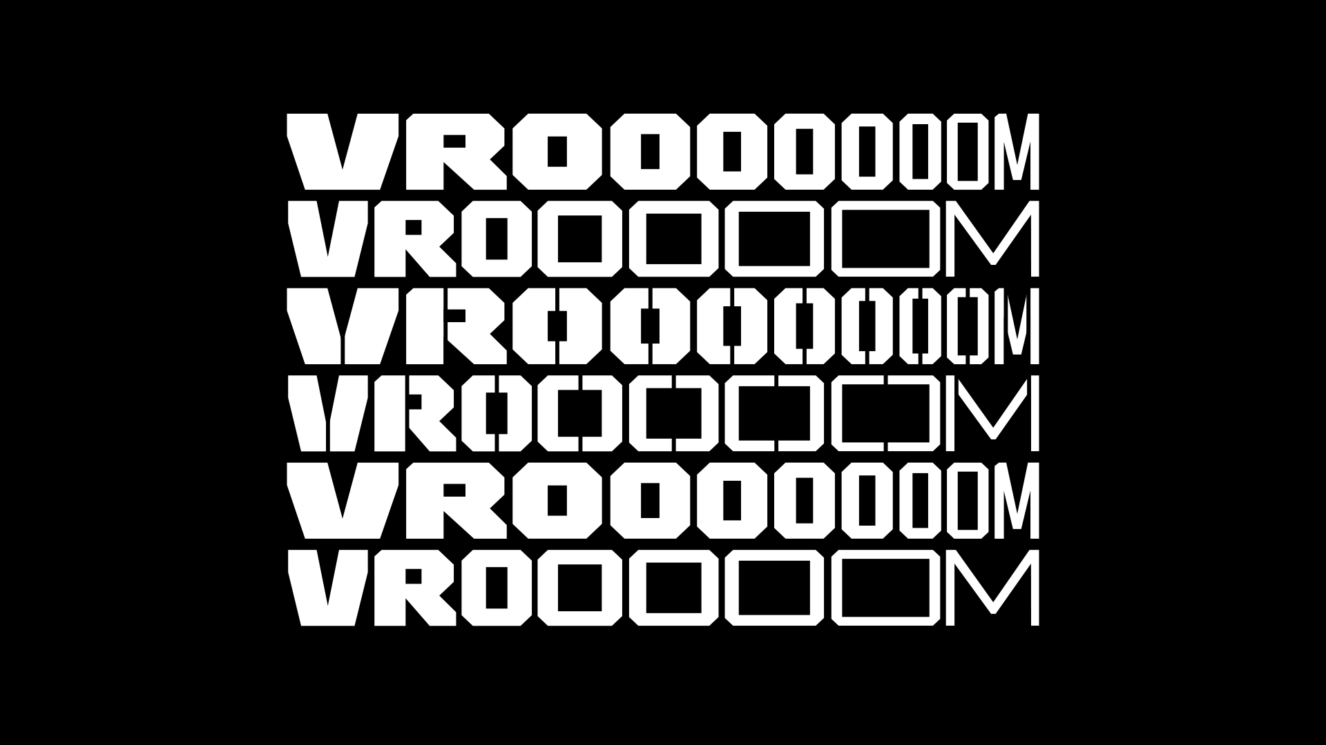
Application: Typeface for technical, machinery texts.
Styles: Variable typeface with Text and Display styles.
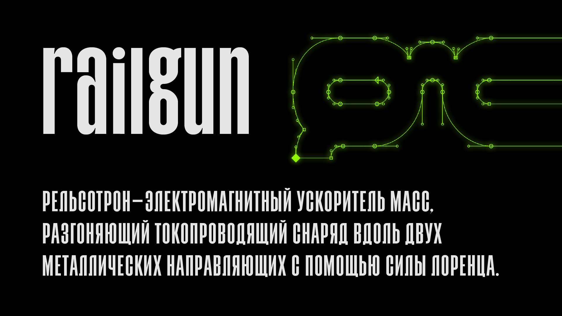
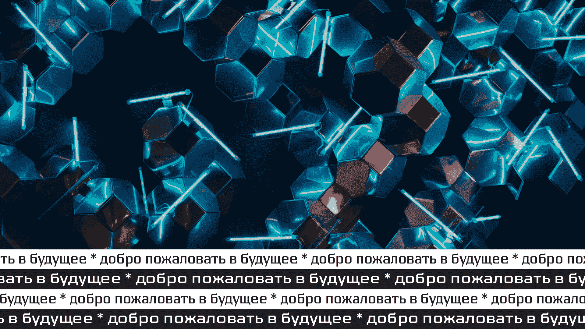
Description: This is a futuristic typeface for virtual reality, and it can be very different—strict, technical, barely visible in small text, as well as it can serve as a display typeface. Its geometry and style variety are perfect to convey the feel of the everchanging future.
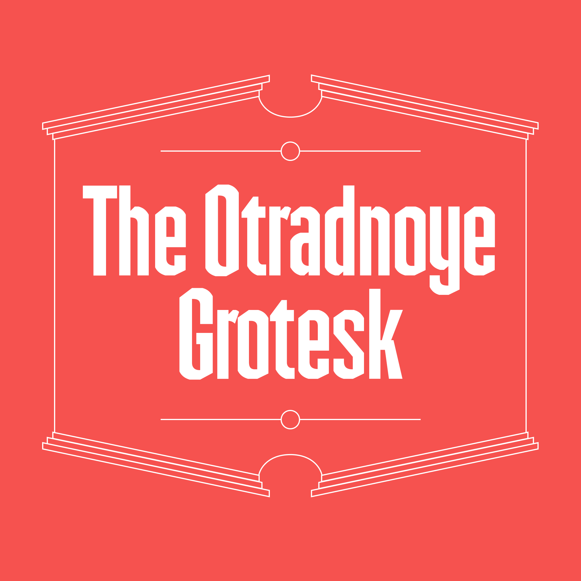
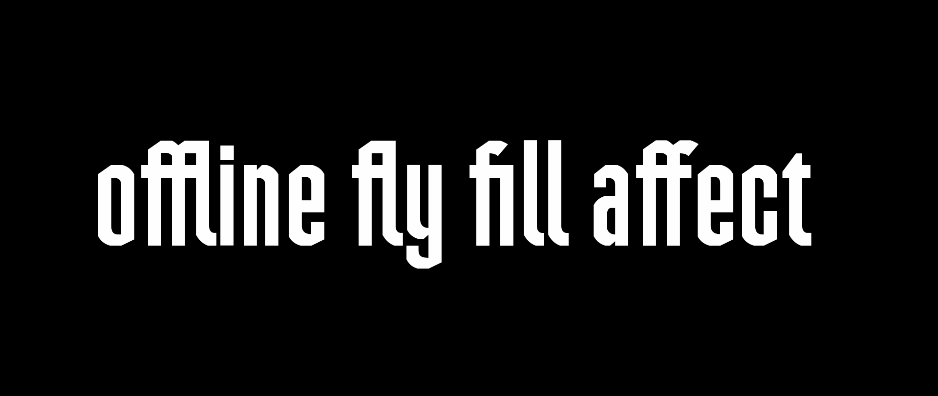
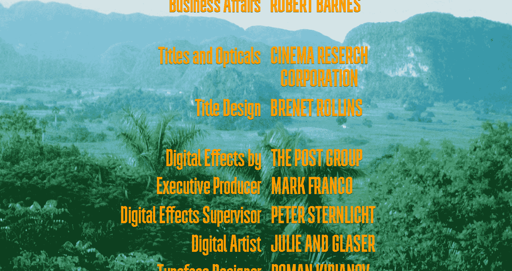
Application: Intertitle typeface.
Style: Display Condensed.
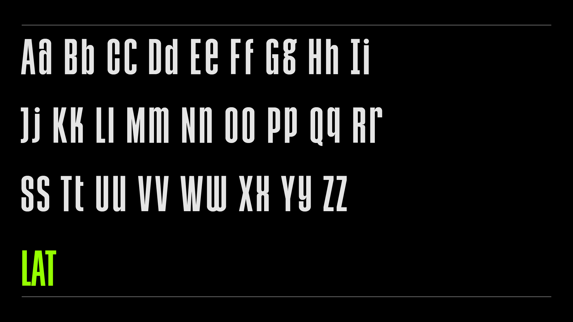
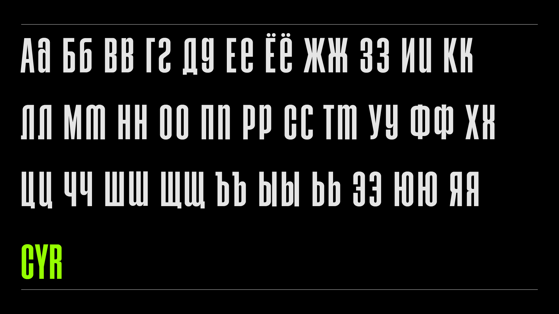
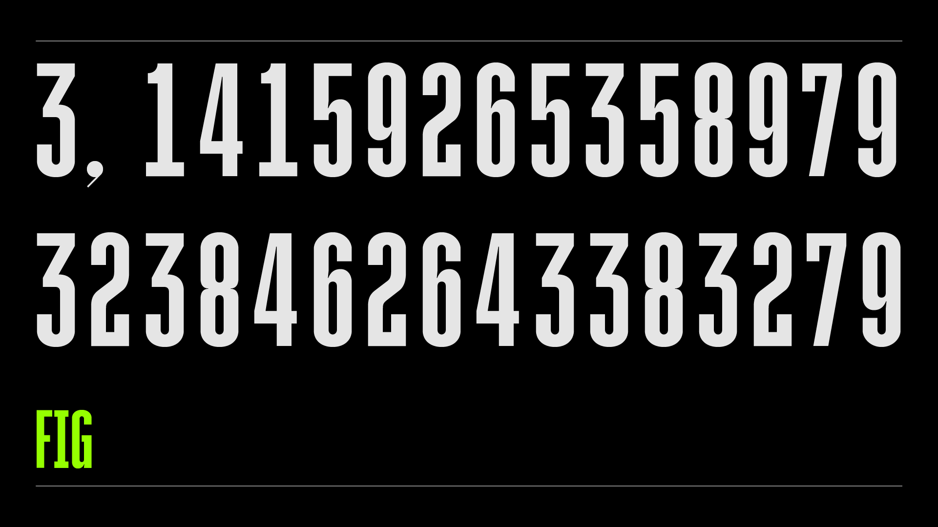
Description: Otradnoye Grotesque (rus. Отрадное Гротеск) was developed for intertitles. It was inspired by the movement of a broad-nib pen. Thanks to the compact style this typeface it would look great in headline in both print and on screens.
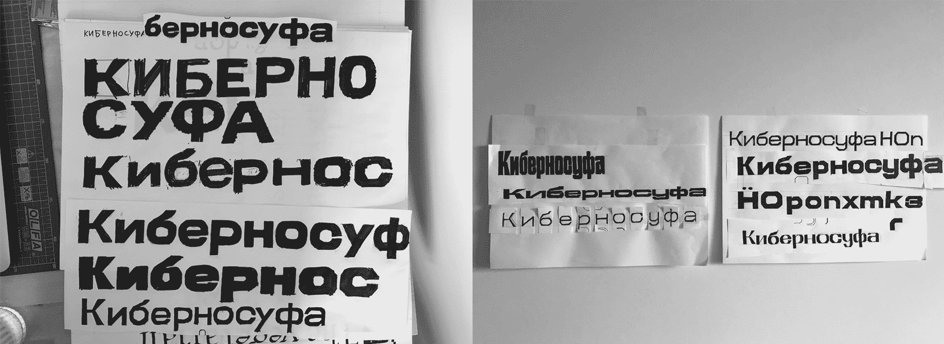
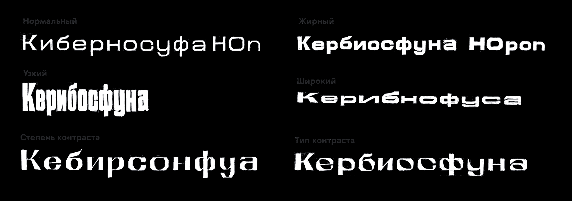
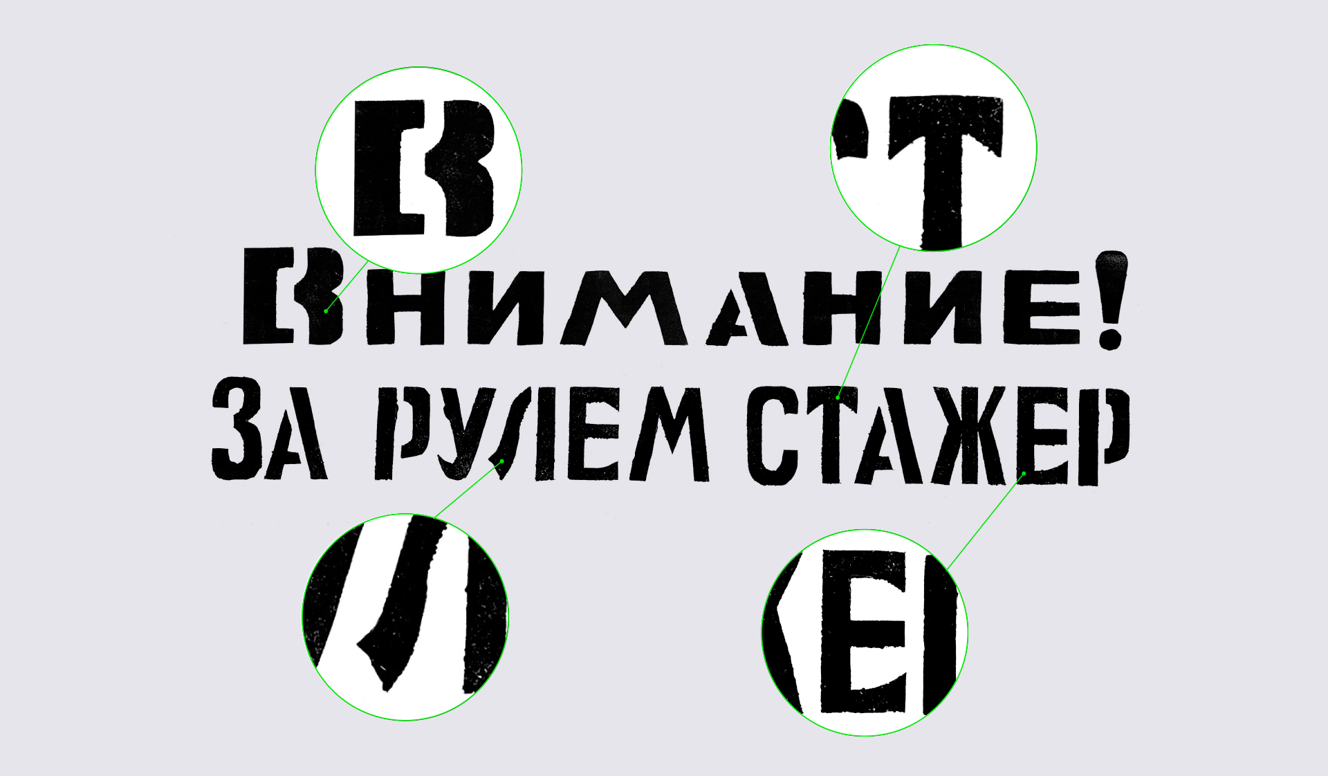
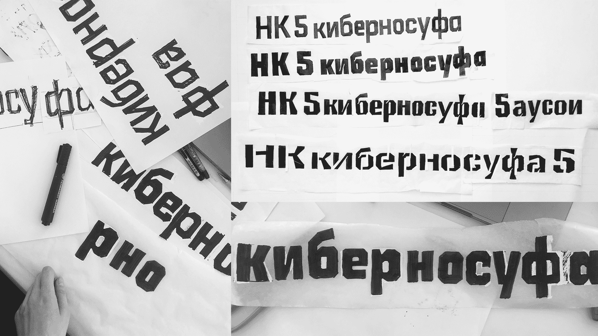
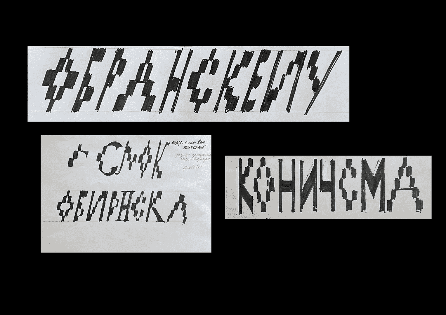
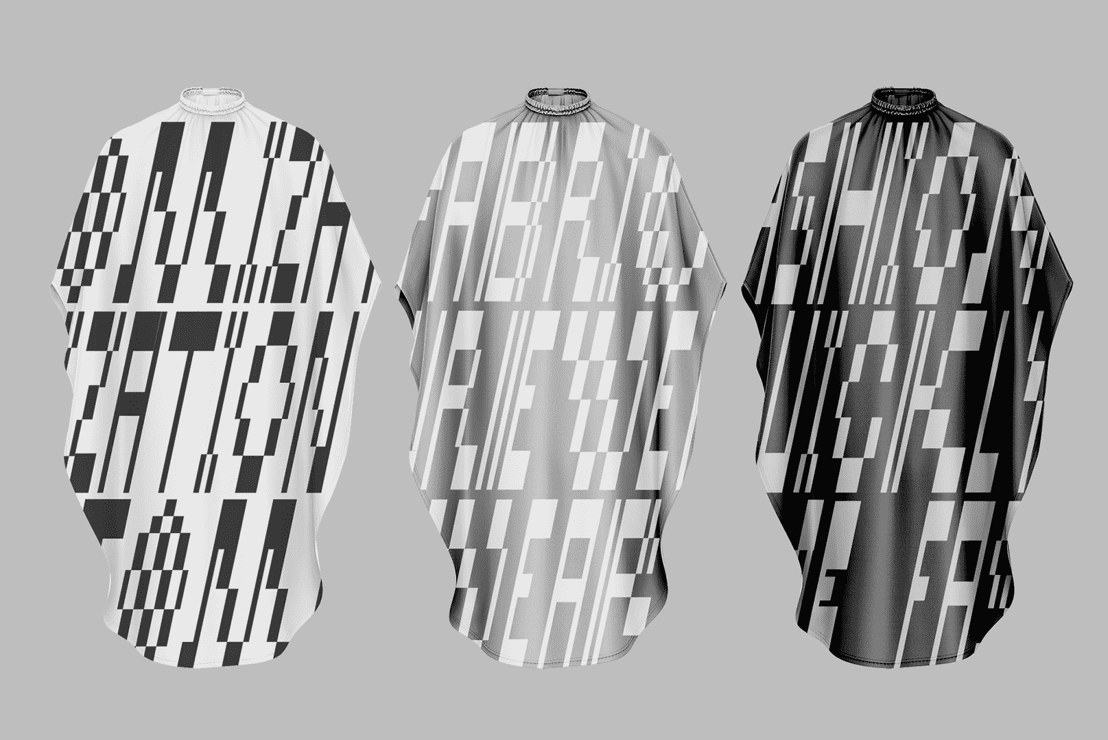
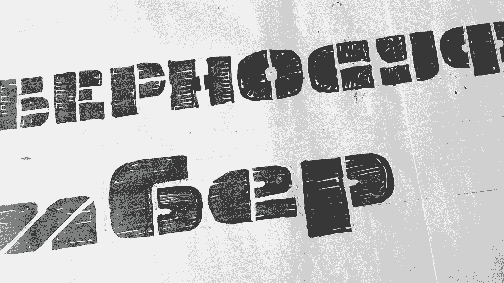
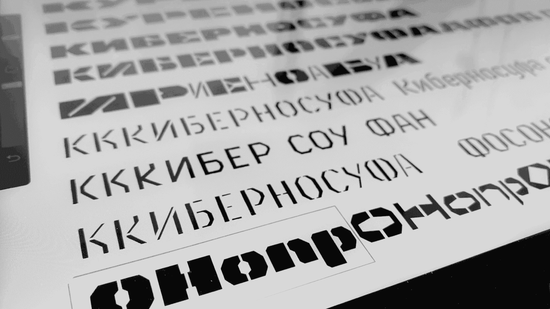
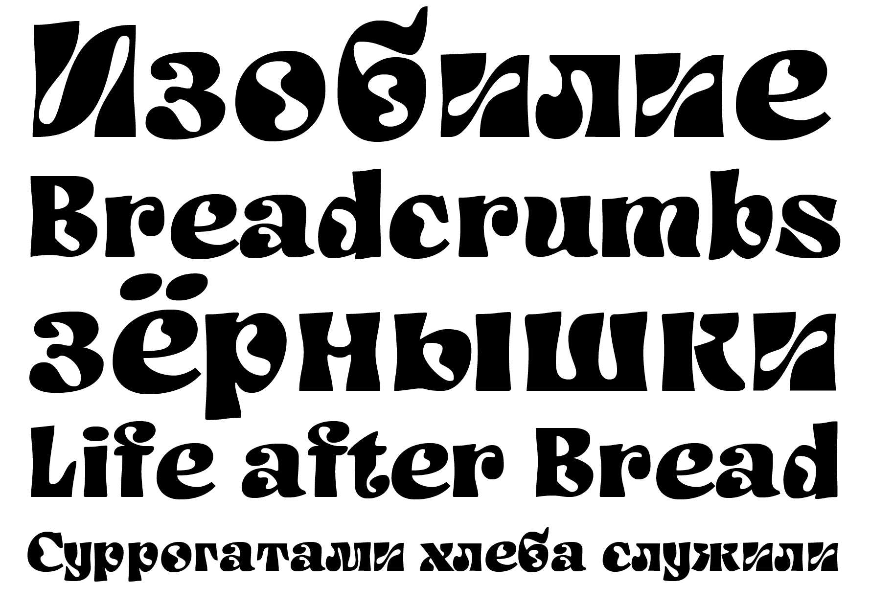
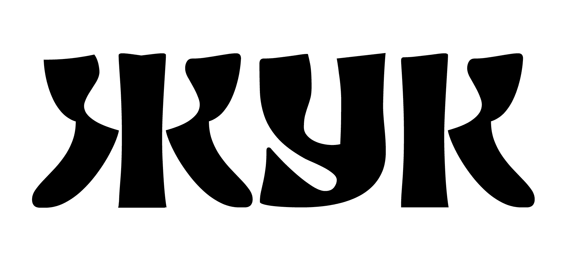
Application: Typeface for a label of a craft drink-kvass.
Styles: Sans Serif, Black Extended, Extra Wide.
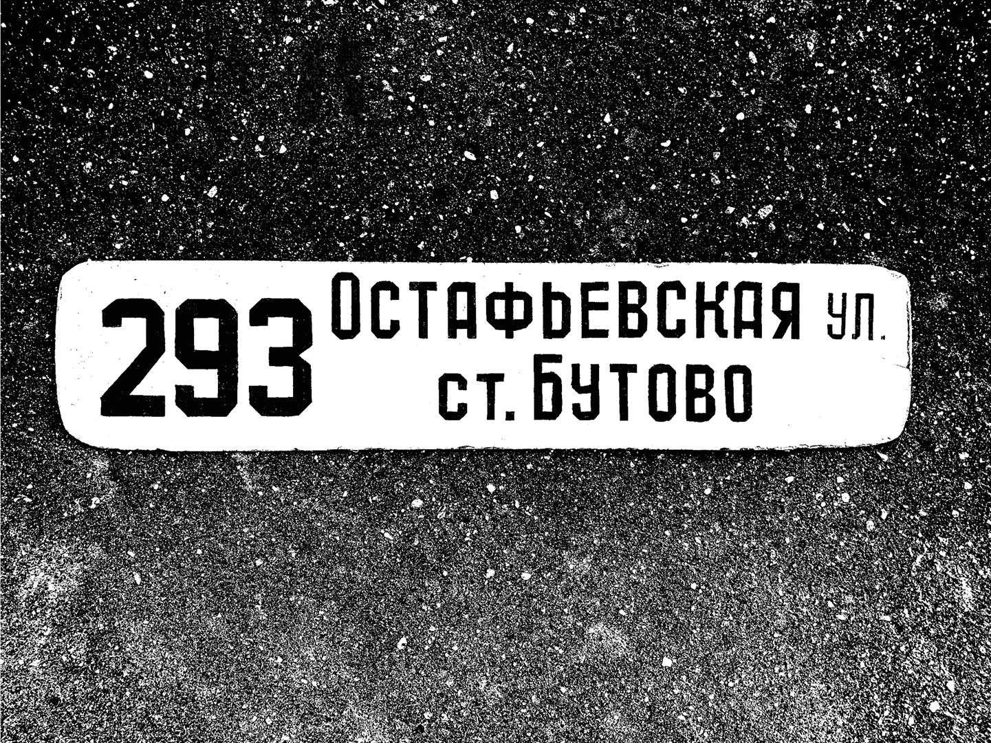
Description: A display typeface based on the navigation plaque from Nagatinskaya Street “В ПАРК'' (translation: “to the park”). Having figured out the intended application of the typeface, I have decided to soften the roughness of the original letters from the sign. Inspired by the round form of the rye bread that serves as a base for the kvass. The main goal of the development of the typeface was adding the half-ustav elements and constructions into the humanist sans serif.
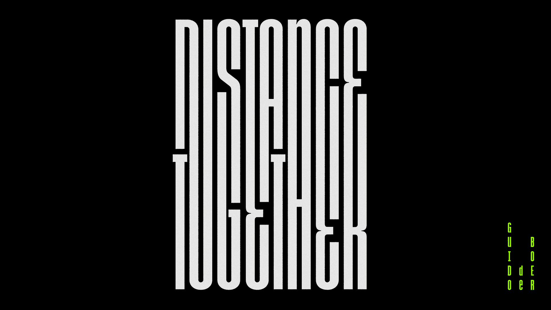
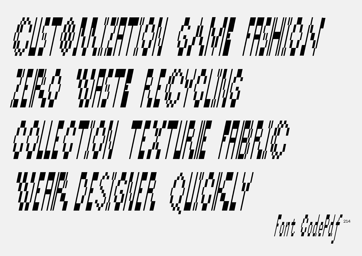
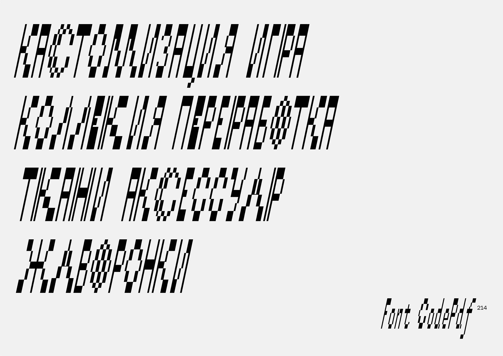
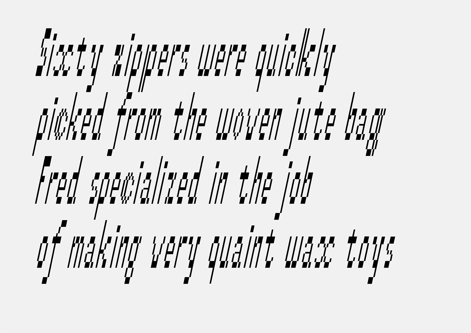
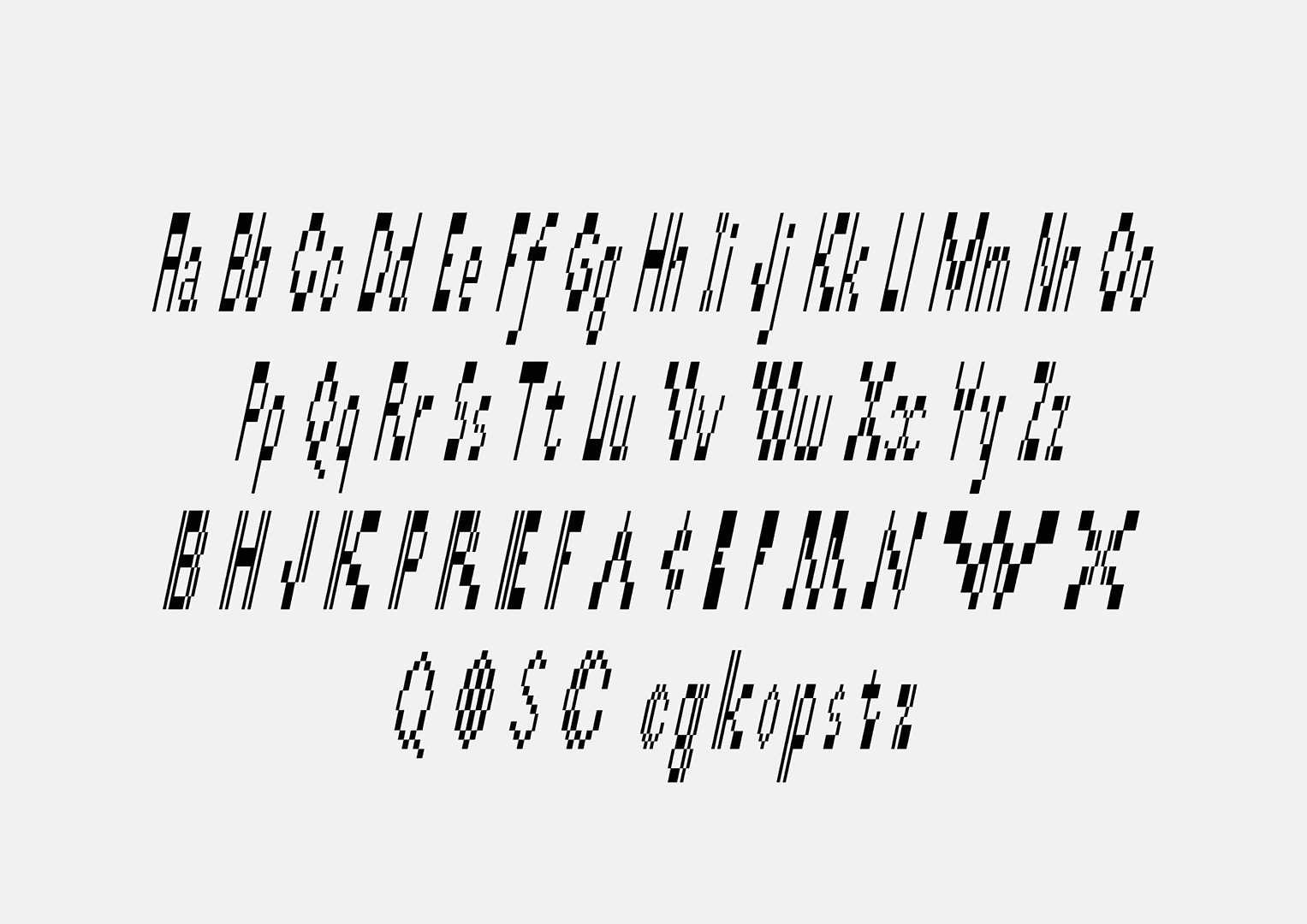
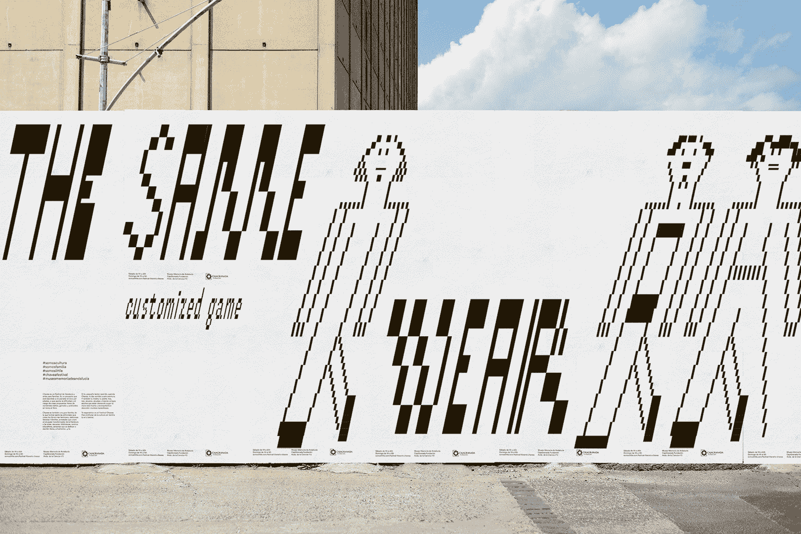
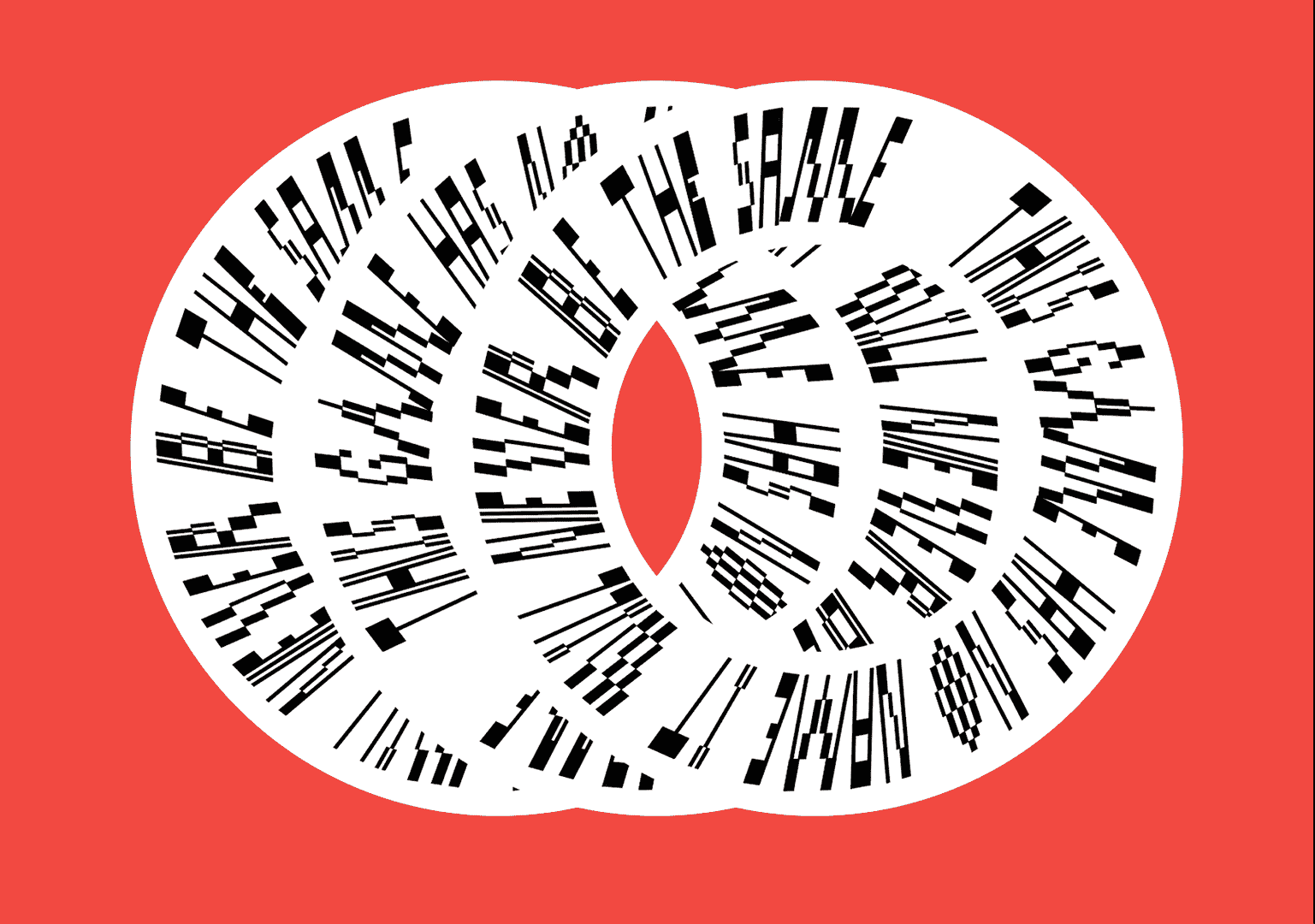
Intended application: Stylised 8-bit video game.
Final application: Typeface for a fashion campaign for a clothing brand (smm, merch, print).
Style: Italic.
Description: Display typeface for short sentences. Contains a large amount of alternative symbols.
Released at tomorrow.type.today.


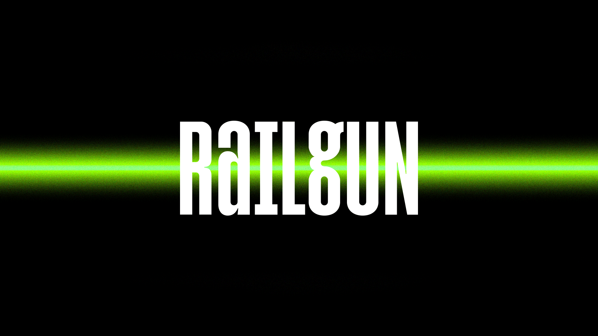
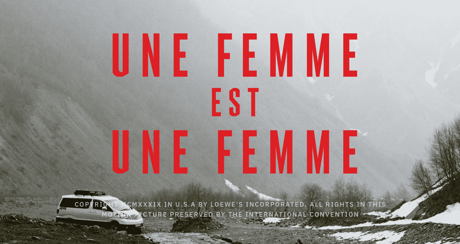
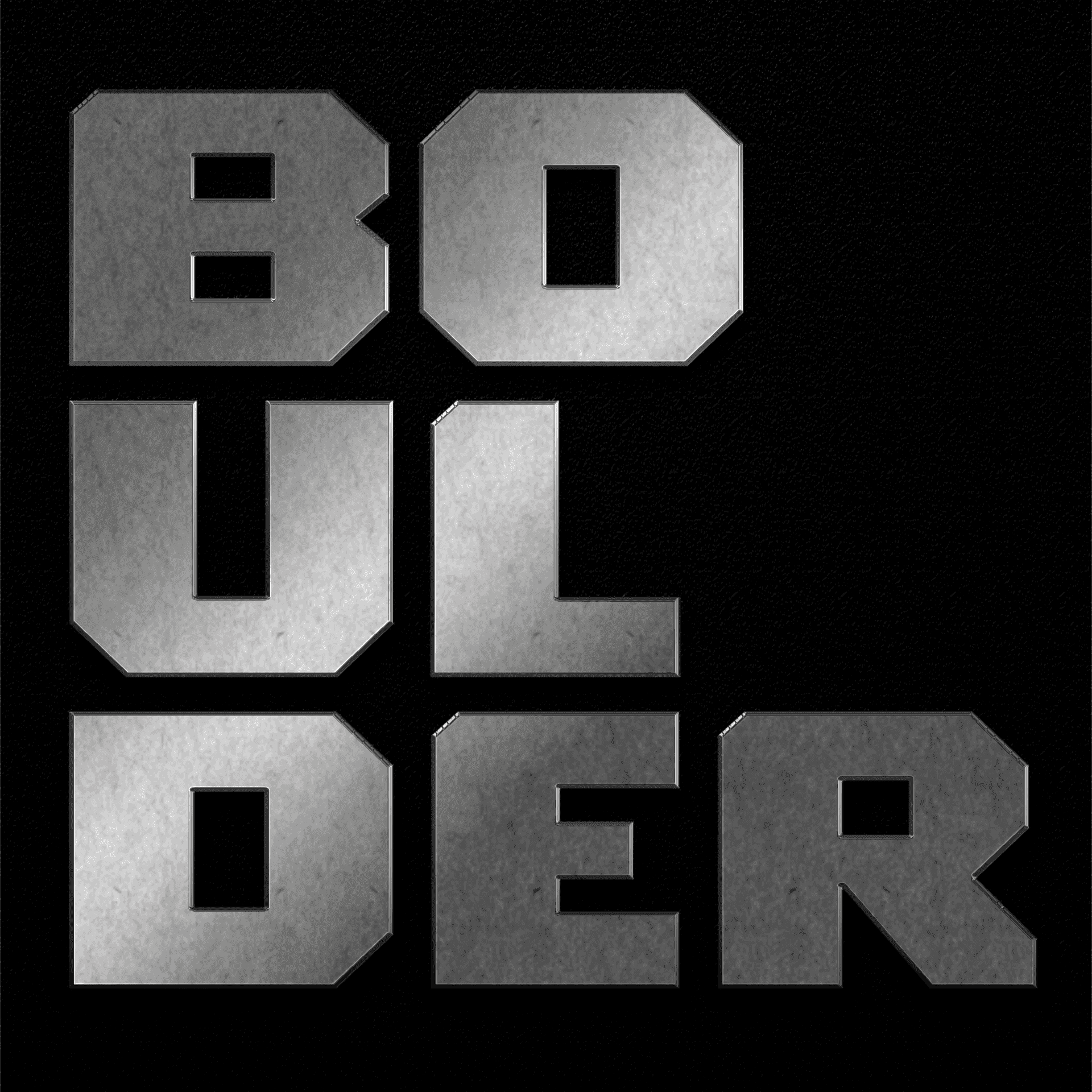
Application: a typeface for a car brand.
Styles: Variable (Black, Black extended, Light, Light Extended, Stencil Black, Stencil Black Extended, Stencil Light, Stencil Light Extended).
Description: Boulder is a brutal typeface, inspired by the large square-angle S.U.V.’s. It is perfect for logos, large titles and all kinds of display typefaces. Unlike many stencil typefaces, Boulder supports Cyrillic, which allows for multilingual branding.
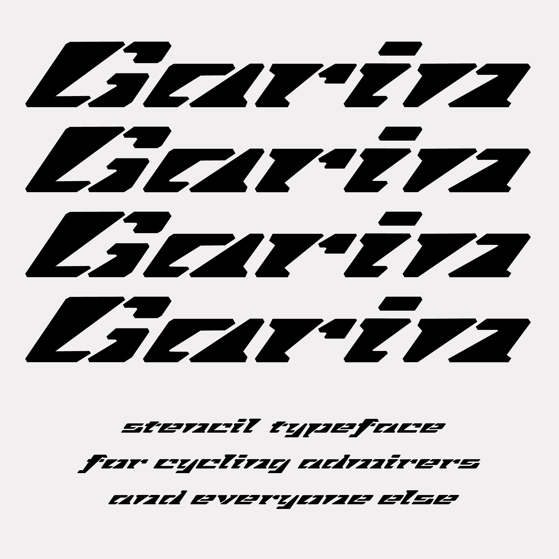
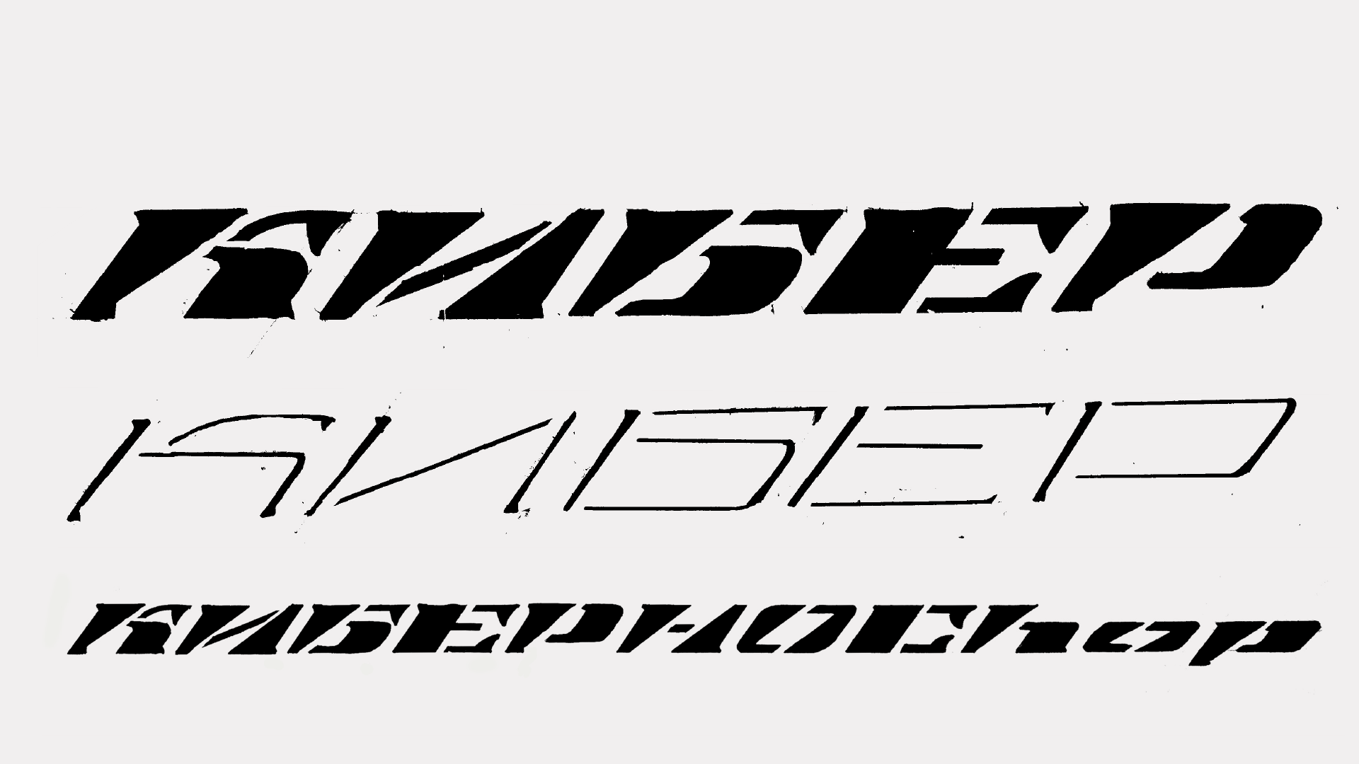
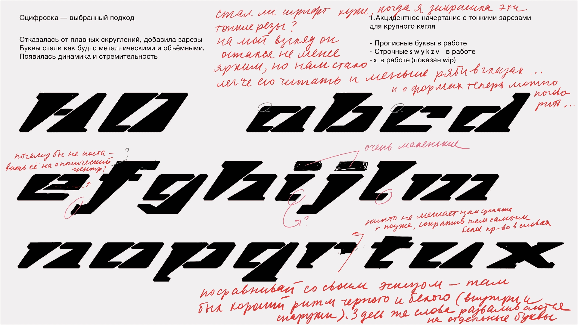
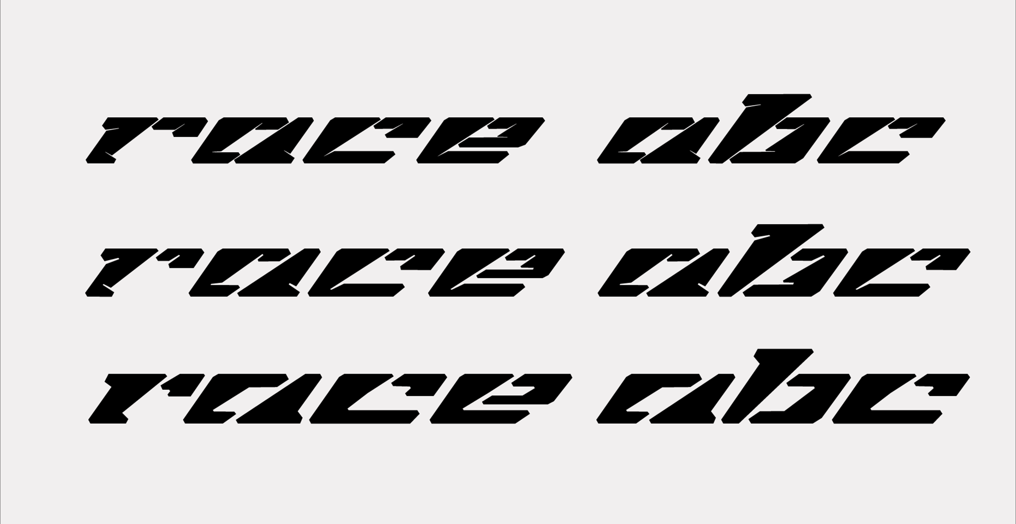
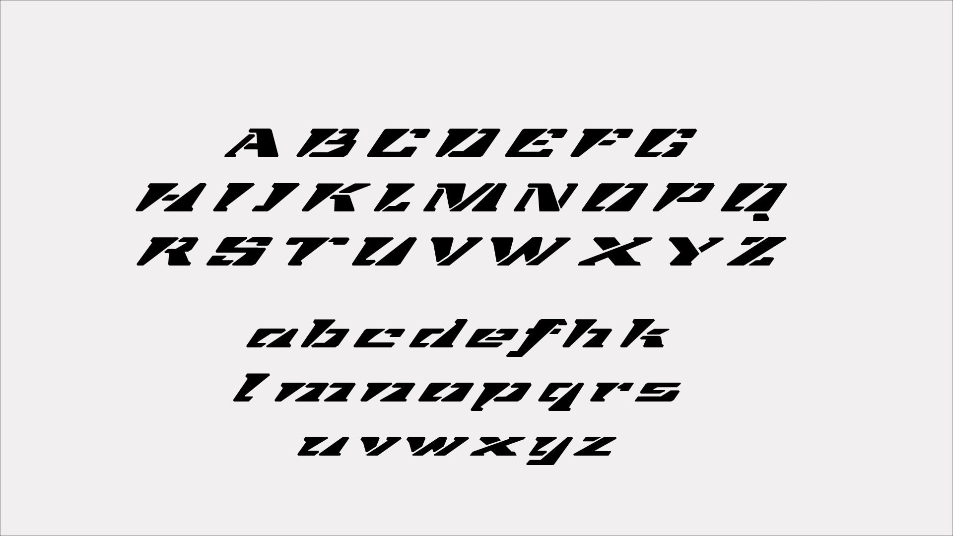
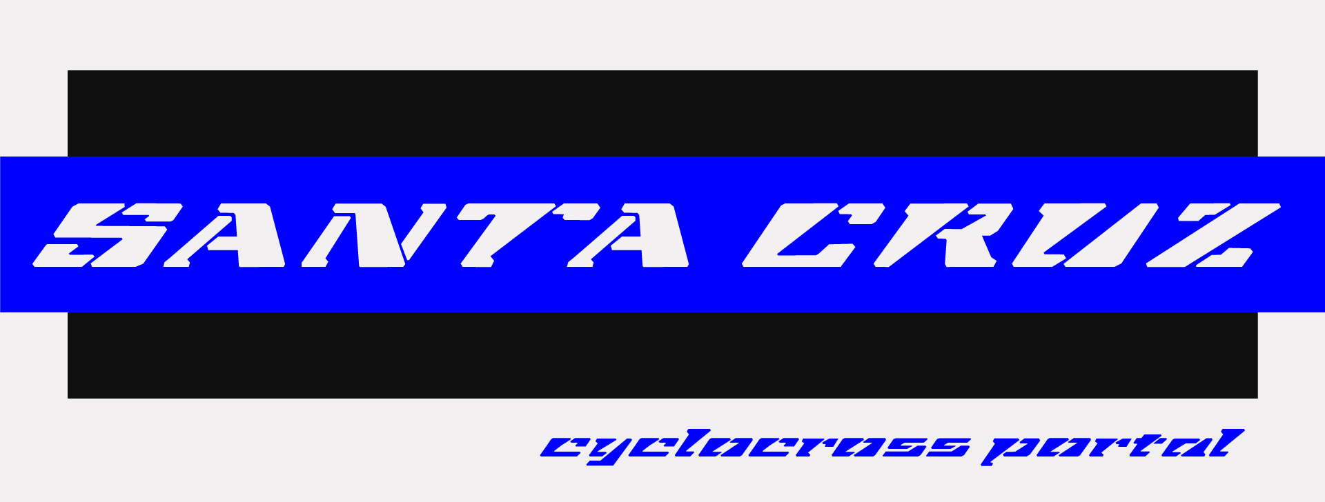
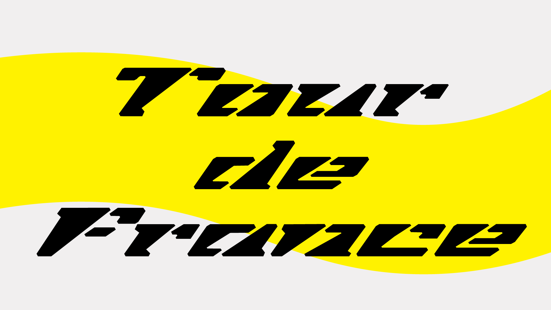
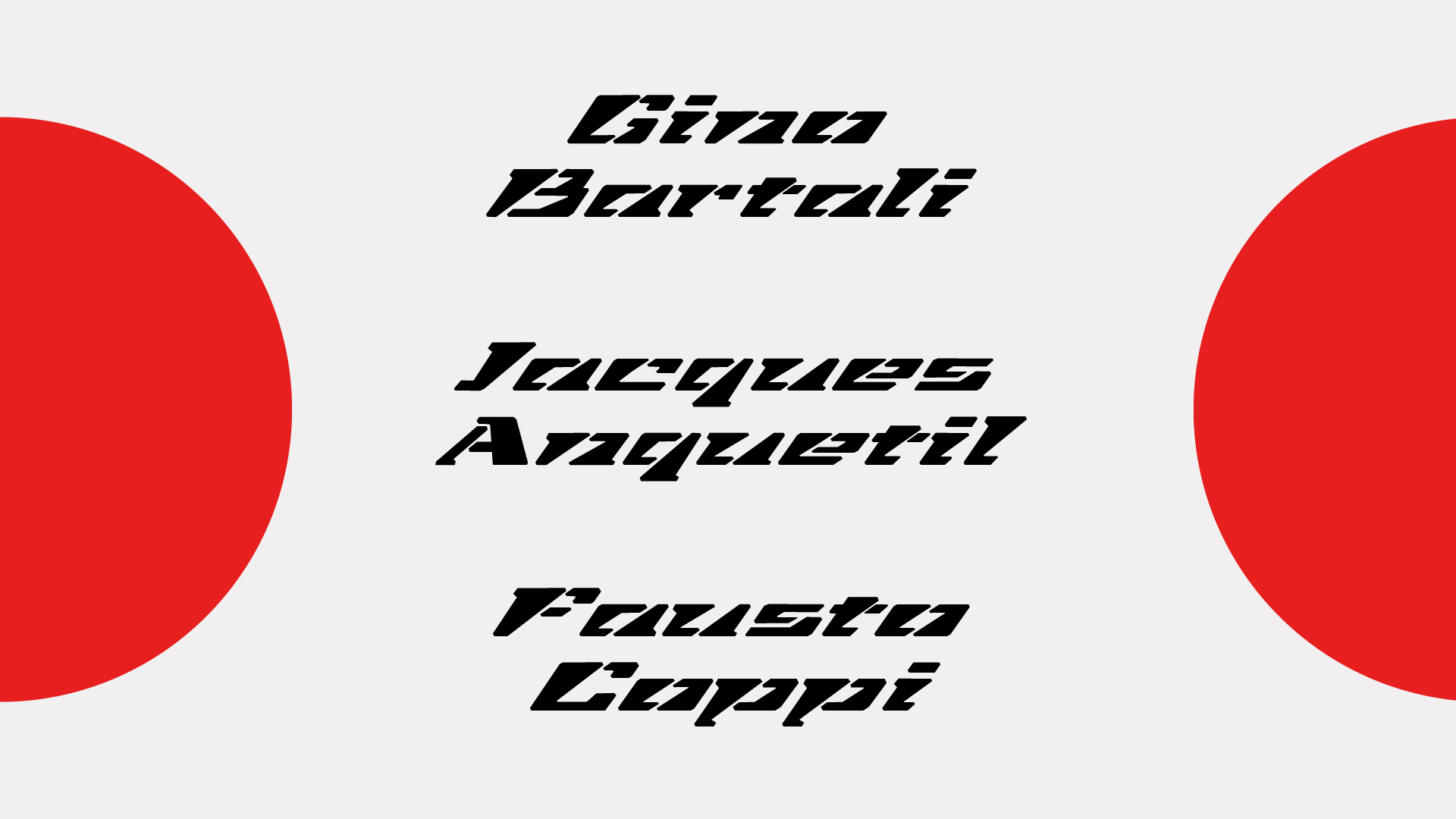
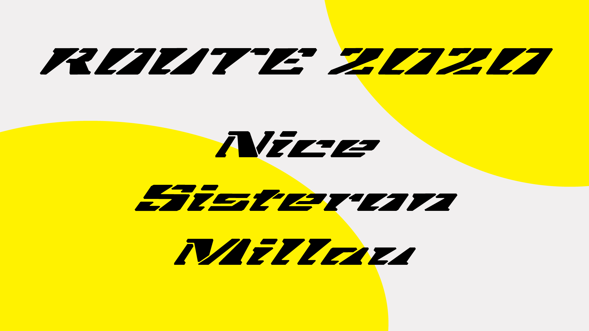
Application: Display typeface for cycling sports.
Styles: Heavy, Extended, Slanted, Stencil.
Description: Extended heavy typeface, inspired by the idea of the blend between a stencil typeface and a display typeface, which is typical for the cycling sports. Based on cursive. Has a large tilt angle, which adds movement and dynamics to the typeface. Intended to be used in headlines and as a display typeface.
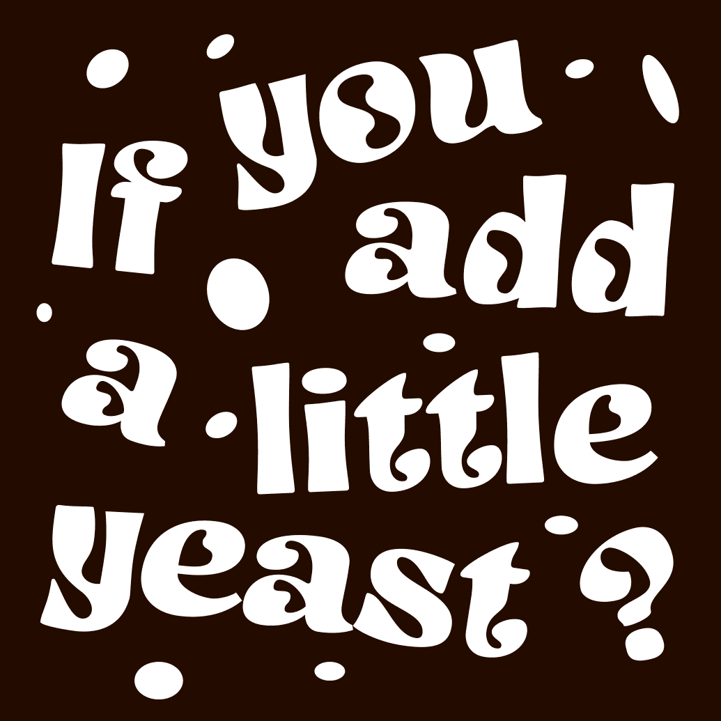
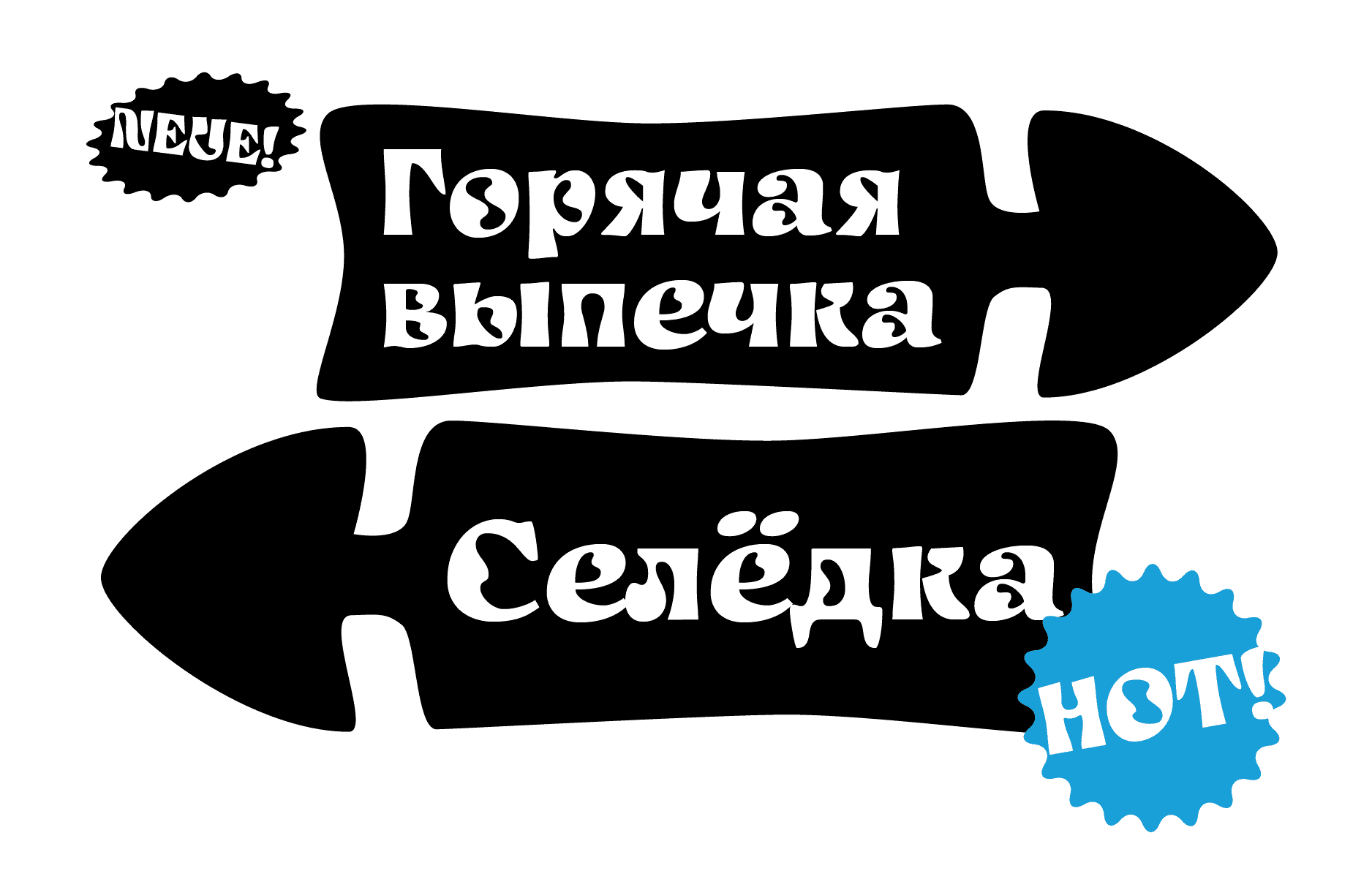
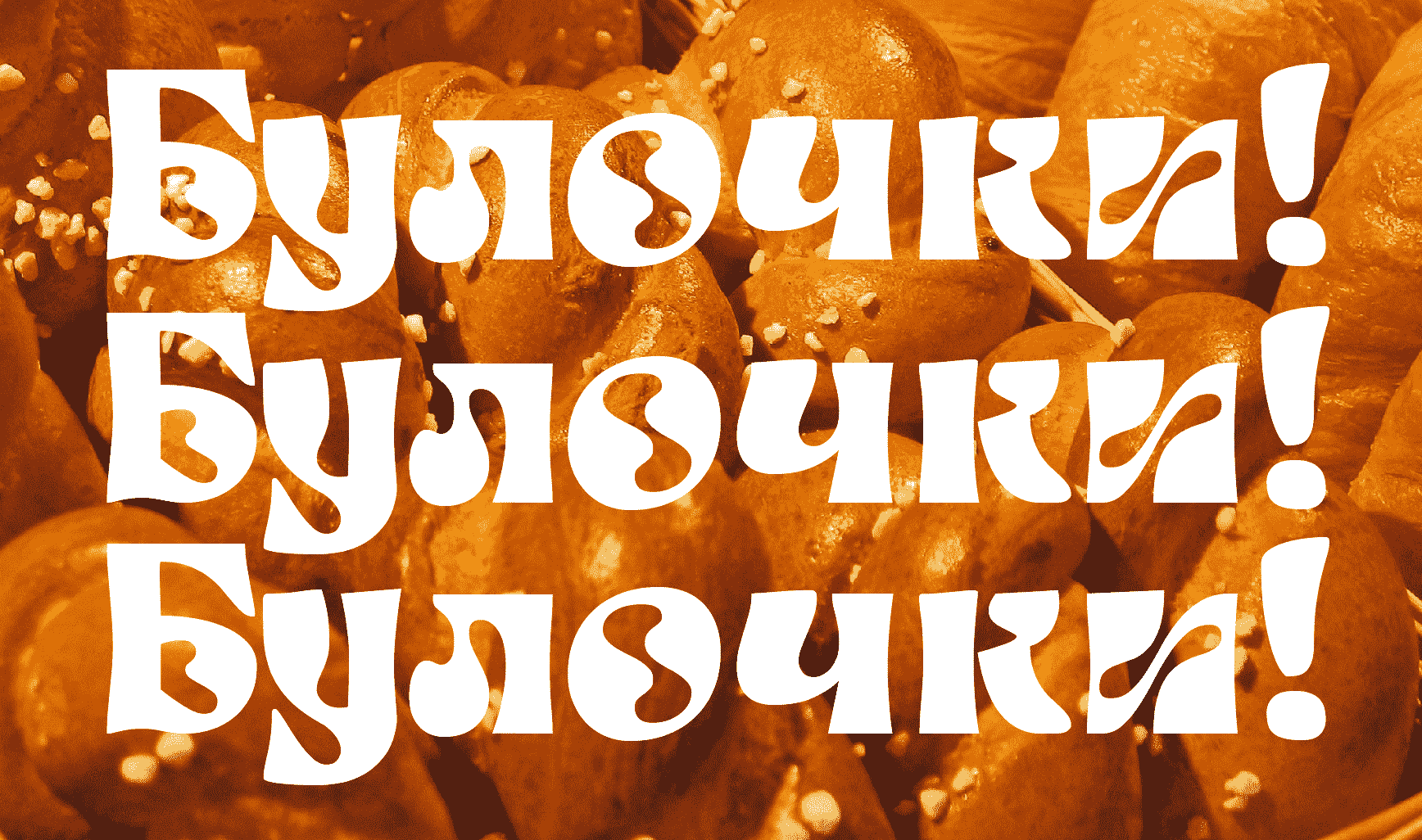
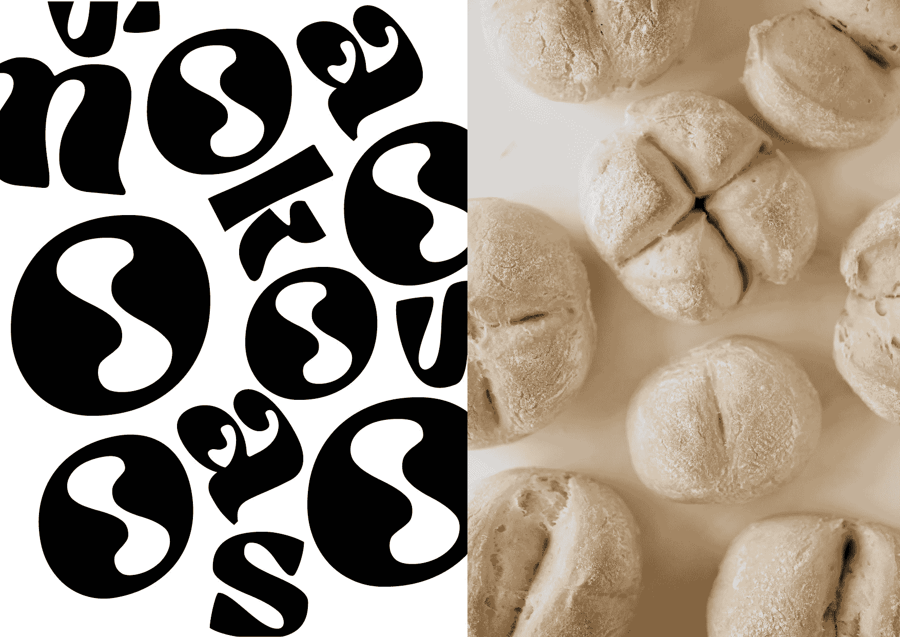
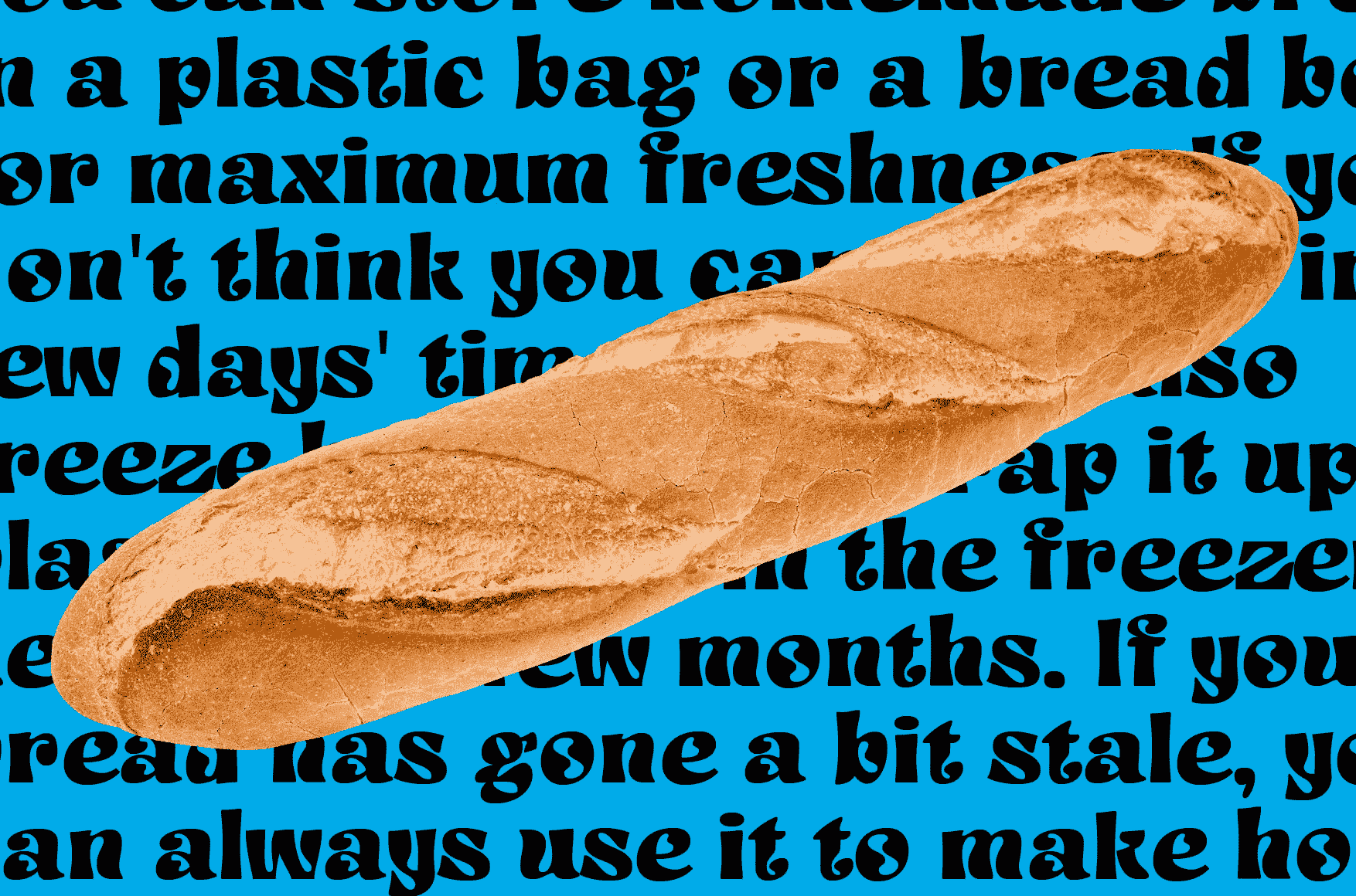
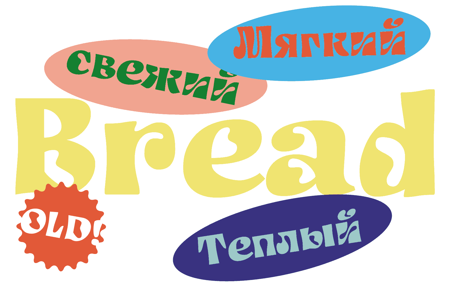
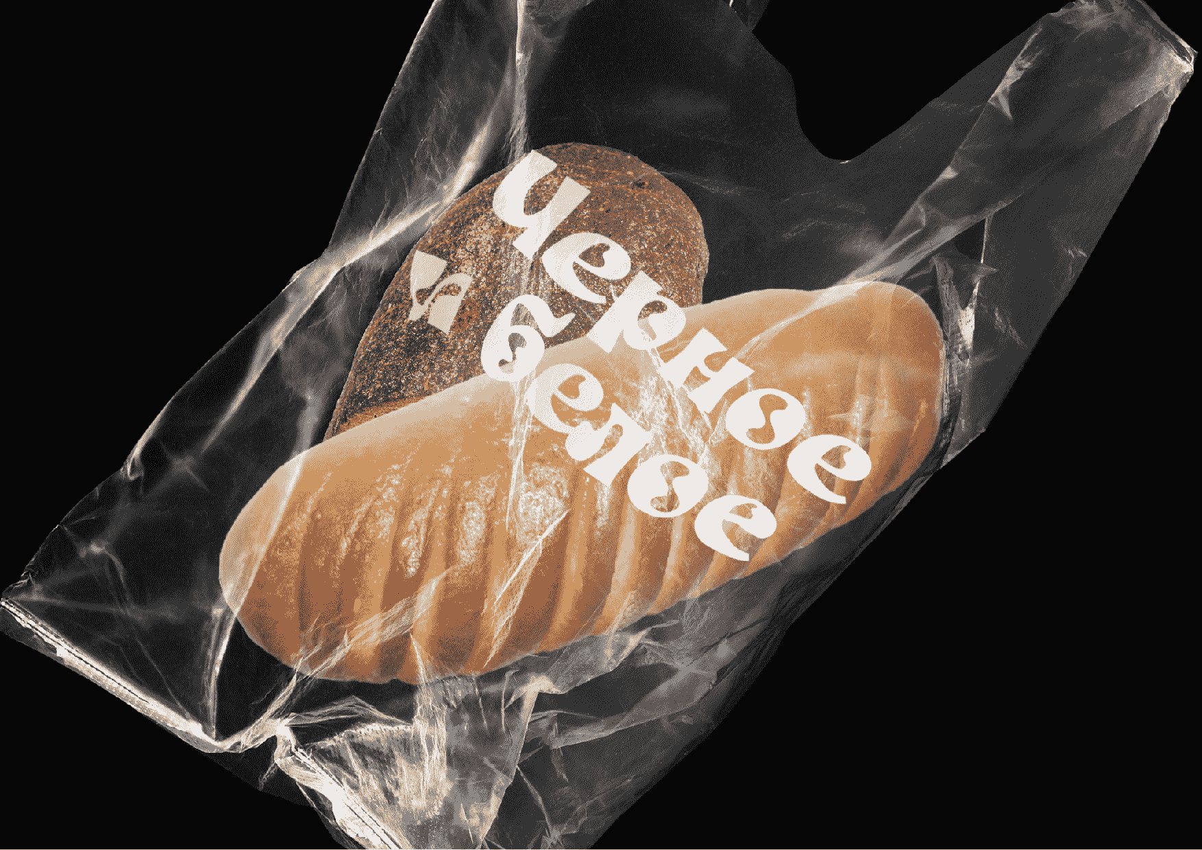
Application: Typeface for a bakery.
Styles: Variable between wide/condensed and regular/puffed up.
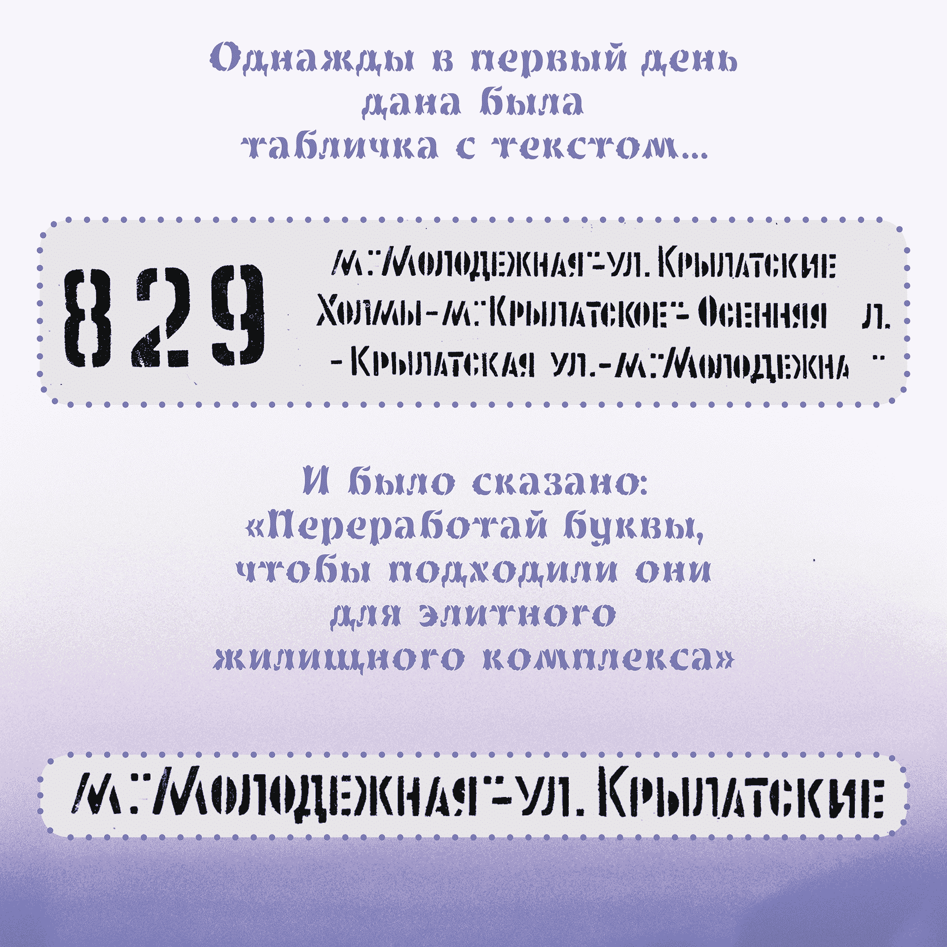
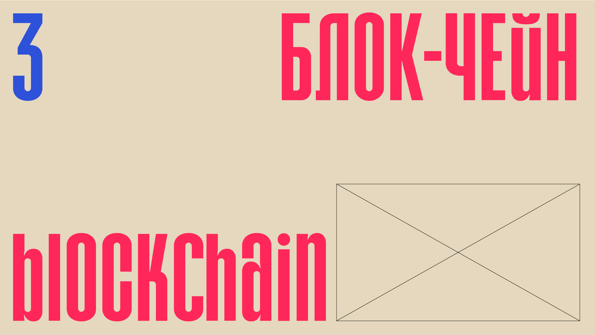
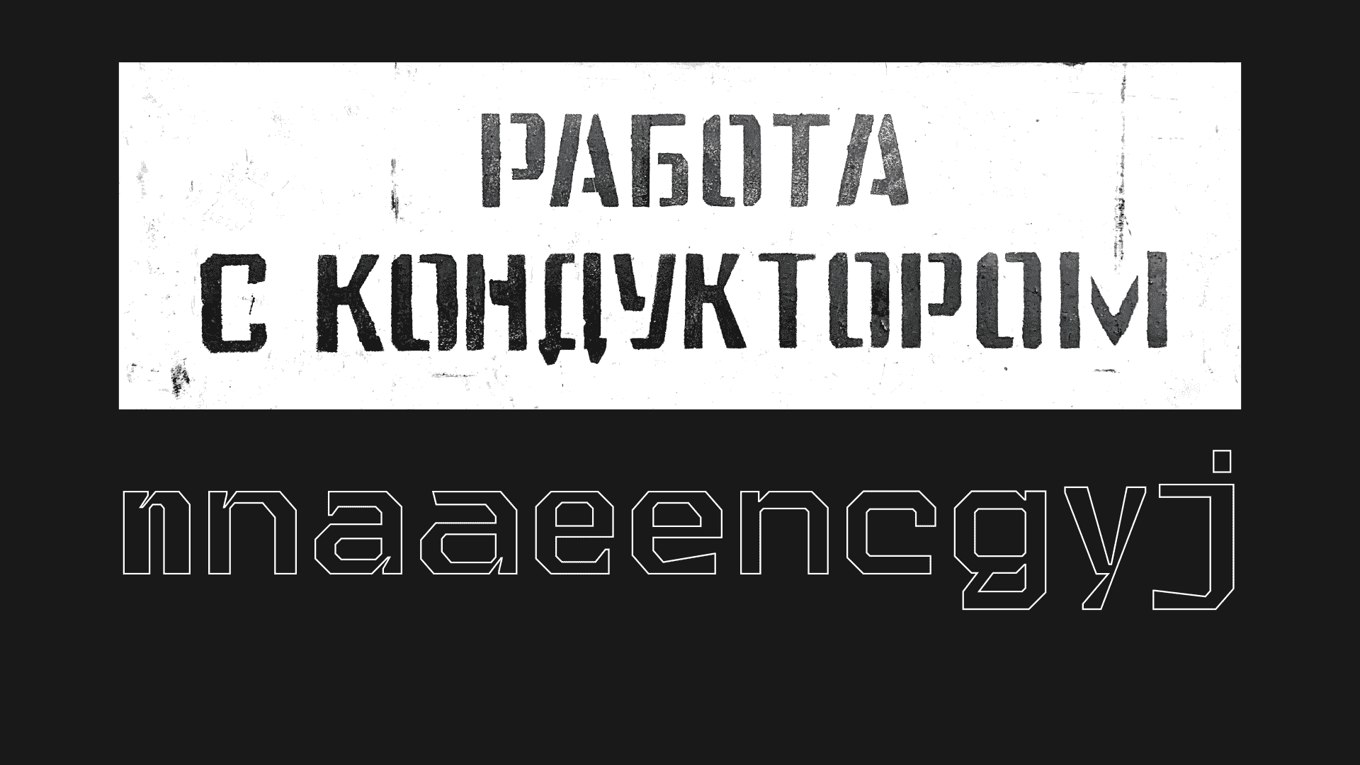
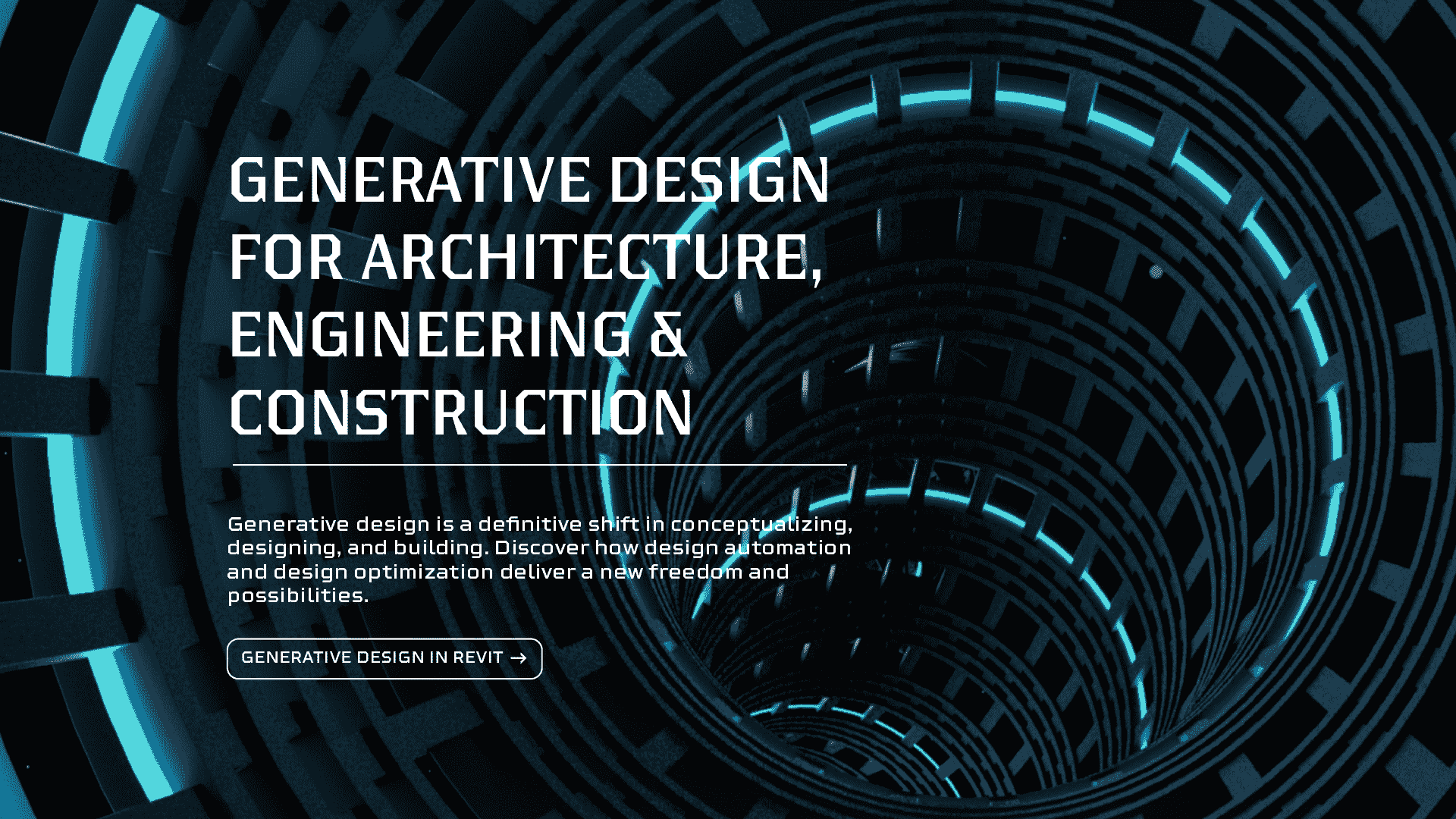
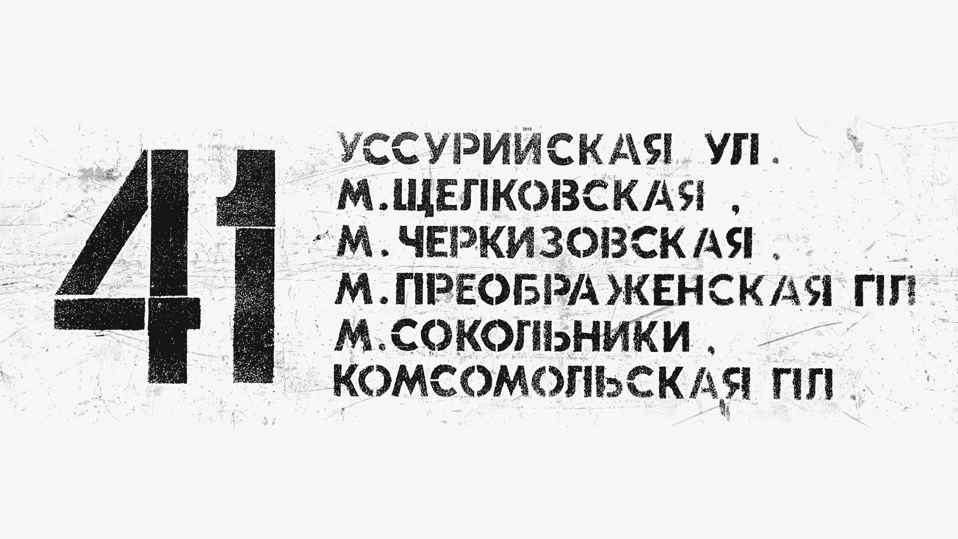
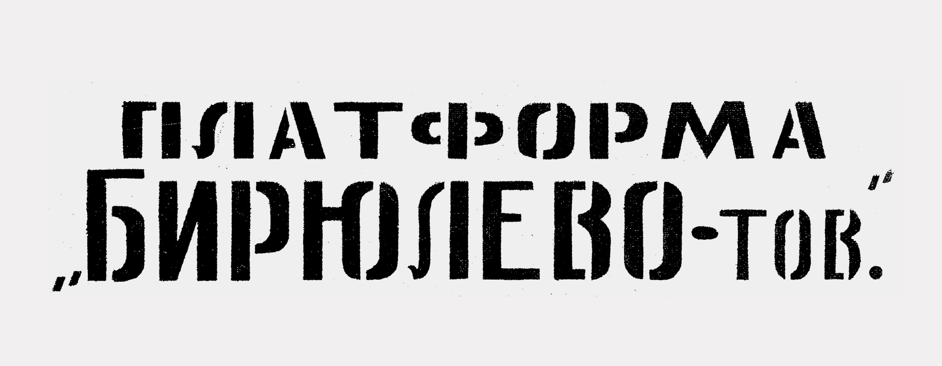
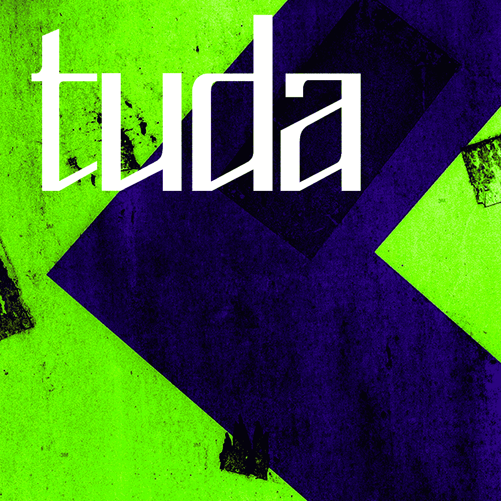
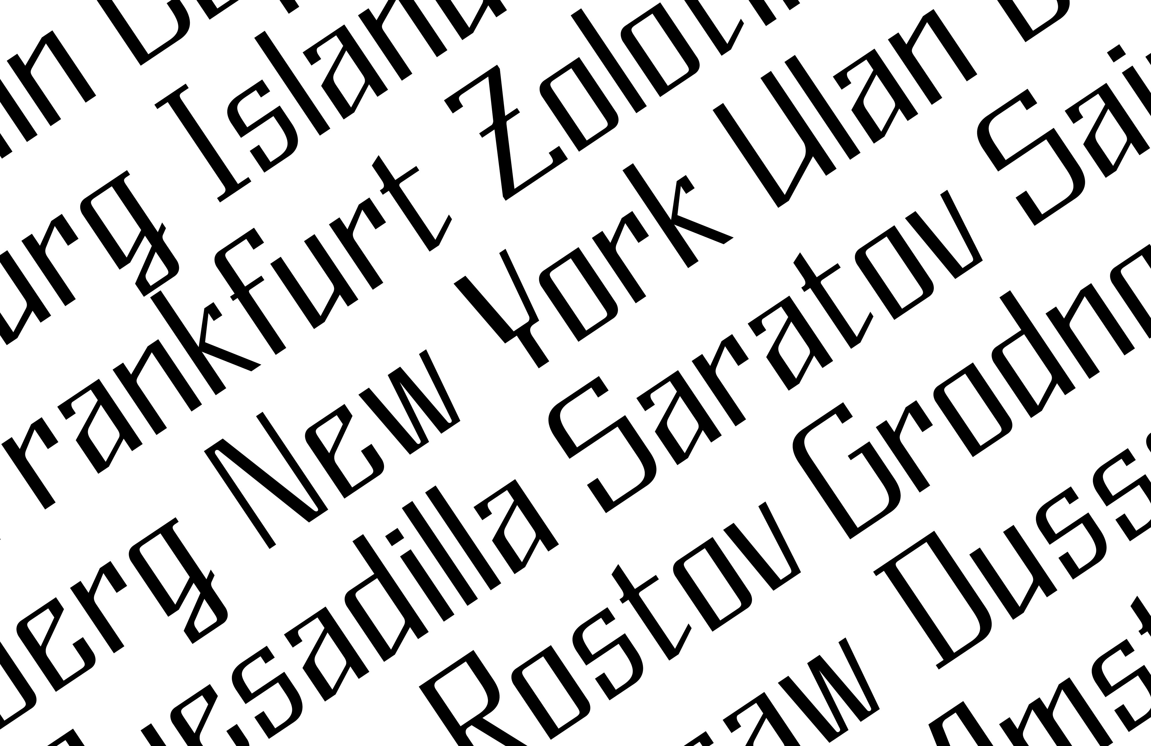
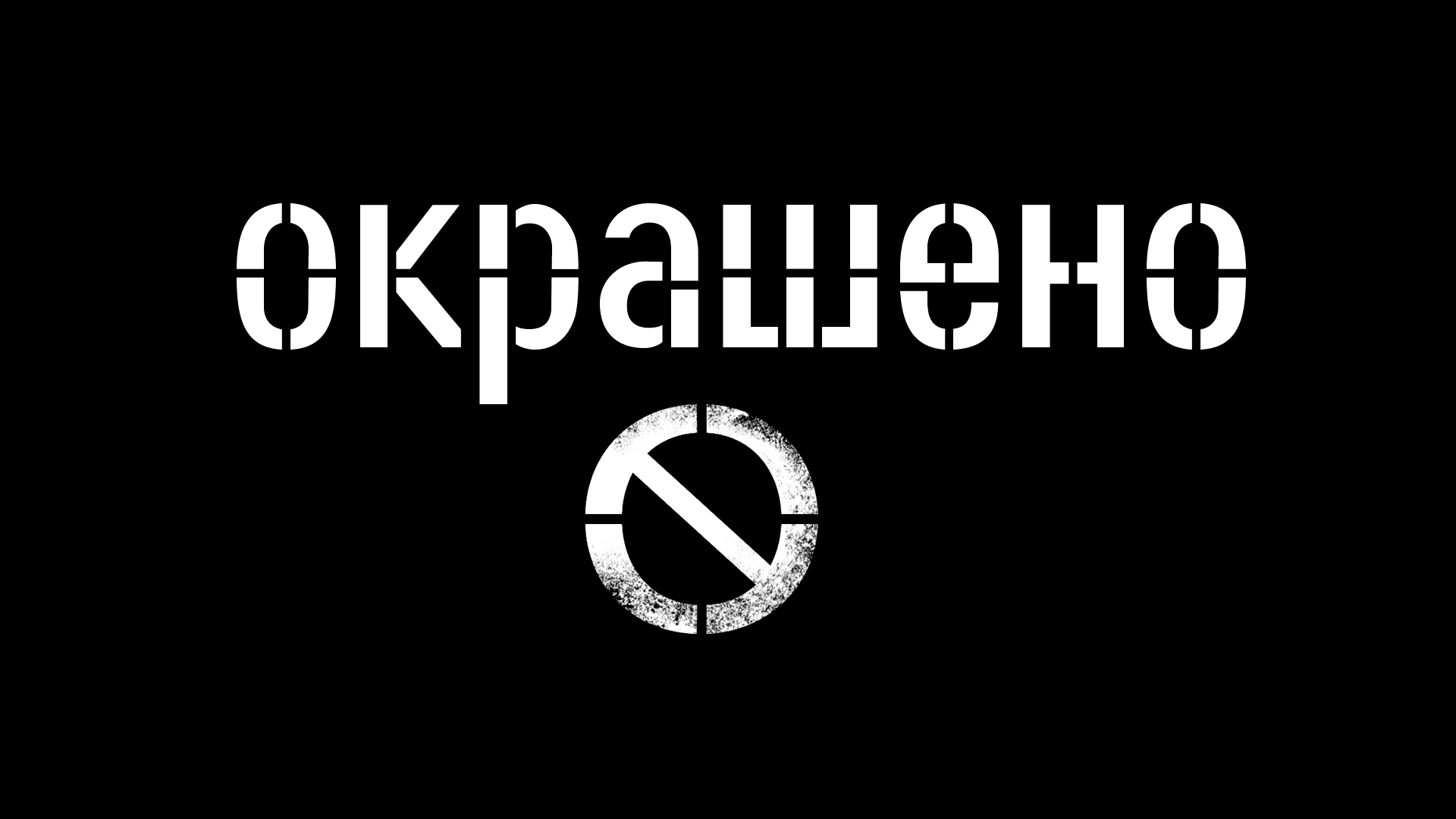
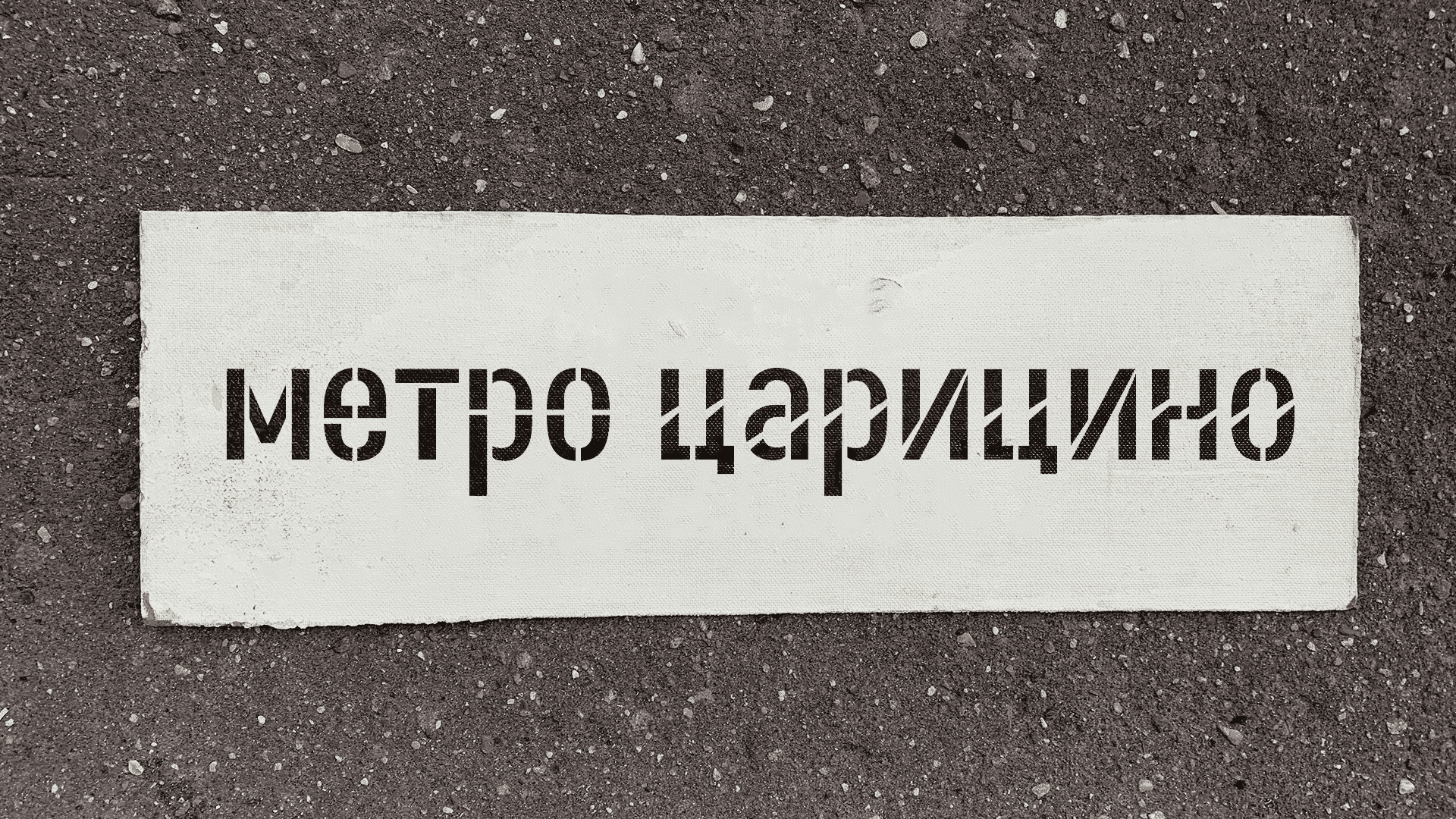
Application: Typeface for road signs.
Style: Medium Condensed.
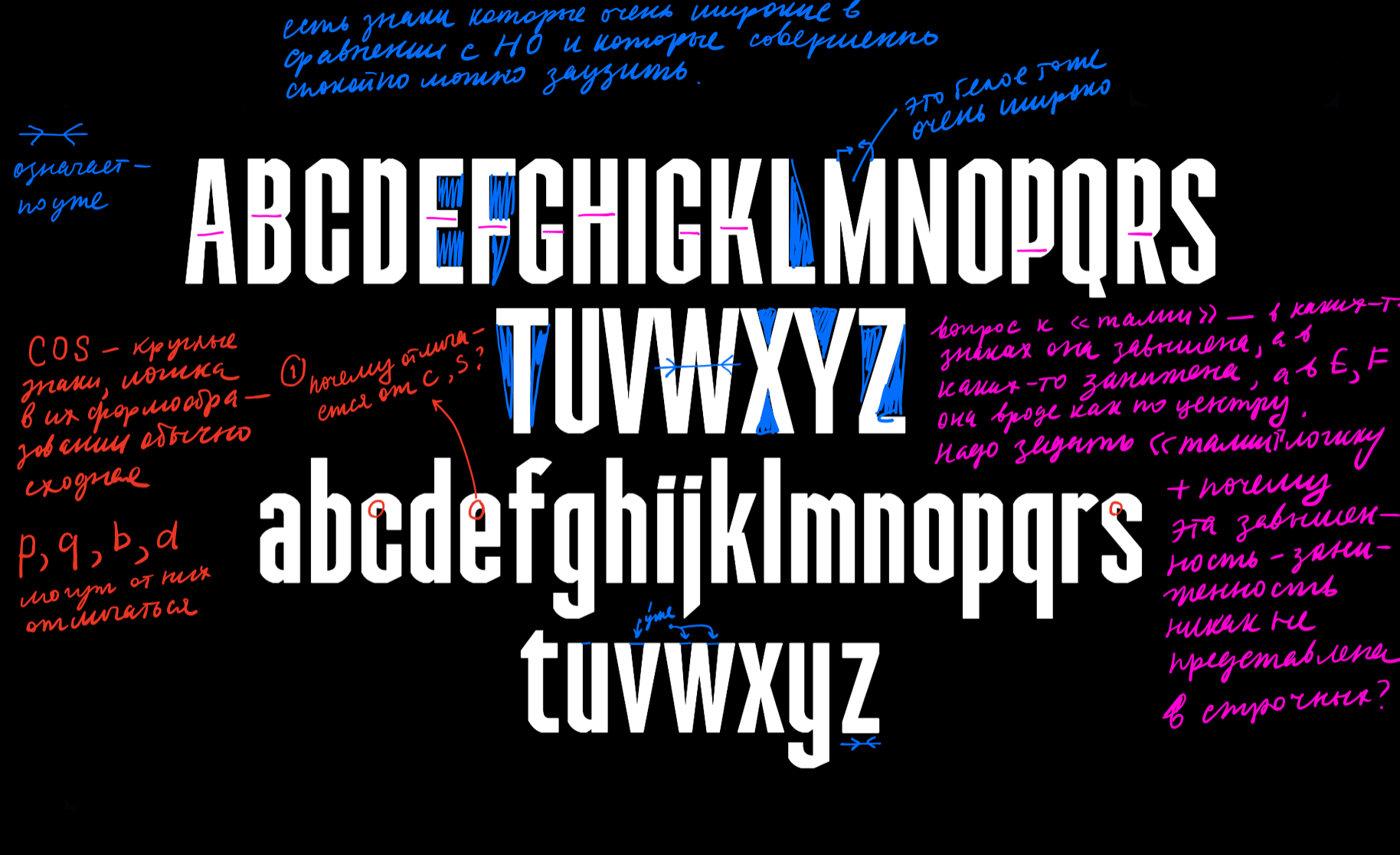
Description: Tuda is a display typeface for navigation within the city with a gothic aftertaste. The foundation of the typeface is the movement of a formal pen. Simple, yet containing peculiar details.
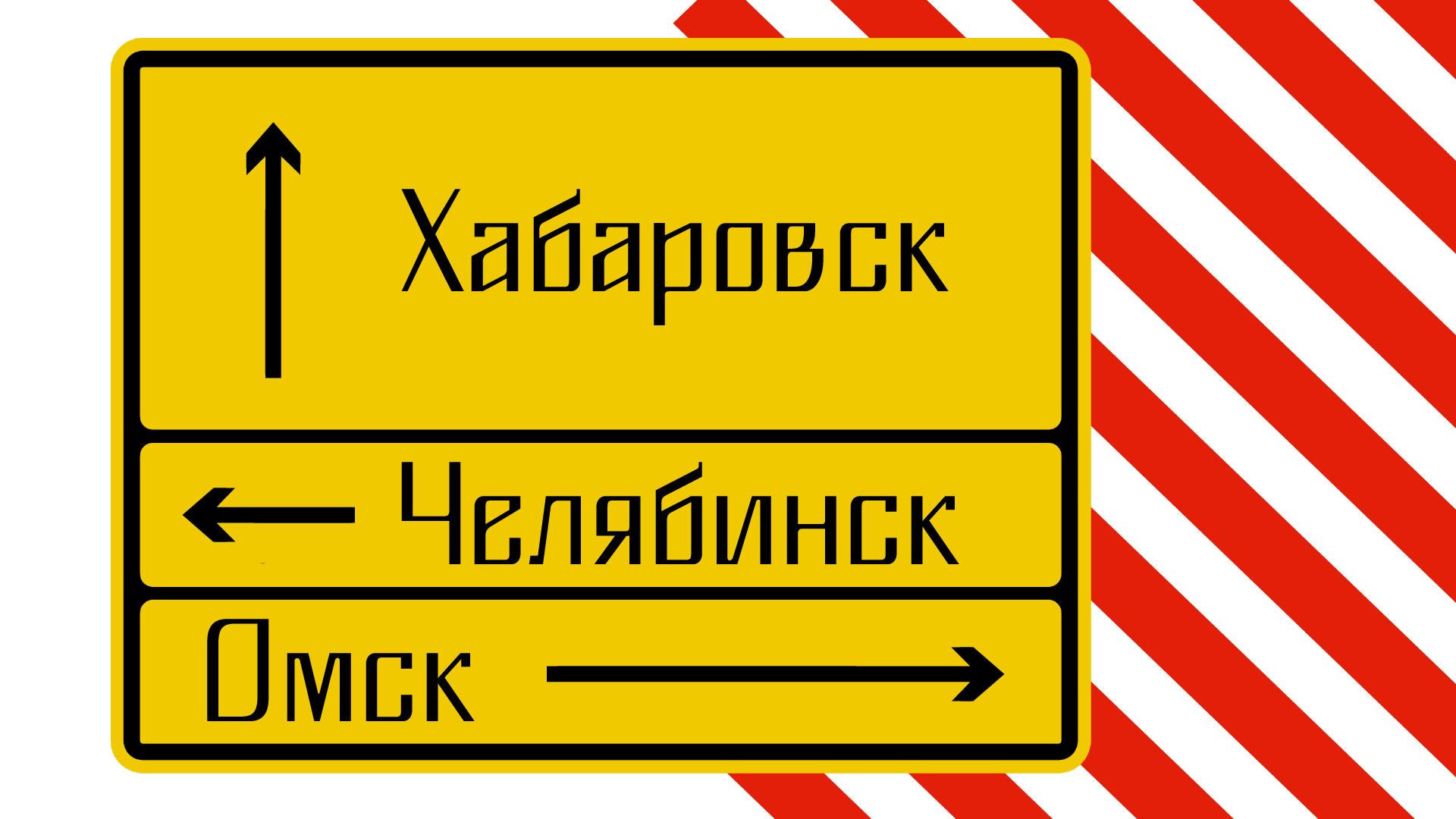
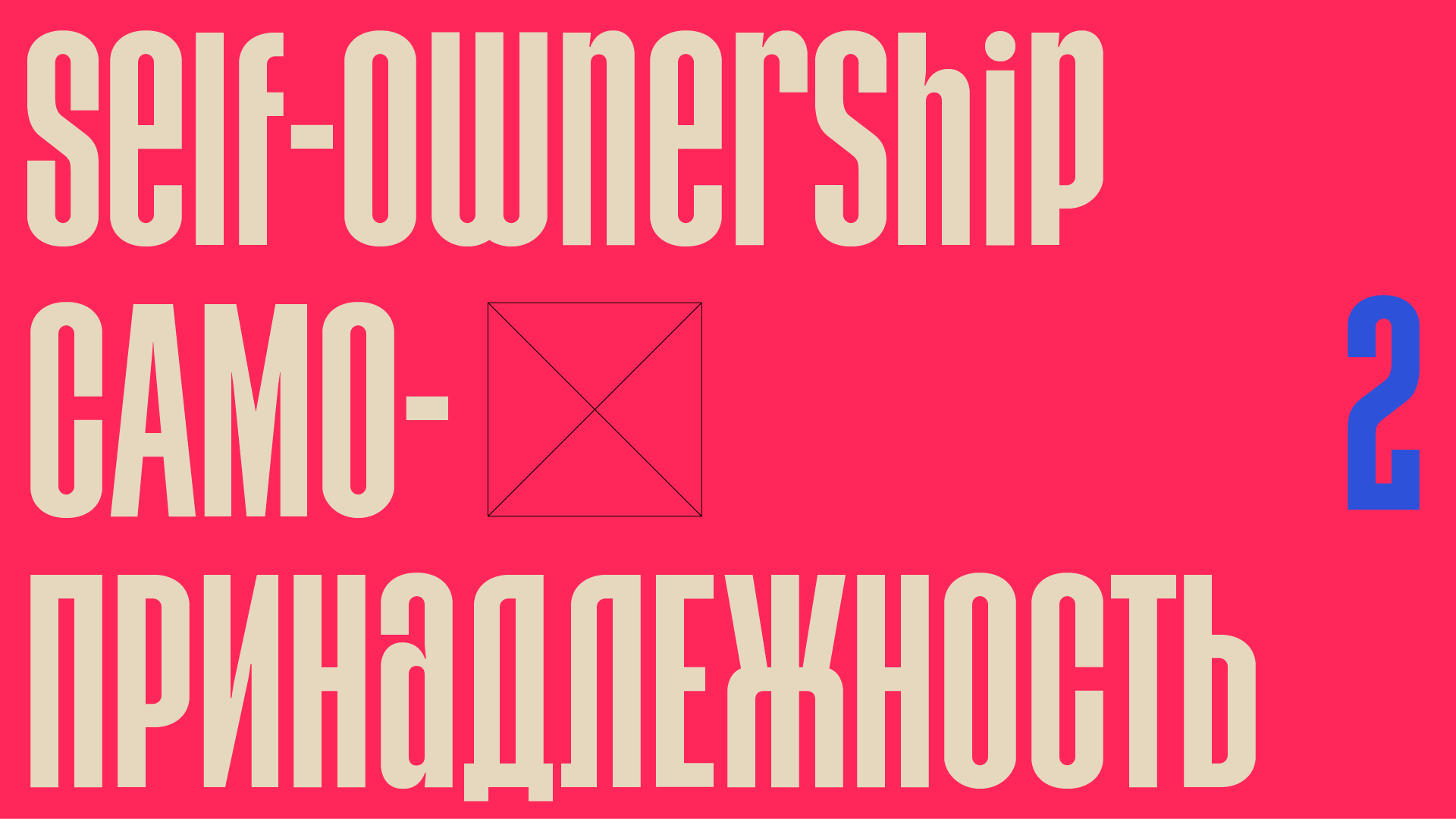
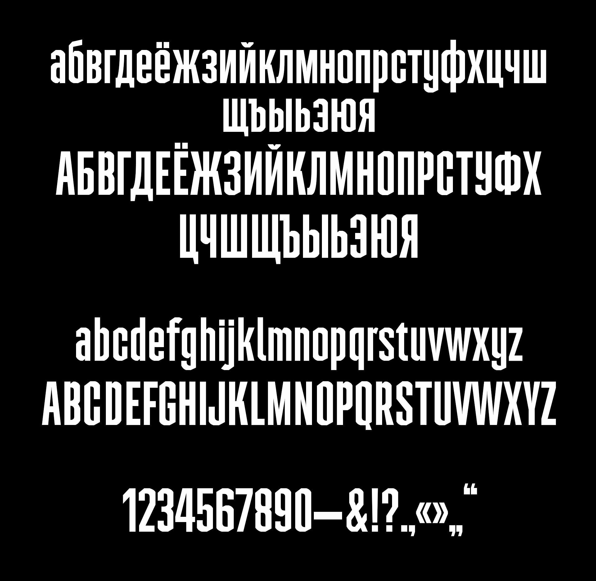
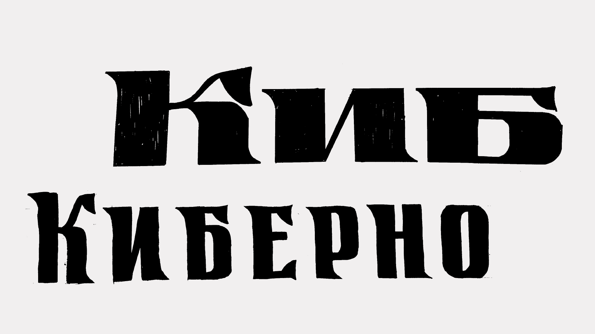
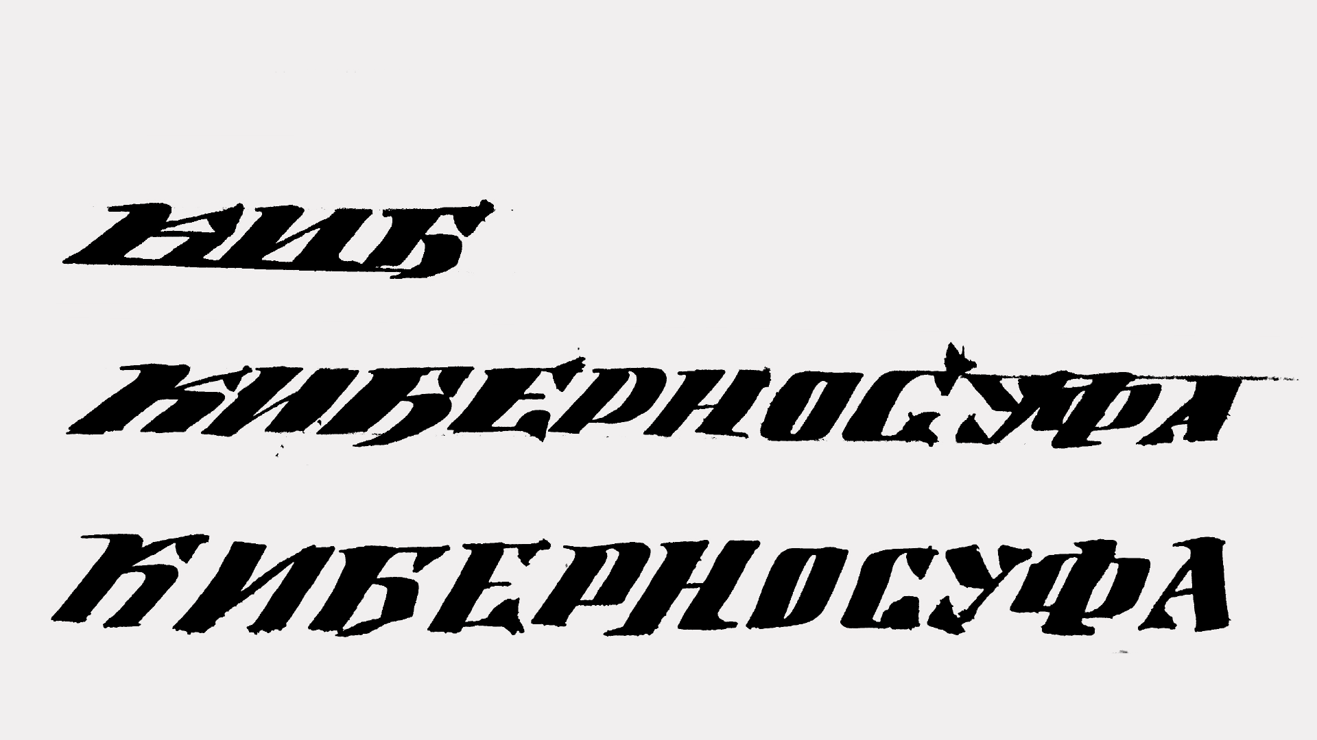
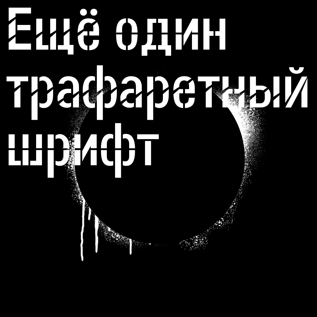
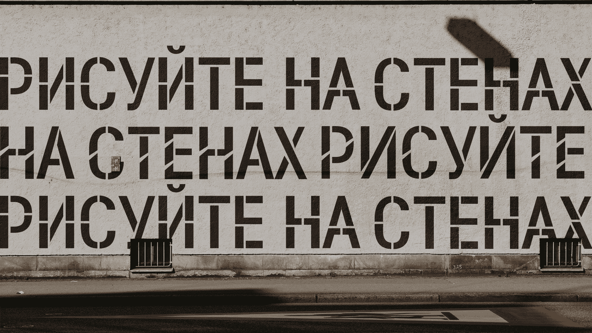
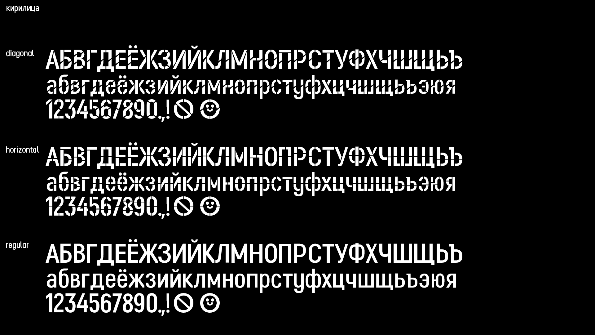
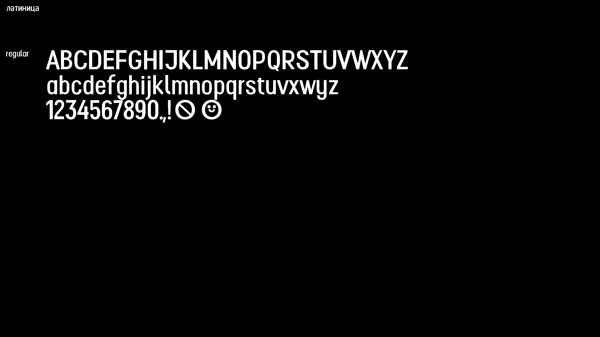
Application: Typeface for the visual navigation/information signs.
Typeface: Slightly narrow sans serif with closed apertures.
Description: “One More Stencil typeface” for signs within the cityscapes. Aside from the Regular it contains two additional styles with different types of stencils. Horizontal—the more static and neutral stencil cuts. Diagonal—dynamic stencil cuts, breaking the form and is great for saying “No”.
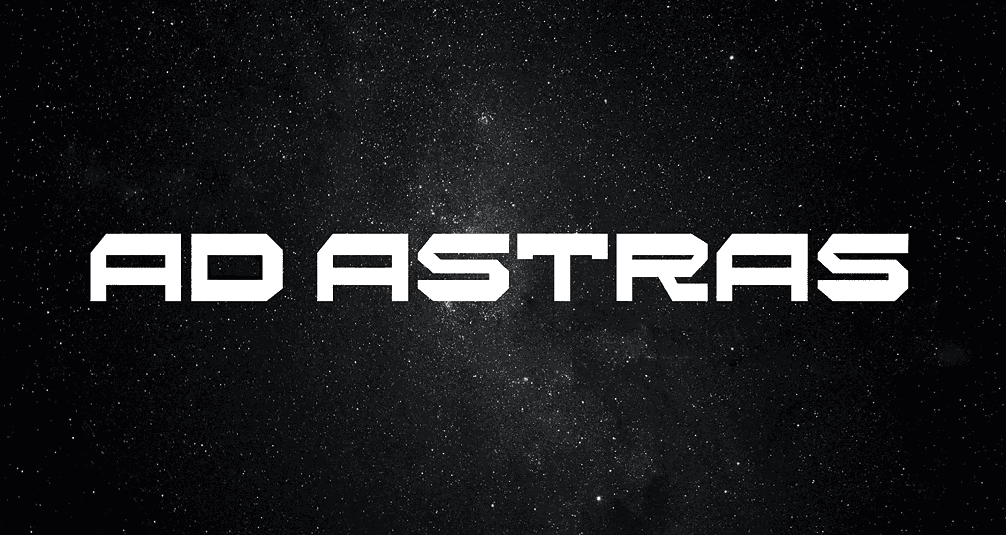
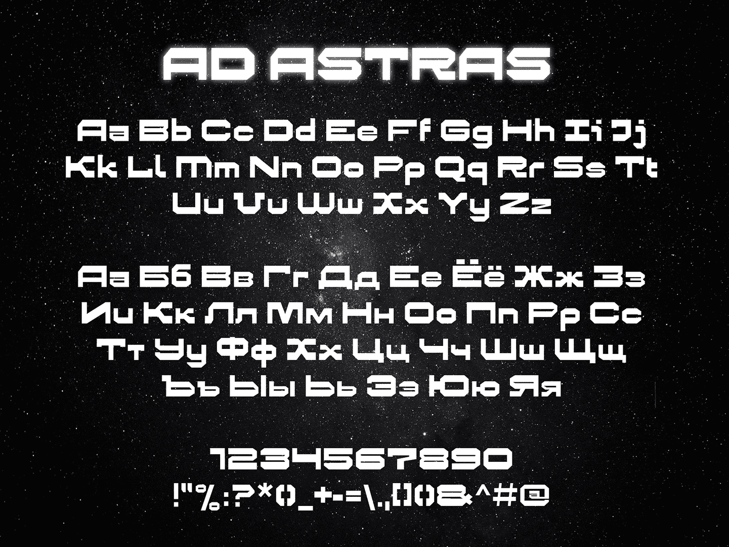
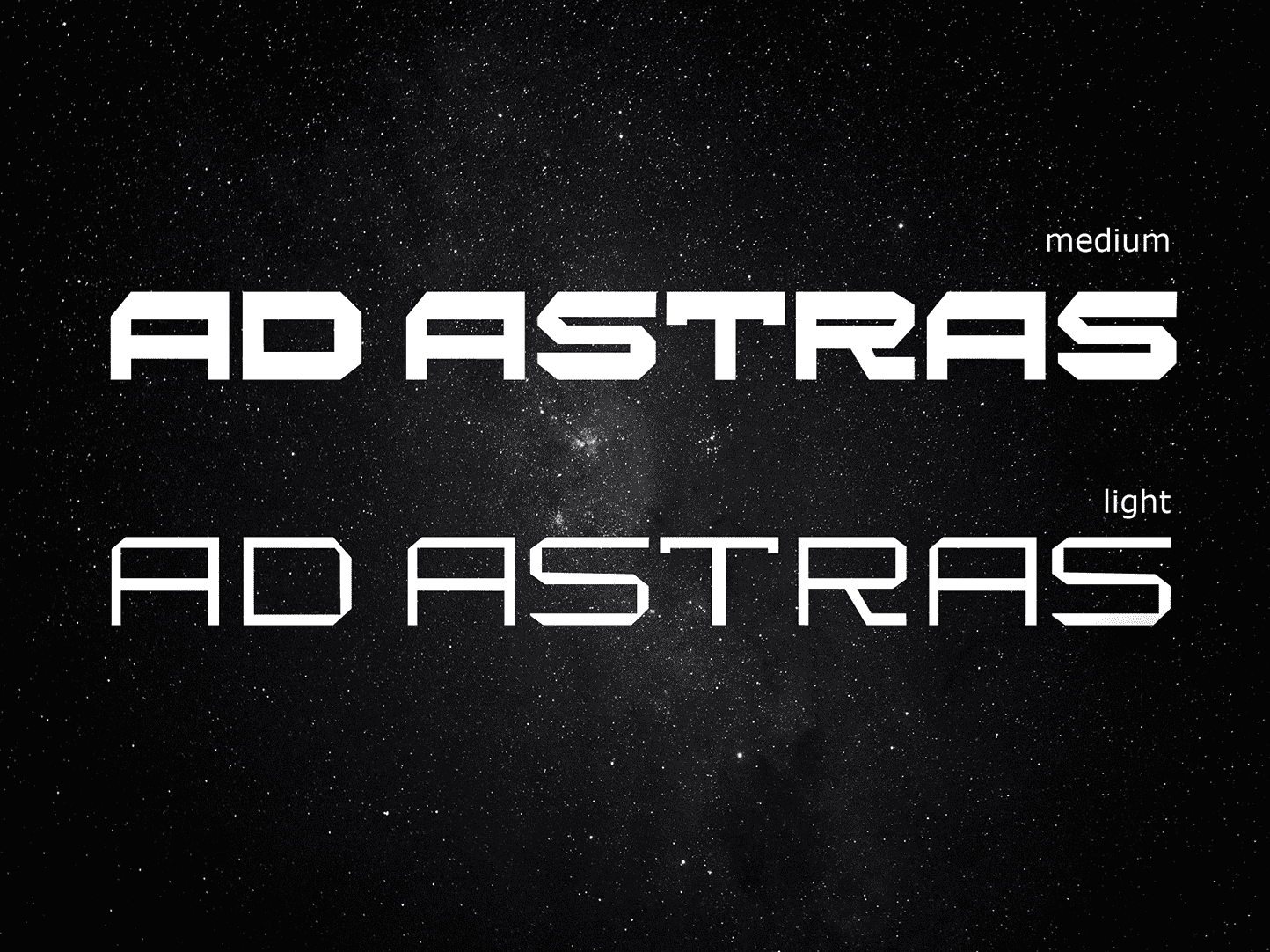
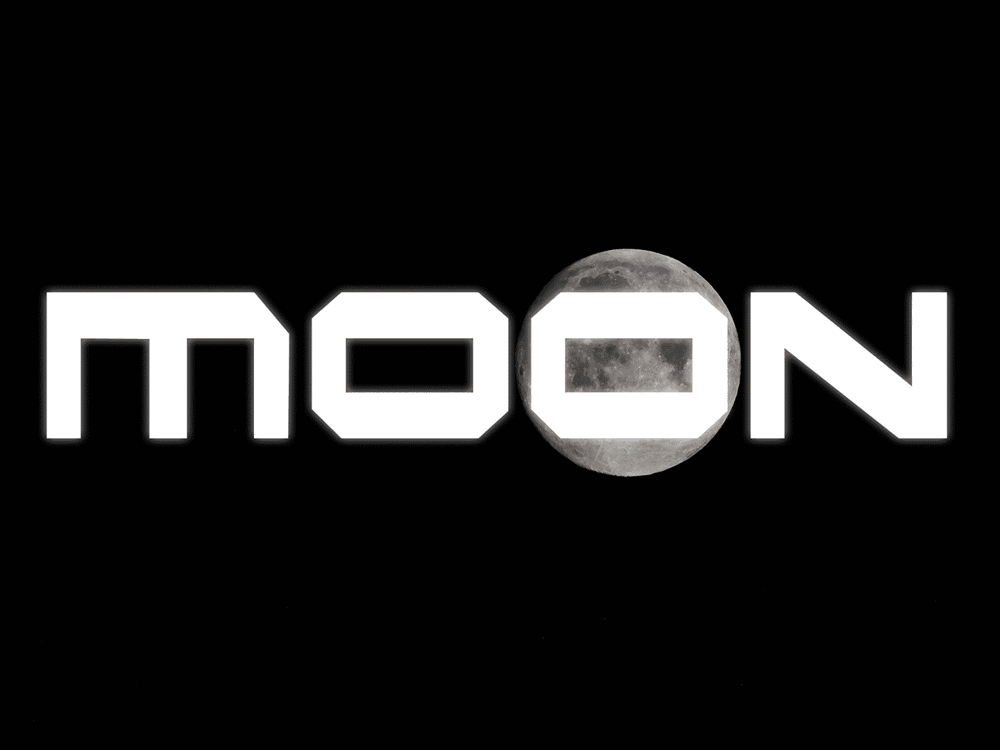
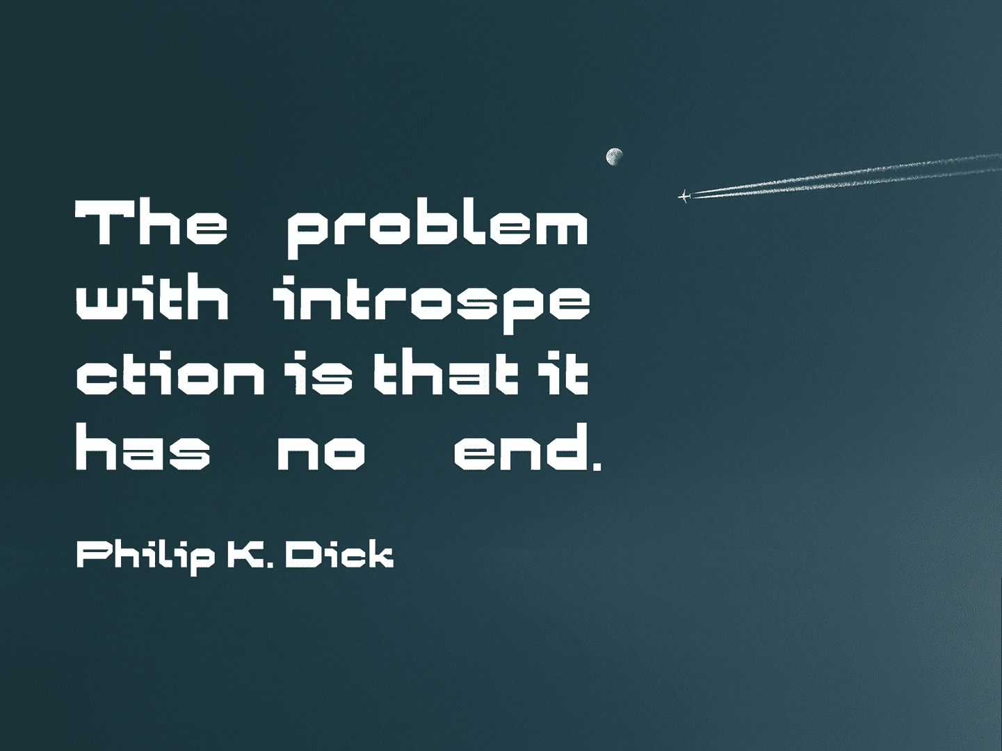
Application: Space shuttle.
Styles: Medium, Light.
Description: AdAstras is a futuristic typeface, inspired by space travel. It contains sharp angles and geometric lines. Wide letters and a blocky feel makes it perfect for logotypes and user interfaces.